Upgrade to Pro
— share decks privately, control downloads, hide ads and more …
Speaker Deck
Features
Speaker Deck
PRO
Sign in
Sign up for free
Search
Search
Building websites for HiDPI devices
Search
Vinay M
March 23, 2013
Technology
5.2k
5
Share
Embed
Copy iframe code
Copy JS code
Copy link
Start on current slide
Building websites for HiDPI devices
Presented at front end meetup Singapore
Vinay M
March 23, 2013
More Decks by Vinay M
See All by Vinay M
DRY css with Sass
artminister
1
150
CSS Best Practices
artminister
6
320
Other Decks in Technology
See All in Technology
個人開発で育てる「大規模設計の苗床」 - AI時代の1人開発から始める業務への知識接続 / The Seedbed for Large-Scale Design - From AI-Era Solo Projects to Professional Knowledge
bitkey
PRO
1
240
CSに"SLO"は要らない、経営層に"99.9%"は伝わらない - SREを全社に"翻訳"する3原則
cscengineer
PRO
1
4.6k
Oracle Base Database Service 技術詳細
oracle4engineer
PRO
15
110k
タスクの複雑さでモデルを選ぶ ── Thompson Samplingで動かす“トークン/コスト最適化
satohy0323
0
410
第67回コンピュータビジョン勉強会CVPR2026読会前編
tsukamotokenji
0
130
Claude Code 珍プレー好プレー
shinyasaita
0
330
Kaggleで成長するために意識したこと
prgckwb
2
360
完全自律ロボットを作りたくて、先に開発を自律させた話(ROS Japan UG #63 LT)
rryz09
0
600
Genie Ontologyは銀の弾丸かを考える / Is Genie Ontology a Silver Bullet?
nttcom
0
300
地域 SRE コミュニティ最前線 / SRE NEXT 2026 Discussion Night Track C
muziyoshiz
0
220
Data + AI Summit 2026 イベントレポート: 「AIがビジネスで意思決定するデータ基盤」へ
nek0128
0
160
AIと共生する開発者プラットフォーム:バクラクのモノレポ×マイクロサービス基盤
sakajunquality
2
3.6k
Featured
See All Featured
The AI Search Optimization Roadmap by Aleyda Solis
aleyda
1
6k
Stop Working from a Prison Cell
hatefulcrawdad
274
21k
Lightning Talk: Beautiful Slides for Beginners
inesmontani
PRO
2
600
Build The Right Thing And Hit Your Dates
maggiecrowley
39
3.3k
Amusing Abliteration
ianozsvald
1
220
Why Our Code Smells
bkeepers
PRO
340
58k
Navigating Weather and Climate Data
rabernat
0
330
The Impact of AI in SEO - AI Overviews June 2024 Edition
aleyda
5
1.1k
Cheating the UX When There Is Nothing More to Optimize - PixelPioneers
stephaniewalter
287
14k
Statistics for Hackers
jakevdp
799
230k
Put a Button on it: Removing Barriers to Going Fast.
kastner
60
4.4k
sira's awesome portfolio website redesign presentation
elsirapls
0
300
Transcript
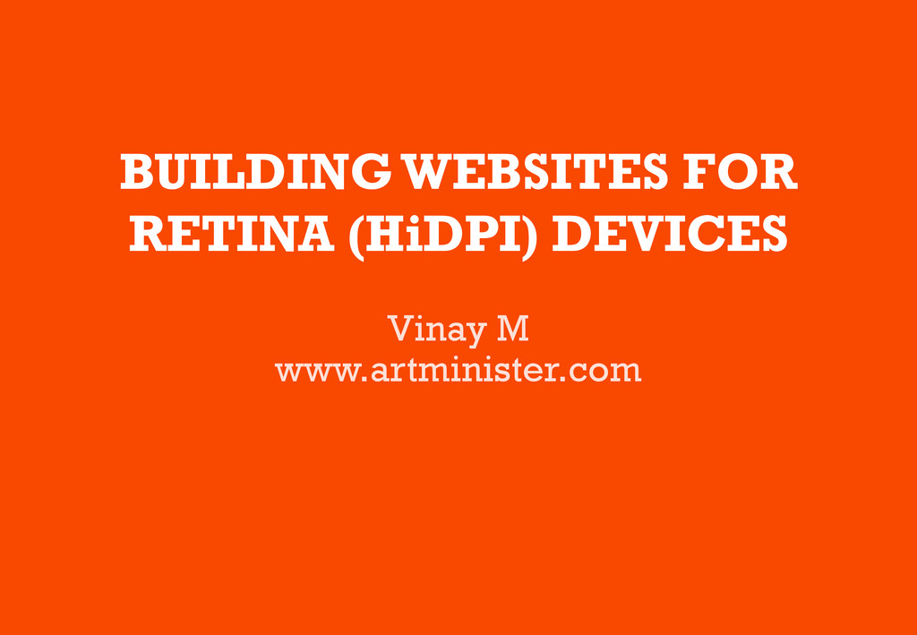
BUILDING WEBSITES FOR RETINA (HiDPI) DEVICES Vinay M www.artminister.com
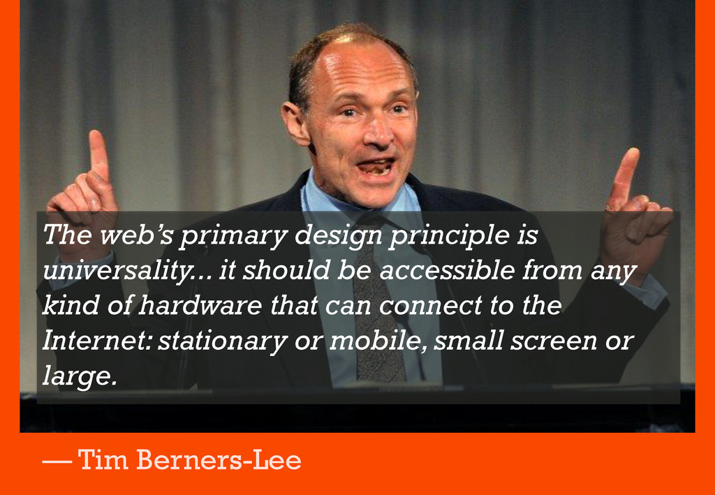
The web’s primary design principle is universality... it should be
accessible from any kind of hardware that can connect to the Internet: stationary or mobile, small screen or large. — Tim Berners-Lee
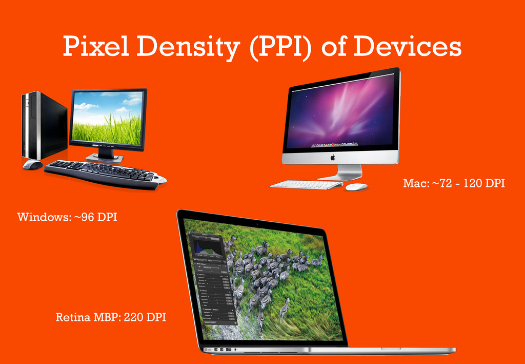
Pixel Density (PPI) of Devices Windows: ~96 DPI Mac: ~72
- 120 DPI Retina MBP: 220 DPI
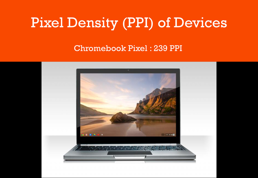
Pixel Density (PPI) of Devices Chromebook Pixel : 239 PPI
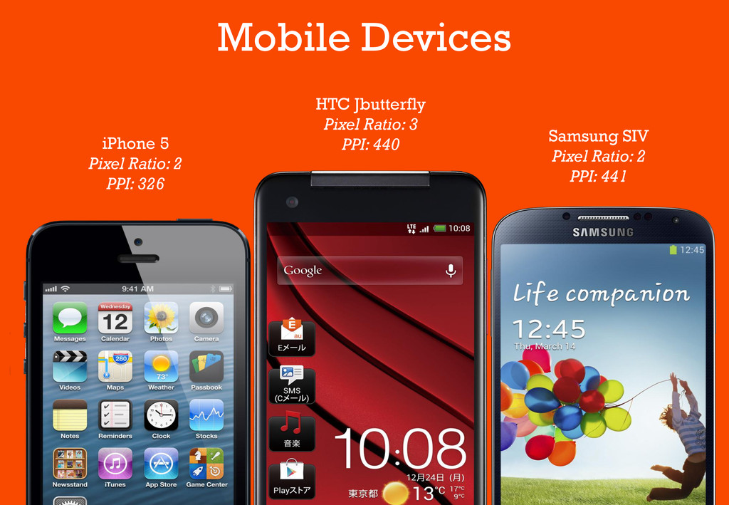
HTC Jbutterfly Pixel Ratio: 3 PPI: 440 Samsung SIV Pixel
Ratio: 2 PPI: 441 iPhone 5 Pixel Ratio: 2 PPI: 326 Mobile Devices
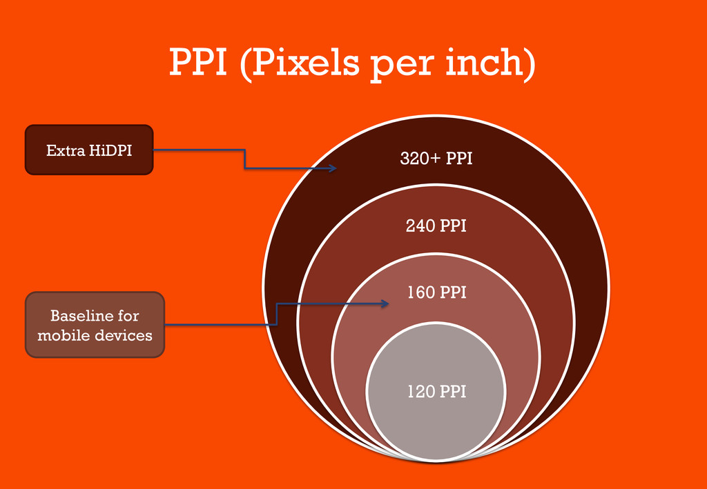
PPI (Pixels per inch) 320+ PPI 240 PPI 160 PPI
120 PPI Extra HiDPI Baseline for mobile devices
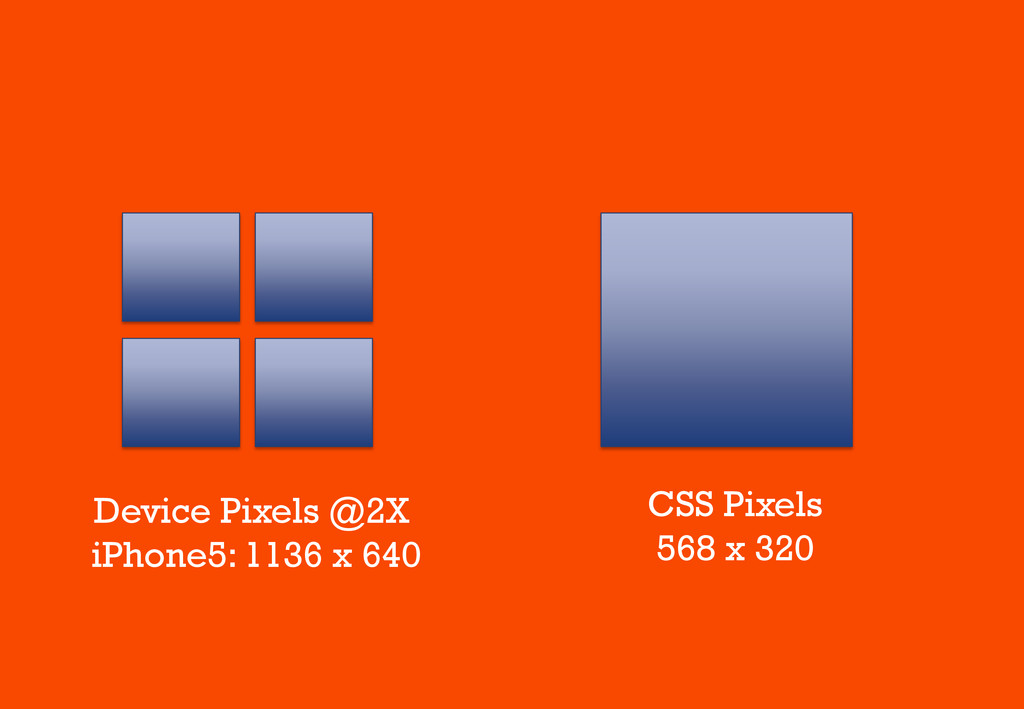
CSS Pixels 568 x 320 Device Pixels @2X iPhone5: 1136
x 640
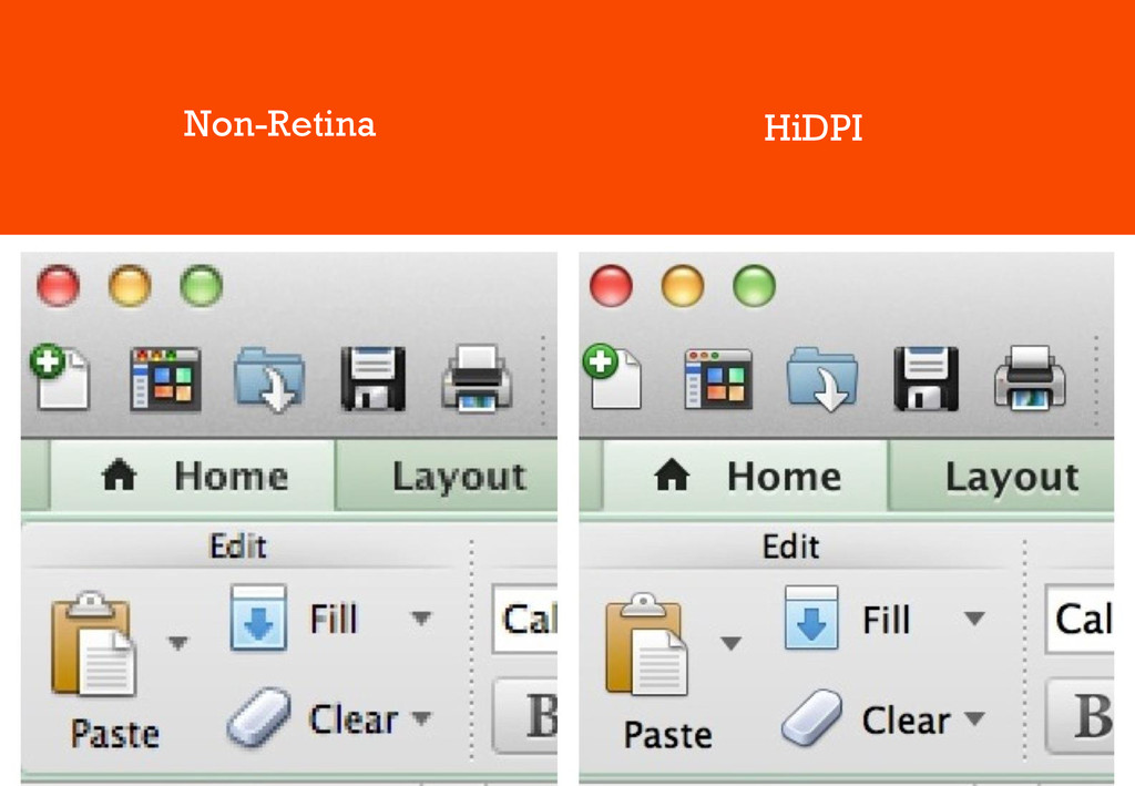
Non-Retina HiDPI
High DPI • Greater pixel density • Physical Resolution is
higher (2x) • Content Resolution is constant • Content Scale is higher (2x)
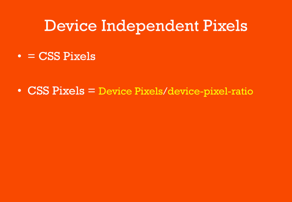
Device Independent Pixels • = CSS Pixels • CSS Pixels
= Device Pixels/device-pixel-ratio
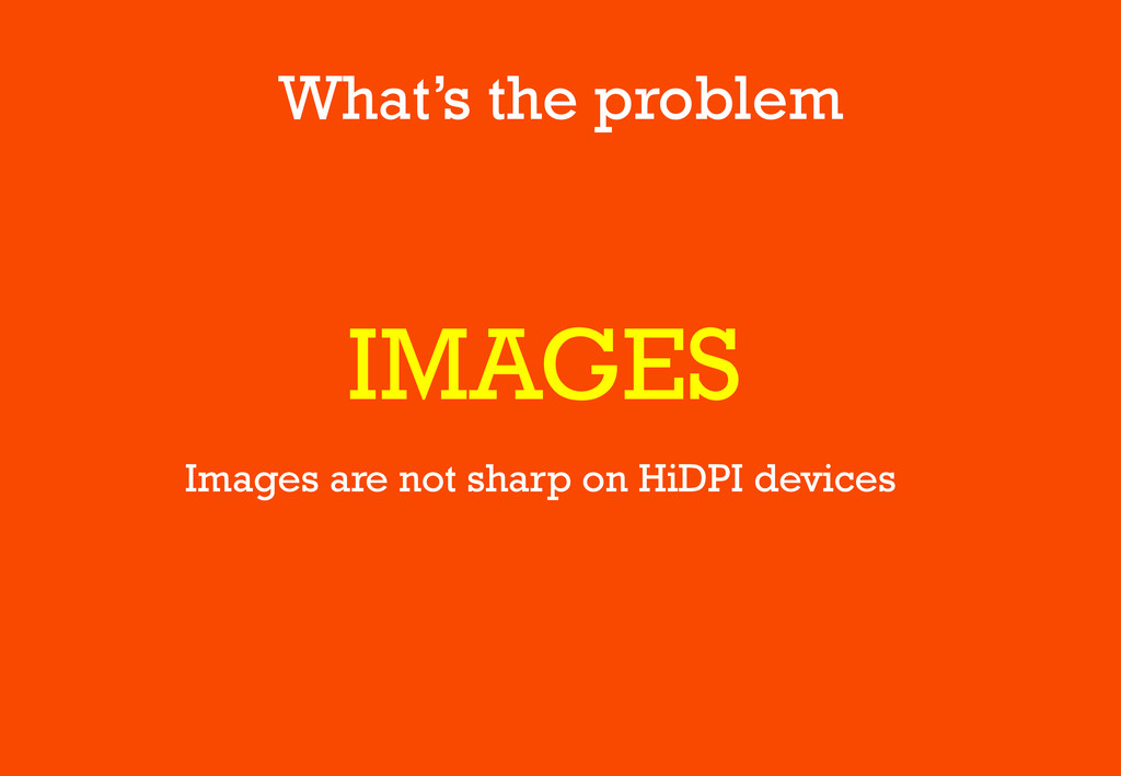
What’s the problem IMAGES Images are not sharp on HiDPI
devices
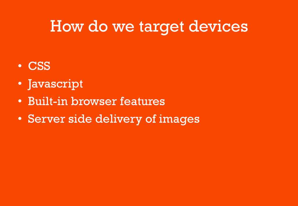
How do we target devices • CSS • Javascript •
Built-in browser features • Server side delivery of images
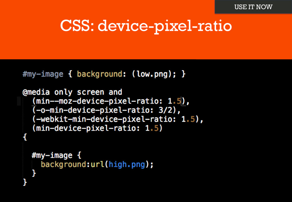
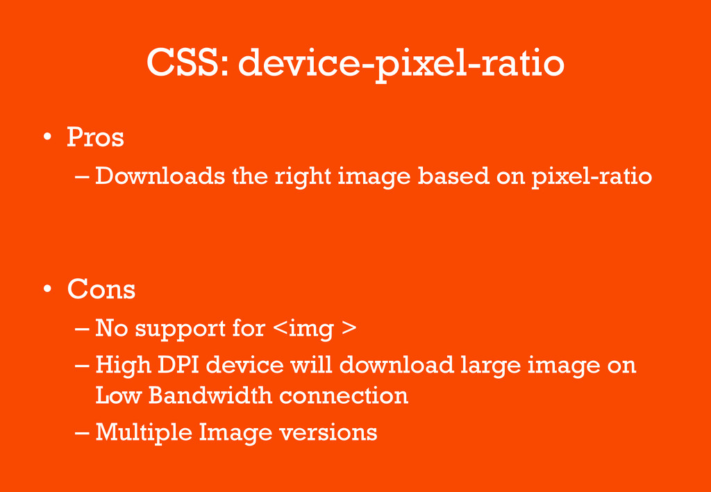
CSS: device-pixel-ratio USE IT NOW
CSS: device-pixel-ratio • Pros – Downloads the right image based
on pixel-ratio • Cons – No support for <img > – High DPI device will download large image on Low Bandwidth connection – Multiple Image versions
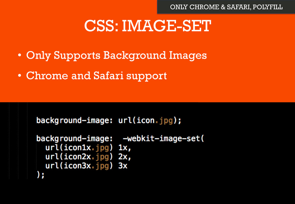
CSS: IMAGE-SET • Only Supports Background Images • Chrome and
Safari support ONLY CHROME & SAFARI, POLYFILL
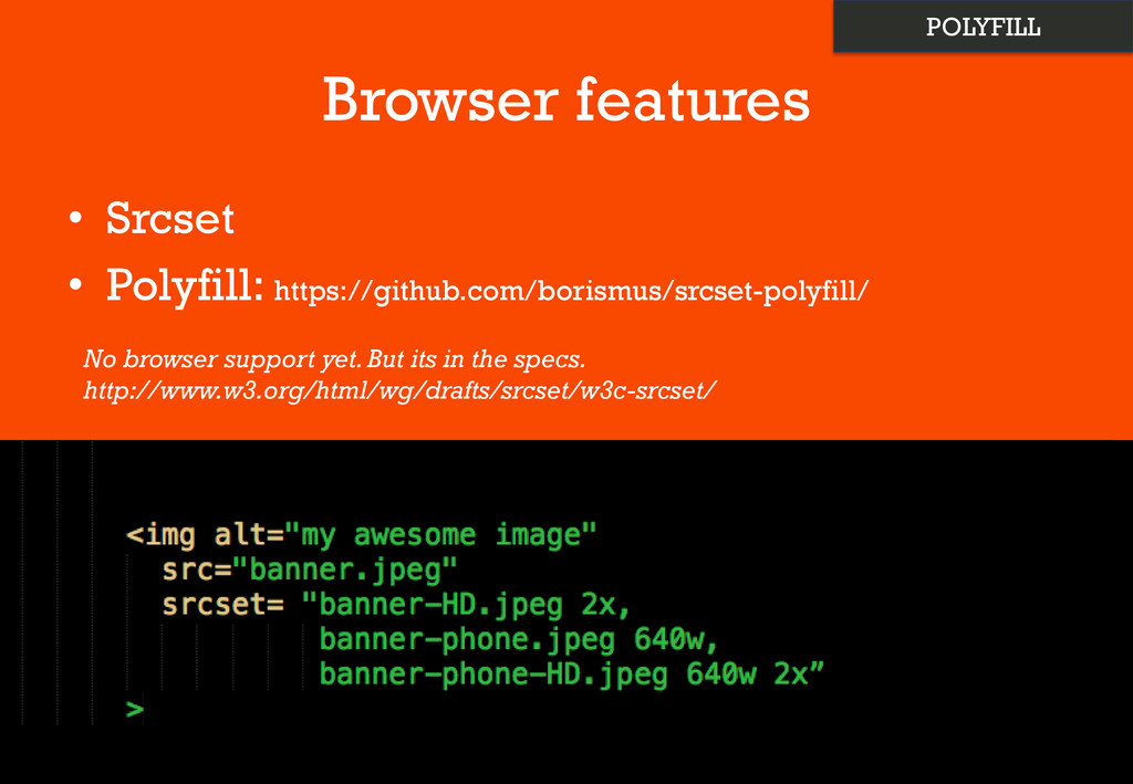
Browser features • Srcset • Polyfill: https://github.com/borismus/srcset-polyfill/ No browser support
yet. But its in the specs. http://www.w3.org/html/wg/drafts/srcset/w3c-srcset/ POLYFILL
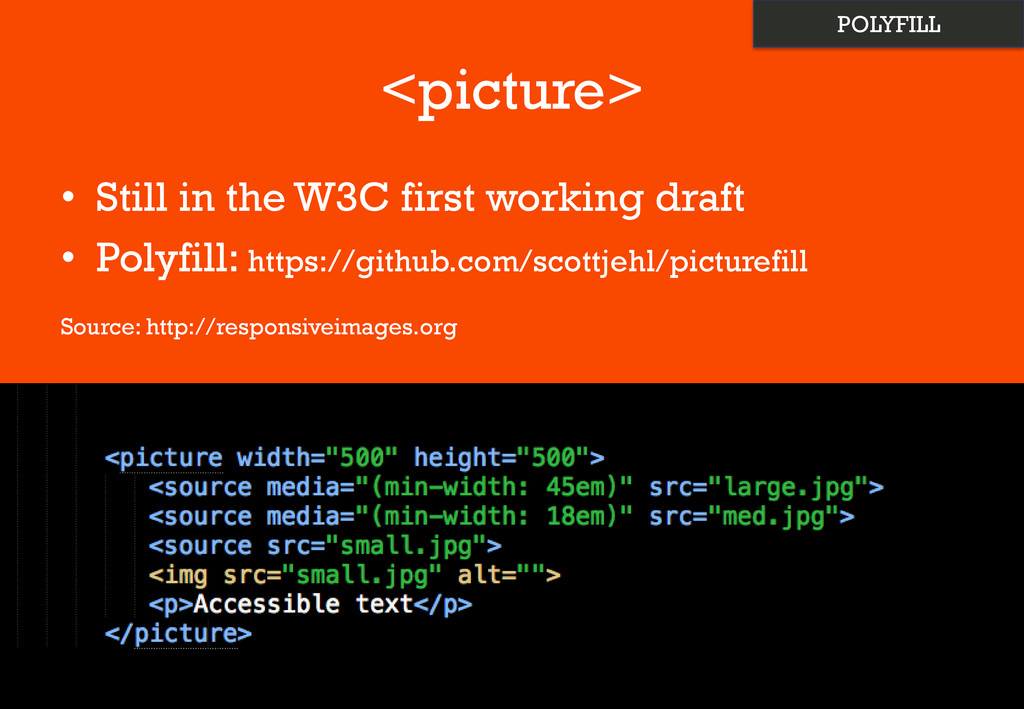
<picture> • Still in the W3C first working draft •
Polyfill: https://github.com/scottjehl/picturefill Source: http://responsiveimages.org POLYFILL
Other Image Tweeks • Background-size: • Compress 2x images –
Webp: https://developers.google.com/speed/webp/
Javacript • Window.devicePixelRatio
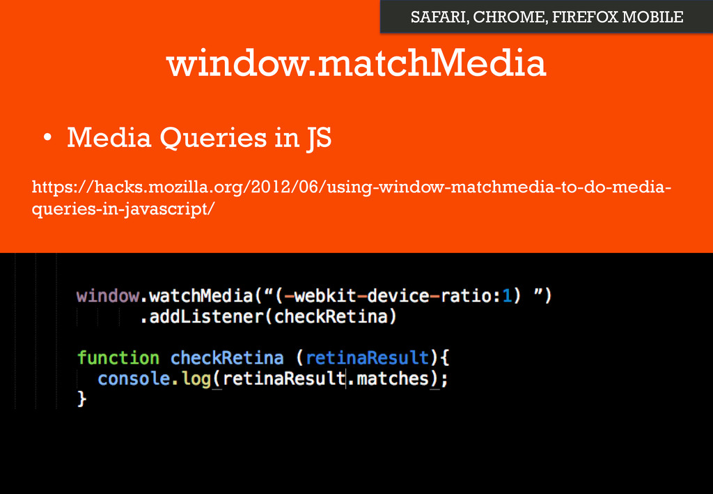
window.matchMedia • Media Queries in JS https://hacks.mozilla.org/2012/06/using-window-matchmedia-to-do-media- queries-in-javascript/ SAFARI, CHROME,
FIREFOX MOBILE
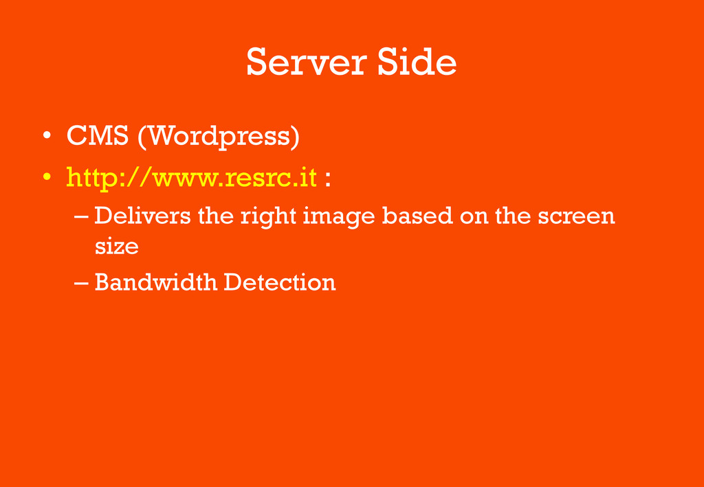
Server Side • CMS (Wordpress) • http://www.resrc.it : – Delivers
the right image based on the screen size – Bandwidth Detection
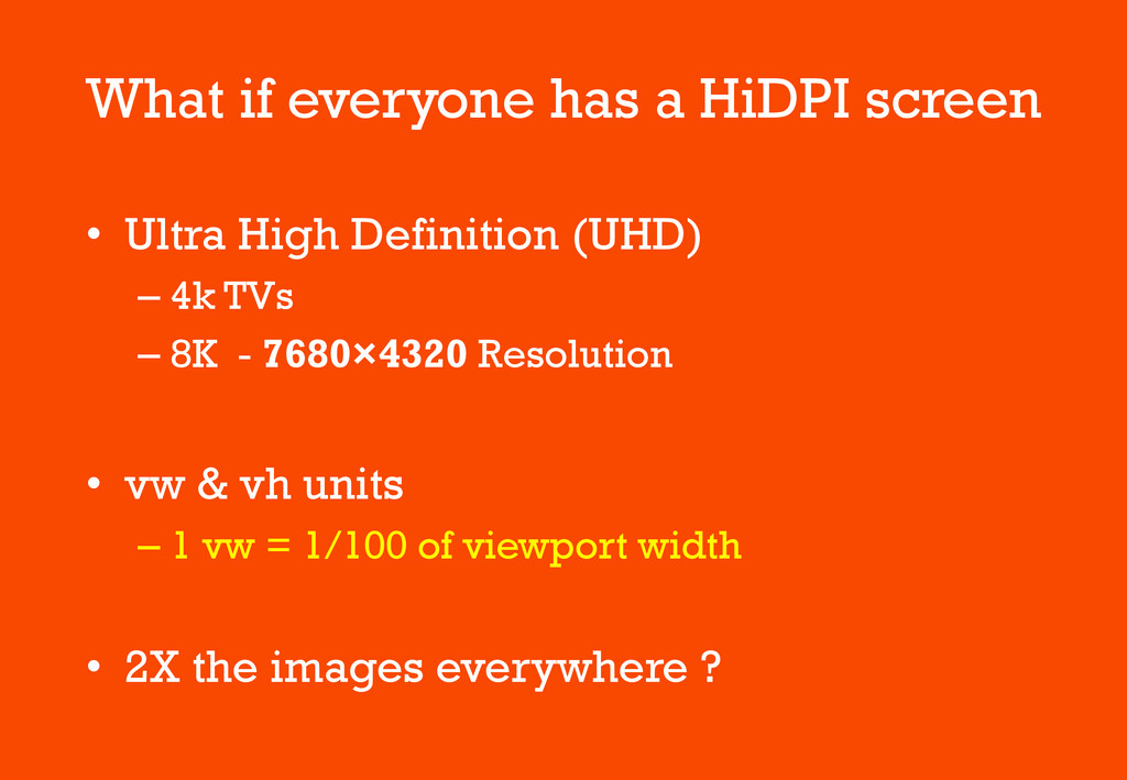
What if everyone has a HiDPI screen • Ultra High
Definition (UHD) – 4k TVs – 8K - 7680×4320 Resolution • vw & vh units – 1 vw = 1/100 of viewport width • 2X the images everywhere ?
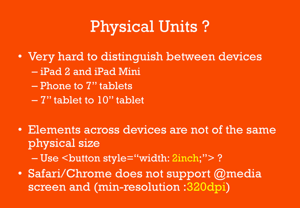
Physical Units ? • Very hard to distinguish between devices
– iPad 2 and iPad Mini – Phone to 7’’ tablets – 7’’ tablet to 10’’ tablet • Elements across devices are not of the same physical size – Use <button style=“width: 2inch;”> ? • Safari/Chrome does not support @media screen and (min-resolution :320dpi)
To Consider for HiDPI • Eliminate Images + Use CSS3
• Web fonts for icons • SVG • Use image-set and srcset • Use Viewport units – vw, vh
Thank You • Slides: https://speakerdeck.com/artminister • Many thanks to –
Micheal Cheng (@coderkungfu) – Hackerspace SG • Calling for speakers
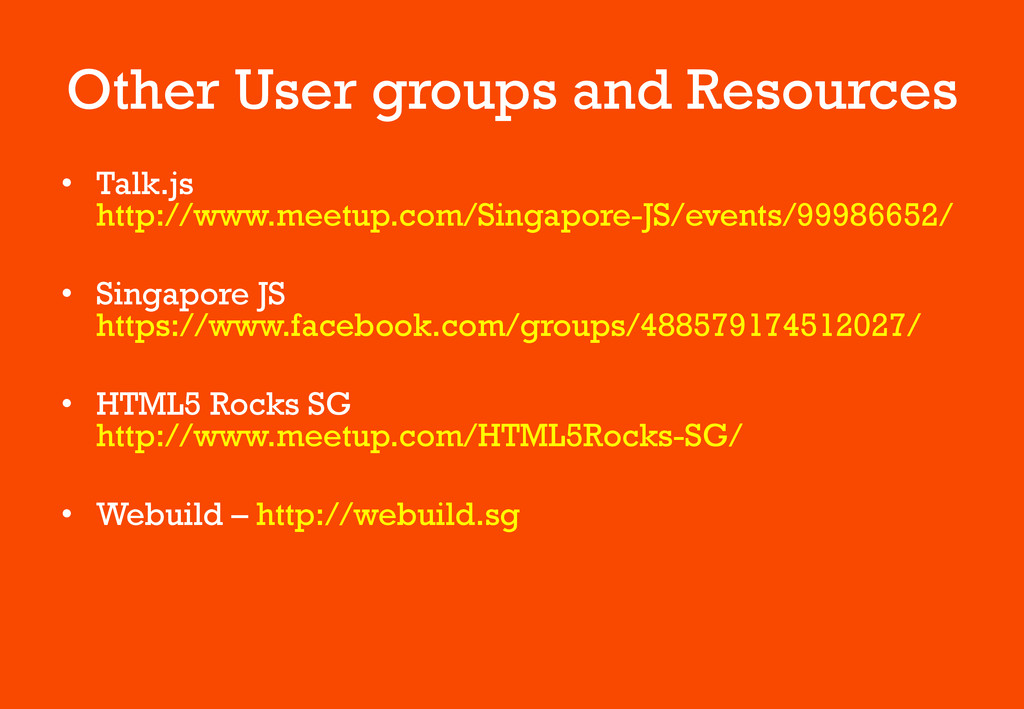
Other User groups and Resources • Talk.js http://www.meetup.com/Singapore-JS/events/99986652/ • Singapore
JS https://www.facebook.com/groups/488579174512027/ • HTML5 Rocks SG http://www.meetup.com/HTML5Rocks-SG/ • Webuild – http://webuild.sg
 artminister
 bitkey
 cscengineer
 oracle4engineer
 satohy0323
 tsukamotokenji
 shinyasaita
 prgckwb
 rryz09
 nttcom
 muziyoshiz
 nek0128
 sakajunquality
 aleyda
 hatefulcrawdad
 inesmontani
 maggiecrowley
 ianozsvald
 bkeepers
 rabernat
 stephaniewalter
 jakevdp
 kastner
 elsirapls