Upgrade to Pro
— share decks privately, control downloads, hide ads and more …
Speaker Deck
Features
Speaker Deck
PRO
Sign in
Sign up for free
Search
Search
Design Systems and Component Based Frontend
Search
Bilal Çınarlı
June 27, 2019
Programming
170
0
Share
Embed
Copy iframe code
Copy JS code
Copy link
Start on current slide
Design Systems and Component Based Frontend
Bilal Çınarlı
June 27, 2019
More Decks by Bilal Çınarlı
See All by Bilal Çınarlı
Efficieny and Scaling in Frontend
bcinarli
0
51
Navigating with Unknowns
bcinarli
1
46
Story of a Boring Work
bcinarli
0
26
Refactoring Frontend
bcinarli
0
55
Accessible By Default!
bcinarli
0
110
Aninda Yüklenen Uygulamalar
bcinarli
0
150
Iletisimin Mühendisligi
bcinarli
0
68
Independently together: better developer experience & App performance
bcinarli
1
550
Developer Experience: How happy are your engineers?
bcinarli
0
290
Other Decks in Programming
See All in Programming
AI駆動開発を妨げる技術的負債の解消アプローチ / ai-refactoring-approach
minodriven
17
8.5k
SREの積み重ねがAI駆動開発のガードレールになった ― 7つの実践/SRE Guardrails The 7
tomoyakitaura
5
830
LaravelLive Japan の裏方のすべて — 第188回 PHP勉強会@東京 (2026-06-24)
suguruooki
2
140
そのテスト、説明できますか?~LWテスト戦略FW~のご紹介
nakahara
0
190
dRuby over BLE
makicamel
2
400
Honoでのサプライチェーン侵害対策 〜 3つのライブラリに学ぶ
yusukebe
7
1.7k
Skillsは効率化、Agentsは"自分の拡張"——Builder時代のエージェント編成(CC Night 2026)
wemra
1
190
AIを活用したE2Eテスト実装効率化のあゆみ / ebisu-mobile-14-kotetu
kotetuco
0
160
TypeScript+Orvalで実現する型安全かつ堅牢でスケーラブルなマルチチャネル通知基盤 / TSKaigi Night talks ~after conference~
d0riven
0
380
LLMによるContent Moderationの本番運用の裏側と品質担保への挑戦
suikabar
3
820
AIで効率化できた業務・日常
ochtum
0
160
才能?センス?知らん、 続けたもん勝ちだ。-- 結婚・出産・癌を越えてなお、私がプロダクトを創り続ける理由
16bitidol
2
650
Featured
See All Featured
The AI Revolution Will Not Be Monopolized: How open-source beats economies of scale, even for LLMs
inesmontani
PRO
3
3.5k
The SEO identity crisis: Don't let AI make you average
varn
0
510
The Cult of Friendly URLs
andyhume
79
6.9k
Tips & Tricks on How to Get Your First Job In Tech
honzajavorek
1
550
世界の人気アプリ100個を分析して見えたペイウォール設計の心得
akihiro_kokubo
PRO
72
40k
Art, The Web, and Tiny UX
lynnandtonic
304
22k
The World Runs on Bad Software
bkeepers
PRO
72
12k
A Tale of Four Properties
chriscoyier
163
24k
<Decoding/> the Language of Devs - We Love SEO 2024
nikkihalliwell
1
270
The Success of Rails: Ensuring Growth for the Next 100 Years
eileencodes
47
8.2k
From π to Pie charts
rasagy
0
230
Put a Button on it: Removing Barriers to Going Fast.
kastner
60
4.3k
Transcript
Design Systems & Component Based Frontend
Bilal Çınarlı Frontend Architect Software Engineer @Adidas @bcinarli github.com/bcinarli bcinarli.com
None
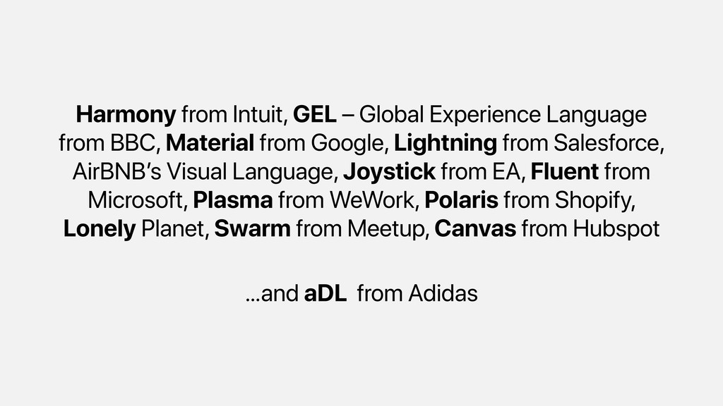
Harmony from Intuit, GEL – Global Experience Language from BBC,
Material from Google, Lightning from Salesforce, AirBNB’s Visual Language, Joystick from EA, Fluent from Microsoft, Plasma from WeWork, Polaris from Shopify, Lonely Planet, Swarm from Meetup, Canvas from Hubspot …and aDL from Adidas
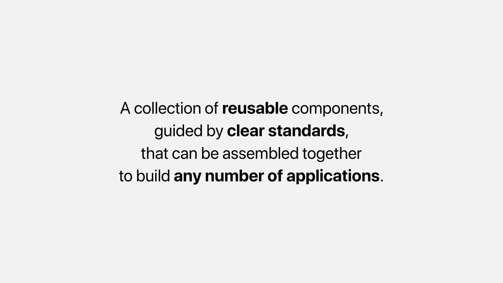
What is a design system?
A collection of reusable components, guided by clear standards, that
can be assembled together to build any number of applications.
None
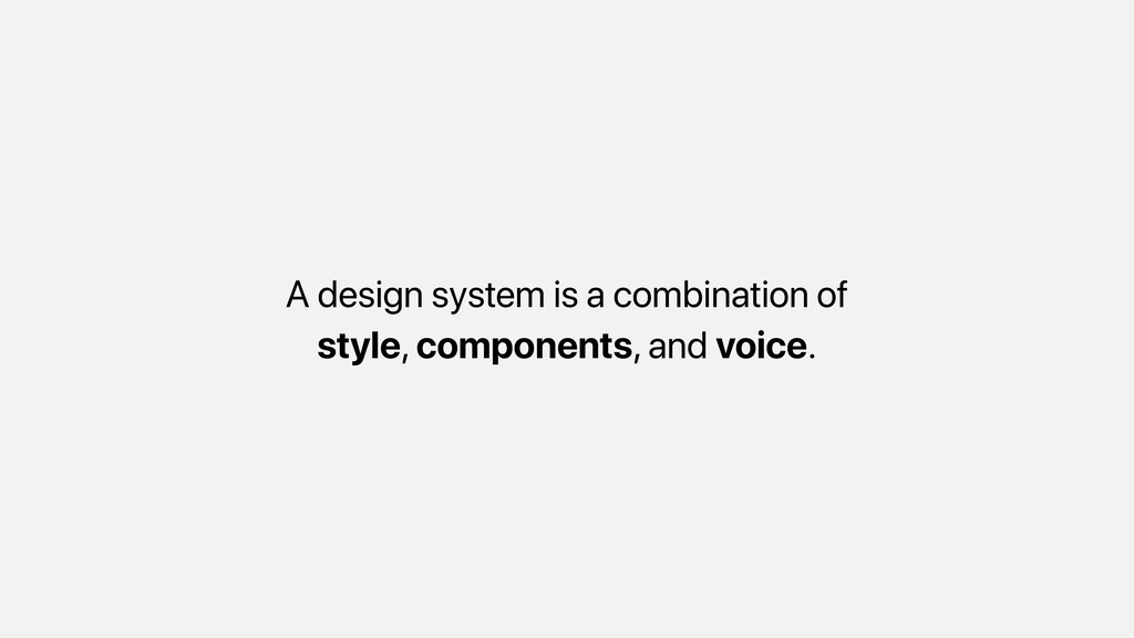
A design system is a combination of style, components, and
voice.
It is scalable at any level
Provides consistency between different pages and applications
With the set of rules and guides, increases the efficiency
Enhances the teamwork and eases the on-boarding of new members
http://bit.do/yarnds
http://bit.do/adl_
Components
Components support levels of abstraction in an application. It is
layered and feature-based.
Individual components provide decoupling which leads to better unit testings
and stability.
Design system and Components combine mostly in UI layer where
your presentation occurs
Besides, components can also communicate with the data layer while
rendering our content.
…and with the standardisation, it improves quality.
None
How Popular Libraries Think?
Build encapsulated components that manage their own state, then compose
them to make complex UIs.
Components define areas of responsibility in your UI that let
you reuse these sets of UI functionality.
It’s an abstraction that allows us to build large-scale applications
composed of small, self-contained, and often reusable components.
But the mainly, they should have a responsibility over a
single part.
None
How to Organise?
Define your folder structure based on their functionalities
Think of everything is sort-of a pluggable component. In most
cases, when you remove it, you should expect no traces left.
// DON’T . !"" controllers | !"" cart.js | #""
checkout.js !"" models | !"" cart.js | #"" checkout.js #"" views !"" cart.pug #"" checkout.pug // DO . !"" cart | !"" index.js | #"" template.pug #"" checkout !"" index.js #"" template.pug
…and tests are a part of your components.
// add test specs . !"" cart | !"" index.js
| !"" test.spec.js | #"" template.pug #"" checkout !"" index.js !"" test.spec.js #"" template.pug
Separate config and scripts away from your components.
. !"" config | !"" index.js | #"" server.js !""
scripts | !"" build.sh | #"" post-install.sh !"" test | !"" index.js | #"" setup.spec.js !"" cart | !"" index.js | !"" test.spec.js | #"" template.pug #"" checkout !"" index.js !"" test.spec.js #"" template.pug
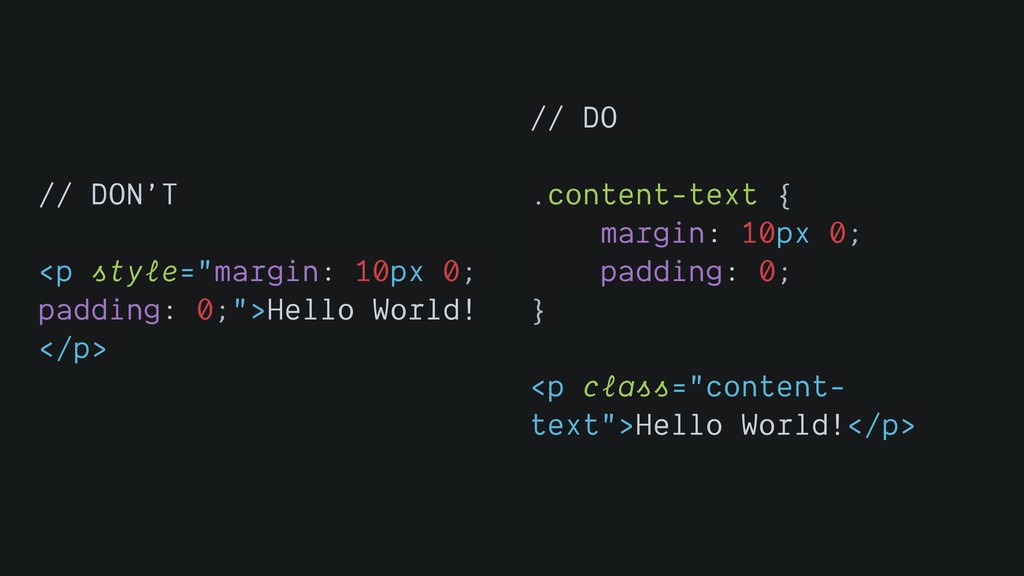
Keep HTML and CSS separate in your source code and
never inline manually
// DON’T <p style="margin: 10px 0; padding: 0;">Hello World! </p>
// DO .content-text { margin: 10px 0; padding: 0; } <p class="content- text">Hello World!</p>
Always think about specificity in CSS, try to avoid creating
specific selectors
// DON’T #main .article .title span { font-size: 32px; font-weight:
bold; } // DO .main-article-title { font-size: 32px; font-weight: bold; }
Do not write the code you are going to overwrite
// DON’T .content { display: flex; max-width: 1280px; margin: 0
auto; } .article { width: 900px; } .supplementary { width: 380px; } @media screen and (min-width: 48.0625em) and (max-width: 64em) { .article { width: 644px; } } @media screen and (max-width: 48em) { .content { flex-direction: column; } .article, .supplementary { width: 100%; } } // DO .content { max-width: 1280px; margin: 0 auto; } @media screen and (min-width: 48.0625em) { .content { display: flex; } .article { flex: 1; } .supplementary { width: 380px; } }
A way to unify different frameworks?
Web components are a set of web platform APIs that
allow you to create new custom, reusable, encapsulated HTML tags to use in web pages and web apps.
Custom components and widgets build on the Web Component standards,
will work across modern browsers, and can be used with any JavaScript library or framework that works with HTML.
<script type="module" src=“components/nav/app- drawer“></script> <app-drawer raised class=“indigo">raised</app-drawer>
<script> class AppDrawer extends HTMLElement {...} window.customElements.define('app-drawer', AppDrawer); </script> <app-drawer></app-drawer>
Good part, all JS frameworks outputs to HTML. Theoretically, we
can use any popular JS library to create Web Components
What is more?
Having self-contained, reusable components helps to turn you app to
micro frontends
… that can have independent deployment, build, coding
… leads to autonomous teams
… and you can have a shell that orchestrates which
micro frontend to load
… with the “Best Friend of Frontend"
Your components should not know what the dependencies are in
behind the curtains you are using.
It should only aware of which functions are available for
a particular action.
Every dependency comes with a technical debt for the future.
Thank you @bcinarli
 bcinarli
 minodriven
 tomoyakitaura
 suguruooki
 nakahara
 makicamel
 yusukebe
 wemra
wemra
 kotetuco
 d0riven
 suikabar
 ochtum
 16bitidol
 inesmontani
 varn
varn
 andyhume
 honzajavorek
 akihiro_kokubo
 lynnandtonic
 bkeepers
 chriscoyier
 nikkihalliwell
 eileencodes
 rasagy
 kastner