previously worked as a UX writer with app developers to create accessible services and games. I’m doing a Masters in UX design. It’s good to be here! @LauraParkerUX
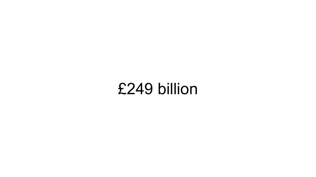
to the spending power of disabled households in the UK. It’s the amount of money people with disabilities do not spend on products and services because they are not accessible. Very few businesses have strategies to tap into this customer market. Make your service accessible = better experience for everyone = more market share. We are purple
Nearly 1 in 5 working adults have a disability • 75% of disabled people and their families have walked away from a business because of poor accessibility or customer service • In 2016, a survey found that more than 4 million people in the UK abandoned a retail website because of the barriers they found, taking with them an estimated spend of £11.75 billion • The “click away pound” was worth £17.1 billion in 2019 We are purple
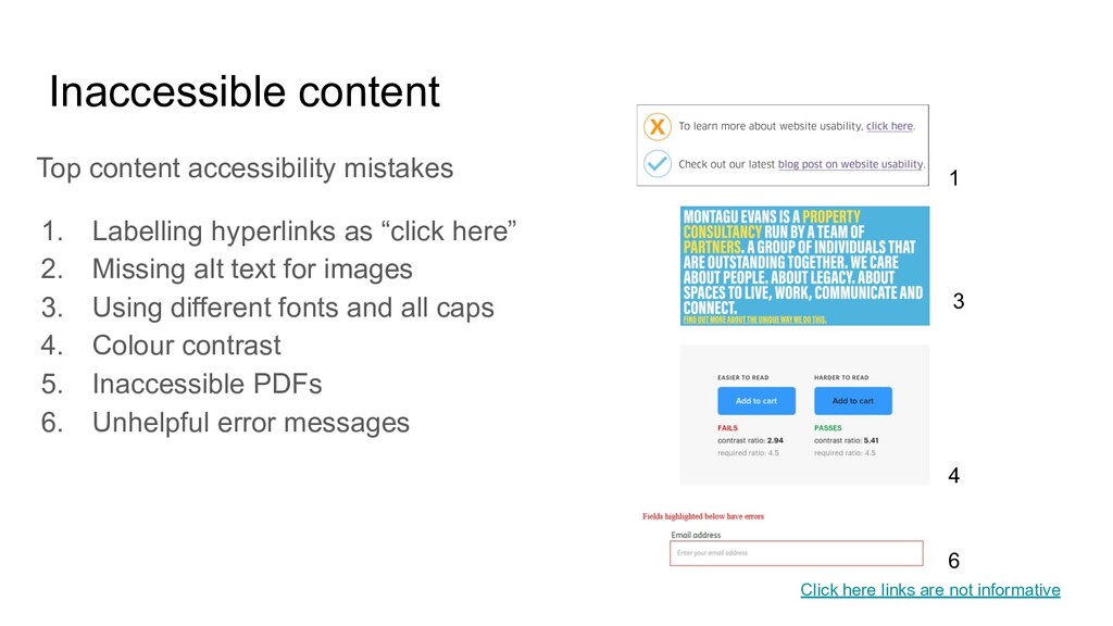
“click here” 2. Missing alt text for images 3. Using different fonts and all caps 4. Colour contrast 5. Inaccessible PDFs 6. Unhelpful error messages 1 6 4 Click here links are not informative 3
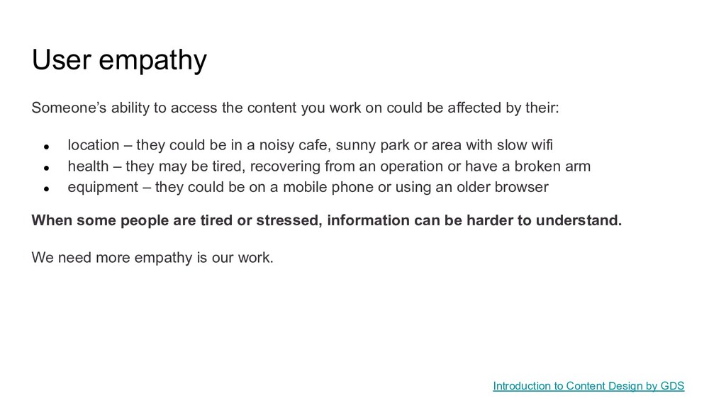
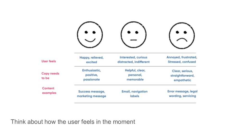
on could be affected by their: • location – they could be in a noisy cafe, sunny park or area with slow wifi • health – they may be tired, recovering from an operation or have a broken arm • equipment – they could be on a mobile phone or using an older browser When some people are tired or stressed, information can be harder to understand. We need more empathy is our work. Introduction to Content Design by GDS
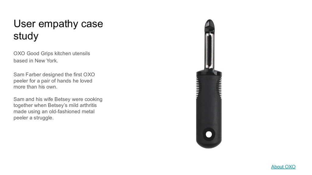
in New York. Sam Farber designed the first OXO peeler for a pair of hands he loved more than his own. Sam and his wife Betsey were cooking together when Betsey’s mild arthritis made using an old-fashioned metal peeler a struggle. About OXO
GOV.UK research, people understand complex specialist language, but don’t want to read it if there’s an alternative • Technical terms are not considered jargon but you should explain what they mean • People with the greatest expertise tend to have the most to read so make sure your content is helpful and easy to scan Writing well for specialists
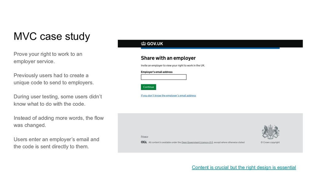
user needs to complete a task. It’s tempting to add words when there’s a problem or user error. Good UX writing removes the need for more words. Adding more words, pictures or whatever means adding more information, which adds complexity. To help users complete tasks we need to remove complexity, not add it. Content is crucial but the right design is essential
employer service. Previously users had to create a unique code to send to employers. During user testing, some users didn’t know what to do with the code. Instead of adding more words, the flow was changed. Users enter an employer’s email and the code is sent directly to them. Content is crucial but the right design is essential
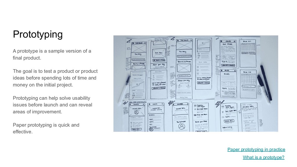
product. The goal is to test a product or product ideas before spending lots of time and money on the initial project. Prototyping can help solve usability issues before launch and can reveal areas of improvement. Paper prototyping is quick and effective. What is a prototype? Paper prototyping in practice
- design your content to take account of the fact that lots of people won’t read the content in detail • Empathise with users - what else might they be doing? • Think about tone - does your copy sound appropriate to the situation and how your user might be feeling? • Consider accessibility needs - words to use and avoid when writing about disability • Use plain language - your copy should be clear and unambiguous
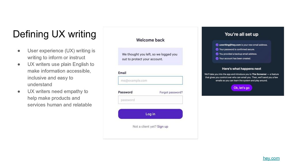
instruct • UX writers use plain English to make information accessible, inclusive and easy to understand • UX writers need empathy to help make products and services human and relatable Defining UX writing hey.com
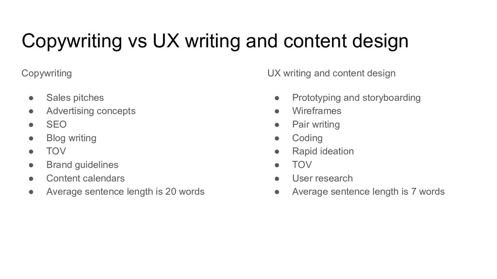
pitches • Advertising concepts • SEO • Blog writing • TOV • Brand guidelines • Content calendars • Average sentence length is 20 words UX writing and content design • Prototyping and storyboarding • Wireframes • Pair writing • Coding • Rapid ideation • TOV • User research • Average sentence length is 7 words
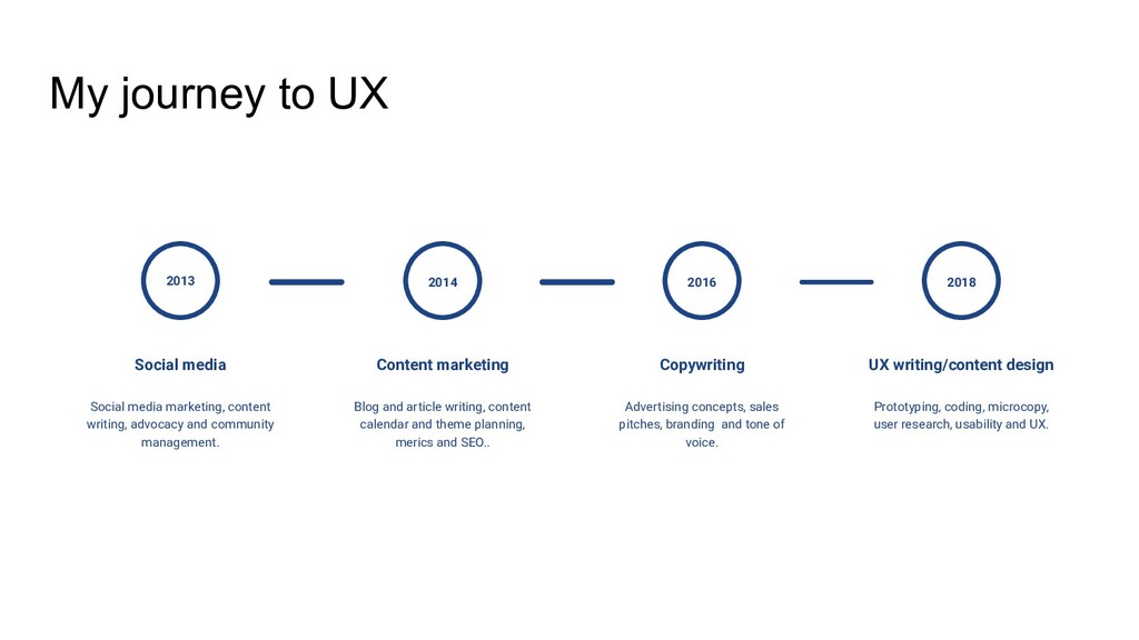
content writing, advocacy and community management. Content marketing Blog and article writing, content calendar and theme planning, merics and SEO.. 2014 Copywriting Advertising concepts, sales pitches, branding and tone of voice. 2016 UX writing/content design Prototyping, coding, microcopy, user research, usability and UX. 2018
simple technique for evaluating content • What is a prototype? • Paper prototyping in practice • We are purple • Dos and don’ts on designing for accessibility • About OXO • Download the government’s design for everyone poster • HMRC accessibility empathy hub • Accessibility webinars from GDS • Click here links are not informative • Error messages: the good, the bad, and the terrible