If you're a writer, or a designer asked to write copy for a website or app, your goal should be to make reading as easy as possible.
Learn about readability and accessible language and help people make sense of your product or service.
Topics covered:
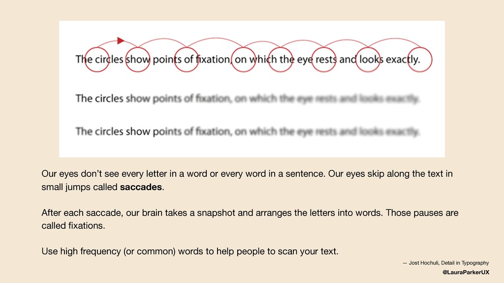
How people read online
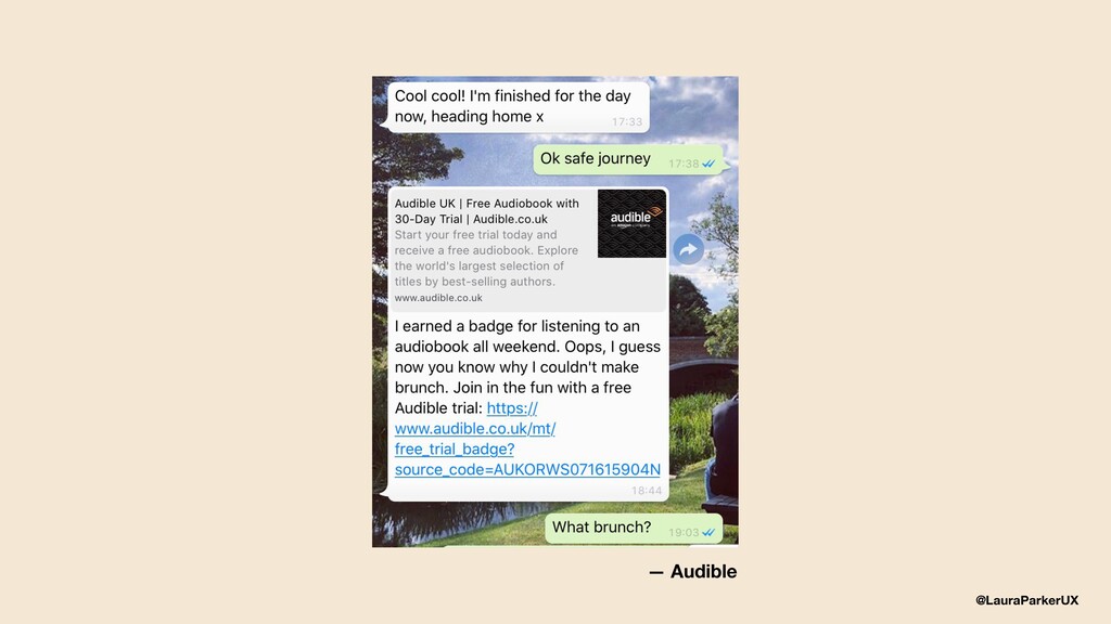
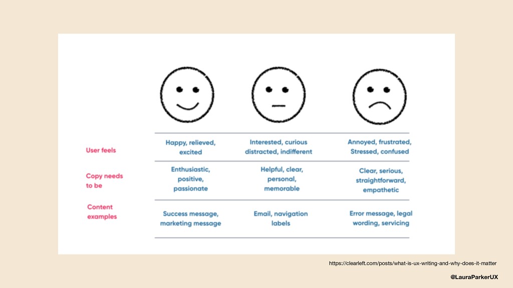
User anxiety and empathy
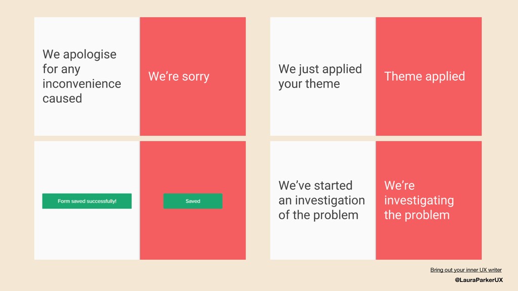
How to write using plain language
The Government Design System
Resources and recommendations
![@LauraParkerUX Web lauramarieparker.com Email [email protected] Twitter @LauraParkerUX](https://files.speakerdeck.com/presentations/a077974d7b0f4bd2bf57ec08d321254d/slide_31.jpg)