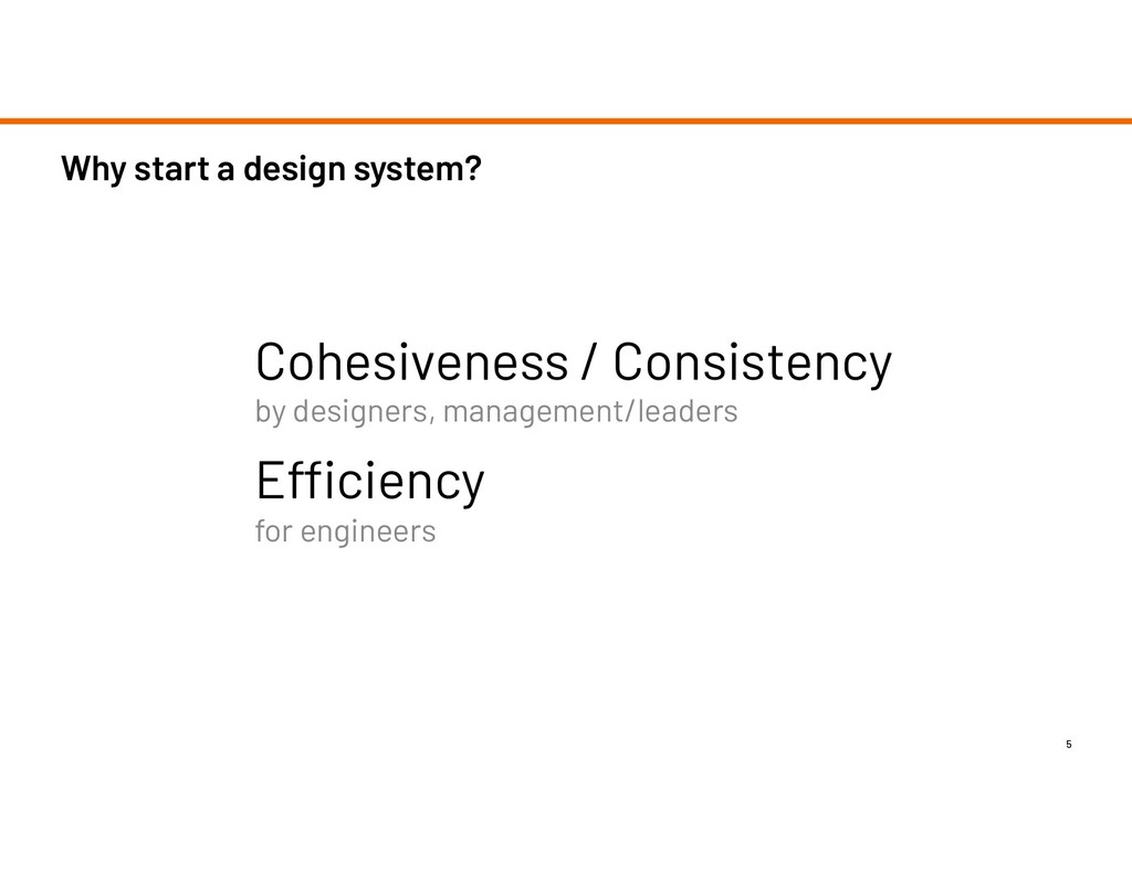
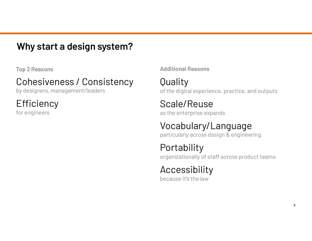
designers, management/leaders Efficiency for engineers Additional Reasons Quality of the digital experience, practice, and outputs Scale/Reuse as the enterprise expands Vocabulary/Language particularly across design & engineering Portability organizationally of staff across product teams Accessibility because it’s the law Top 2 Reasons
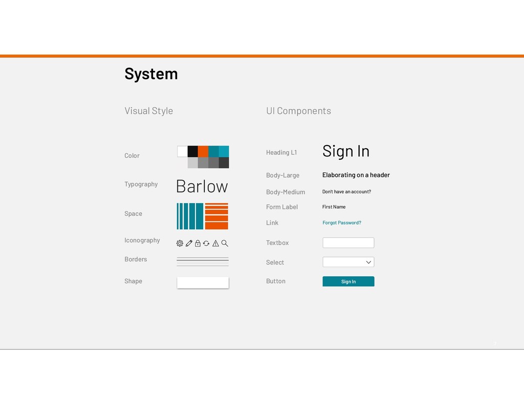
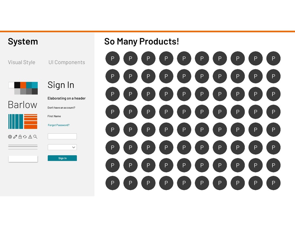
UI Components Heading L1 Body-Large Textbox Form Label Select Button Body-Medium Link System Sign In Forgot Password? First Name Sign In Elaborating on a header Don't have an account?
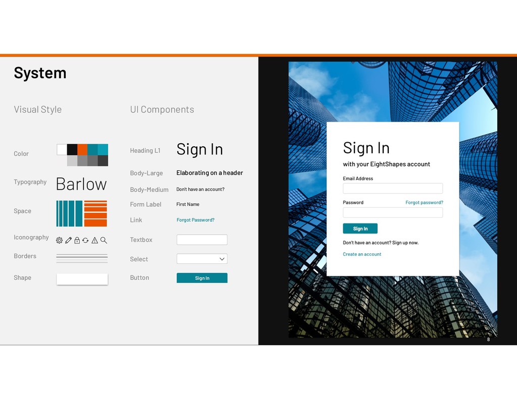
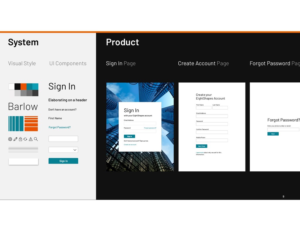
Style UI Components Heading L1 Body-Large Textbox Form Label Select Button Body-Medium Link System Sign In Forgot Password? First Name Sign In Elaborating on a header Don't have an account? Sign In with your EightShapes account Email Address Sign In Password Forgot password? Don’t have an account? Sign up now. Create an account
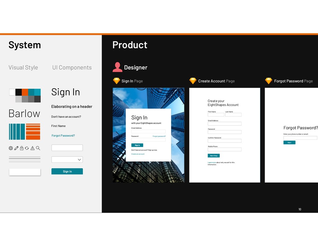
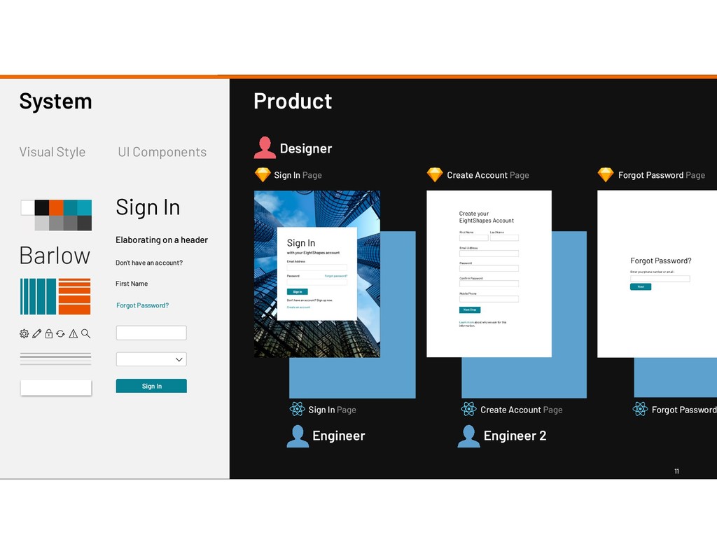
Password? First Name Sign In Elaborating on a header Don't have an account? Learn more about why we ask for this information. Create your EightShapes Account Email Address First Name Last Name Password Confirm Password Mobile Phone Next Step Enter your phone number or email: Forgot Password? Next Product Sign In Page Create Account Page Forgot Password Pag
Password? First Name Sign In Elaborating on a header Don't have an account? Learn more about why we ask for this information. Create your EightShapes Account Email Address First Name Last Name Password Confirm Password Mobile Phone Next Step Enter your phone number or email: Forgot Password? Next Product Sign In Page Create Account Page Forgot Password Page Designer
Password? First Name Sign In Elaborating on a header Don't have an account? Learn more about why we ask for this information. Create your EightShapes Account Email Address First Name Last Name Password Confirm Password Mobile Phone Next Step Enter your phone number or email: Forgot Password? Next Product Sign In Page Create Account Page Forgot Password Page Designer Engineer Sign In Page Create Account Page Forgot Password Engineer 2
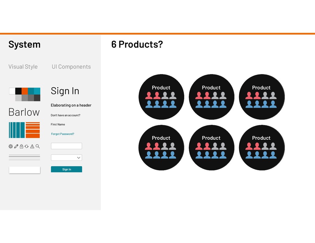
UI Components System Sign In Forgot Password? First Name Sign In Elaborating on a header Don't have an account? Product Product Product Product Product Product 6 Products?
First Name Sign In Elaborating on a header Don't have an account? So Many Products! P P P P P P P P P P P P P P P P P P P P P P P P P P P P P P P P P P P P P P P P P P P P P P P P P P P P P P P P P P P P P P P P P P P P P P P P P P P P P P P P
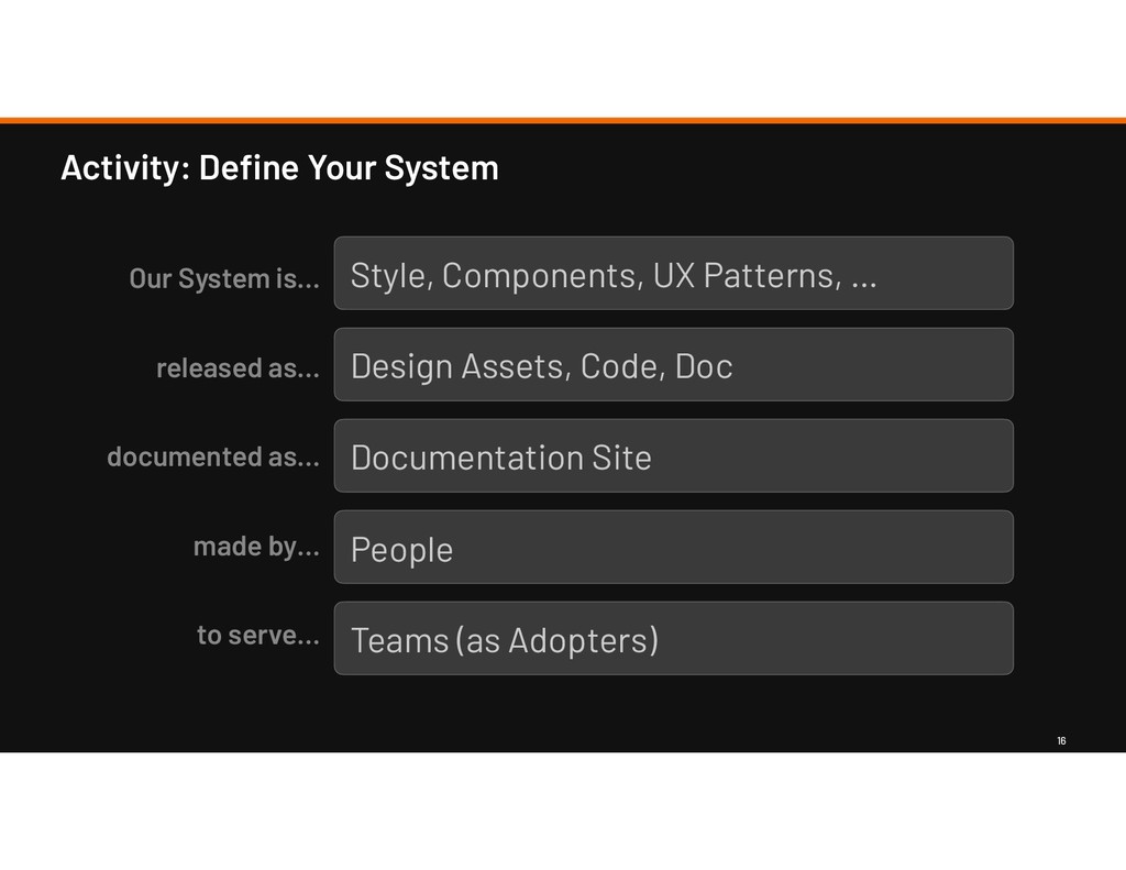
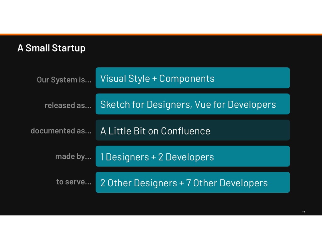
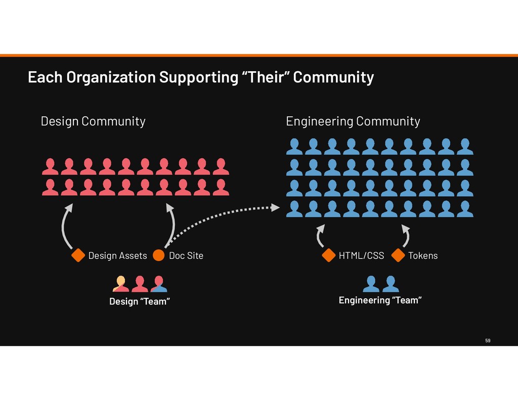
as… made by… to serve… Visual Style + Components Sketch for Designers, Vue for Developers A Little Bit on Confluence 1 Designers + 2 Developers 2 Other Designers + 7 Other Developers
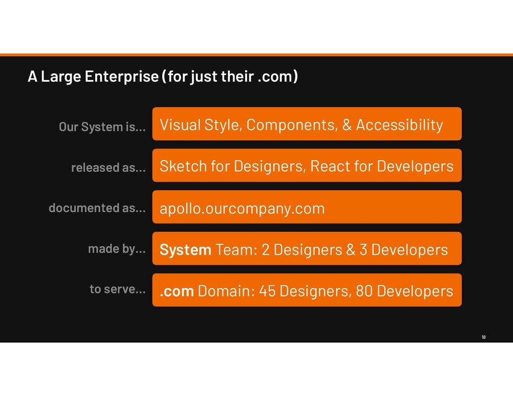
Components, & Accessibility Sketch for Designers, React for Developers apollo.ourcompany.com System Team: 2 Designers & 3 Developers .com Domain: 45 Designers, 80 Developers Our System is… released as… documented as… made by… to serve…
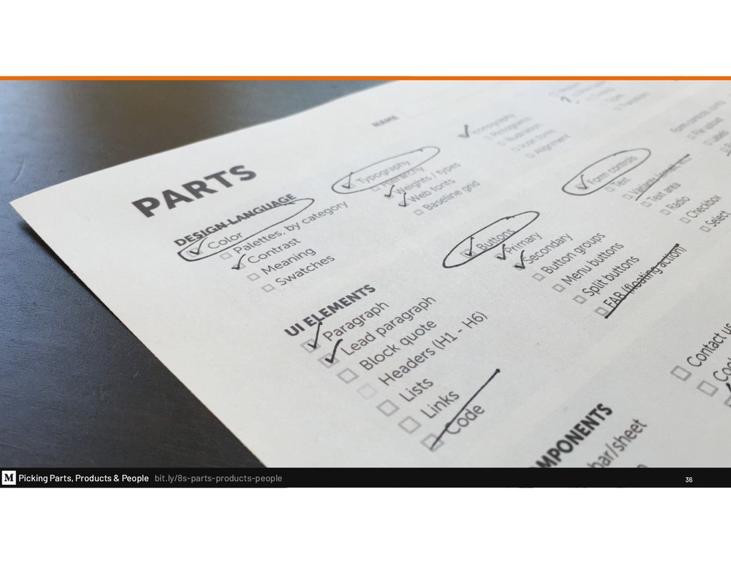
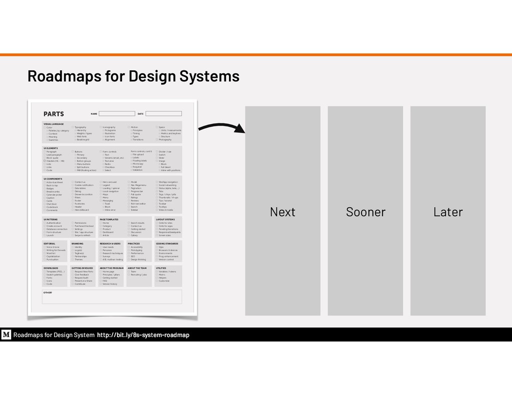
VISUAL LANGUAGE Color Palettes, by category Contrast Meaning Swatches UI ELEMENTS Paragraph Lead paragraph Block quote Headers (H1 - H6) Lists Links Code Typography Hierarchy Weights / types Web fonts Baseline grid Buttons Primary Secondary Button groups Menu buttons Split buttons FAB (floating action) Iconography Pictograms Illustration Icon fonts Alignment Form controls Text Variants (email, etc) Text area Radio Checkbox Select Motion Principles Timing Types Transitions Form controls, cont’d File upload Labels Floating labels Microcopy Required Validation Space Units / measurments Metrics and keylines Structure Photography Divider / rule Switch Slider Image Block Full bleed Inline with positions UI COMPONENTS Action bar/sheet Back to top Badges Breadcrumbs Calendar picker Caption Cards Chat (live) Code block Comments Contact us Cookie notification Data tables Dialog Drawer/accordion Filters Footer Footnotes Header Hero billboard Hero carousel Legend Loading / spinner Local navigation Maps Menu Messaging Toast Block Inline error Modal Nav Megamenu Pagination Progress bar Pull quote Ratings Reviews Rich text editor Search Sidebar Site/App navigation Social networking Status (alpha, beta,...) Tabs Tags / chips / pills Thumbnails / #-ups Tips / tutorial Toolbar Tooltips Video & media UI PATTERNS Authentication Create account Database connection Form structure Launch EDITORIAL Voice & tone Writing for the web Word list Capitalization Punctuation DOWNLOADS Templates (PSD,...) Swatch palettes Fonts Icons Code Permissions Purchase/checkout Settings Site / app structure Swipe to refresh BRANDING Identity Logo(s) Tagline(s) Partnerships Themes GETTING INVOLVED Request New Parts Give Feedback Request Audit Present at a Share Contribute PAGE TEMPLATES Home Category Product Dashboard Article RESEARCH & USERS User needs Personas Research techniques Surveys A/B, multivar. testing ABOUT THE PROGRAM Home page Principles / pillars Getting started FAQ Version history Search results Contact us Getting started Discussion Gallery PRACTICES Accessibility Prototyping Performance SEO Design thinking ABOUT THE TEAM Team Recruiting / jobs LAYOUT SYSTEMS Grids for sites Grids for apps Paneling/transitions Responsive/breakpoints Screen sizes CODING STANDARDS Style Browsers & devices Environments Prog. enhancement Version control UTILITIES Variables / tokens Mixins Helpers Customize OTHER? PARTS NAME DATE Next Sooner Later
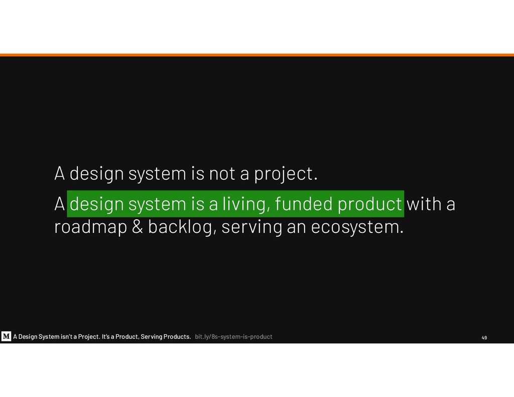
Products. bit.ly/8s-system-is-product 49 A design system is not a project. A design system is a living, funded product with a roadmap & backlog, serving an ecosystem.
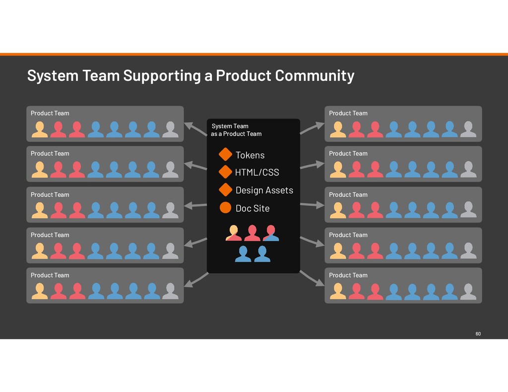
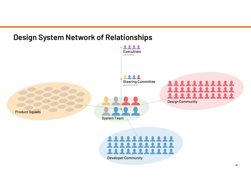
Product Team Product Team Product Team Product Team Product Team Product Team Product Team Product Team System Team Supporting a Product Community 60 Tokens HTML/CSS Design Assets Doc Site
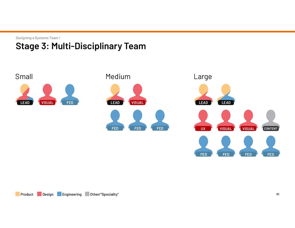
VISUAL Small FED LEAD VISUAL Medium FED LEAD UX Large LEAD FED FED FED FED FED FED VISUAL VISUAL LEAD CONTENT Product Design Engineering Other/“Speciality”
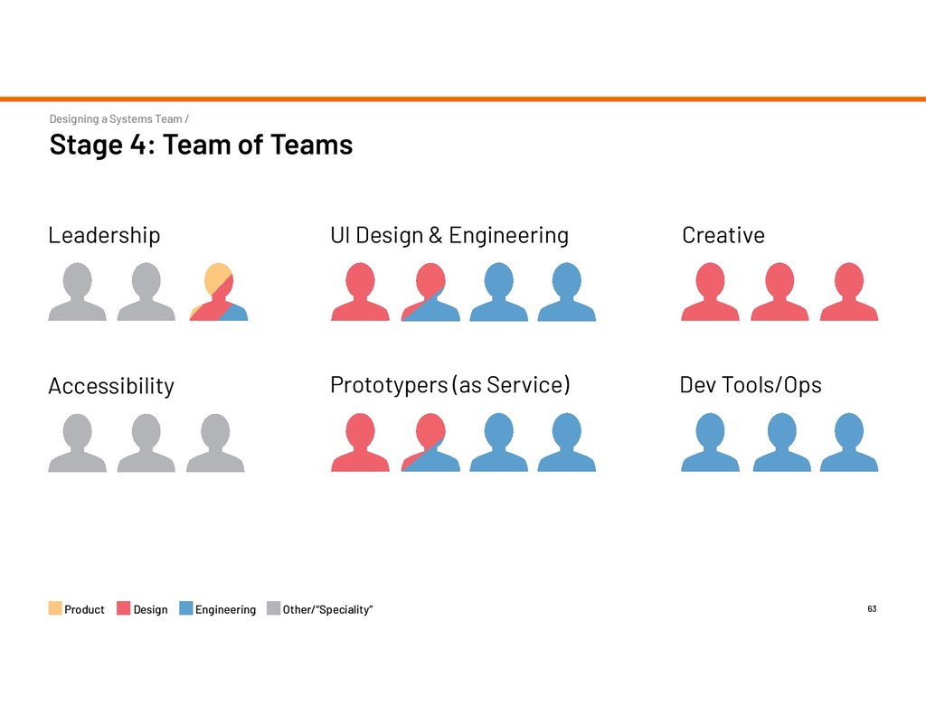
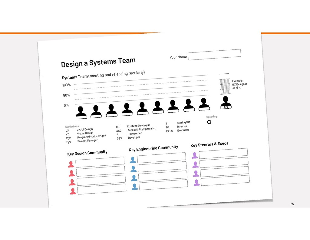
VD Visual Design PgM Program/Product Mgmt PjM Project Manager CS Content Strategist ACC Accessibility Specialist R Researcher DEV Developer Rotating UX Example: UX Designer at 75% Design a Systems Team Systems Team (meeting and releasing regularly) Key Design Community Key Engineering Community Key Steerers & Execs T Testing/QA DR Director EXEC Executive
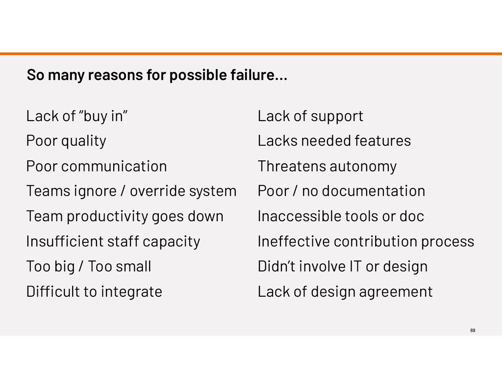
in” Poor quality Poor communication Teams ignore / override system Team productivity goes down Insufficient staff capacity Too big / Too small Difficult to integrate Lack of support Lacks needed features Threatens autonomy Poor / no documentation Inaccessible tools or doc Ineffective contribution process Didn’t involve IT or design Lack of design agreement
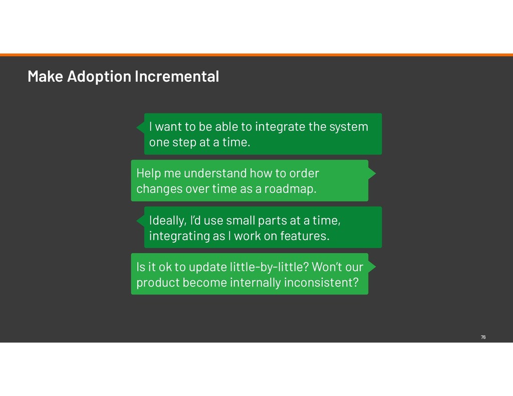
changes over time as a roadmap. I want to be able to integrate the system one step at a time. Ideally, I’d use small parts at a time, integrating as I work on features. Is it ok to update little-by-little? Won’t our product become internally inconsistent?
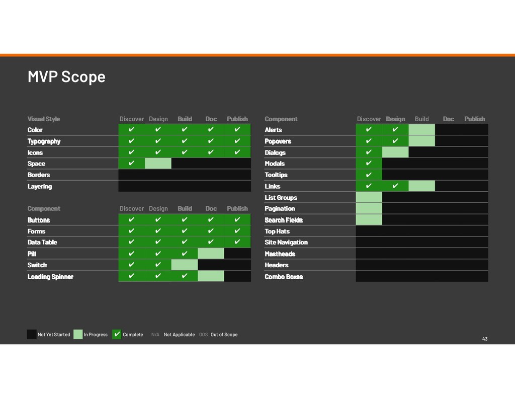
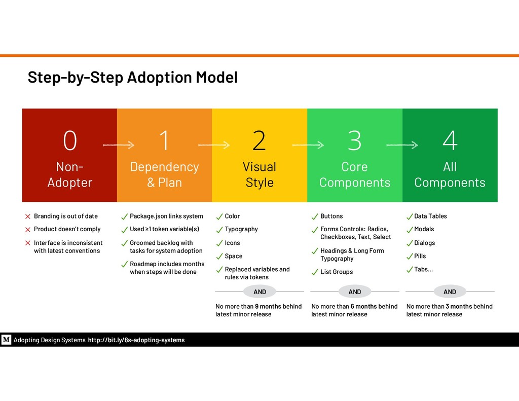
of date Product doesn’t comply Interface is inconsistent with latest conventions 1 Dependency & Plan Package.json links system Used ≥1 token variable(s) Groomed backlog with tasks for system adoption Roadmap includes months when steps will be done 2 Visual Style Color Typography Icons Space Replaced variables and rules via tokens 3 Core Components Buttons Forms Controls: Radios, Checkboxes, Text, Select Headings & Long Form Typography List Groups 4 All Components Data Tables Modals Dialogs Pills Tabs… No more than 9 months behind latest minor release AND No more than 6 months behind latest minor release AND No more than 3 months behind latest minor release AND Adopting Design Systems http://bit.ly/8s-adopting-systems
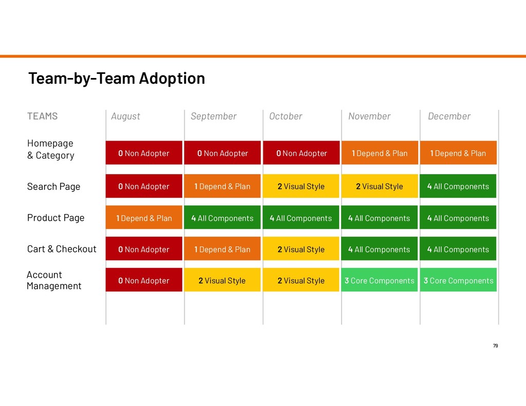
Category Search Page Product Page Cart & Checkout TEAMS Account Management 2 Visual Style 2 Visual Style 2 Visual Style 4 All Components 2 Visual Style 0 Non Adopter 1 Depend & Plan 0 Non Adopter 0 Non Adopter 0 Non Adopter 1 Depend & Plan 0 Non Adopter 1 Depend & Plan 4 All Components 4 All Components 4 All Components 2 Visual Style 0 Non Adopter 1 Depend & Plan 1 Depend & Plan 4 All Components 4 All Components 3 Core Components 3 Core Components 4 All Components
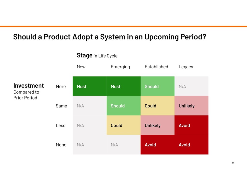
N/A Should Could Unlikely Less N/A Could Unlikely Avoid None N/A N/A Avoid Avoid Should a Product Adopt a System in an Upcoming Period? 81 Stage in Life Cycle Investment Compared to Prior Period
 nathanacurtis
 ajstarks
 karad
karad
 hiromimaeo
 a2k
a2k
 videlvequio
 sony
sony
 kspace
 terencebasart
 marzstarz
 securecat
 saka2jp
 klemens
 dugsong
 eileencodes
 katarinadahlin
 maltzj
 sabderemane
 tenderlove
 3n
3n
 aleyda
 madoxten
 soudai