VA (near Washington, DC) Worked on ~85 design systems since 2006 Blog at medium.com/@nathan curtis a Socialize on linkedin.com, twitter.com @nathan curtis a Hi, I’m Nathan
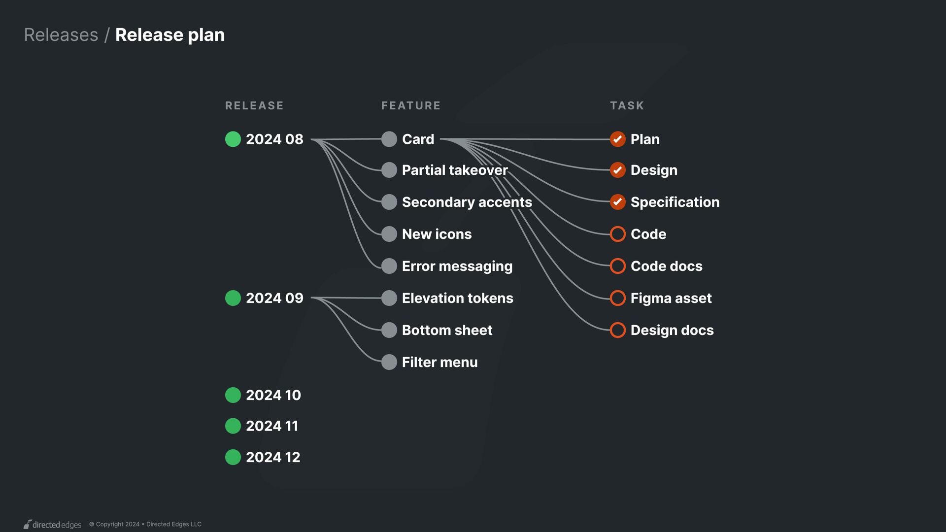
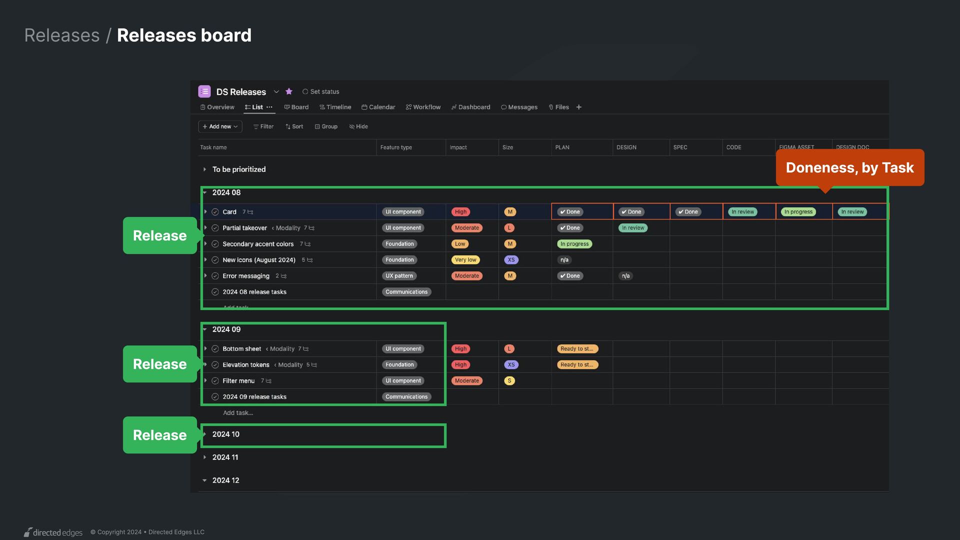
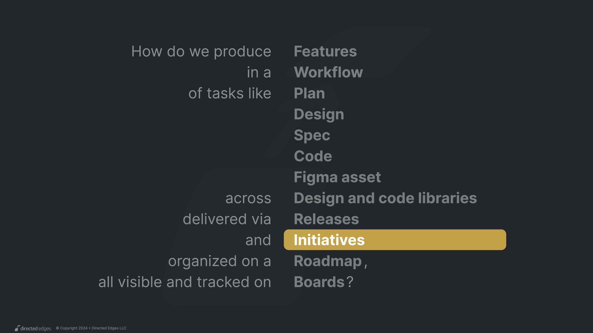
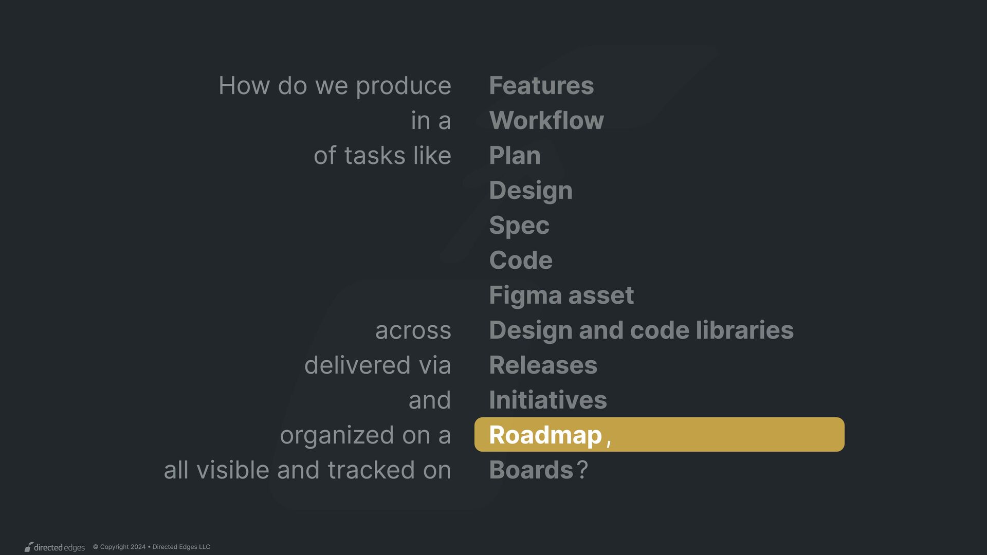
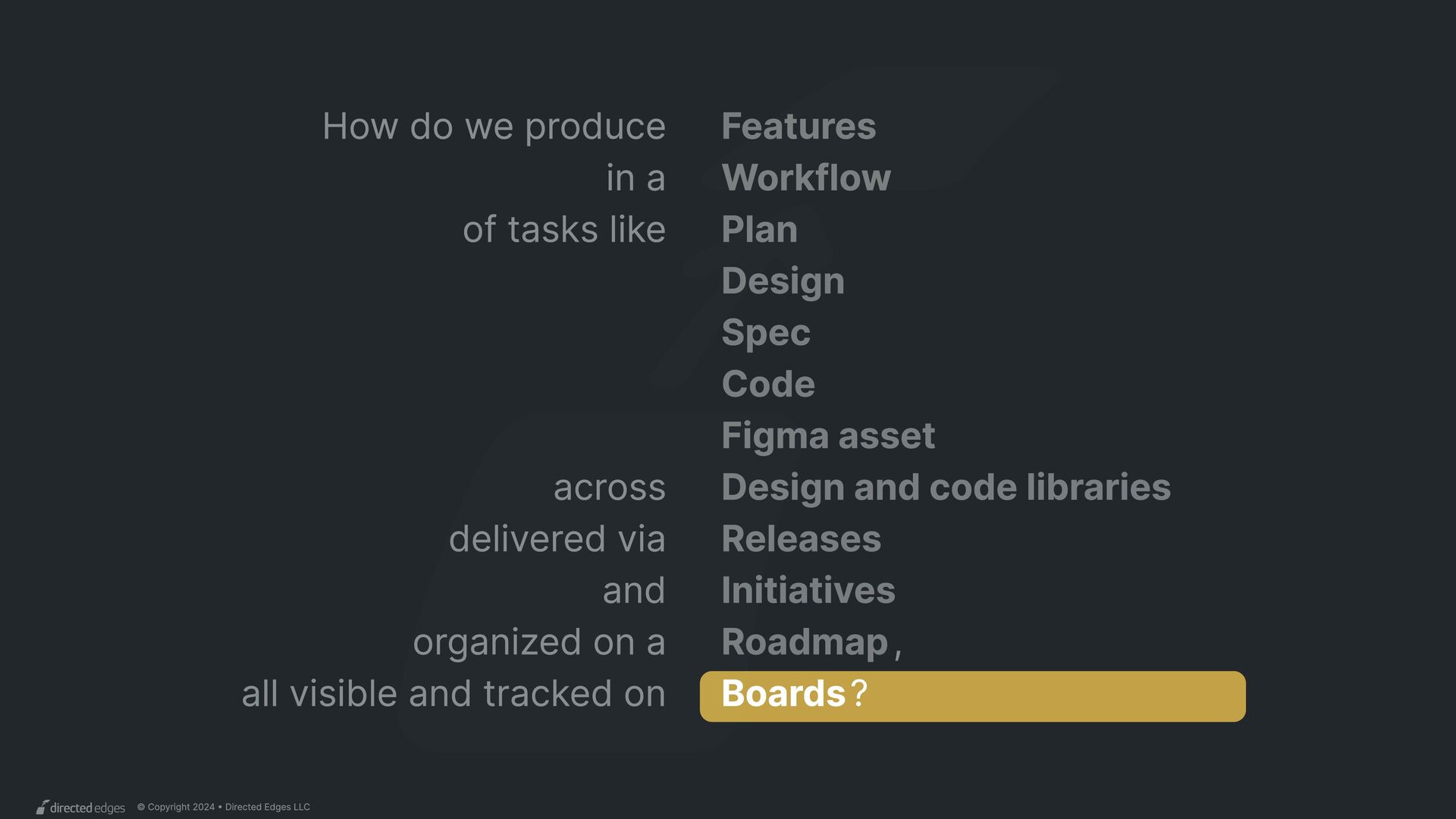
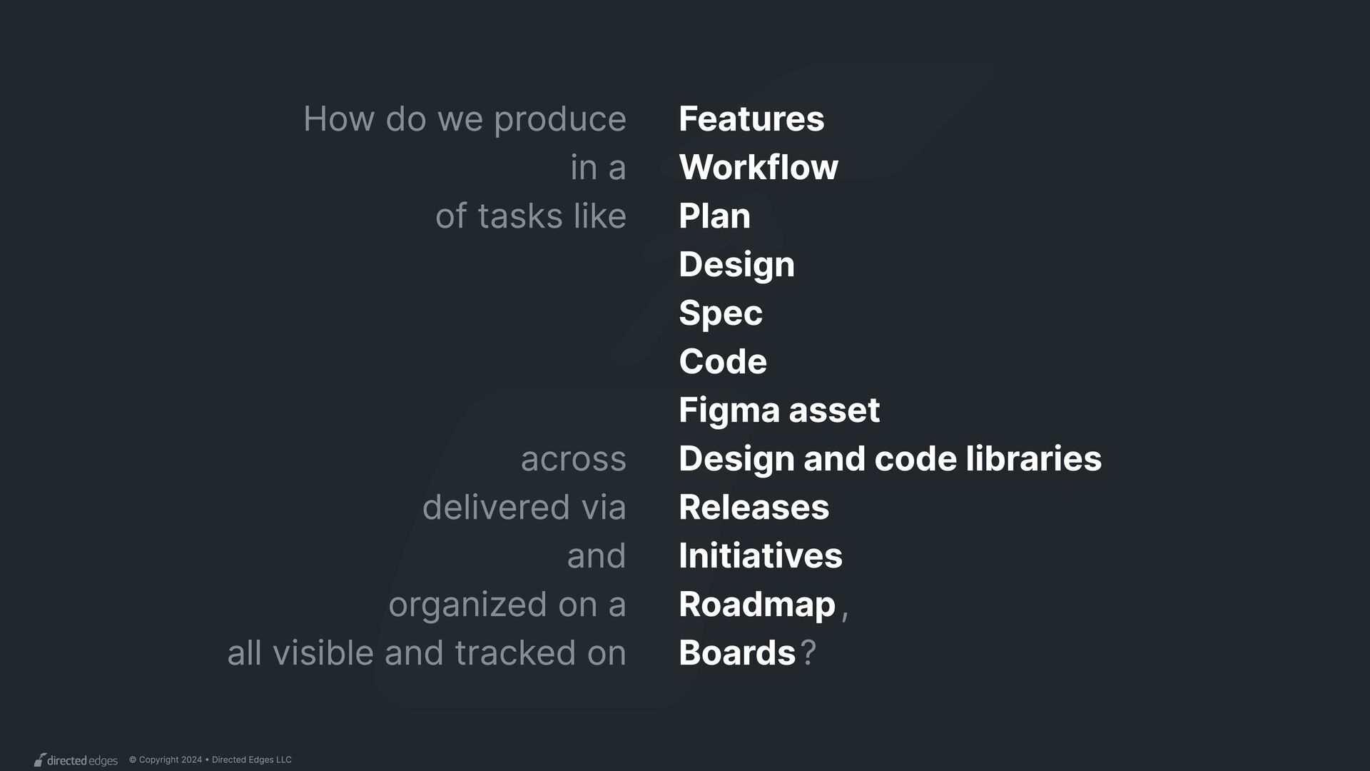
produce Features in a of tasks like delivered via across and organized on a , all visible and tracked on Releases Workflow Design and code libraries Plan Design Spec Code Figma asset Initiatives Roadmap Boards?
we produce Workflow process Training curriculum Strategy and plans Analytics reports Design tokens UI components UX patterns Content guidance Not features Features Today’s focus
and as a system asset. made documented released attributes Published in 1+ Useful to and/or and/or Implicitly or explicitly librariew designers developers otherw versioned
LLC Design Code Document Publish Design ≠ docs Producing docs content is different than getting the design approved. Workflow / Discovery, 2016 R o l e Design Developer Product/project Content Specialist “Multiple assignee” NEW NEW
LLC Discover Design Code Document Publish Scope a plan Audits, exploration, and agreeing scope as a milestone. Workflow / Morningstar, 2017 NEW R o l e Design Developer Product/project Content Specialist “Multiple assignee”
LLC Discover Design Code Document Publish Scope a plan Audits, exploration, and agreeing scope as a milestone. Workflow / Morningstar, 2017 NEW R o l e Design Developer Product/project Content Specialist “Multiple assignee”
LLC Discover Design Code Accessibility Document UI toolkit Publish External collaborator Accessibility requires a review from separate team of experts. Workflow / Target, 2017 NEW NEW R o l e Design Developer Product/project Content Specialist “Multiple assignee”
LLC Discover Design Code Accessibility Document UI toolkit Publish External collaborator Accessibility requires a review from separate team of experts. Workflow / Target, 2017 Late changes Finalize the design asset after the code is final, to ensure alignment. NEW NEW R o l e Design Developer Product/project Content Specialist “Multiple assignee”
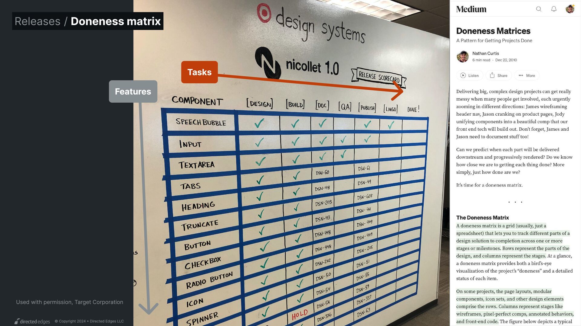
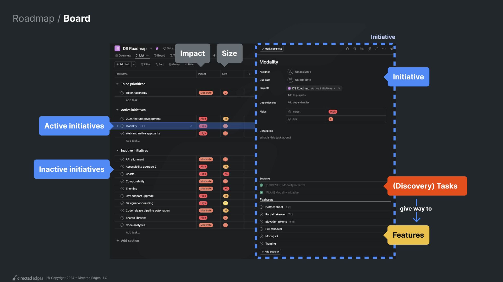
Plan Design Specification Code Code docs Figma asset Design docs Audits, explorations, and scope Detailed design (in Figma) Detailed specs (in a Figma document) Code package(s) Code docs, possibly within a code package Figma asset(s) published in the library Doc site content Output Task
Defining done Decide not to pursue or set scope, ready to start Done when Design approved by design stakeholders Handed off to assignees, agreed on API provisionally Figma assets tested, reviewed, ready to publish Code tested, reviewed, merged, ready to release Code docs reviewed and ready to publish Design docs reviewed and ready to publish Plan Design Specification Code Code docs Figma asset Design docs Task Are we ready?
what we want to make, why, and if it’s worth it Activities Audit existing cases and comparative examples Always Sometimes Sometimes Design and/or explorations code Other research
Yes, let’s make it! -> Communicate to stakeholders -> Formalize the scope -> Assign remaining tasks -> Assign to release -> Initiate next task No, will not support -> Communicate to stakeholders -> Close task
Include examples from products Styled with design tokens Content examples Behaviors and states Interactive prototypes Responsiveness Variant configurations Sizing and density Examples in-situ to stress test across products and themes Accessibility Usability With assigned developer(s) With system team With design community With design head / director With key adopting team(s) By designer peer(s) By assigned developer(s) By accessibility Final edits Transfer to begin specification Start Make Test Share Review Deliver Design
Add examples from products Examples with real content Styled with design tokens ⚠️ Behaviors and states ⚠️ Interactive prototypes ⚠️ Responsiveness ⚠️ Variant configurations ⚠️ Sizing and density Examples in-situ to stress test across products and themes Accessibility Usability With assigned developer(s) With design head / director ⚠ With system team With design community With key adopting team(s) By assigned developer(s) By accessibility ⚠ By designer peer(s) By system team Final edits Transfer to begin specification Start Make Test Share Review Deliver Design Do you usability test every desig system UI component you make? REALLY? Be honest. Product designers Avoid or do Less Than / Minimal, the as, or system designers. Same More than
Generate file(s) Source reusable code Draft API Obtain API feedback Code HTML, CSS, JavaScript Create visual test cases Document API Create usage examples Update dependent code Browsers & devices Functional Unit tests Accessibility (manual) Accessibility (automated) Visual regression tests With assigned designer(s) With system team With developer community With key adopting team(s) By developer peer(s) By assigned designer(s) By community developer(s) By accessibility Final edits Write changelog Merge pull request Start Make Test Share Review Deliver Code
Generate file(s) Source reusable code Draft API Obtain API feedback Create visual test cases Document API Create usage examples Code HTML, CSS, JavaScript Update dependent code Browsers & devices Functional Accessibility (manual) Accessibility (automated) Visual regression tests Unit tests With assigned designer(s) With system team With developer community With key adopting team(s) By developer peer(s) By assigned designer(s) By community developer(s) By accessibility Final edits Write changelog Merge pull request 5 min 2 min ...when? 3 min Start Make Test Share Review Deliver Code
Generate file(s) Source reusable code Draft API Obtain API feedback Code HTML, CSS, JavaScript Create visual test cases Document API Create usage examples Update dependent code Browsers & devices Functional Unit tests Accessibility (manual) Accessibility (automated) Visual regression tests With assigned designer(s) With system team With developer community With key adopting team(s) By developer peer(s) By assigned designer(s) By community developer(s) By accessibility Final edits Write changelog Merge pull request Start Make Test Share Review Deliver Code Technical design
in library file Create a page from template Integrate finalized design Draft API Obtain API feedback Compose anatomy and layers Apply visual style Create configurable variants Configure nested components Create visual test cases Create usage examples Update dependent assets Descriptions and metadata Anatomy and naming Property combinations Content (text/images) flow Layout resizing Visual style variation, modes Composition in situ Composition of slots Varying nested configurations Behaviors Common overrides With assigned designer(s) With assigned developer(s) With system team With design community With key adopting team(s) By assigned developer(s) By assigned designer(s) By community designer(s) By design lead Final edits Write changelog Merge branch (Publishable) Figma asset Start Make Test Share Review Deliver
in library file Create a page from template Integrate finalized design Draft API Obtain API feedback Compose anatomy and layers Apply visual style Create configurable variants Configure nested components Create visual test cases Create usage examples Update dependent assets Descriptions and metadata Anatomy and naming Property combinations Content (text/images) flow Layout resizing Visual style variation, modes Composition in situ Composition of slots Varying nested configurations Behaviors Common overrides With assigned designer(s) With assigned developer(s) With system team With design community With key adopting team(s) By assigned developer(s) By assigned designer(s) By community designer(s) By design lead Final edits Write changelog Merge branch (Publishable) Figma asset Start Make Test Share Review Deliver You plan Figma assets?
Architect Figma components without building them ESDS Card Mode Light Size Medium Action(s)? Custom areas None Card Container Type Primary State Initial Card Image Aspect ratio 16:9 Aspect ratio Cover Card Text Metadata? Description? Card Actions Variant Single Button Figma Props panel components Designers Developers
Explore API alternatives ESDS Card Mode Light Size Medium Action(s)? Custom areas None Card Container Type Primary State Initial Card Image Aspect ratio 16:9 Aspect ratio Cover Card Text Metadata? Description? Card Actions Variant Single Button ESDS Card Contained? Custom areas None Action(s)? Container Surface Light primary State Initial Image Aspect ratio 16:9 Text Size Medium Metadata? Description? Actions Variant Button Size Medium Should subcomponents include Card in the name? Nathan Curtis At what level do we expose surface color? Nathan Curtis Is description shown or hidden by default? Nathan Curtis Figma Props panel components API explorations Alternative 1 Alternative 2 Alternative 3 Are actions required, and is that exposed at the top level? Nathan Curtis
in library file Create a page from template Integrate finalized design Draft API Obtain API feedback Compose anatomy and layers Apply visual style Create configurable variants Configure nested components Create visual test cases Create usage examples Update dependent assets Descriptions and metadata Anatomy and naming Property combinations Content (text/images) flow Layout resizing Visual style variation, modes Composition in situ Composition of slots Varying nested configurations Behaviors Common overrides With assigned designer(s) With assigned developer(s) With system team With design community With key adopting team(s) By assigned developer(s) By assigned designer(s) By community designer(s) By design lead Final edits Write changelog Merge branch (Publishable) Figma asset Start Make Test Share Review Deliver You test Figma assets?
Testing 1. Metadata 1.1 Name Is it named consistently with code and web-based documentation? 1.2 Namespace Is it namespaced as ESDS-? 1.3. Description Does it include a one sentence introduction and any important "Use Whens? 1.4 Status Is status up-to-date with commensurate code version (X.X.X) and stability (Stable vs Experimental)? 2. Anatomy 2.1 Layer name Are element names consistent with specification and code? 2.2 Layer Are layer names formatted as actual names in sentence case, not “Frame ###”? 2.3 Layer shorthand Are naming conventions applied, such as using space between (]-[) for layers applying only autolayout or emoji for indicators like edi 2.4 Nested component names Are nested components named descriptively (such as Dismiss Icon) instead of nested component's default name (Icon)? 2.5 Default visiblity Are layers shown or hidden appropriately, including layers within hidden layers? 3. Color 3.1 Color accuracy Are background, text, and stroke colors applied accurately?? 3.2 Color styles Is every fill, stroke, solid color and gradient color applying a color style instead of a hardcoded value, when possible? 3.3 Color specificity Is each style applying the most semantically specific (Text > Link > On Dark) instead of generic (Palette > Blue > 50) style? 3.4 Hardcoded properties Where a hardcoded value is used, has it been discussed and agreed upon? 3.5 Buried Colors Are "buried" hardcoded colors - applied to shadow effects and other non-styled locations - applied accurately? 4. Text 4.1 Text styles Is each text layer associated with a defined text style? 4.2 Non-text style properties Are properties not styles - list style, vertical alignment, and horizontal alignment - accurately applied or omitted? 5. Properties 5.1. Property names Are properties named and formatted correctly? 5.2. Property order Are properties ordered sensibly, such as by priority, alphabetical, related sets, or documented order across components? 5.3. Option names Are property options named and formatted correctly? 5.4. Option order Are options ordered correctly, such as by scale order ( small then medium then large) or alphabetical? 5.5. Default option Diam quis enim loborti scelerxq. Cras semper auctor neque vitae. Quis amet. Lorem ipsum dolor sit amet, consectetur adipiscing elit, sed do eiusmod tempor incididunt ut labore et dolore magna aliqua. Urna molestie at elementum eu. Sit amet consectetur adipiscing elit duis tristique. Eget felis eget nunc lobortis mattis aliquam A Custom Link Label {Title} {Details} {Button} {Title} {Label} C o n t e n t C o l l i s i o n W R O N G C O N T E N T M I S S I N G C O N T E N T
libraries / Libraries? Yup, lots of ‘em Figma has become the single, central tool most systems for ... ...and it’s common for a design system to implement across two, three or even more code libraries for . designers developers
libraries implement the components? What is each built with? framework What support each one? team(s) How is each with the design team? connected Are releases or released independently? synced Design and code libraries / Multi-library alignment
libraries / Common models 1 Figma library 3 Code libraries 1 Dev team (integrated) 1 Figma library 3 Code libraries 3 Dev teams (integrated) 1 Figma library 3 Code libraries 1 Dev team (integrated) 2 Dev teams (independent) 1 Figma library 1 Code library 1 Figma library 0 Code libraries A B C D E CSS CSS Angular Web components React or Angular or Web components React iOS Android React iOS Android
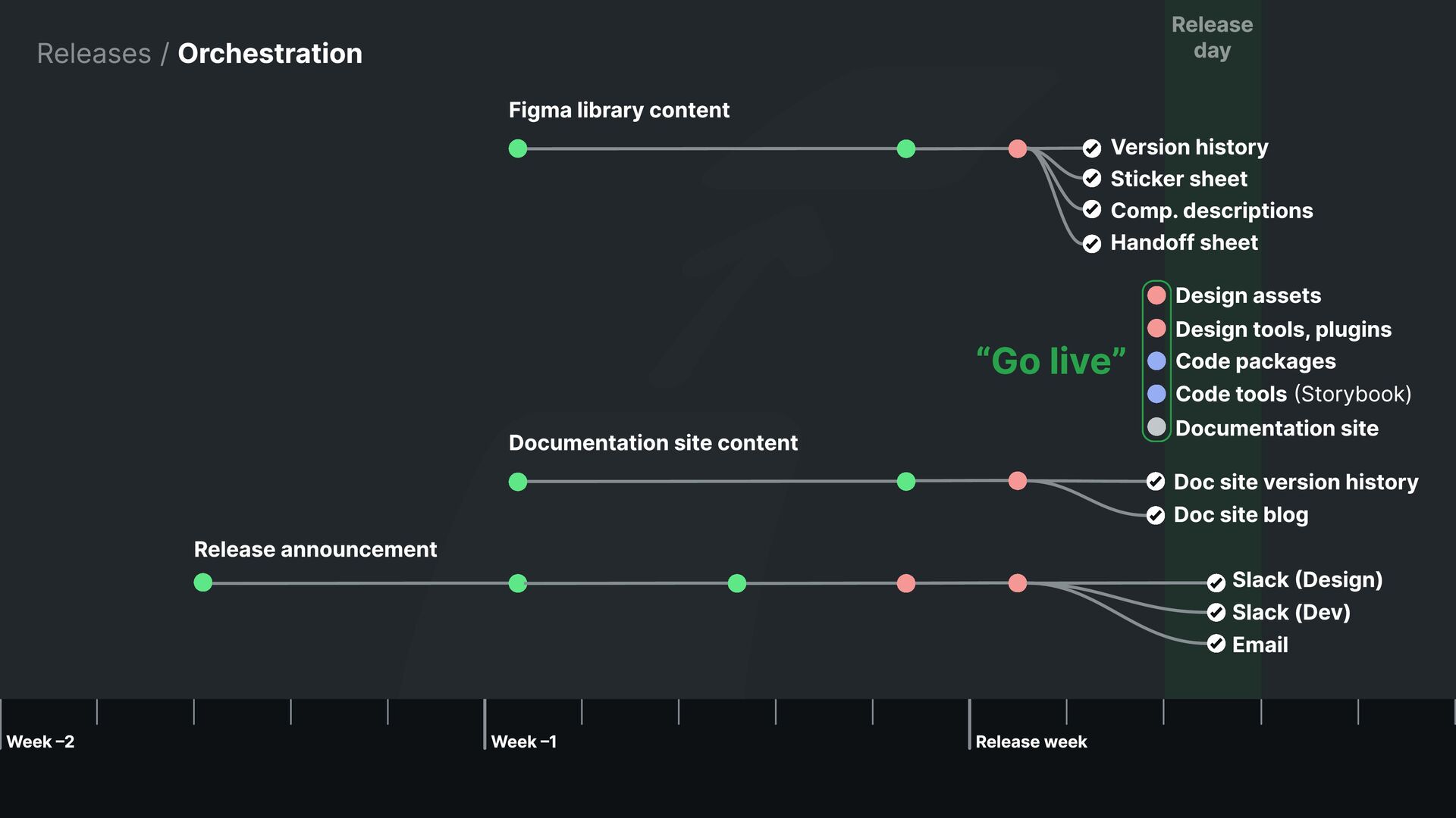
libraries / Describe and link to changes... Version history April 24, 2024 j Added dismissible property, layout and spacing and X icon butto j Updated Basic Type color variables from generic values to new Alert / Basic semantic variables View Updates
Y VQA Sprint Code Android L I B R A R Y VQA Design and code libraries / Multi-framework dashboard {##} {##} {Component} Done Done Done Done {##} {##} {Component} Done Done Done Done {##} {##} {Component} Done Done Done Done {##} {##} {Component} Done Done Done Done {##} {##} {Component} Done Done Done Done {##} {##} {Component} Done Done Done Done {##} {##} {Component} Done Done Done Done {##} {##} {Component} Done Done Done Done {##} {##} {Component} Done Done Done In review {##} {##} {Component} Done Done Done In review {##} {##} {Component} Done Done Done In progress {##} {##} {Component} Done Done Done In progress {##} {##} {Component} Done Done In progress Ready to start {##} {##} {Component} Done Done In progress Ready to start {##} {##} {Component} Done Done In progress Ready to start {##} {##} {Component} Done Done Ready to start Not yet started {##} {##} {Component} Done Done Ready to start Not yet started {##} {##} {Component} Done Done Ready to start Not yet started {##} {##} {Component} Done Done Not yet started Not yet started {##} {##} {Component} Done Done Not yet started Not yet started {##} {##} {Component} Done Done Not yet started Not yet started Core team Library team
Y VQA Accessibility Sprint Code Android L I B R A R Y VQA Accessibility Design and code libraries / Multi-framework dashboard {##} {##} {Component} Done Done Done Done Done Done {##} {##} {Component} Done Done Done Done Done Done {##} {##} {Component} Done Done Done Done Done Done {##} {##} {Component} Done Done Done Done Done Done {##} {##} {Component} Done Done Done Done Done Done {##} {##} {Component} Done Done Done Done Done Done {##} {##} {Component} Done Done Done Done Done Done {##} {##} {Component} Done Done Done Done Done Done {##} {##} {Component} Done Done Done Done In review In progress {##} {##} {Component} Done Done Done Done In review In progress {##} {##} {Component} Done Done Done Done In progress Ready to start {##} {##} {Component} Done Done Done Done In progress Ready to start {##} {##} {Component} Done Done Done In progress Ready to start Not yet started {##} {##} {Component} Done Done Done In progress Ready to start Not yet started {##} {##} {Component} Done Done Done In progress Ready to start Not yet started {##} {##} {Component} Done Done Done Ready to start Not yet started Not yet started {##} {##} {Component} Done Done Done Ready to start Not yet started Not yet started {##} {##} {Component} Done Done Done Ready to start Not yet started Not yet started {##} {##} {Component} Done Done Done Not yet started Not yet started Not yet started {##} {##} {Component} Done Done Done Not yet started Not yet started Not yet started {##} {##} {Component} Done Done Done Not yet started Not yet started Not yet started Third team
Y A P P I n t e g r at i o n VQA Accessibility Sprint Status Release Code Android L I B R A R Y A P P I n t e g r at i o n VQA Accessibility Status Release What app PdMs care about What app PdMs care about Design and code libraries / Multi-framework dashboard {##} {##} {##} {##} {Component} Done Done Done Done Done Done Done Done {##} {##} {##} {##} {Component} Done Done Done Done Done Done Done Done {##} {##} {##} {##} {Component} Done Done Done Done Done Done Done Done {##} {##} {##} {##} {Component} Done Done Done Done Done Done Done Done {##} {##} {##} {##} {Component} Done Done Done Done Done Done Done Done {##} {##} {##} {##} {Component} Done Done Done Done Done Done Done Ready to start {##} {##} {##} {##} {Component} Done Done Done Done Done Done Done Ready to start {##} {##} {##} {##} {Component} Done Done Done Done Done Done Done Ready to start {##} {##} {##} {##} {Component} Done Done Done Done Done In review In progress Not yet started {##} {##} {##} {##} {Component} Done Done Done Done Done In review In progress Not yet started {##} {##} {##} {##} {Component} Done Done Done Done Done In progress Ready to start Not yet started {##} {##} {##} {##} {Component} Done Done Done Done Done In progress Ready to start Not yet started {##} {##} {##} {##} {Component} Done Done Done Done In progress Ready to start Not yet started Not yet started {##} {##} {##} {##} {Component} Done Done Done Done In progress Ready to start Not yet started Not yet started {##} {##} {##} {##} {Component} Done Done Done Done In progress Ready to start Not yet started Not yet started {##} {##} {##} {##} {Component} Done Done Done Done Ready to start Not yet started Not yet started Not yet started {##} {##} {##} {##} {Component} Done Done Done Done Ready to start Not yet started Not yet started Not yet started {##} {##} {##} {##} {Component} Done Done Done Done Ready to start Not yet started Not yet started Not yet started {##} {##} {##} {##} {Component} Done Done Done Done Not yet started Not yet started Not yet started Not yet started {##} {##} {##} {##} {Component} Done Done Done Done Not yet started Not yet started Not yet started Not yet started {##} {##} {##} {##} {Component} Done Done Done Done Not yet started Not yet started Not yet started Not yet started
without code have value. They just aren’t yet reaching full potential. What to do Make specs available to all teams Work with developers bottom-up anyway Pounce on moments of major change Wait for leaders to rotate in/out Design and code libraries / No code library
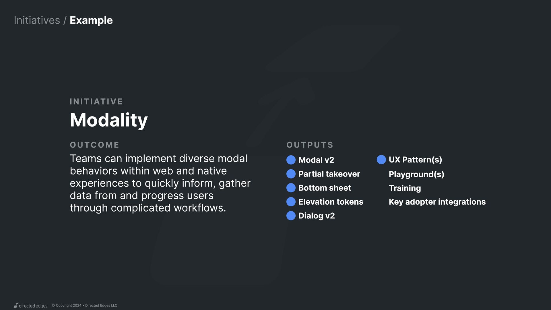
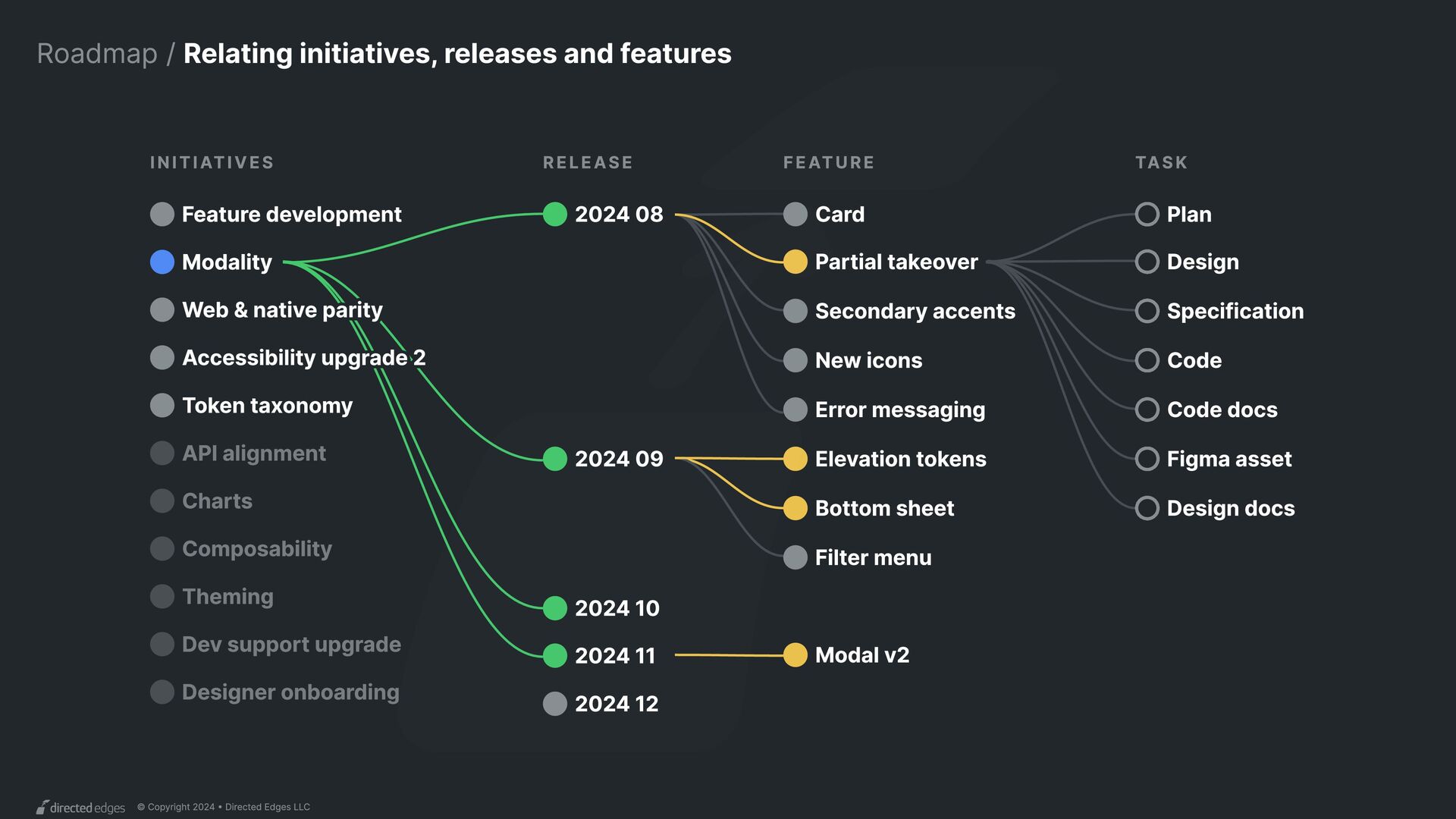
Initiative Modality outcome Teams can implement diverse modal behaviors within web and native experiences to quickly inform, gather data from and progress users through complicated workflows. Outputs Partial takeover Dialog v2 UX Pattern(s) Playground(s) Training Key adopter integrations Elevation tokens Modal v2 Bottom sheet
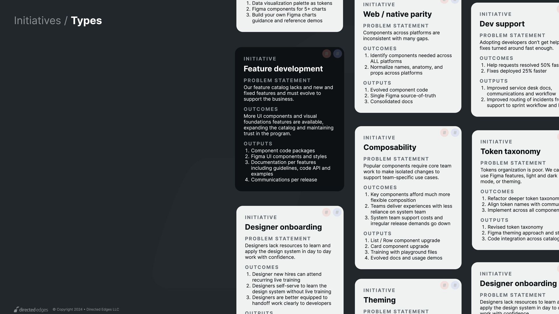
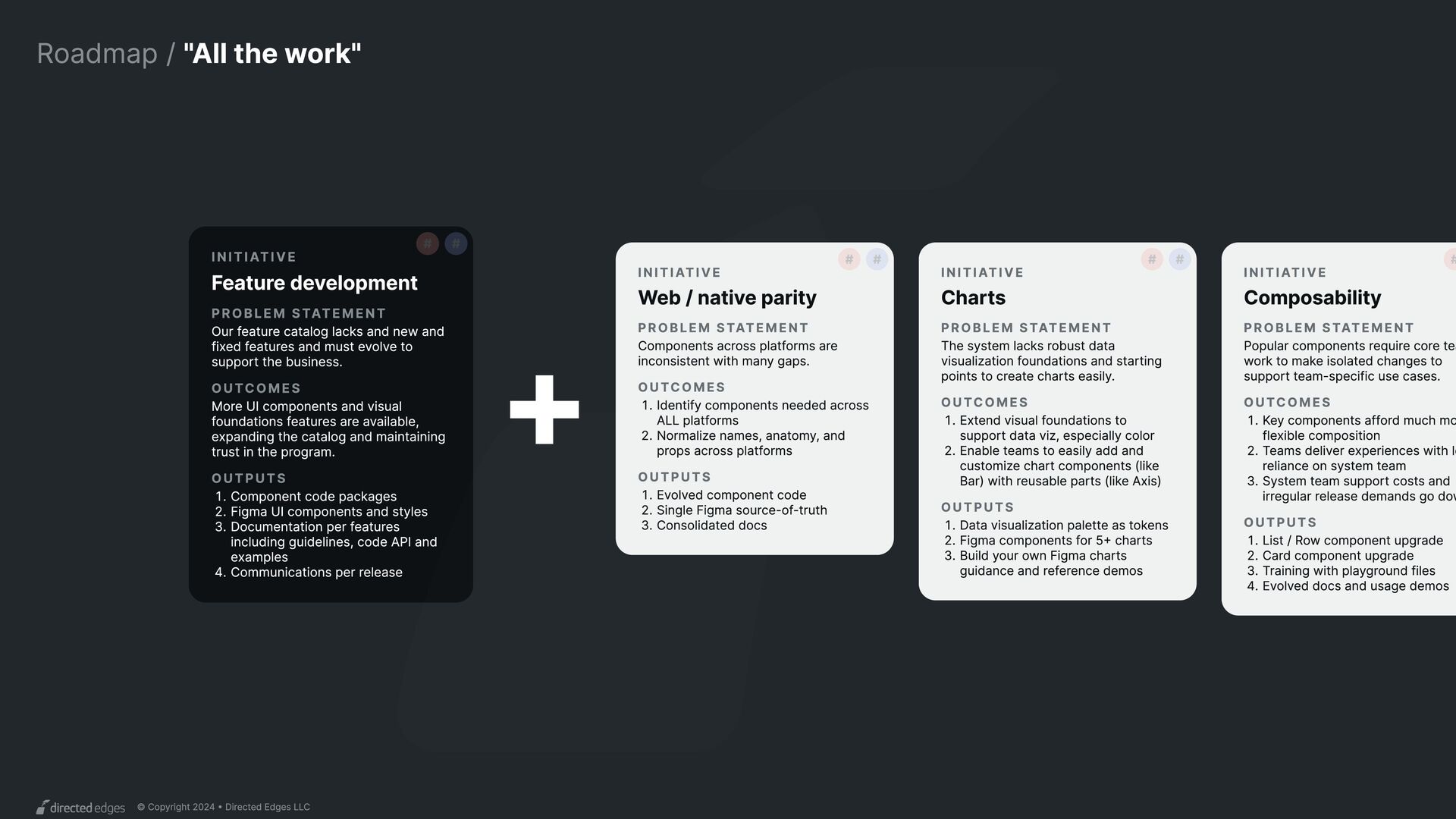
INITIATIVE Token taxonomy PROBLEM STATEMENT Tokens organization is poor. We can use Figma features, light and dark mode, or theming. Outcomes {z Refactor deeper token taxonom uz Align token names with commun fz Implement across all componen OUTPUTS {z Revised token taxonomk uz Figma theming approach and st fz Code integration across catalog INITIATIVE Web / native parity # PROBLEM STATEMENT Components across platforms are inconsistent with many gaps. # Outcomes {z Identify components needed across ALL platform uz Normalize names, anatomy, and props across platforms OUTPUTS {z Evolved component codeÜ uz Single Figma source-of-trutÌ fz Consolidated docs INITIATIVE Dev support PROBLEM STATEMENT Adopting developers don’t get help fixes turned around fast enough. Outcomes {z Help requests resolved 50% fast uz Fixes deployed 25% faster OUTPUTS {z Improved service desk docs, communications and workflo0 uz Improved routing of incidents fro support to sprint workflow and b INITIATIVE Feature development # PROBLEM STATEMENT Our feature catalog lacks and new and fixed features and must evolve to support the business. # Outcomes More UI components and visual foundations features are available, expanding the catalog and maintaining trust in the program. OUTPUTS {z Component code package uz Figma UI components and style fz Documentation per features including guidelines, code API and example wz Communications per release INITIATIVE Composability # PROBLEM STATEMENT Popular components require core team work to make isolated changes to support team-specific use cases. # Outcomes {z Key components afford much more flexible compositioË uz Teams deliver experiences with less reliance on system tea× fz System team support costs and irregular release demands go down OUTPUTS {z List / Row component upgradç uz Card component upgradç fz Training with playground file wz Evolved docs and usage demos INITIATIVE Theming # PROBLEM STATEMENT # {z Data visualization palette as token uz Figma components for 5+ chart fz Build your own Figma charts guidance and reference demos INITIATIVE Designer onboarding PROBLEM STATEMENT Designers lack resources to learn a apply the design system in day to d INITIATIVE Designer onboarding # PROBLEM STATEMENT Designers lack resources to learn and apply the design system in day to day work with confidence. # Outcomes {z Designer new hires can attend recurring live trainin uz Designers self-serve to learn the design system without live trainin fz Designers are better equipped to handoff work clearly to developers
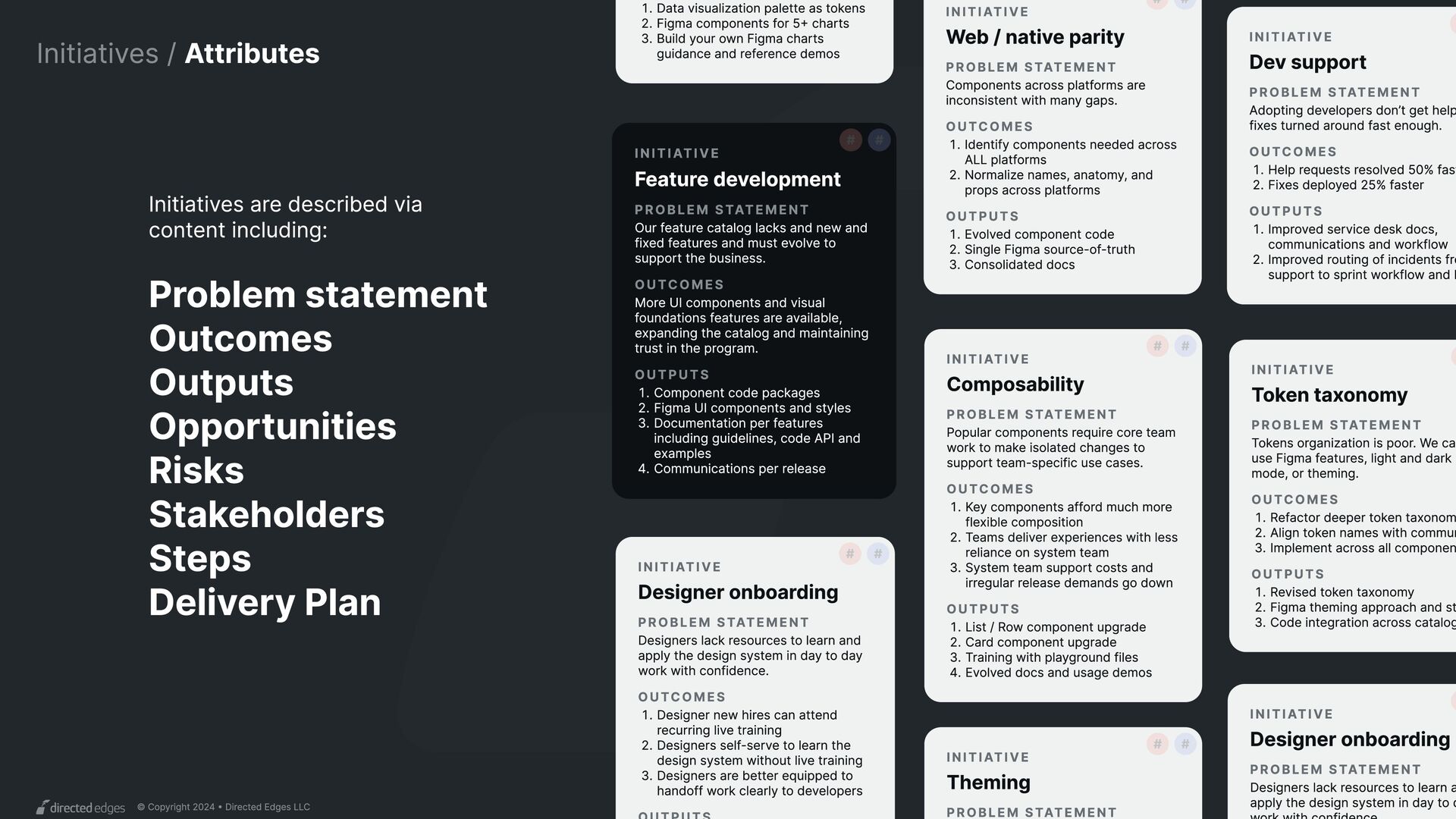
INITIATIVE Token taxonomy PROBLEM STATEMENT Tokens organization is poor. We can use Figma features, light and dark mode, or theming. Outcomes ~} Refactor deeper token taxonom x} Align token names with commun i} Implement across all componen OUTPUTS ~} Revised token taxonomn x} Figma theming approach and st i} Code integration across catalog INITIATIVE Web / native parity # PROBLEM STATEMENT Components across platforms are inconsistent with many gaps. # Outcomes ~} Identify components needed across ALL platform x} Normalize names, anatomy, and props across platforms OUTPUTS ~} Evolved component codeß x} Single Figma source-of-trutÏ i} Consolidated docs INITIATIVE Dev support PROBLEM STATEMENT Adopting developers don’t get help fixes turned around fast enough. Outcomes ~} Help requests resolved 50% fast x} Fixes deployed 25% faster OUTPUTS ~} Improved service desk docs, communications and workflo0 x} Improved routing of incidents fro support to sprint workflow and b INITIATIVE Feature development # PROBLEM STATEMENT Our feature catalog lacks and new and fixed features and must evolve to support the business. # Outcomes More UI components and visual foundations features are available, expanding the catalog and maintaining trust in the program. OUTPUTS ~} Component code package x} Figma UI components and style i} Documentation per features including guidelines, code API and example w} Communications per release INITIATIVE Composability # PROBLEM STATEMENT Popular components require core team work to make isolated changes to support team-specific use cases. # Outcomes ~} Key components afford much more flexible compositioË x} Teams deliver experiences with less reliance on system tea× i} System team support costs and irregular release demands go down OUTPUTS ~} List / Row component upgradç x} Card component upgradç i} Training with playground file w} Evolved docs and usage demos INITIATIVE Theming # PROBLEM STATEMENT # ~} Data visualization palette as token x} Figma components for 5+ chart i} Build your own Figma charts guidance and reference demos INITIATIVE Designer onboarding PROBLEM STATEMENT Designers lack resources to learn a apply the design system in day to d INITIATIVE Designer onboarding # PROBLEM STATEMENT Designers lack resources to learn and apply the design system in day to day work with confidence. # Outcomes ~} Designer new hires can attend recurring live trainin x} Designers self-serve to learn the design system without live trainin i} Designers are better equipped to handoff work clearly to developers Initiatives are described via content including: Problem statement Outcomes Outputs Opportunities Risks Stakeholders Steps Delivery Plan
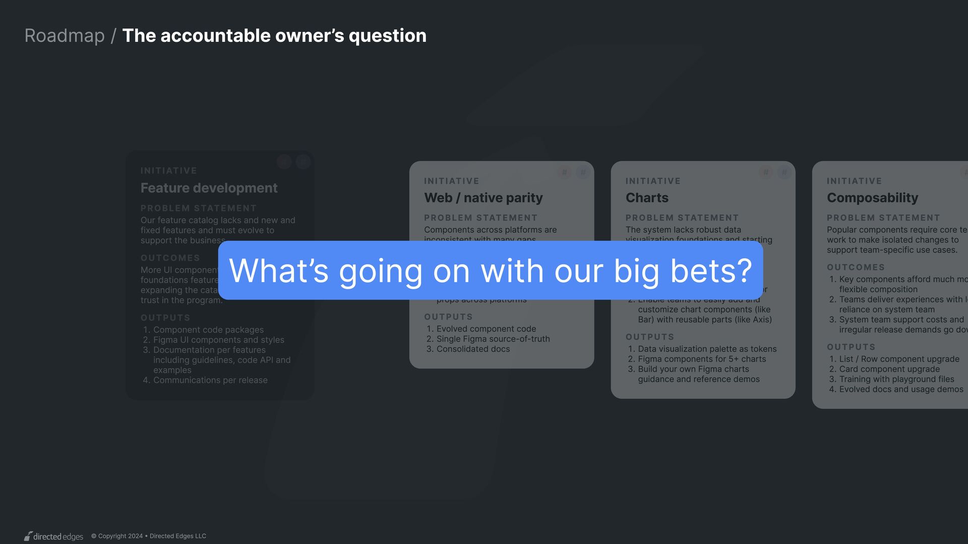
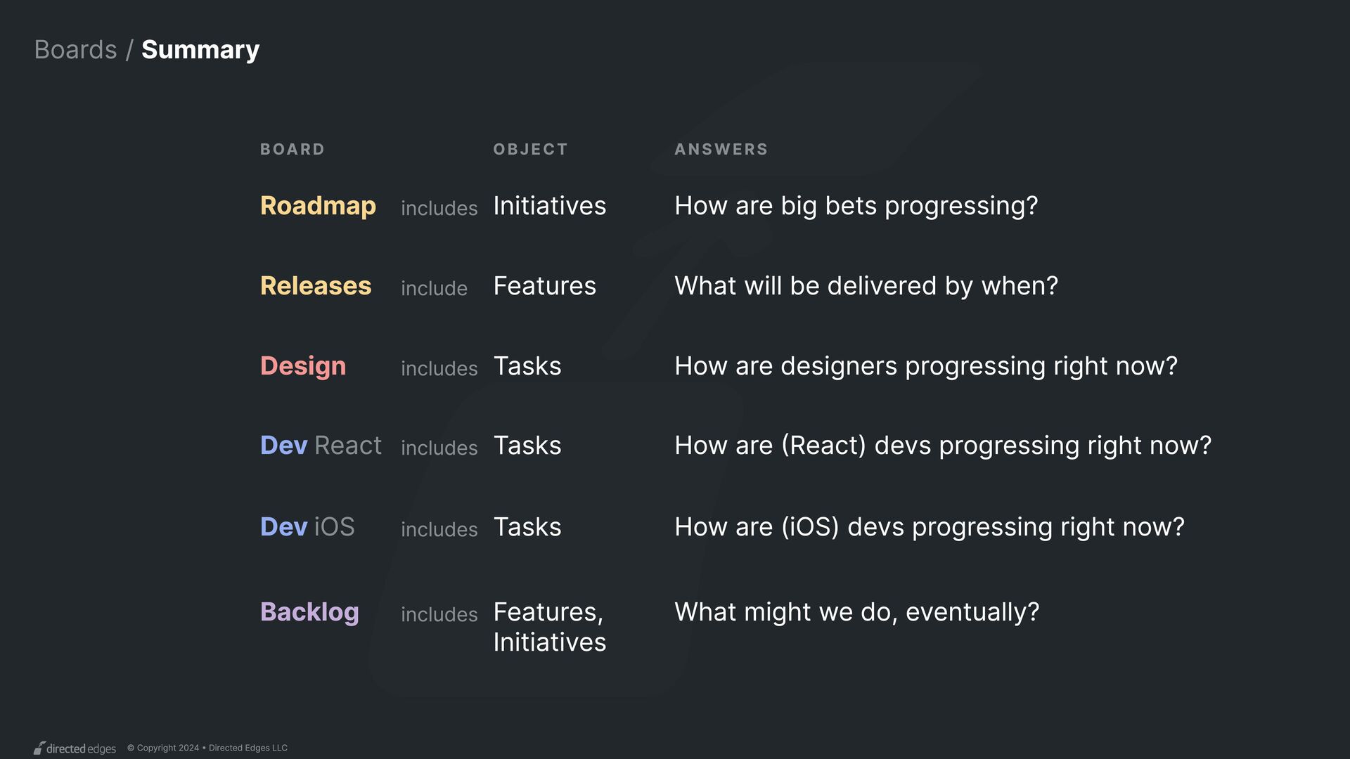
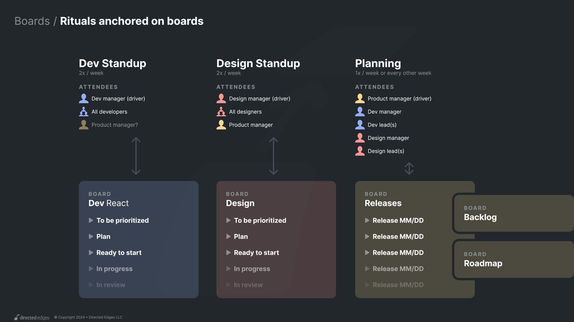
Dev React Dev iOS Design Releases Roadmap Backlog Tasks Tasks Tasks Features Initiatives Features, Initiatives includes includes How are (React) devs progressing right now? includes include includes includes How are (iOS) devs progressing right now? How are designers progressing right now? What will be delivered by when? How are big bets progressing? OBJECT What might we do, eventually? Board answers
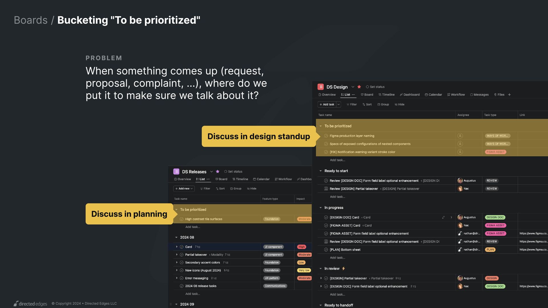
"To be prioritized" Discuss in planning When something comes up (request, proposal, complaint, ...), where do we put it to make sure we talk about it? PROBLEM Discuss in design standup
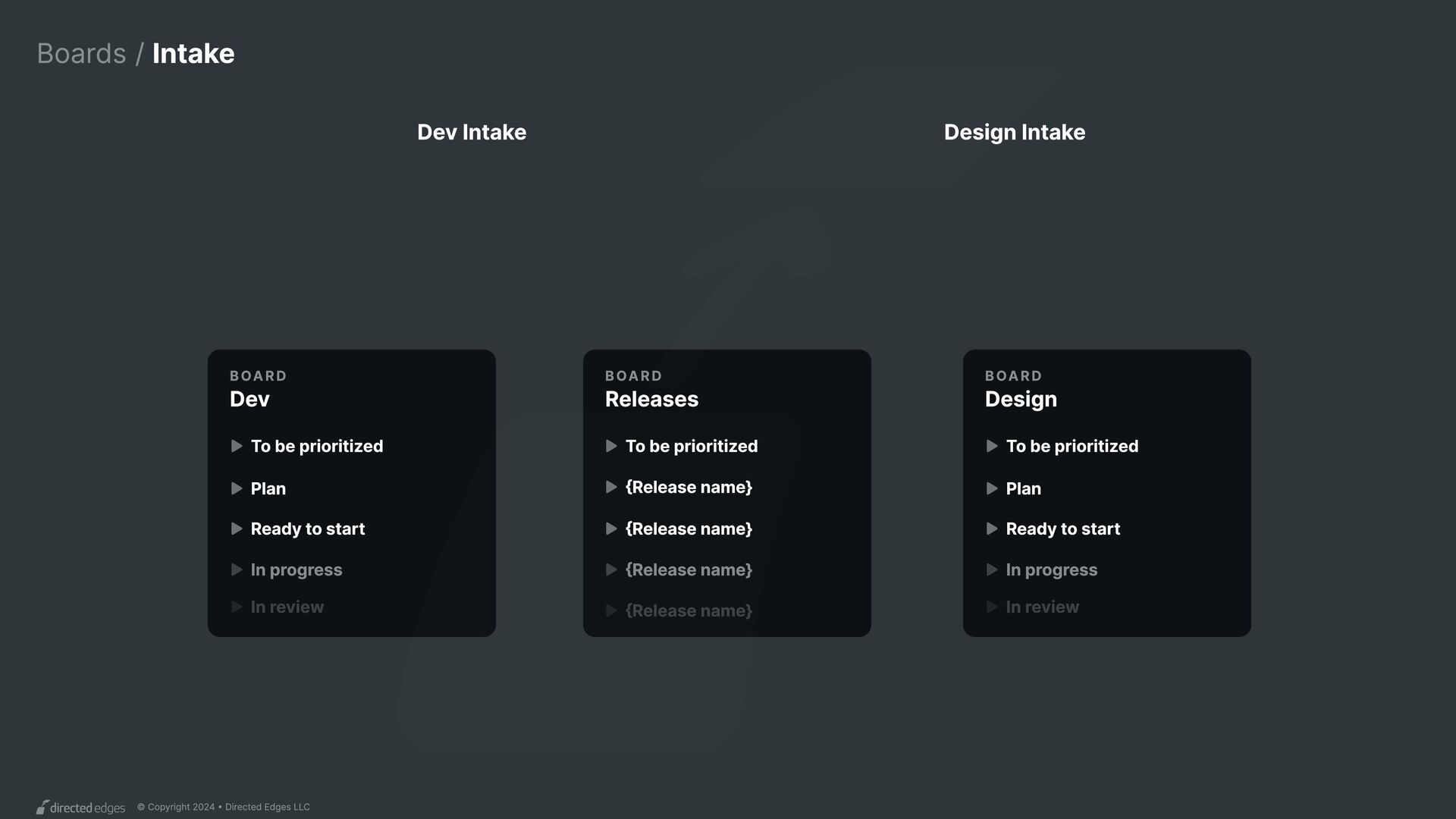
Design Intake Dev Intake Board Releases Board Dev Board Design To be prioritized To be prioritized Plan Plan Ready to start Ready to start In progress In progress In review In review {Release name} To be prioritized {Release name} {Release name} {Release name}
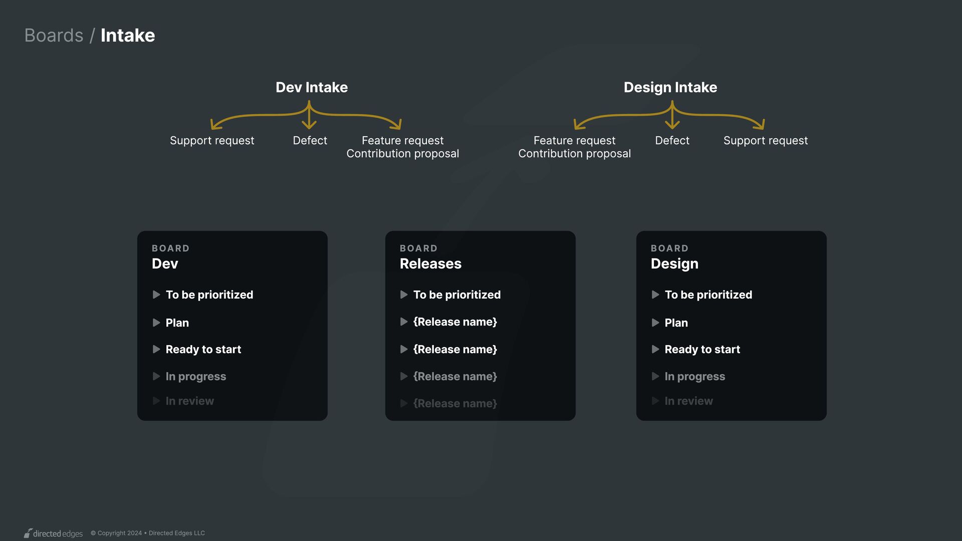
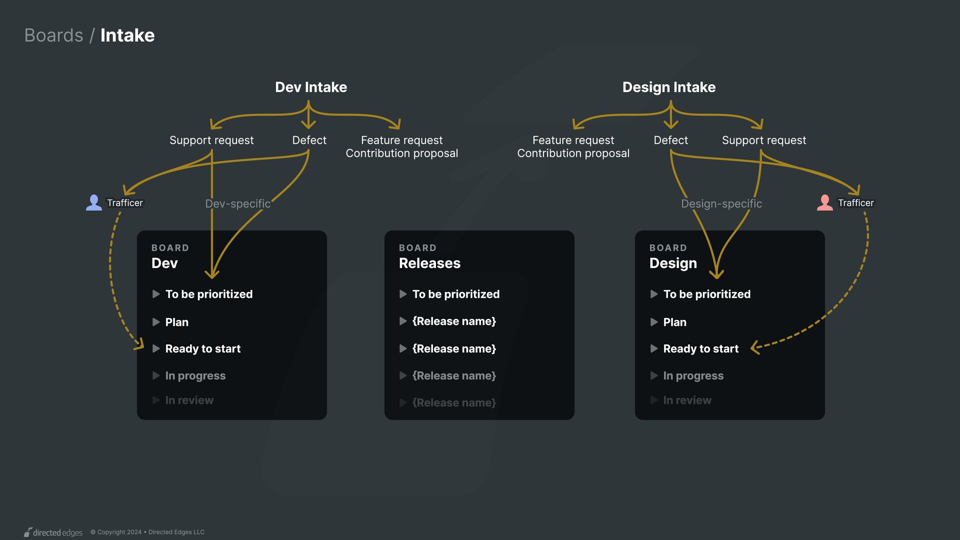
Design Intake Dev Intake Board Releases Support request Board Dev Board Design Support request Feature request Contribution proposal Feature request Contribution proposal To be prioritized To be prioritized Plan Plan Ready to start Ready to start In progress In progress In review In review {Release name} To be prioritized {Release name} {Release name} {Release name} Defect Defect
Design Intake Dev Intake Board Releases Support request Board Dev Board Design Support request Feature request Contribution proposal Feature request Contribution proposal To be prioritized To be prioritized Plan Plan Ready to start Ready to start In progress In progress In review In review {Release name} To be prioritized {Release name} {Release name} {Release name} Defect Defect Design-specific Dev-specific Trafficer Trafficer
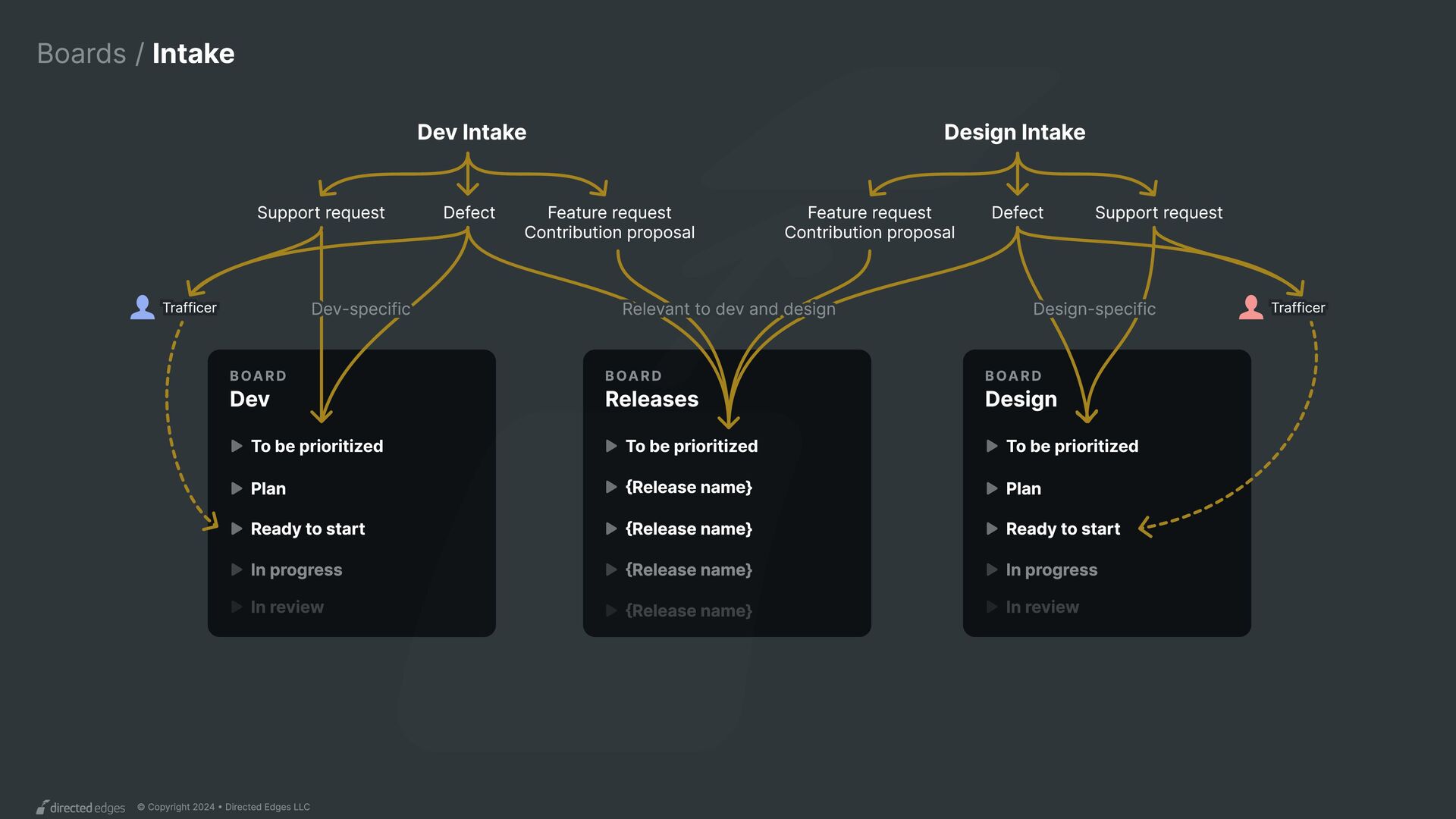
Design Intake Dev Intake Board Releases Support request Board Dev Board Design Support request Feature request Contribution proposal Feature request Contribution proposal To be prioritized To be prioritized Plan Plan Ready to start Ready to start In progress In progress In review In review {Release name} To be prioritized {Release name} {Release name} {Release name} Defect Defect Design-specific Dev-specific Relevant to dev and design Trafficer Trafficer
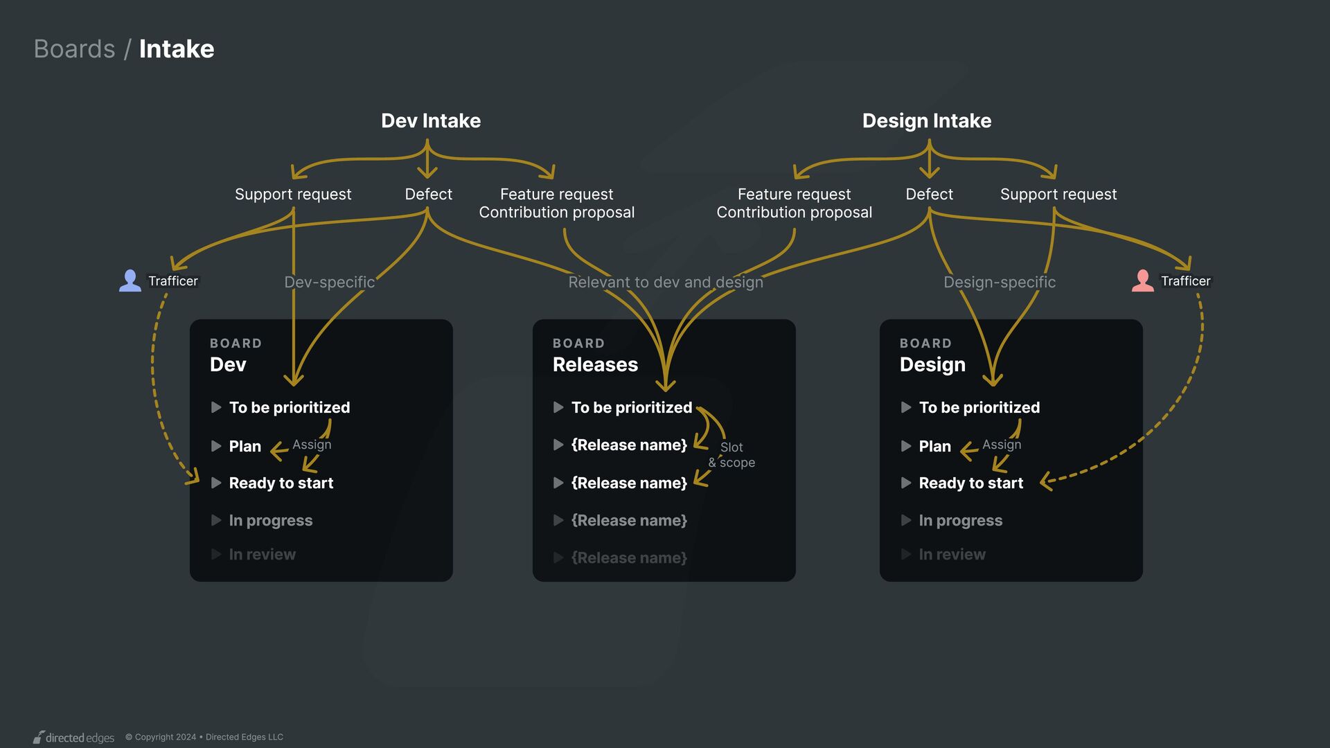
Design Intake Dev Intake Board Releases Support request Board Dev Board Design Support request Feature request Contribution proposal Feature request Contribution proposal To be prioritized To be prioritized Plan Plan Ready to start Ready to start In progress In progress In review In review {Release name} To be prioritized {Release name} {Release name} {Release name} Assign Assign Slot & scope Defect Defect Design-specific Dev-specific Relevant to dev and design Trafficer Trafficer
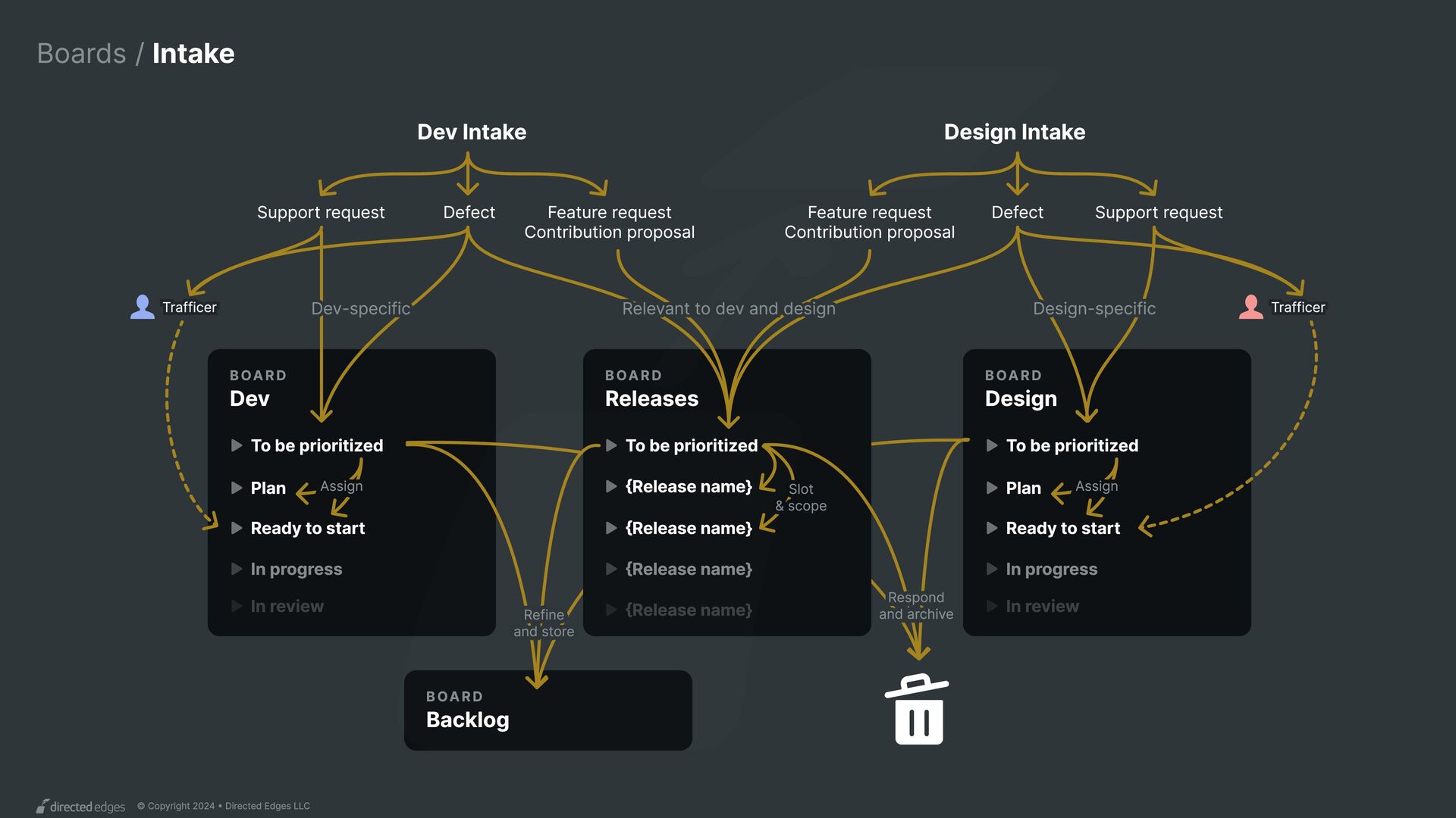
Design Intake Dev Intake Board Releases Support request Board Dev Board Design Board Backlog Support request Feature request Contribution proposal Feature request Contribution proposal To be prioritized To be prioritized Plan Plan Ready to start Ready to start In progress In progress In review In review {Release name} To be prioritized {Release name} {Release name} {Release name} Assign Assign Respond and archive Slot & scope Refine and store Defect Defect Design-specific Dev-specific Relevant to dev and design Trafficer Trafficer
produce Features in a of tasks like delivered via across and organized on a , all visible and tracked on Releases Workflow Design and code libraries Plan Design Spec Code Figma asset Initiatives Roadmap Boards?
 nathanacurtis
 yusukeiyoda
 kitanosirokuma
 mhand01
 keroyama
 securecat
 marzstarz
 centou
 garyuten
 godlingkogami
 tararira
 klemens
 uxman
uxman
 chriscoyier
 signer
 vanstee
 frankvandijk
 madoxten
 eileencodes
 ipullrank
 tmiket
 jacobtomlinson
 aleyda
 nikkihalliwell
 panda_program