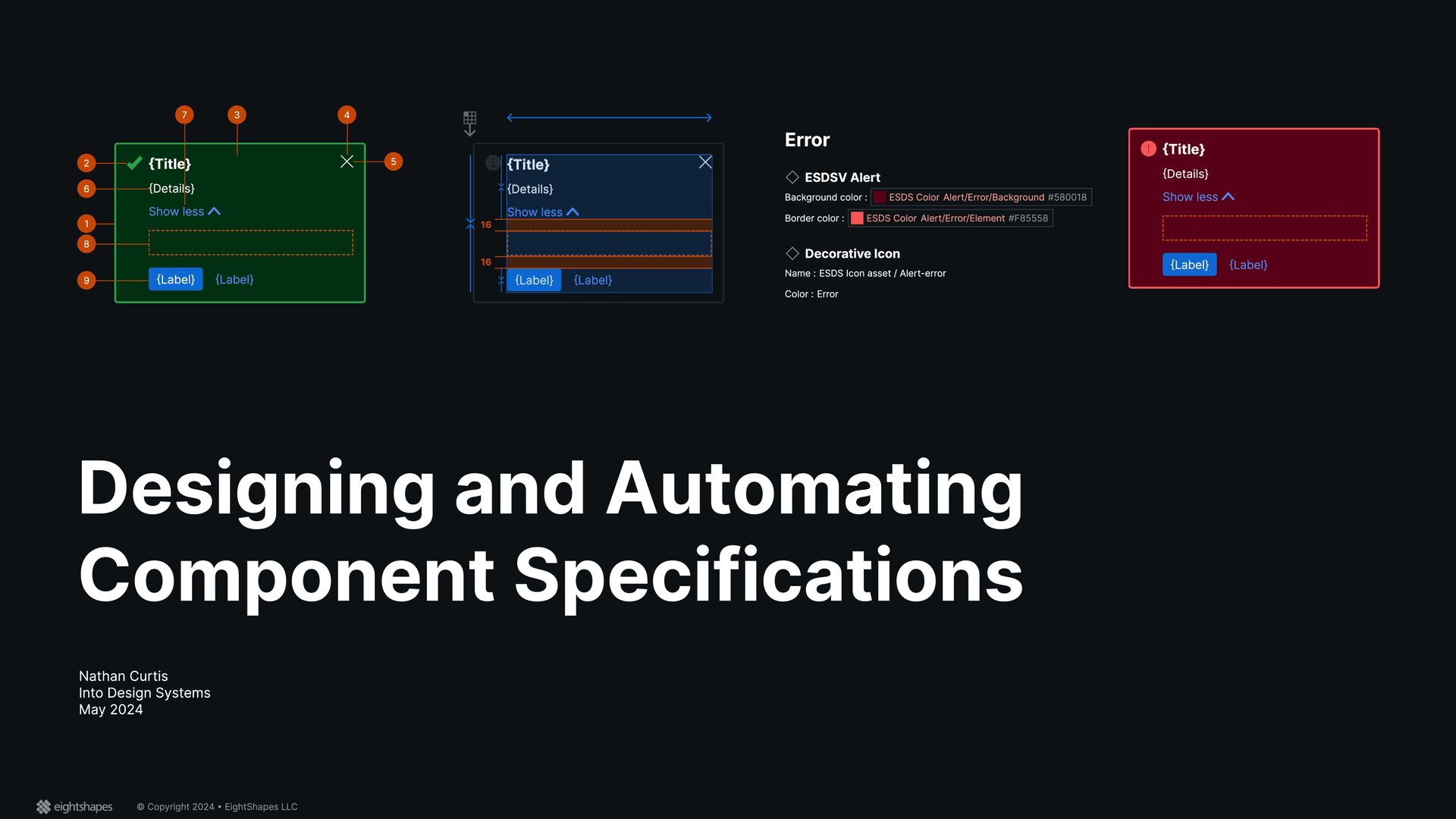
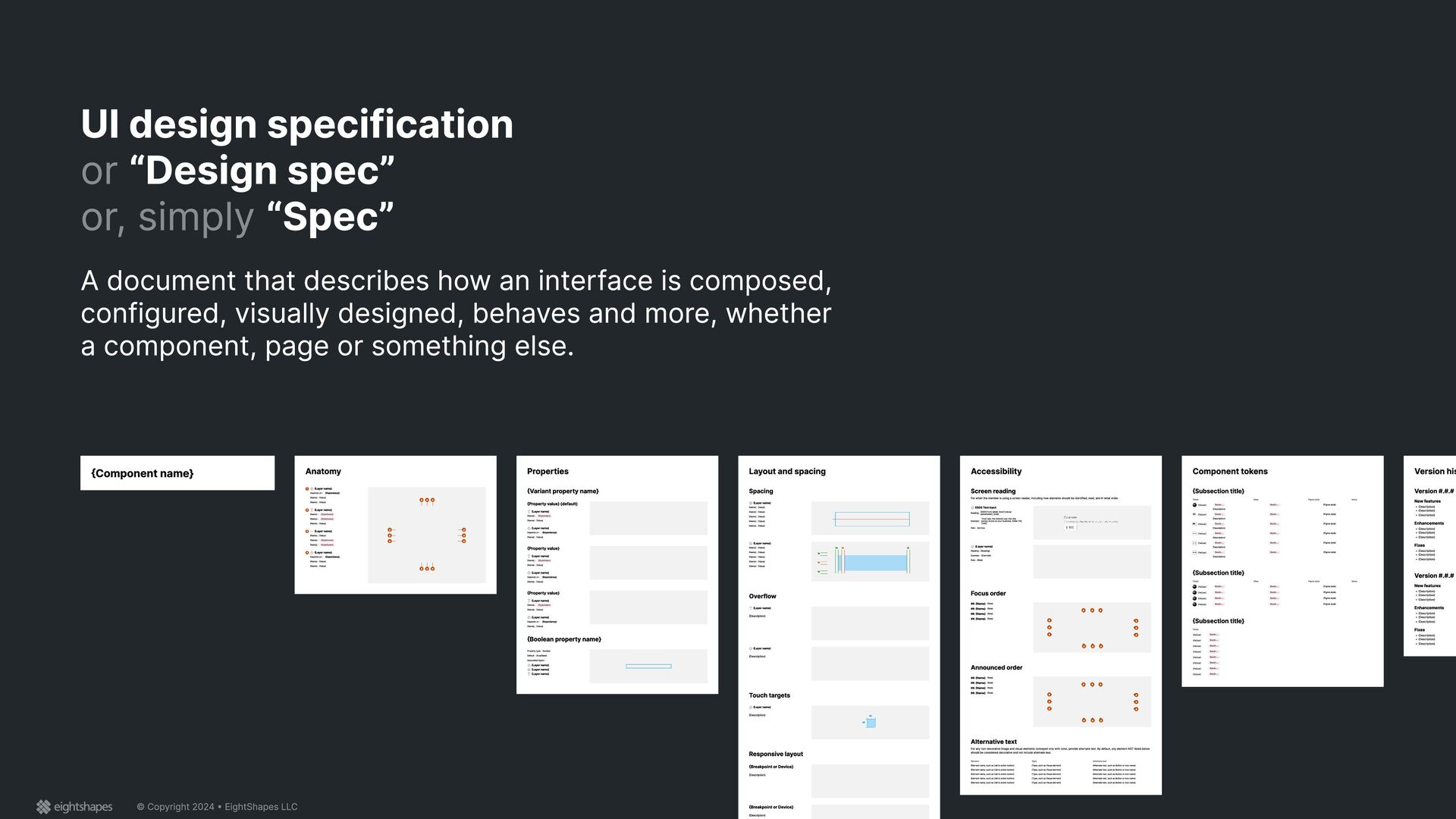
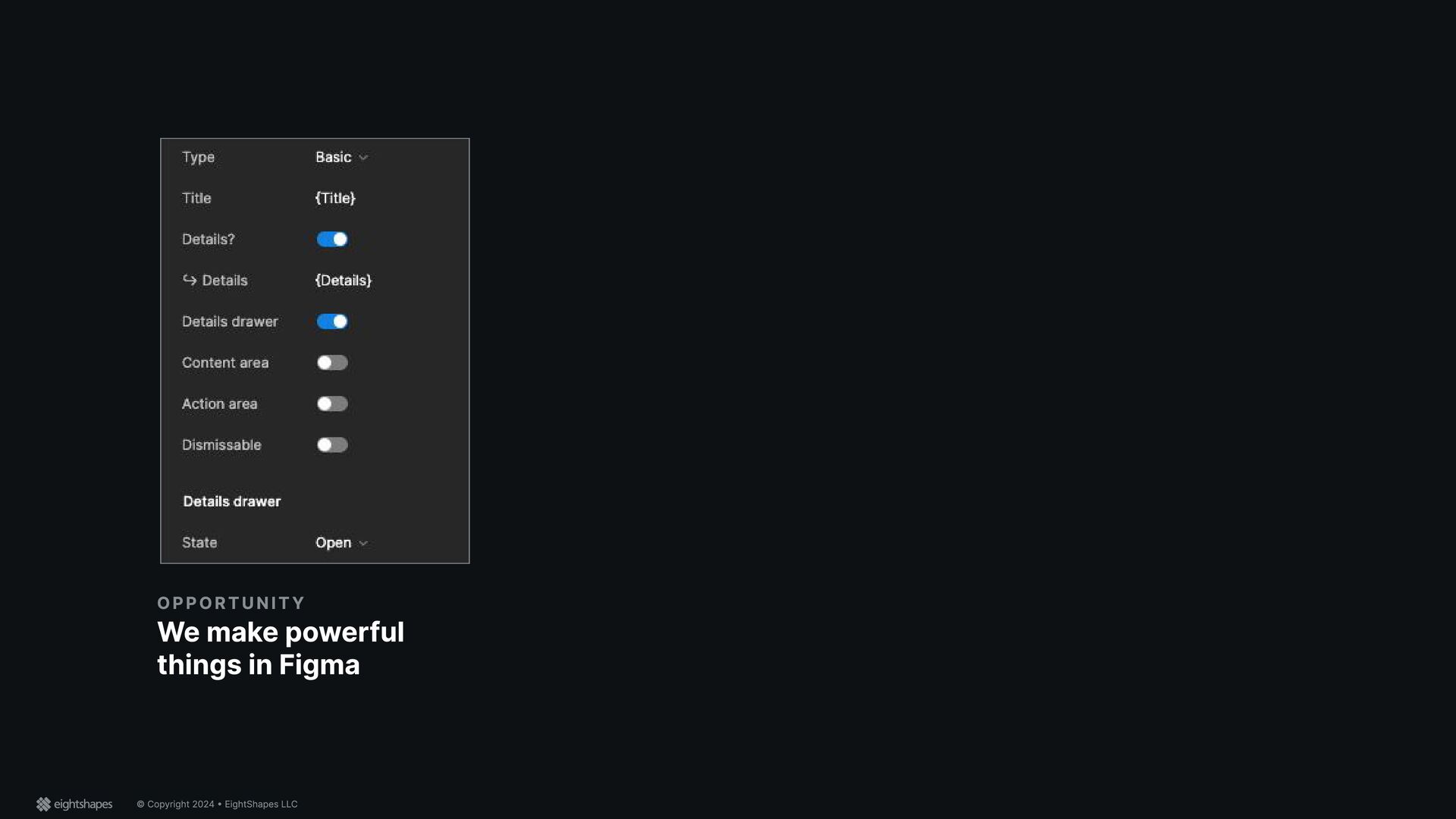
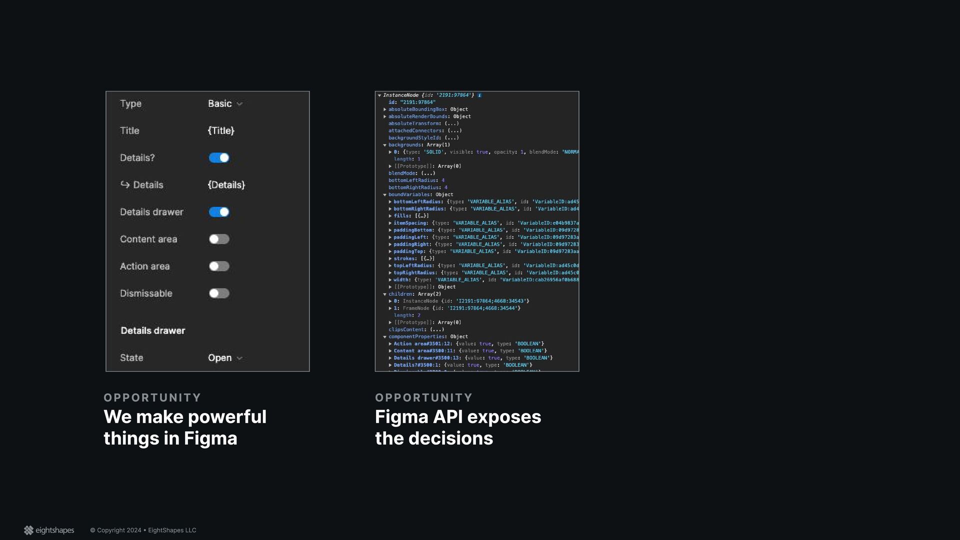
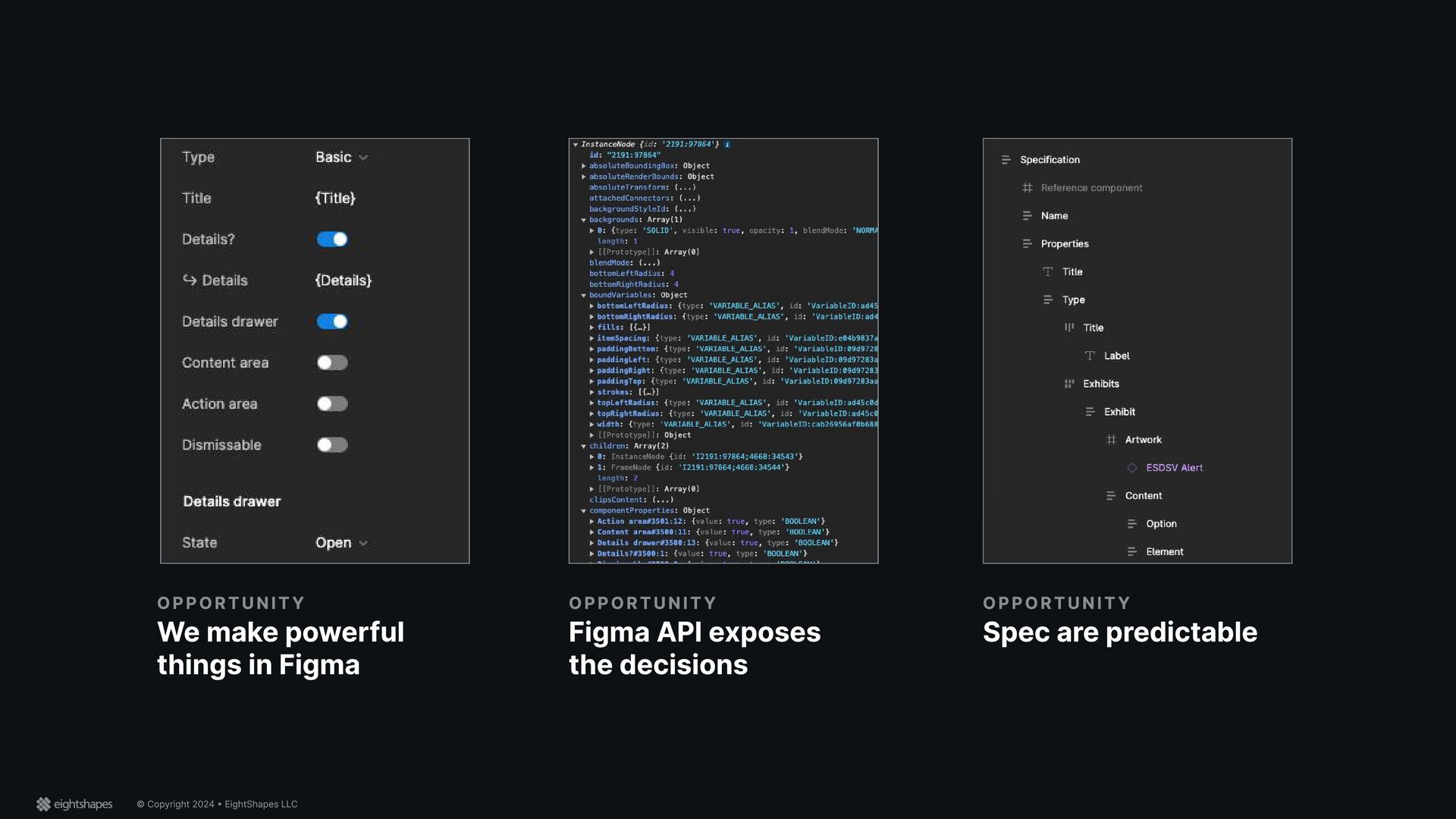
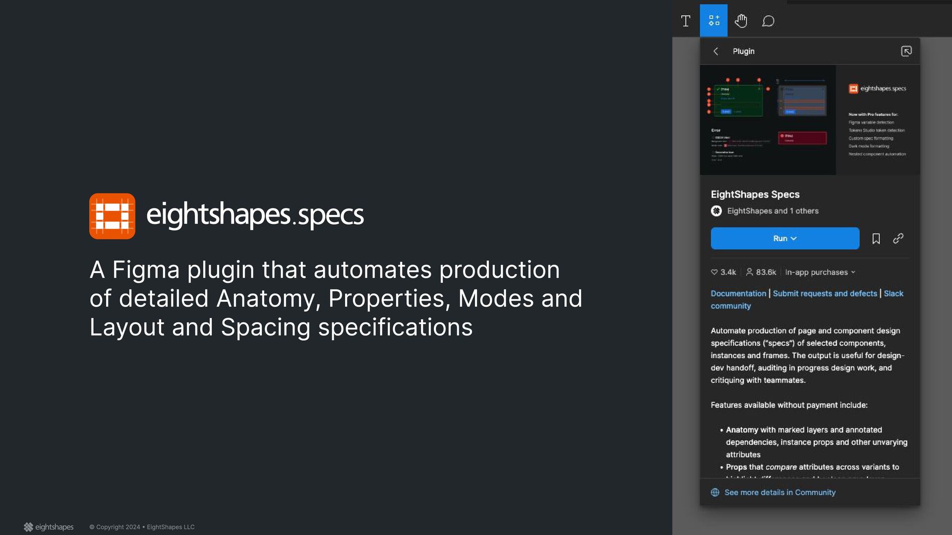
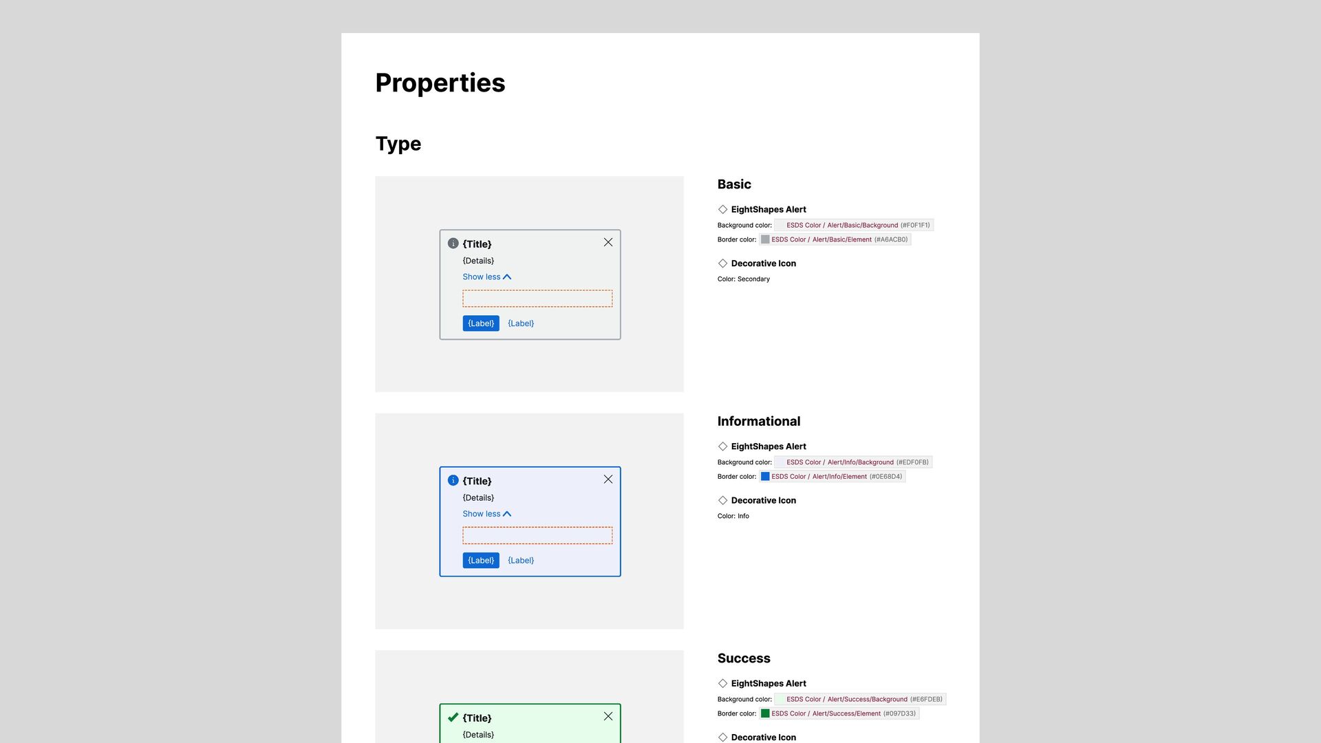
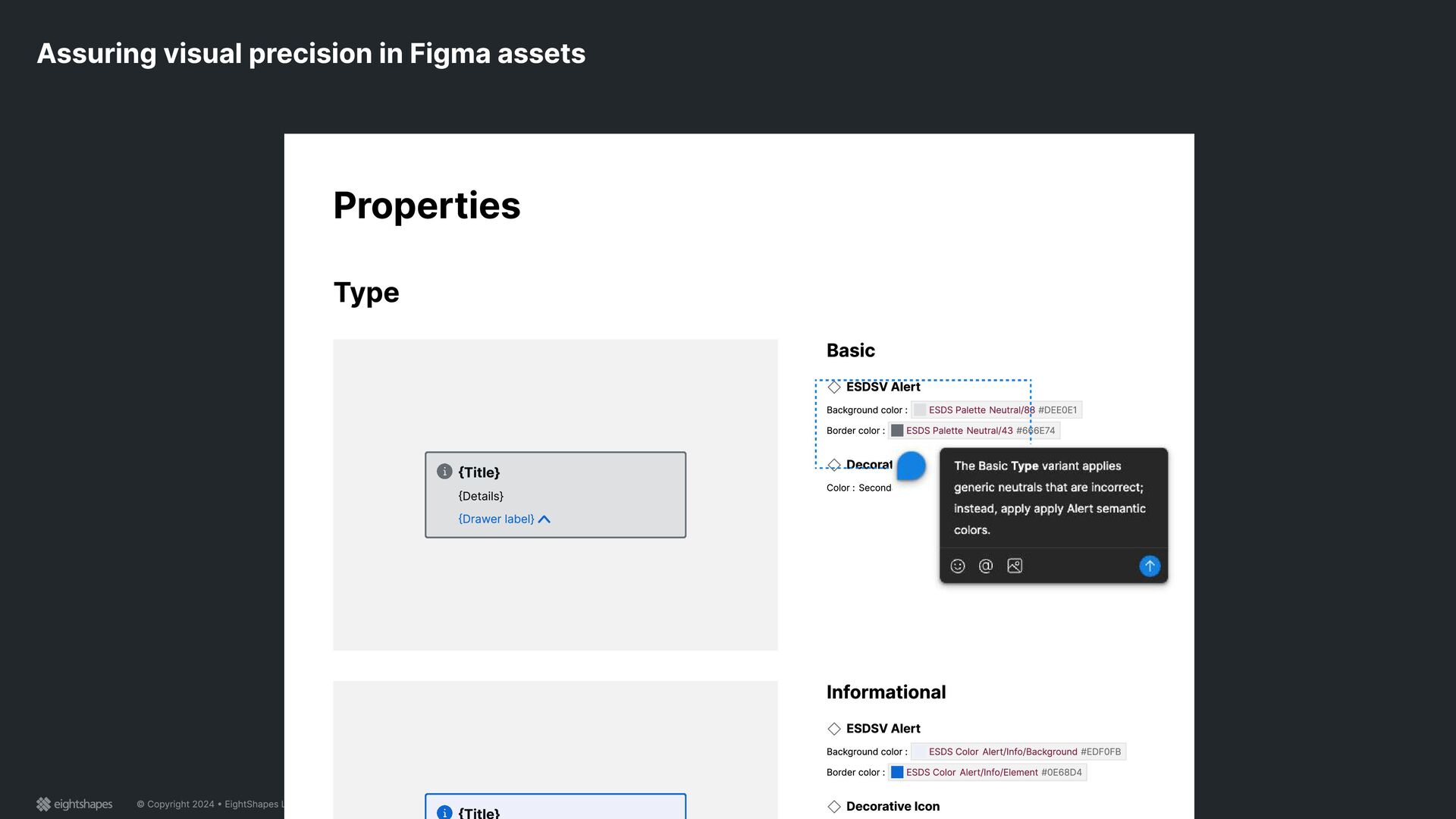
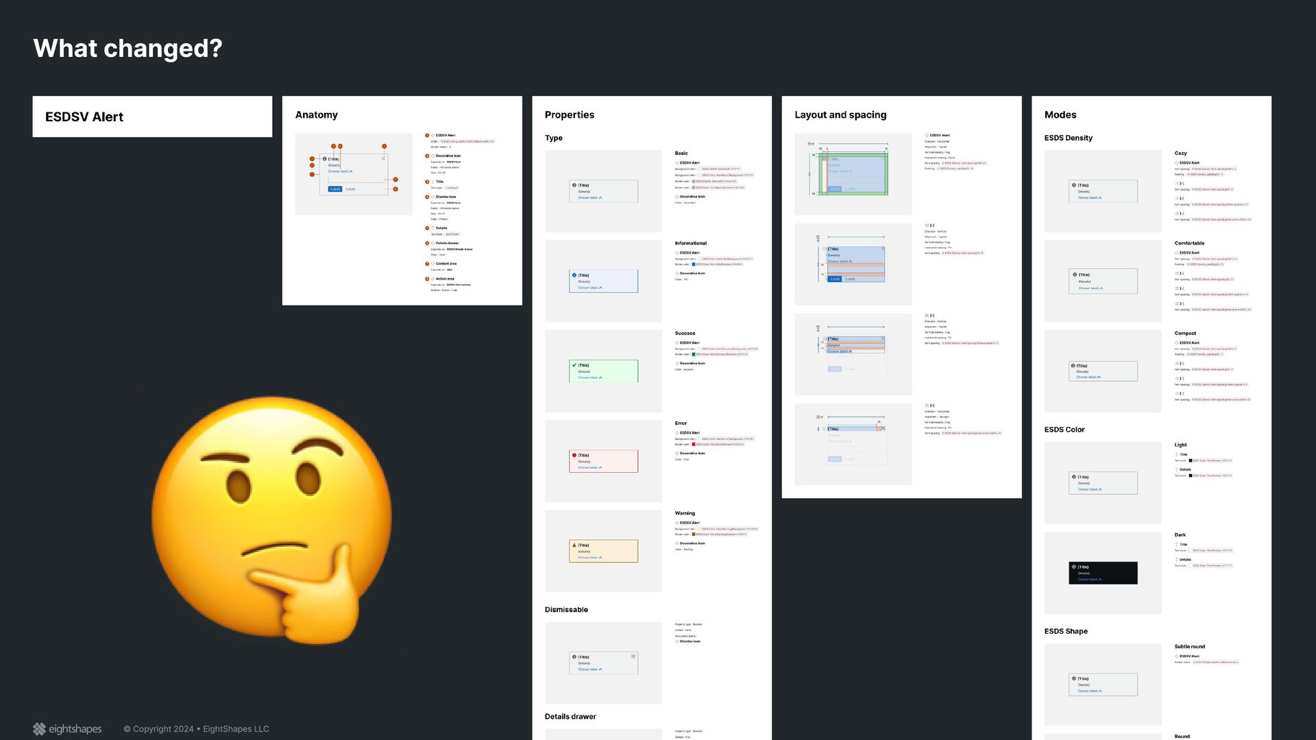
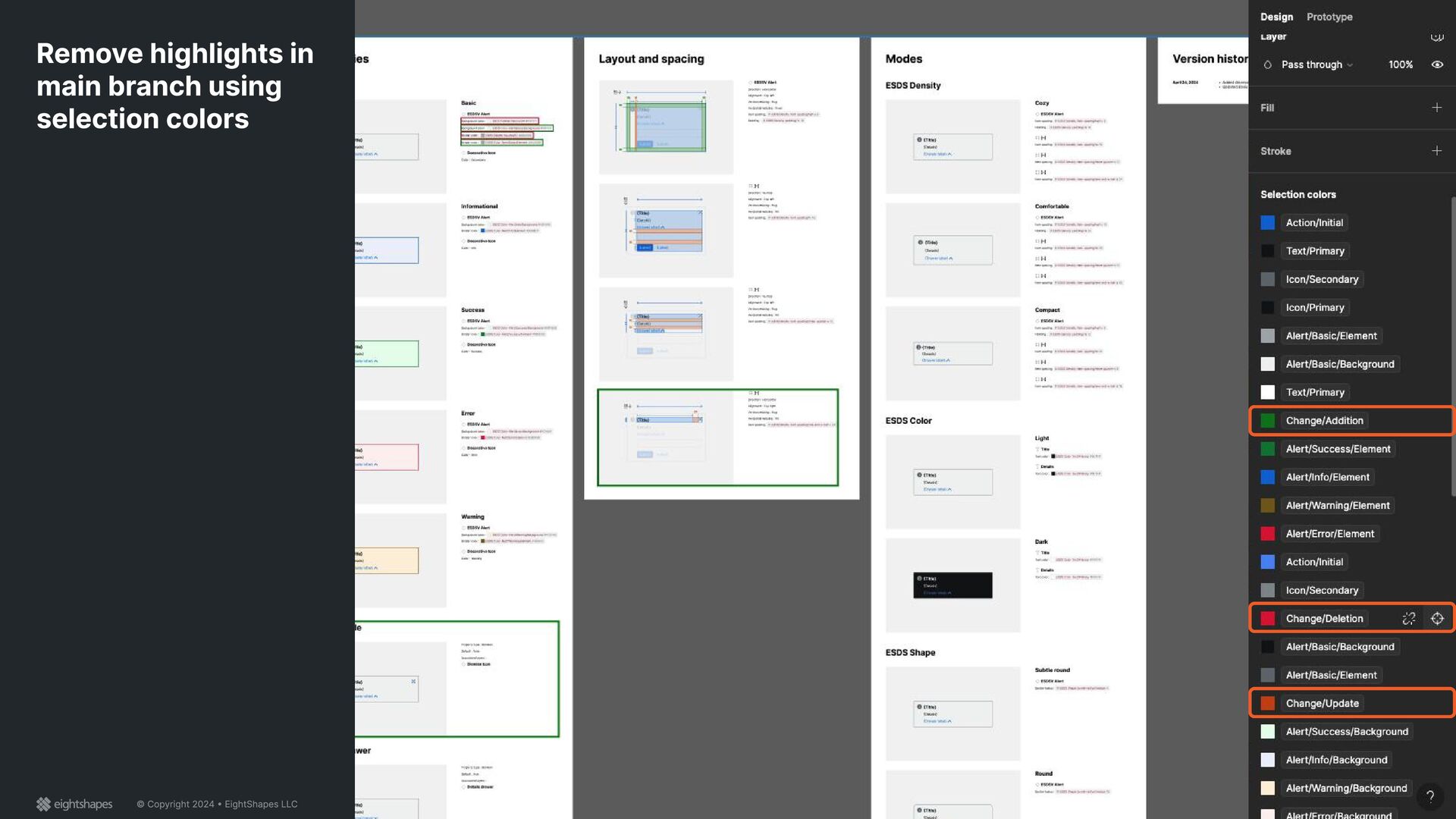
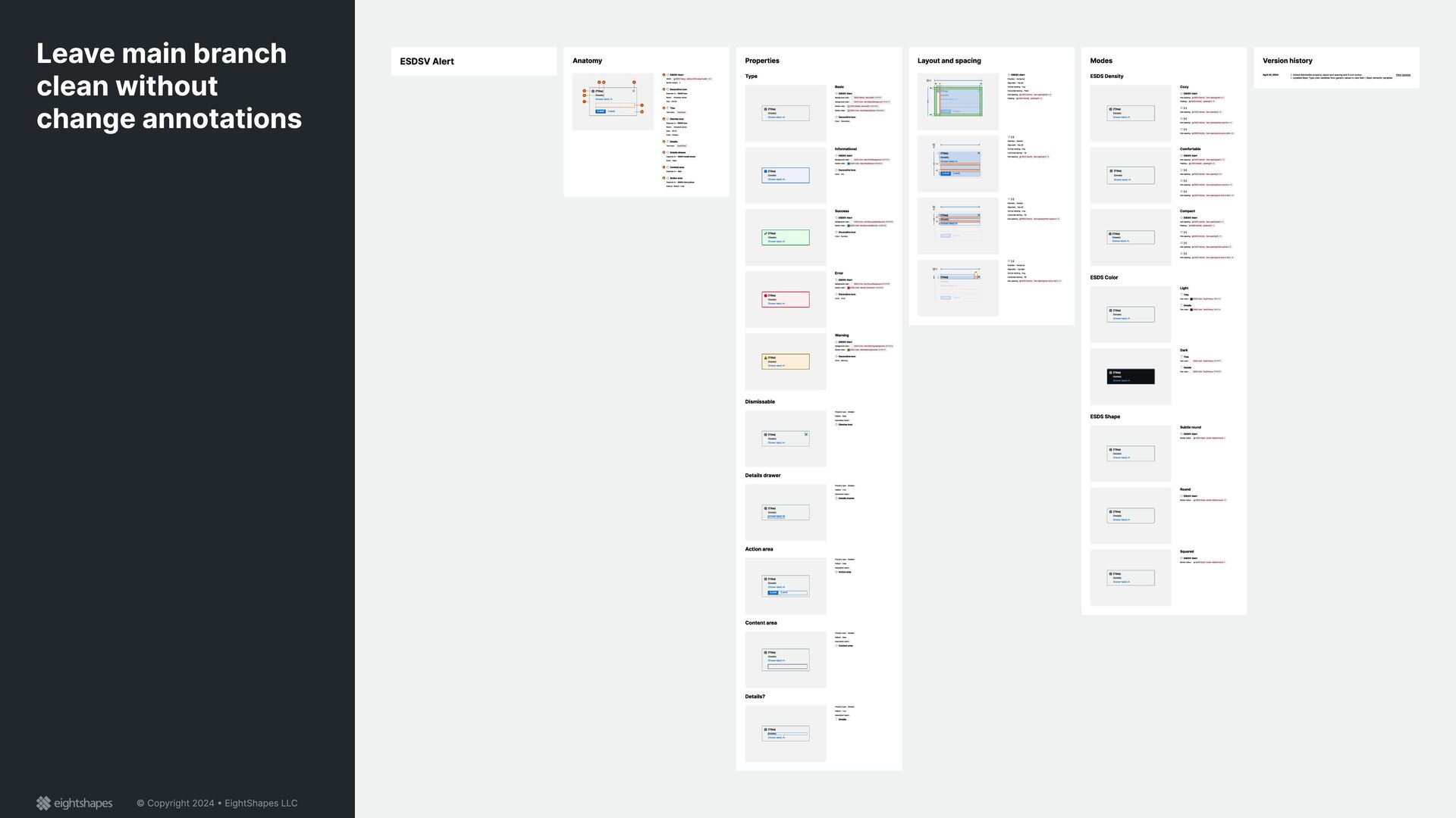
{Label} {Label} 1 2 3 4 5 6 7 8 9 {Title} {Details} Show less {Label} {Label} {Title} {Details} Show less {Label} {Label} 16 16 Error ESDSV Alert Background color : ESDS Color Alert/Error/Background #580018 Border color : ESDS Color Alert/Error/Element #F85558 Decorative Icon Name : ESDS Icon asset / Alert-error Color : Error {Title} {Details} Show less {Label} {Label} Designing and Automating Component Specifications Nathan Curtis Into Design Systems May 2024
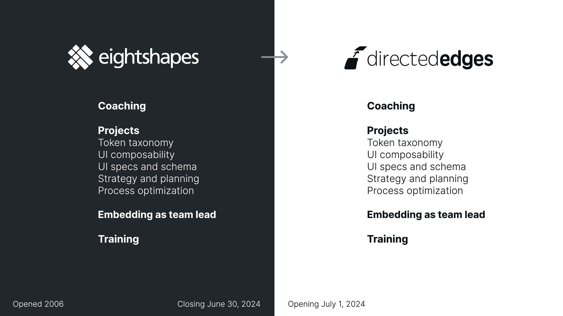
UI specs and schema Strategy and planning Process optimization Embedding as team lead Training Coaching Projects Token taxonomy UI composability UI specs and schema Strategy and planning Process optimization Embedding as team lead Training Closing June 30, 2024 Opened 2006
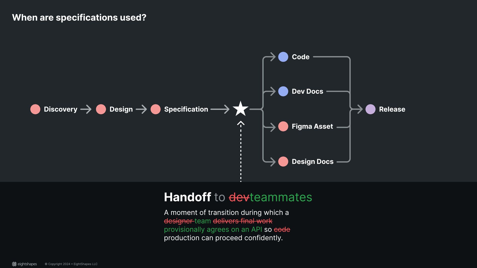
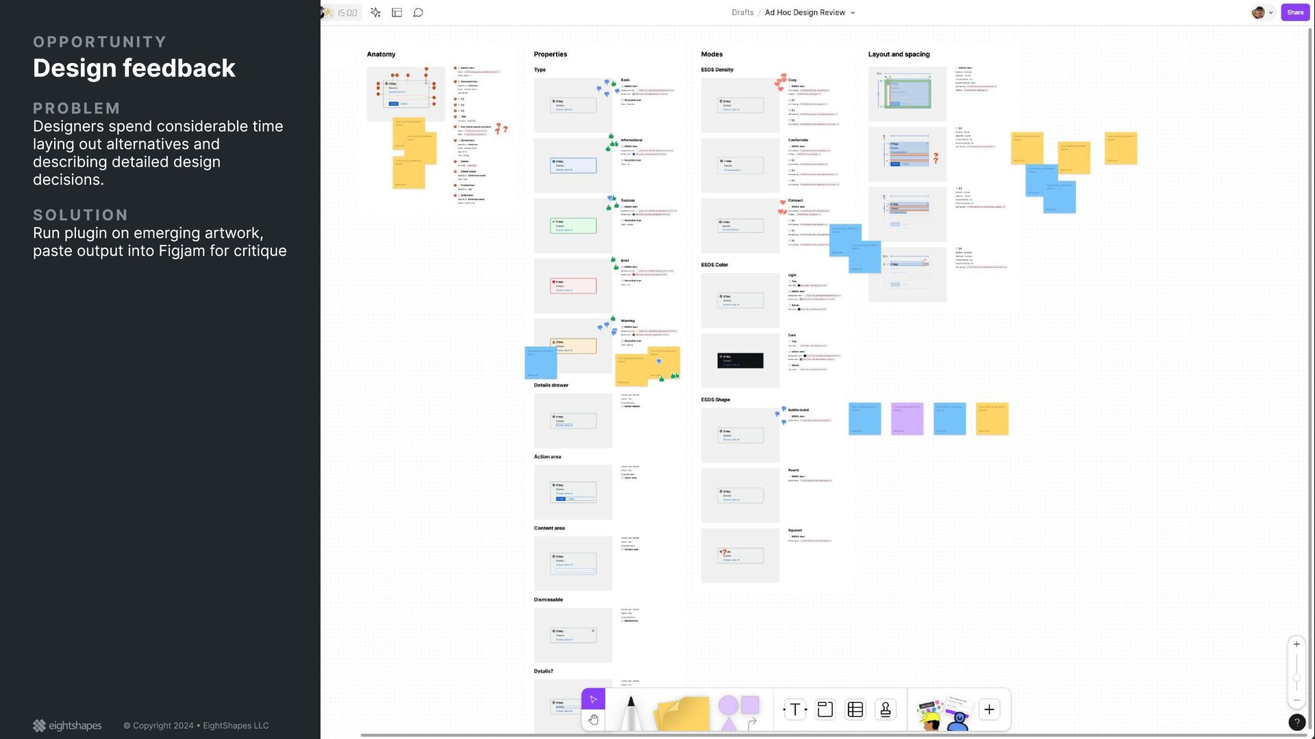
coding the thing Designers making a Figma asset to publish Teammates composing docs People using things Developers importing and using the code Instead, use docs or Storybook. Designers inserting a Figma asset Instead, use guideline docs like Use When. Writers authoring copy Instead, use documented guidelines. Who uses a specification?
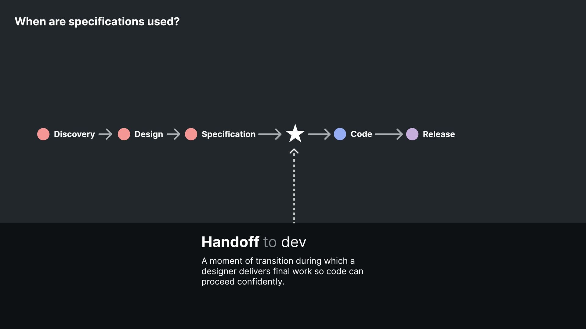
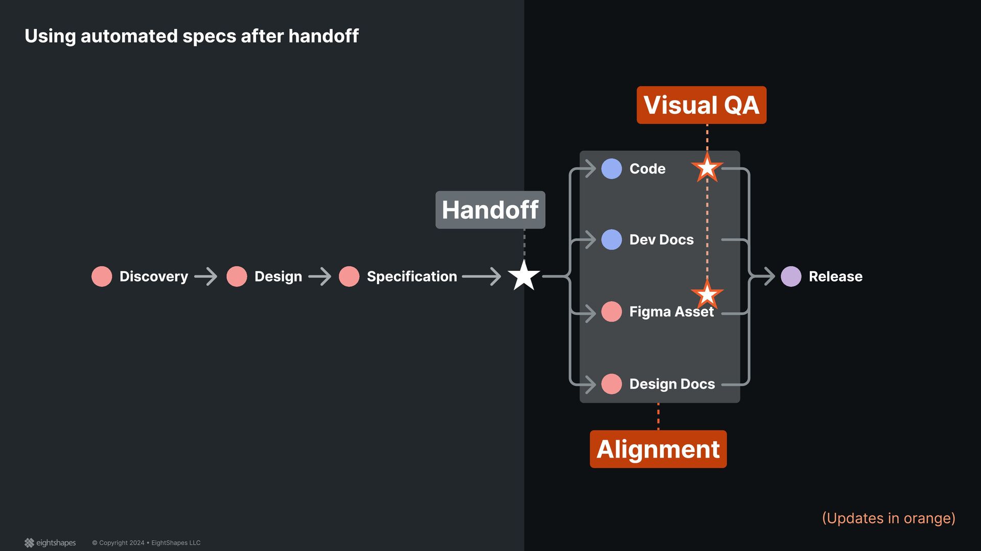
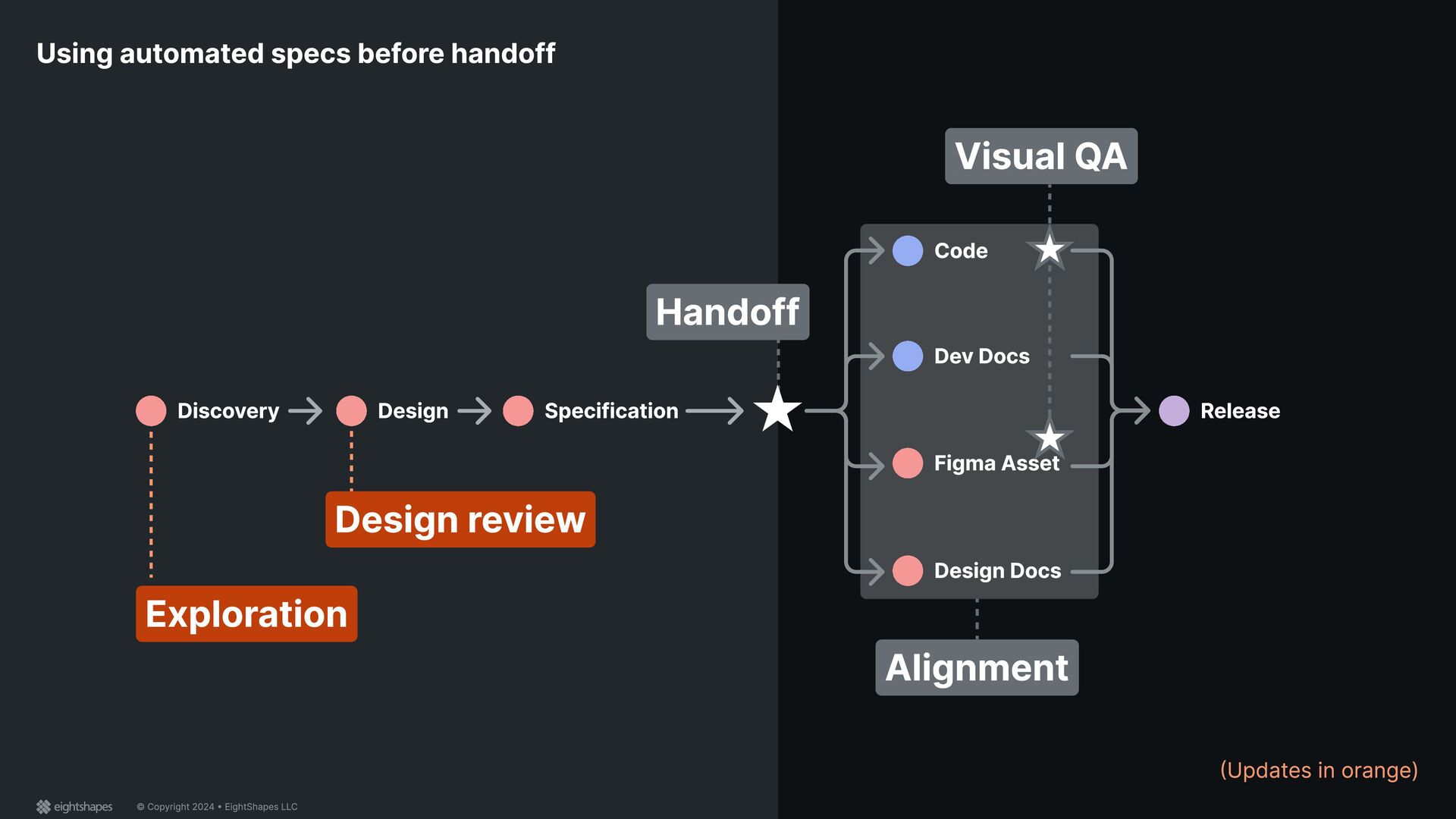
Design Specification Code Release Discovery Handoff dev to A moment of transition during which a designer delivers final work so code can proceed confidently.
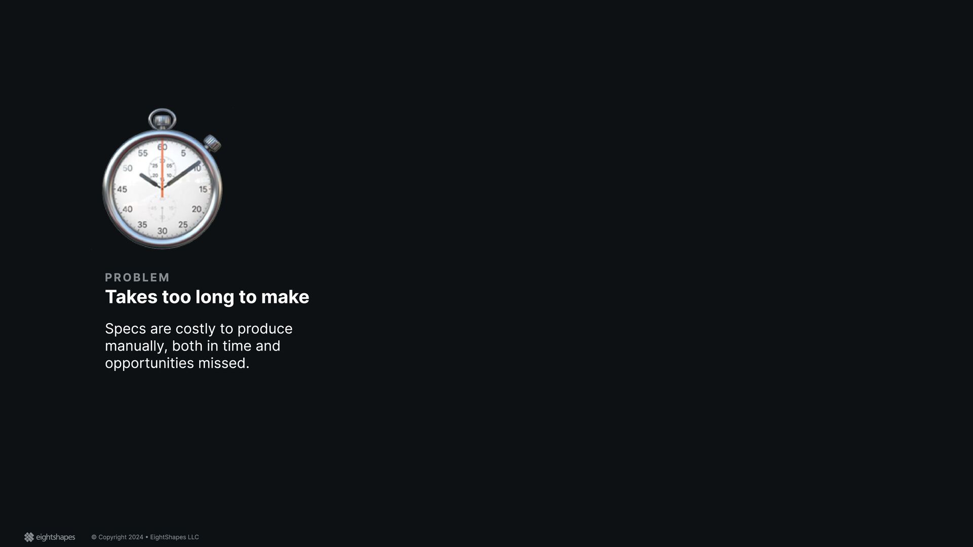
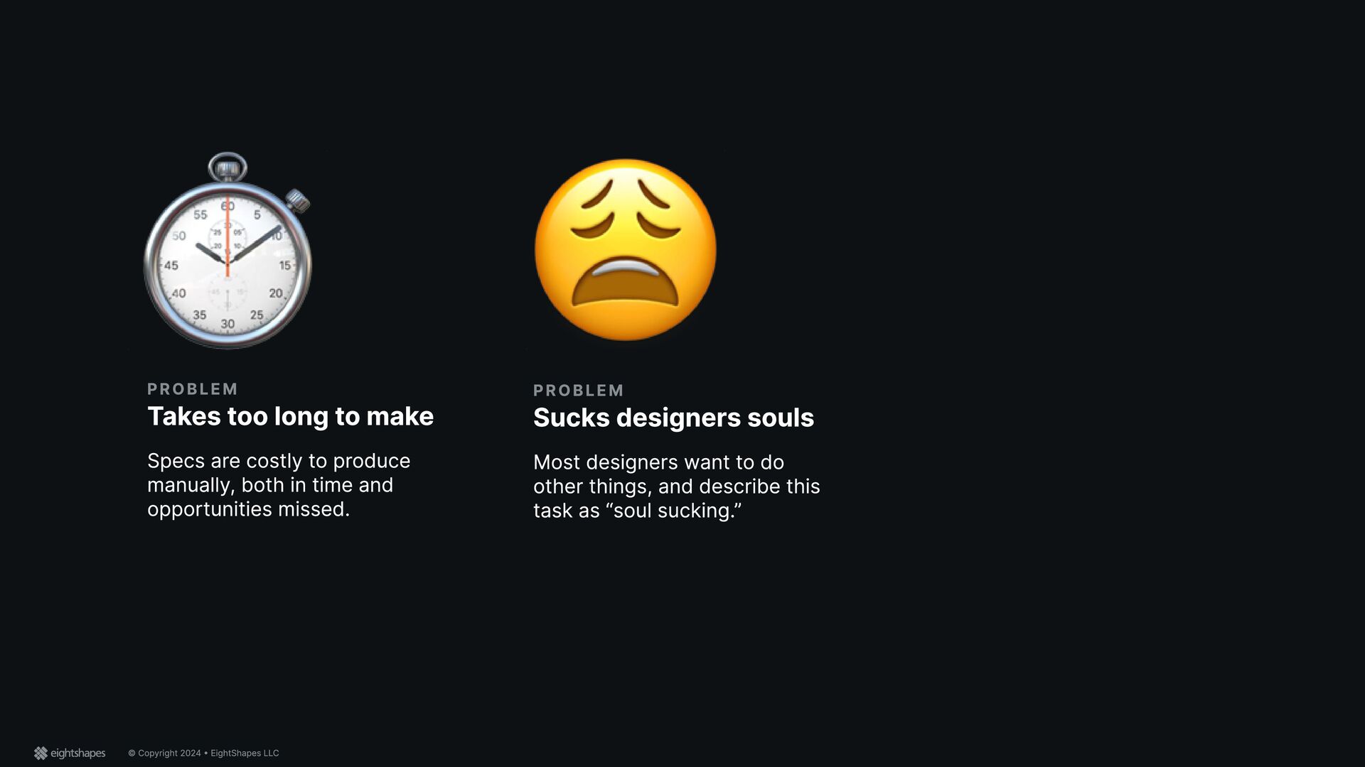
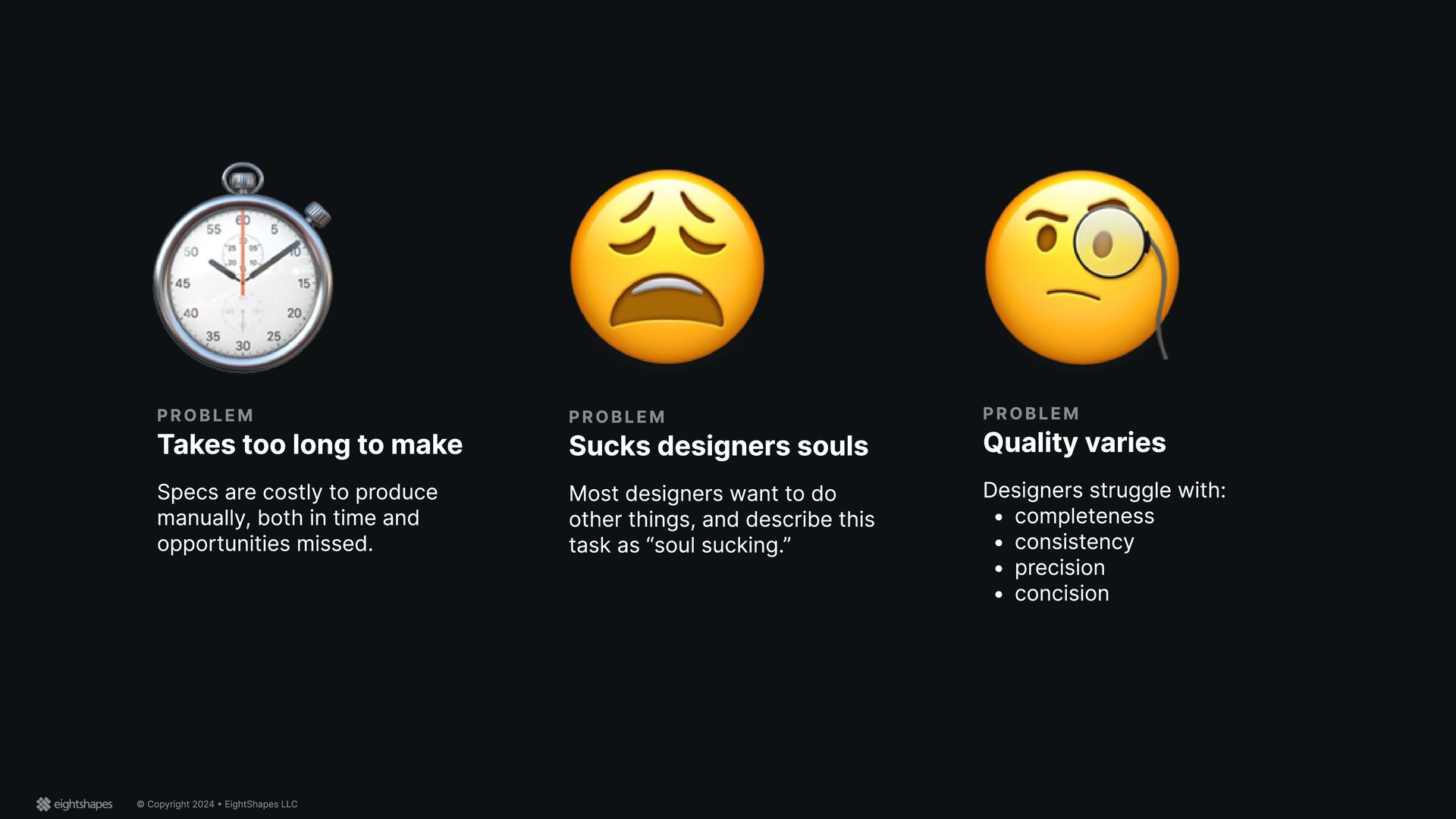
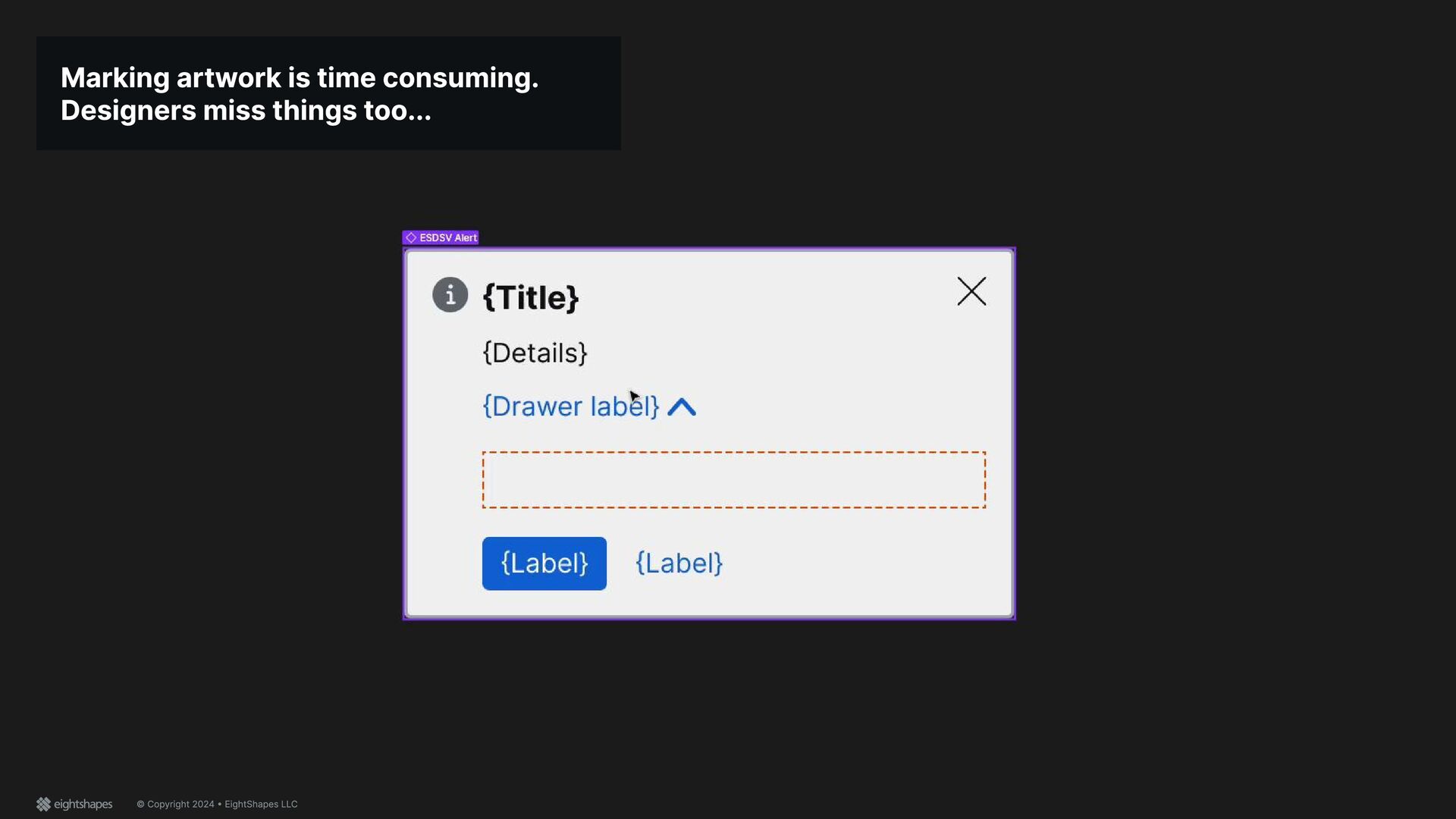
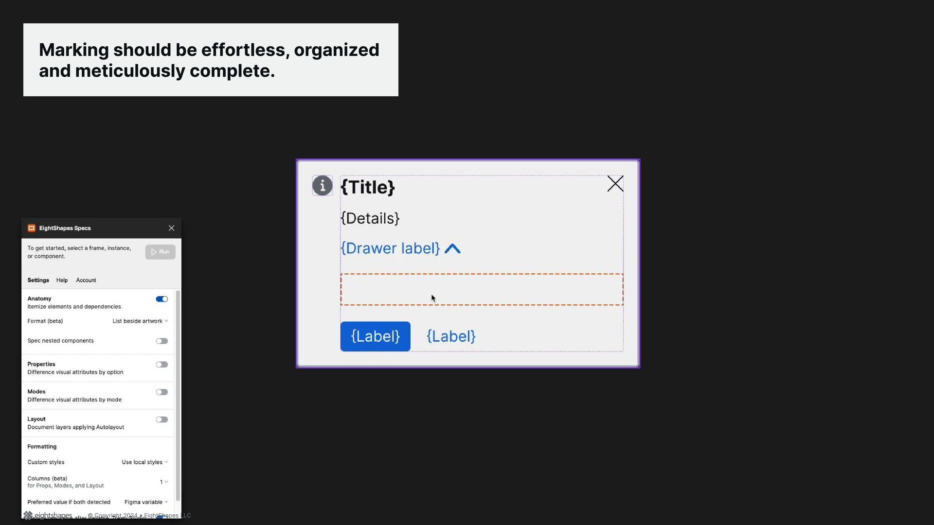
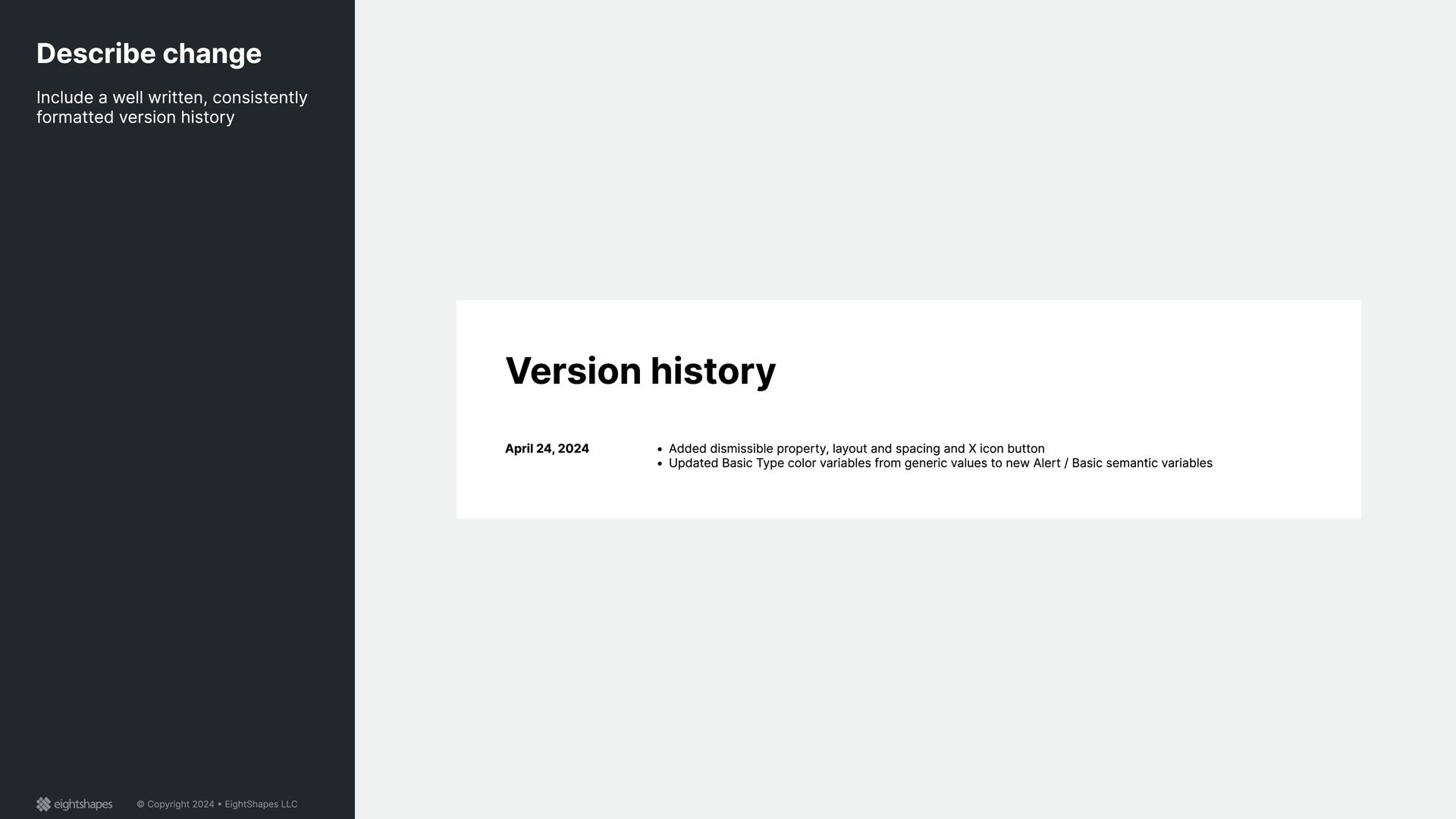
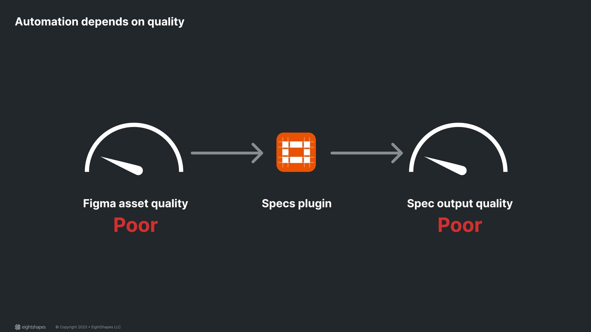
to make Specs are costly to produce manually, both in time and opportunities missed. Problem Sucks designers souls Most designers want to do other things, and describe this task as “soul sucking.”
to make Specs are costly to produce manually, both in time and opportunities missed. Problem Sucks designers souls Most designers want to do other things, and describe this task as “soul sucking.” Problem Quality varies Designers struggle withv x completenes x consistenc x precisio} x concision
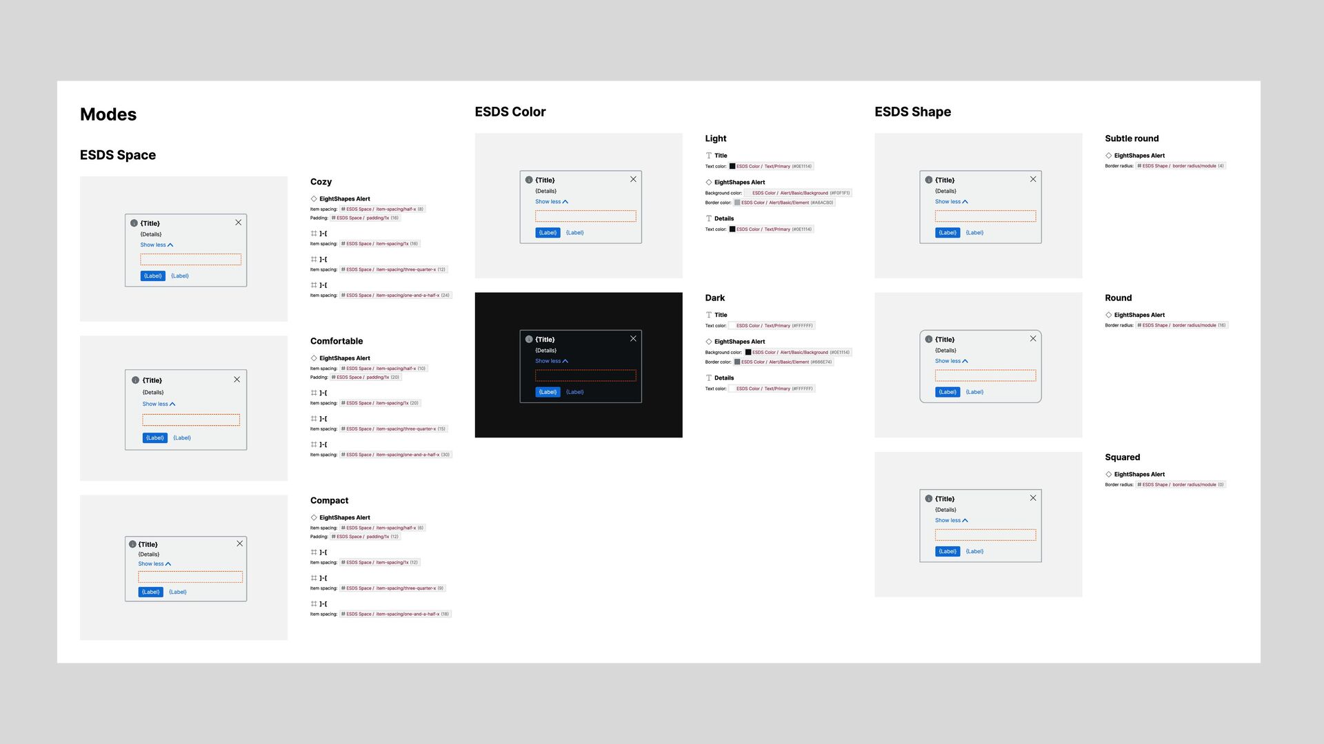
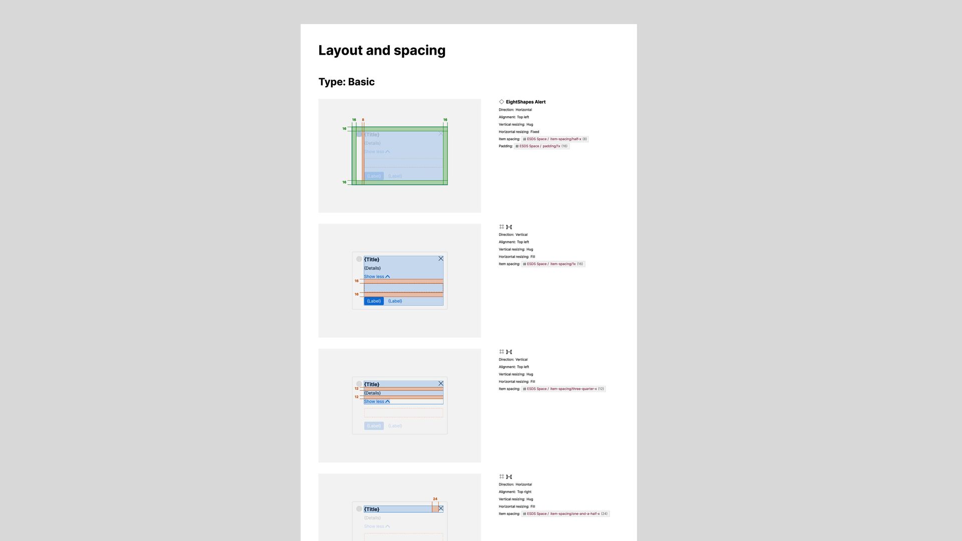
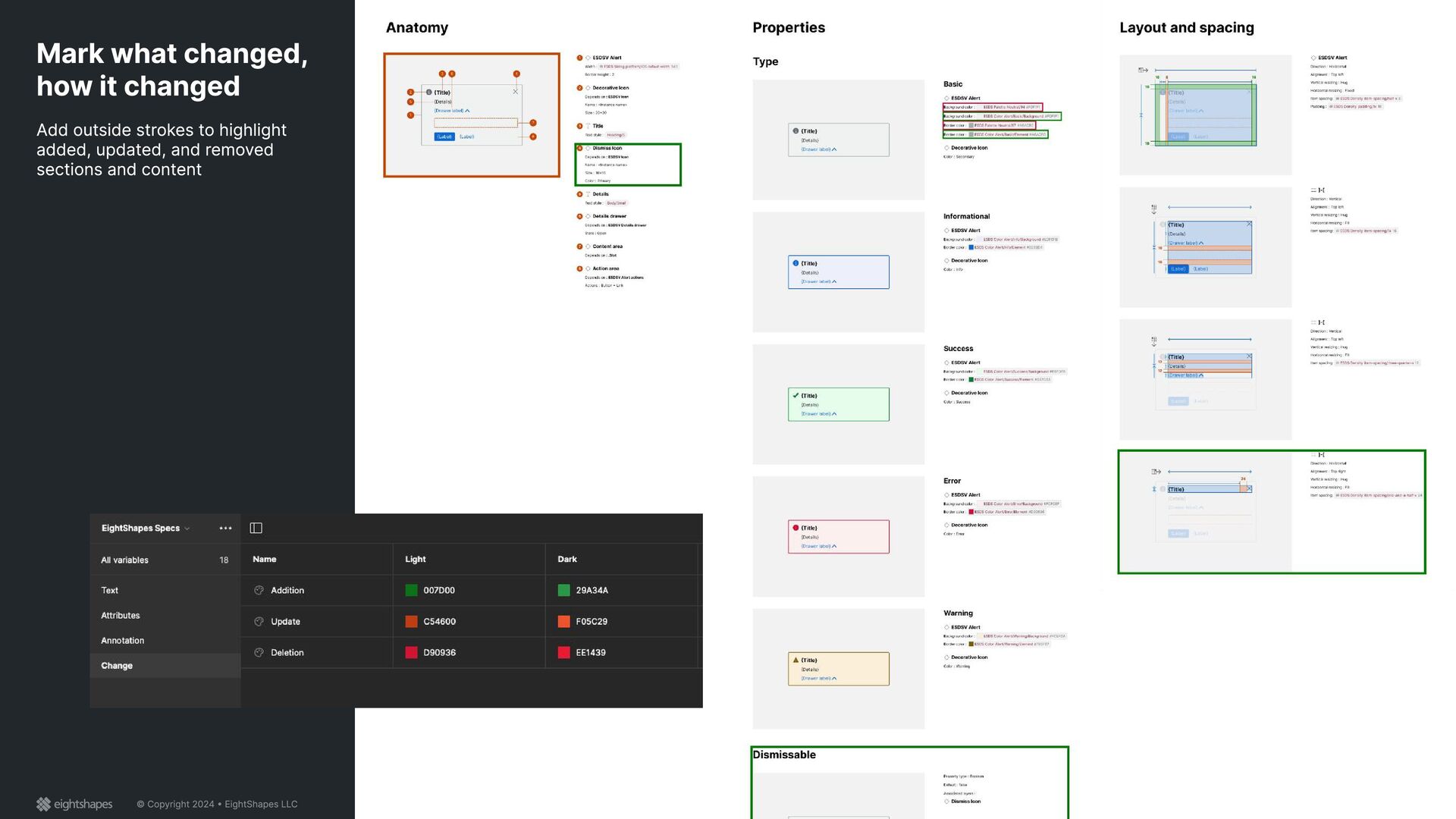
{Label} 8 16 16 16 16 EightShapes Alert Direction: Horizontal Alignment: Top left Vertical resizing: Hug Horizontal resizing: Fixed Item spacing: ESDS Space / item-spacing/half-x (8) Padding: ESDS Space / padding/1x (16) {Title} {Details} Show less {Label} {Label} {Title} {Details} Show less {Label} {Label} 16 16 ]-[ Direction: Vertical Alignment: Top left Vertical resizing: Hug Horizontal resizing: Fill Item spacing: ESDS Space / item-spacing/1x (16) {Title} {Details} Show less {Label} {Label} {Title} {Details} Show less 12 12 ]-[ Direction: Vertical Alignment: Top left Vertical resizing: Hug Horizontal resizing: Fill Item spacing: ESDS Space / item-spacing/three-quarter-x (12) {Title} {Details} Show less {Title} 24 ]-[ Direction: Horizontal Alignment: Top right Vertical resizing: Hug Horizontal resizing: Fill Item spacing: ESDS Space / item-spacing/one-and-a-half-x (24)
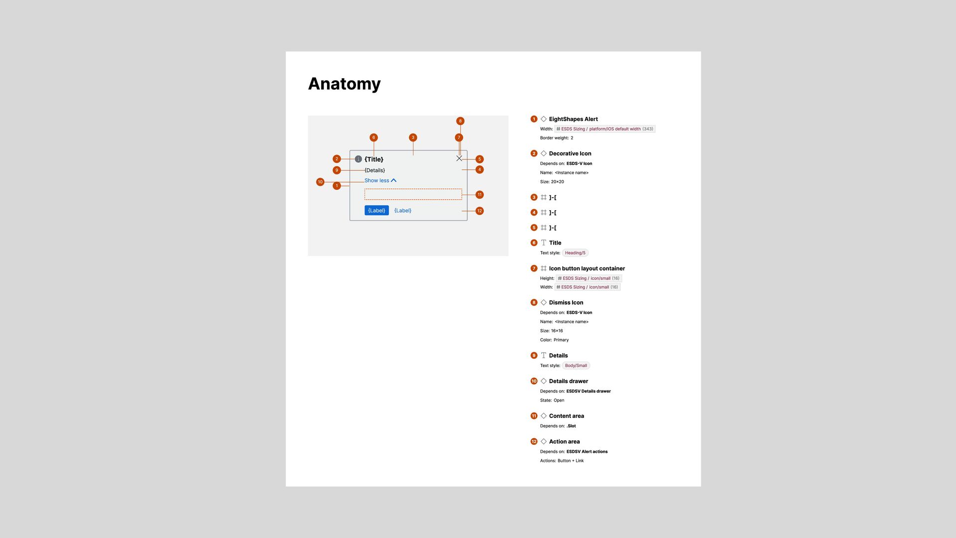
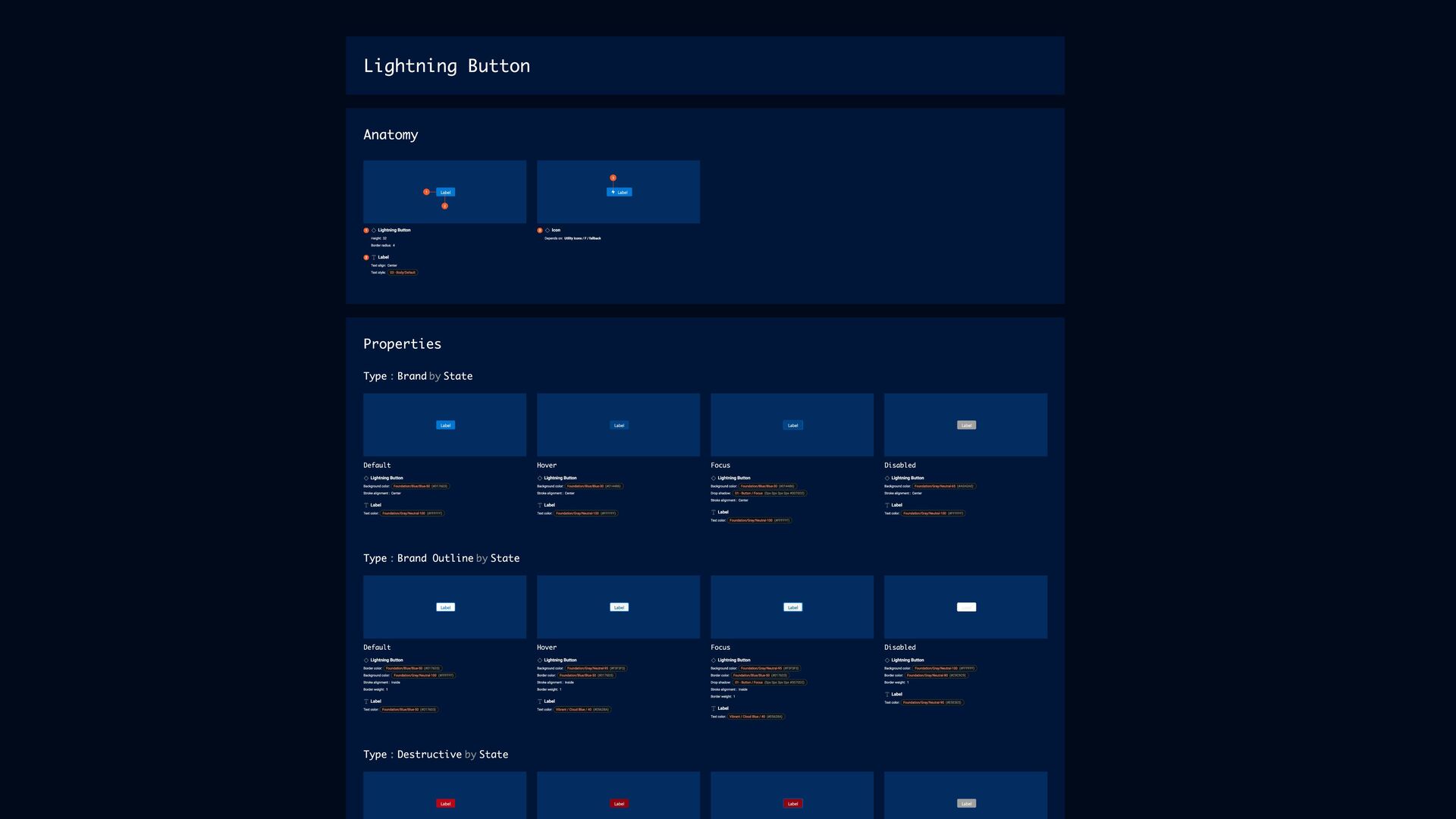
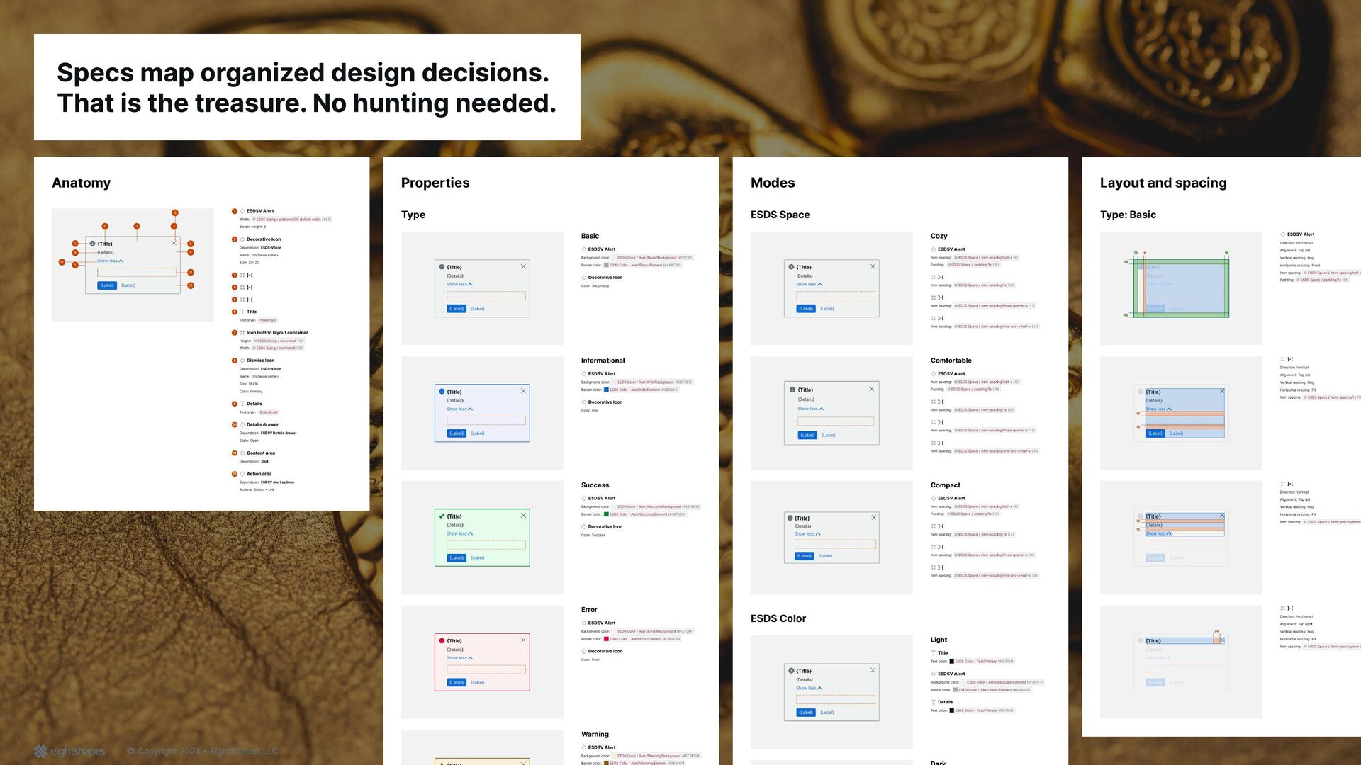
1 Width: 600 Border color: Foundation/Gray/Neutral-80 (#C9C9C9) Border weight: 1 Border radius: 4 Standard Icons / A / account 2 Depends on: Standard Icons / A / account Title 3 Text color: Text / Default (#181818) Text style: 06 - Page Title / Default Sub-title 4 Text color: #000000 Text style: 03 - Body/Default Title App Name Label 5 6 App Name 5 Text color: #000000 Text style: 03 - Body/Default Button 6 Depends on: Button Type: Neutral State: Default Icon: None Page Name Sub-Title Label Label Label Label Label Title 7 8 9 10 11 12 13 14 15 16 17 18 Page Name 7 Text color: #000000 Text style: 03 - Body/Default Sub-Title 8 Text color: #000000 Text style: 03 - Body/Default _Item 9 Depends on: _Item Type: Base Text State: Default Position: Left _Item 10 Depends on: _Item Type: Icon State: Default Position: Right Button Icon 11 Depends on: Button Icon Type: Bordered Size: More State: Default Button Icon 12 Depends on: Button Icon Type: Bordered Size: More State: Default Button Icon (Stateful) 13 Depends on: Button Icon (Stateful) State: Default Selected: No Button Icon (Stateful) 14 Depends on: Button Icon (Stateful) State: Default Selected: No _Item 15 Depends on: _Item Type: Icon State: Default Position: Left _Item 16 Depends on: _Item Type: Icon State: Default Position: Right Title 17 Text color: Text / Default (#181818) Text style: 06 - Page Title / Default Utility Icons / D / down 18 Depends on: Utility Icons / D / down Record Name Title Label Label Label Label Label Label Label Label Label Label Label Label 19 20 21 22 23 24 25 26 27 28 29 Card 19 Depends on: Card Header: False Footer: False Header 20 Height: 72 Width: 600 Background color: Foundation/Gray/Neutral-95 (#F3F3F3) Border color: Foundation/Gray/Neutral-80 (#C9C9C9) Border weight: 1 Top left radius: 4 Top right radius: 4 Standard Icons / A / account 21 Depends on: Standard Icons / A / account Record Name 22 Text color: #000000 Text style: 03 - Body/Default Title 23 Text color: Text / Default (#181818) Text style: 06 - Page Title / Default Button 24 Depends on: Button Type: Neutral State: Default Icon: Left Button Group 25 Height: 32 _Item 26 Depends on: _Item Type: Base Text State: Default Position: Left
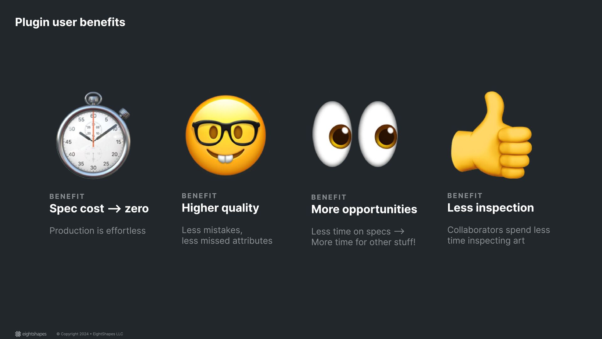
Production is effortless Spec cost --> zero BENEFIT Less time on specs --> More time for other stuff! More opportunities BENEFIT Collaborators spend less time inspecting art Less inspection BENEFIT Less mistakes, less missed attributes Higher quality
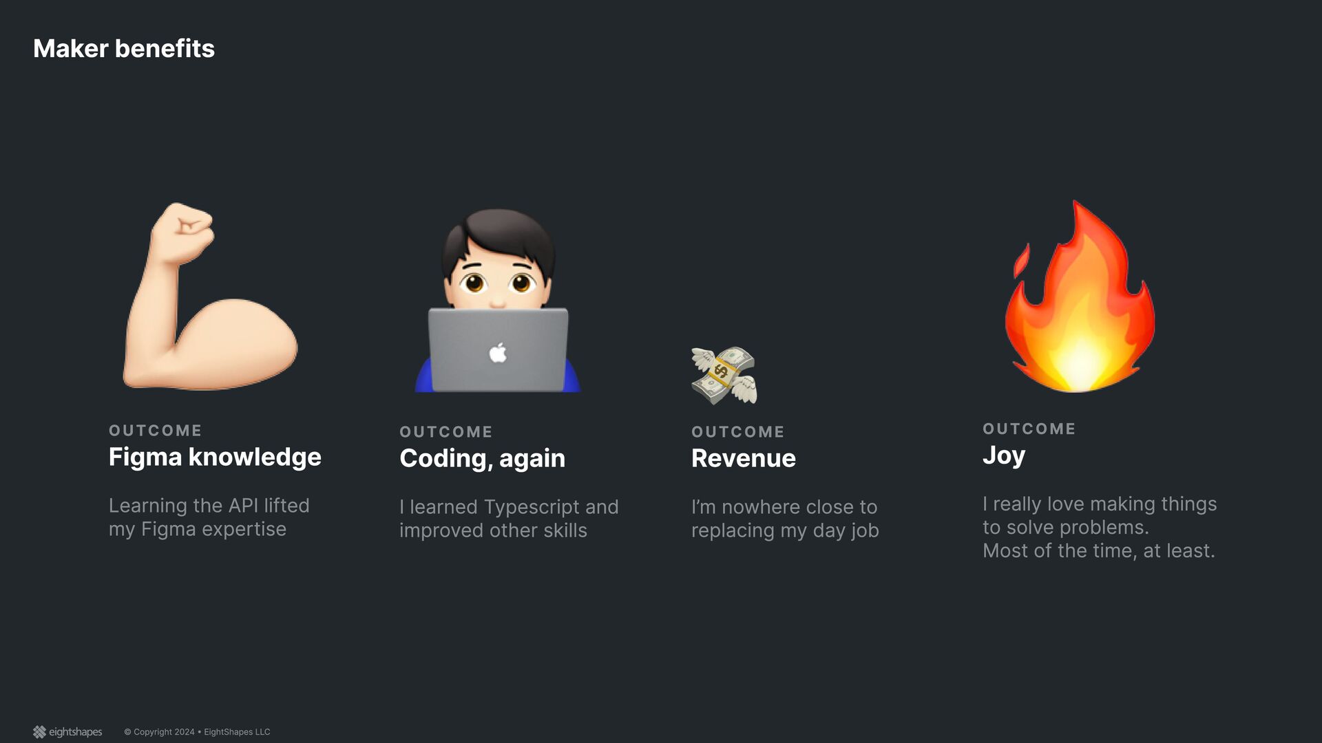
the API lifted my Figma expertise Figma knowledge OUTCOME I learned Typescript and improved other skills Coding, again OUTCOME I’m nowhere close to replacing my day job Revenue OUTCOME I really love making things to solve problems. Most of the time, at least. Joy
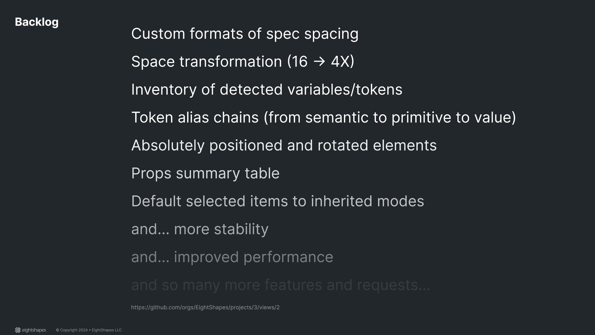
spec spacing Space transformation (16 -> 4X) Inventory of detected variables/tokens Token alias chains (from semantic to primitive to value) https://github.com/orgs/EightShapes/projects/3/views/2
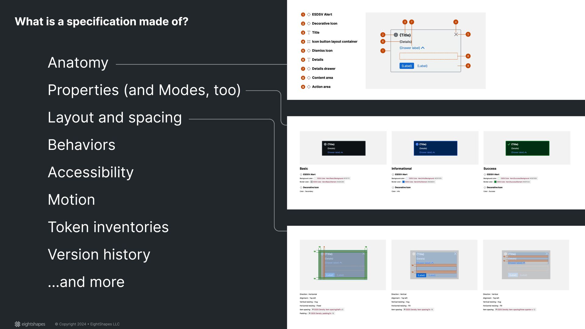
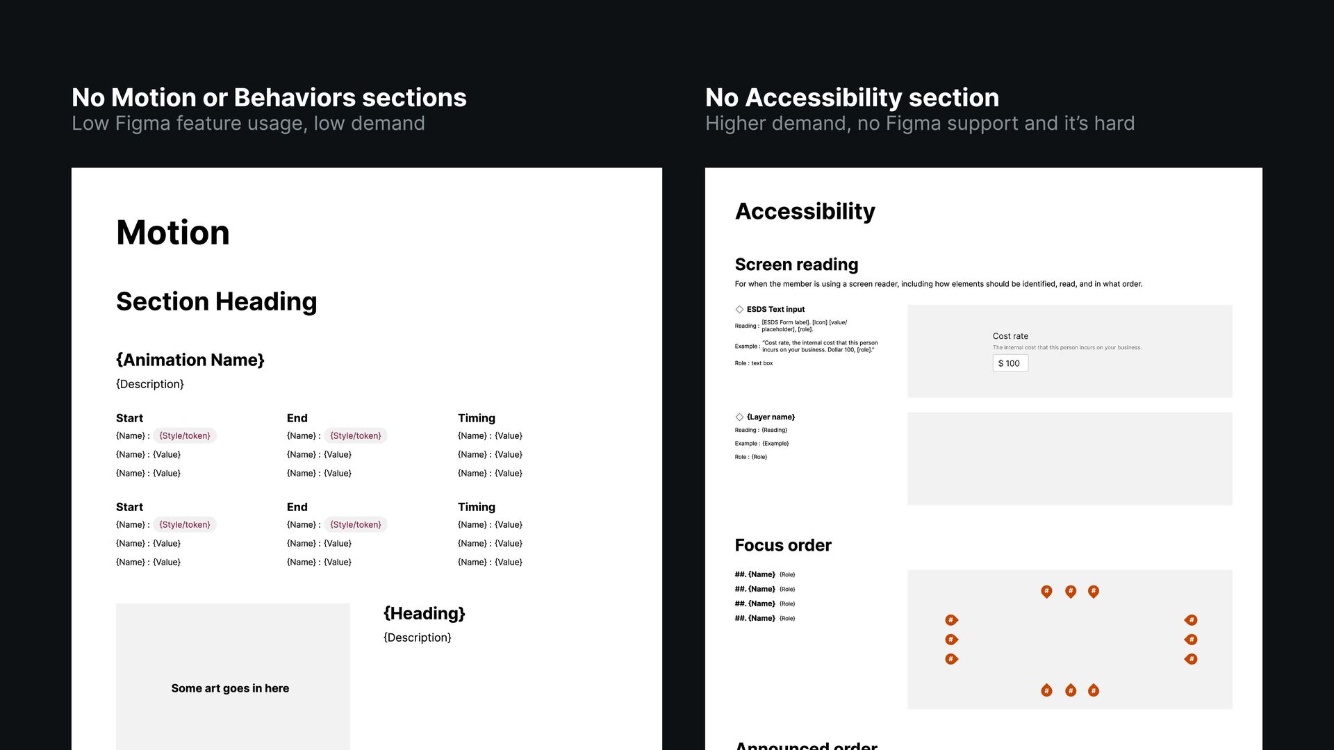
{Name} : {Value} {Name} : {Value} End {Name} : {Style/token} {Name} : {Value} {Name} : {Value} Timing {Name} : {Value} {Name} : {Value} {Name} : {Value} Start {Name} : {Style/token} {Name} : {Value} {Name} : {Value} End {Name} : {Style/token} {Name} : {Value} {Name} : {Value} Timing {Name} : {Value} {Name} : {Value} {Name} : {Value} Some art goes in here {Heading} {Description} Accessibility Screen reading For when the member is using a screen reader, including how elements should be identified, read, and in what order. ESDS Text input Reading : [ESDS Form label]. [Icon] [value/ placeholder], [role]. Example : “Cost rate, the internal cost that this person incurs on your business. Dollar 100, [role].” Role : text box {Layer name} Reading : {Reading} Example : {Example} Role : {Role} Focus order ##. {Name} {Role} ##. {Name} {Role} ##. {Name} {Role} ##. {Name} {Role} # # # # # # # # # # # # No Motion or Behaviors sections Low Figma feature usage, low demand No Accessibility section Higher demand, no Figma support and it’s hard
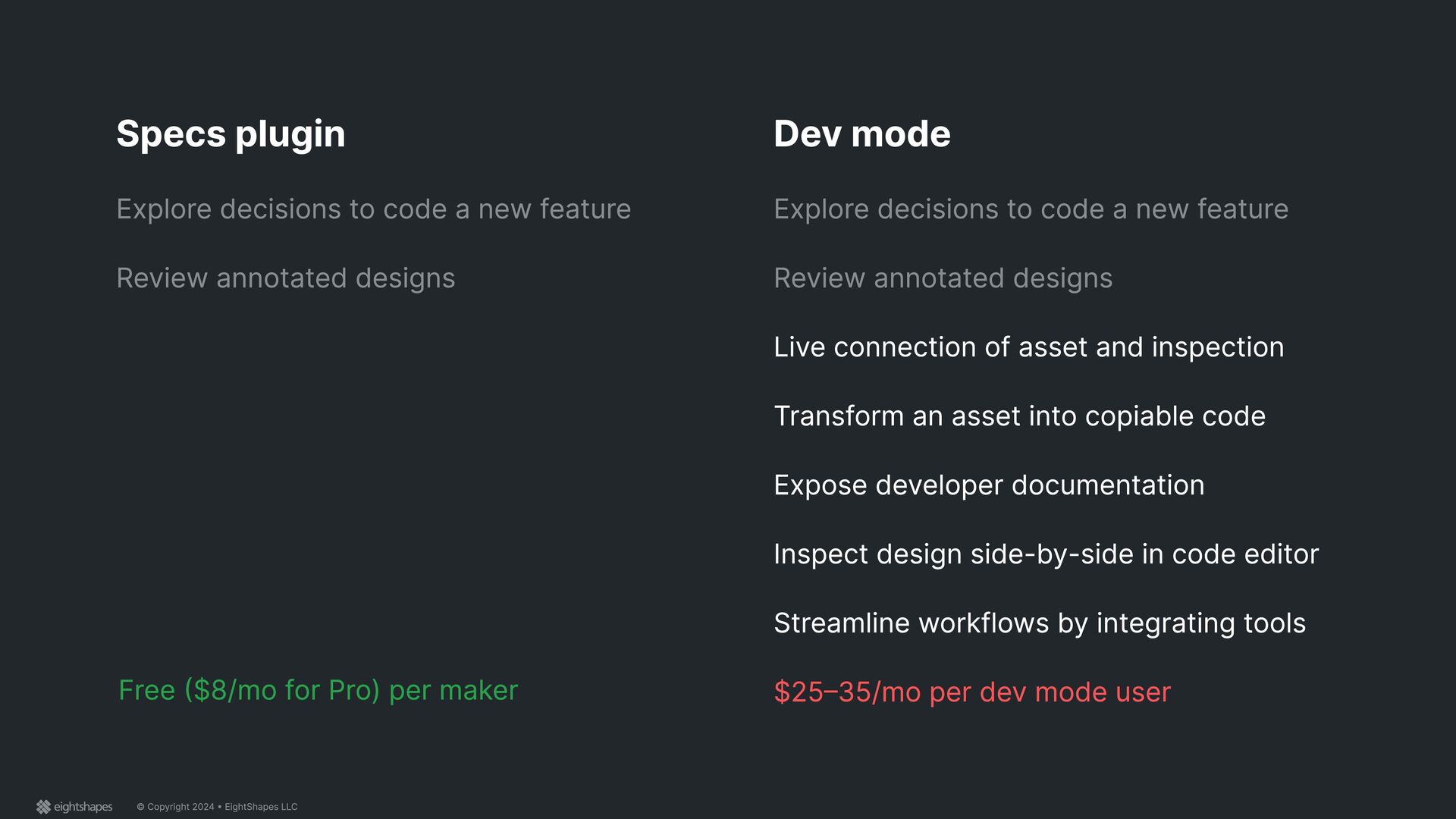
to code a new feature Review annotated designs Dev mode Explore decisions to code a new feature Review annotated designs Live connection of asset and inspection Transform an asset into copiable code Expose developer documentation Inspect design side-by-side in code editor Streamline workflows by integrating tools $25–35/mo per dev mode user Free ($8/mo for Pro) per maker
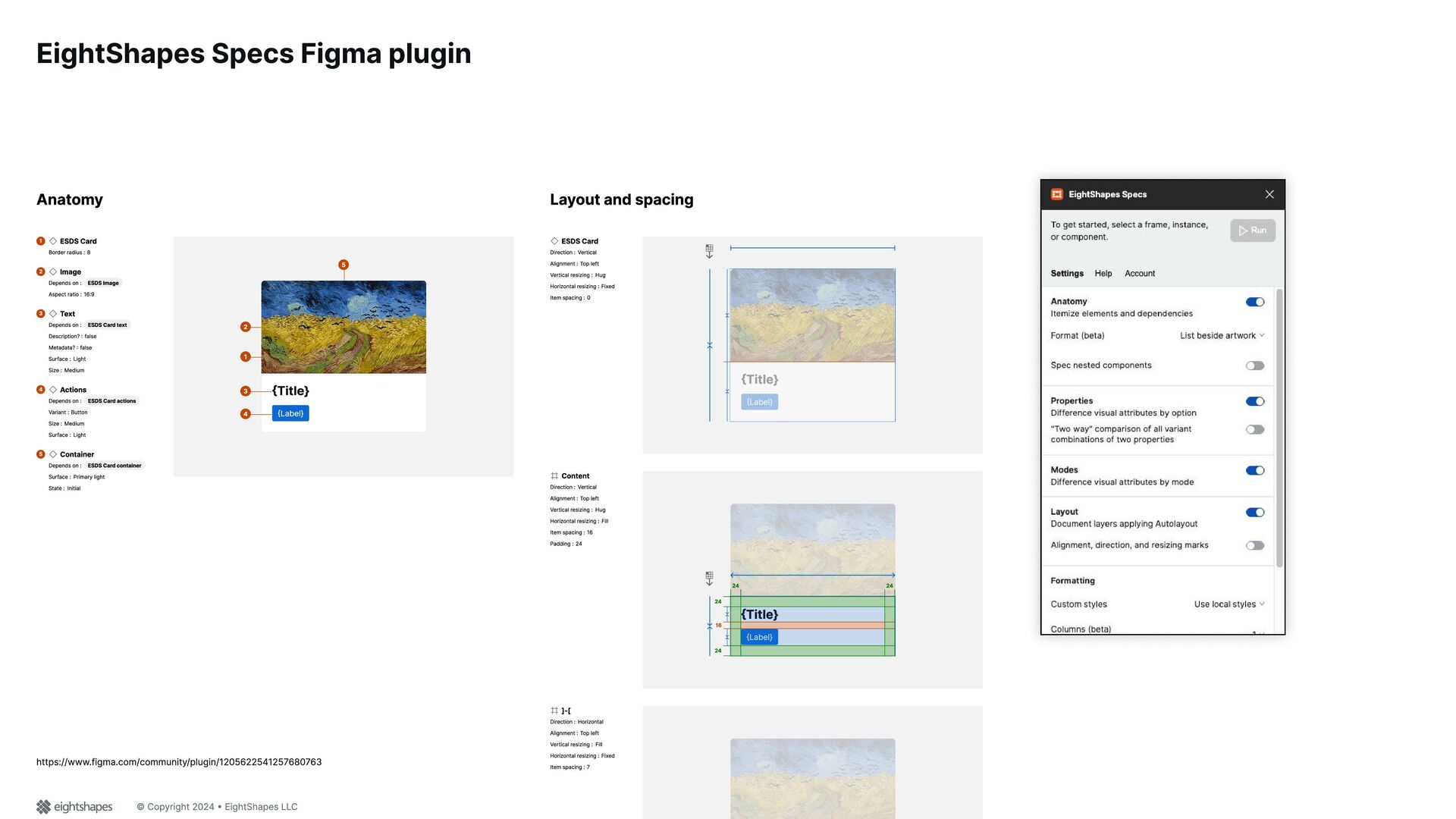
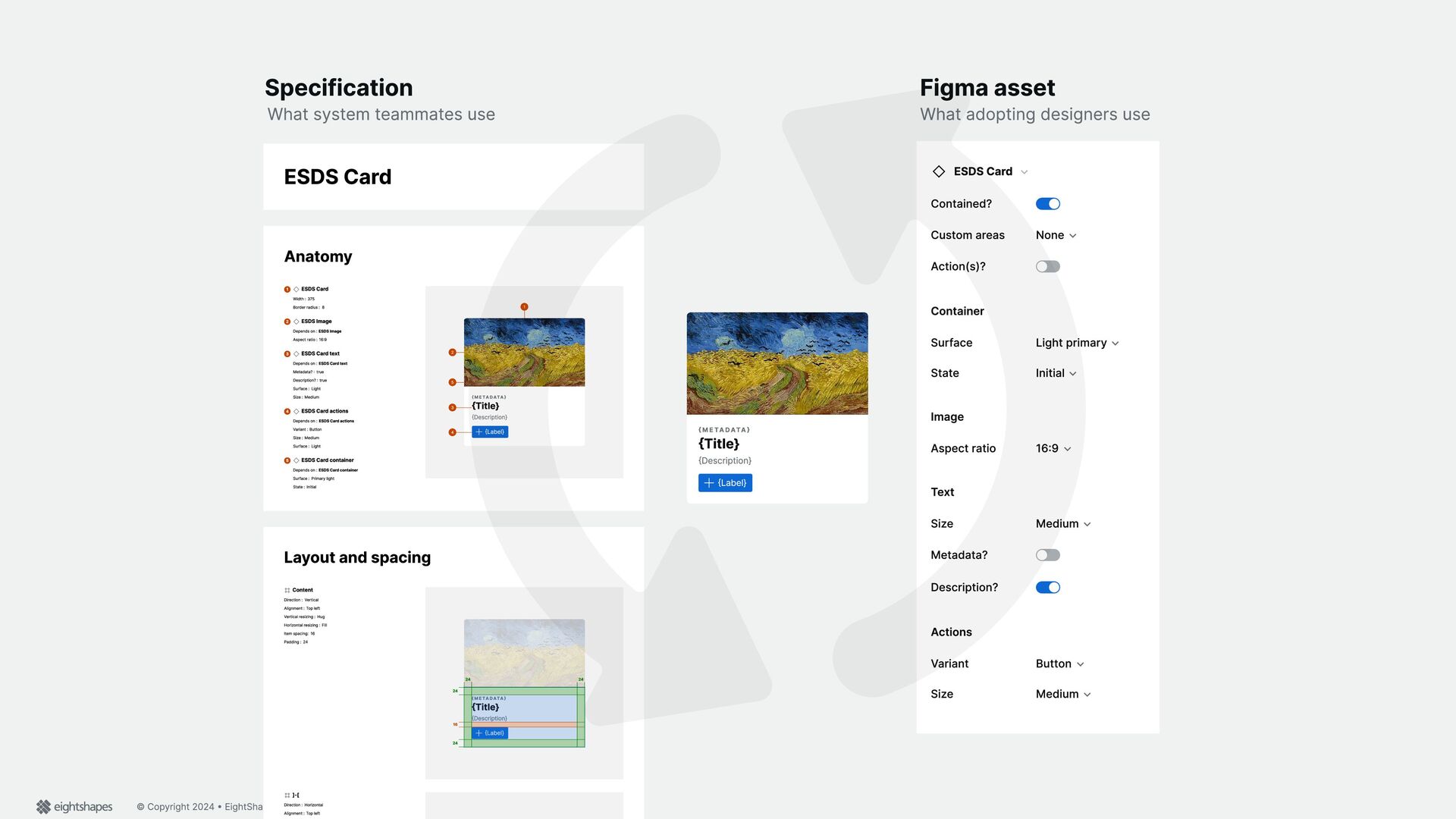
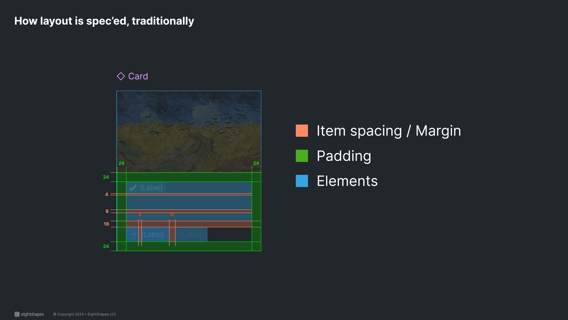
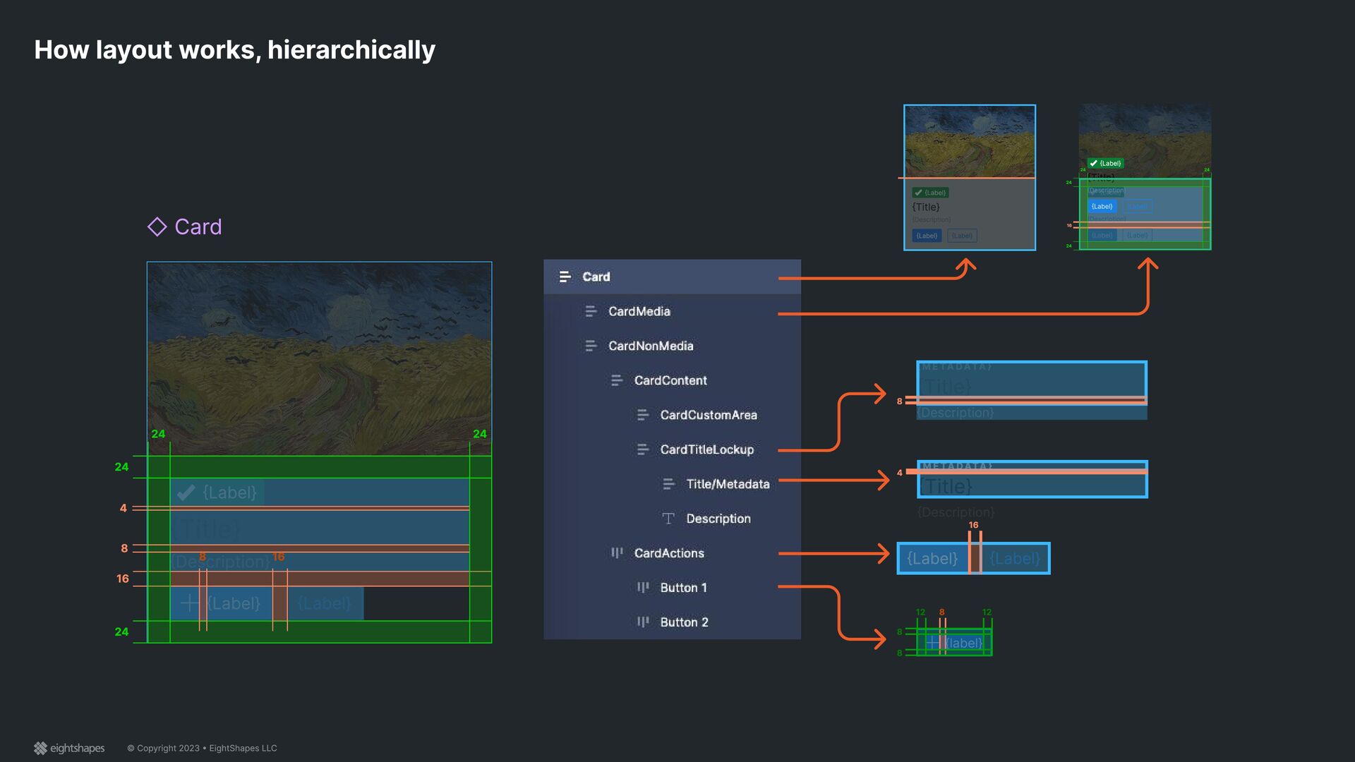
Card Contained? Custom areas None Action(s)? Container Surface Light primary State Initial Image Aspect ratio 16:9 Text Size Medium Metadata? Description? Actions Variant Button Size Medium ESDS Card Anatomy ESDS Card 1 Width : 375 Border radius : 8 ESDS Image 2 Depends on : ESDS Image Aspect ratio : 16:9 ESDS Card text 3 Depends on : ESDS Card text Metadata? : true Description? : true Surf ace : Light Siz e : Medium ESDS Card actions 4 Depends on : ESDS Card actions V ariant : Button Siz e : Medium Surf ace : Light ESDS Card container 5 Depends on : ESDS Card container Surf ace : P rim ary l ight State : I nitial { M e t a d a t a } {T itl e} { Description} { Lab el} 1 2 3 4 5 L ayou t and spacing Content Direction : V ertical Al ignm ent : T op l ef t V ertical resiz ing : H ug H oriz ontal resiz ing : F ill I tem spacing: 16 P adding : 24 { M e t a d a t a } {T itl e} { Description} { Lab el} { M e t a d a t a } {T itl e} { Description} { Lab el} 16 24 24 24 24 ]-[ Direction : H oriz ontal Al ignm ent : T op l ef t What system teamm ates use What adopting designers use { M e t a d a t a } {T itl e} { Description} { Lab el}
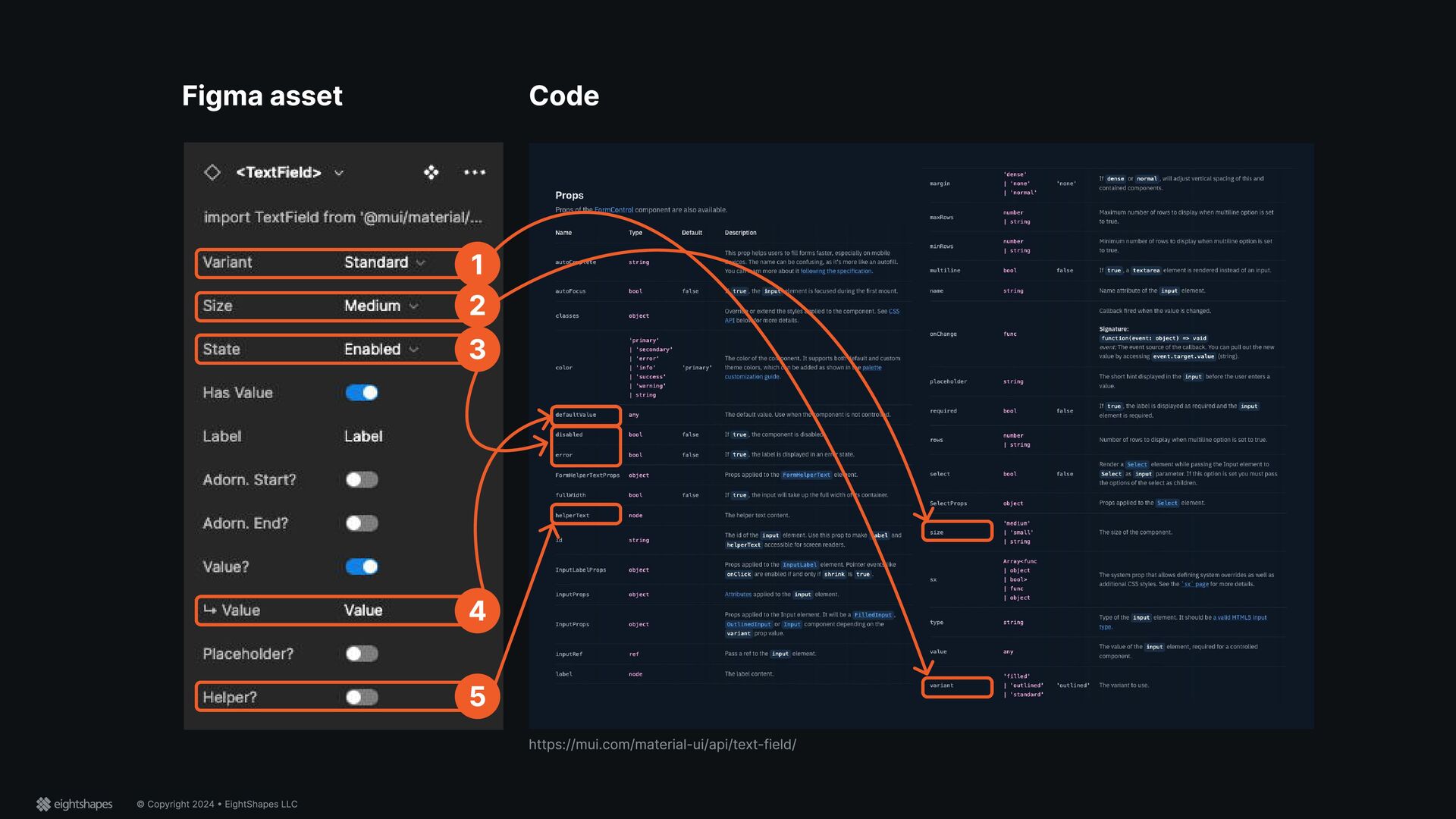
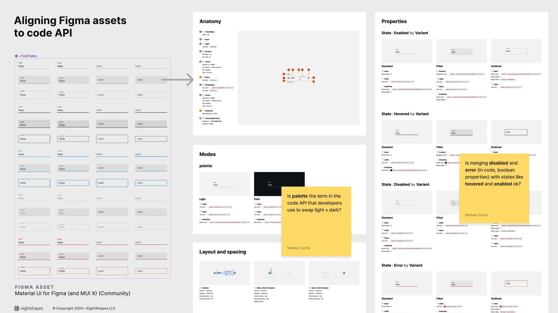
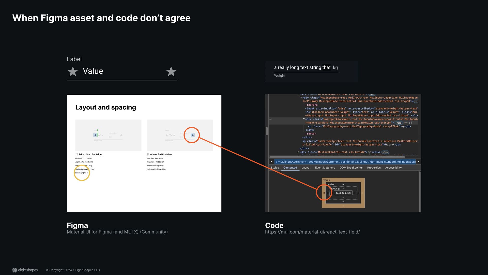
code API Anatomy <TextField> 1 Width : 220 Input 2 Label 3 Text style : input/label Content 4 Min height : 24 Min width : 24 <Icon> 5 Depends on : <Icon> Icon Instance : <Instance name> Size : Medium Type : SVG Icon Value 6 Text style : input/value Placeholder 7 Text color : palette text/disabled #000000, 38% Text style : input/value <Icon> 8 Depends on : <Icon> Icon Instance : <Instance name> Size : Medium Type : SVG Icon Underline 9 Stroke alignment : Center <FormHelperText> 10 Depends on : <FormHelperText> Disabled : Enabled Label Value Placehol der H elp er t ext 1 2 3 4 5 6 7 8 9 1 0 Properties State : Enabled by Variant Label Value Standard Input B order radius : 0 Label Text color : palette text/secondary #000000, 6 0% Underline B order color : palette _ components/input/standard/enabledB order #000000, 42% B order weight : 1 Label Value Filled Content B ackground color : palette _ components/input/f illed/enabledF ill #000000, 6 % Label Text color : palette text/secondary #000000, 6 0% Value Text color : palette text/primary #000000, 87 % Underline B order color : palette _ components/input/standard/enabledB order #000000, 42% B order weight : 1 Value Label O utlined Input B order color : palette _ components/input/outlined/enabledB order #000000, 23% B order weight : 1 B order radius : shape borderR adius 4 Value Text color : palette text/primary #000000, 87 % State : Hov ered by Variant Label Value Standard Input B order radius : 0 Label Text color : palette text/secondary #000000, 6 0% Underline B order color : palette _ components/input/standard/hoverB order #000000 Label Value Filled Content B ackground color : palette _ components/input/f illed/hoverF ill #000000, 9 % Underline B order color : palette _ components/input/standard/hoverB order #000000 B order weight : 2 Value Label O utlined Input B order color : palette _ components/input/outlined/hoverB order #000000 B order weight : 1 B order radius : shape borderR adius 4 Label Text color : palette text/secondary #000000, 6 0% State : Disabled by Variant Label Value Standard Input B order radius : 0 Label Text color : palette text/disabled #000000, 38% Value Text color : palette text/disabled #000000, 38% Underline B order color : palette _ components/input/standard/enabledB order #000000, 42% B order weight : 1 Label Value Filled Label Text color : palette text/disabled #000000, 38% Value Text color : palette text/disabled #000000, 38% Value Label O utlined Input B order color : palette _ components/input/outlined/enabledB order #000000, 23% B order weight : 1 B order radius : shape borderR adius 4 Value Text color : palette text/disabled #000000, 38% Label Text color : palette text/disabled #000000, 38% State : Error by Variant Label Value Standard Input B order radius : 0 Label Label Value Filled Label Text color : palette error/main #D32F 2F Underline Value Label O utlined Input B order color : palette error/main #D32F 2F B order weight : 1 B order radius : shape borderR adius 4 Modes palette Label Value Light Label Text color : palette text/secondary #000000, 6 0% Value Text color : palette text/primary #000000, 87 % Underline B order color : palette _ components/input/standard/enabledB order #000000, 42% Label Value Dark Label Text color : palette text/secondary #FFFFFF , 7 0% Value Text color : palette text/primary #FFFFFF Underline B order color : palette _ components/input/standard/enabledB order #FFFFFF , 42% Layout and spacing Label Value Placehol der H elp er t ext Value Placehol der Content Direction : Horizontal Alignment : Middle lef t Vertical resizing : Hug Horizontal resizing : F ill Label Value Placehol der H elp er t ext 8 Adorn. Start Container Direction : Horizontal Alignment : Middle lef t Vertical resizing : Hug Horizontal resizing : Hug Padding right: 8 Label Value Placehol der H elp er t ext Adorn. End Container Direction : Horizontal Alignment : Middle lef t Vertical resizing : Hug Horizontal resizing : Hug FIG MA As s e t Material UI f or F igma (and MUI X) (Community) Is merging disabled and error (in code, boolean properties) with states like hov ered and enabled ok? Nathan Curtis Is palette the term in the code API that developers use to swap light v dark? Nathan Curtis
• EightShapes LLC Figma Material UI for Figma (and MUI X) (Community) Code https://mui.com/material-ui/react-text-field/ Layout and spacing Label Value Placehol der Helper text 8 Adorn. Start Container Direction : Horizontal Alignment : Middle left Vertical resizing : Hug Horizontal resizing : Hug Padding right: 8 Label Value Placehol der Helper text Adorn. End Container Direction : Horizontal Alignment : Middle left Vertical resizing : Hug Horizontal resizing : Hug Label Value
{Label} 16 24 24 24 24 8 4 8 16 Card How layout works, hierarchically { M e ta data } {Title} {Description} { M e ta data } {Title} 4 {label} {label} 8 8 8 12 12 {Label} {Label} {Label} {Label} 16 {Label} {Title} {Description} {Label} {Label} {Label} {Title} {Description} {Label} {Label} { M e ta data } {Title} {Description} { M e ta data } {Title} {Description} 8 {Label} {Title} {Description} {Label} {Label} {Label} {Title} {Description} {Label} {Label} 16 24 24 24 24
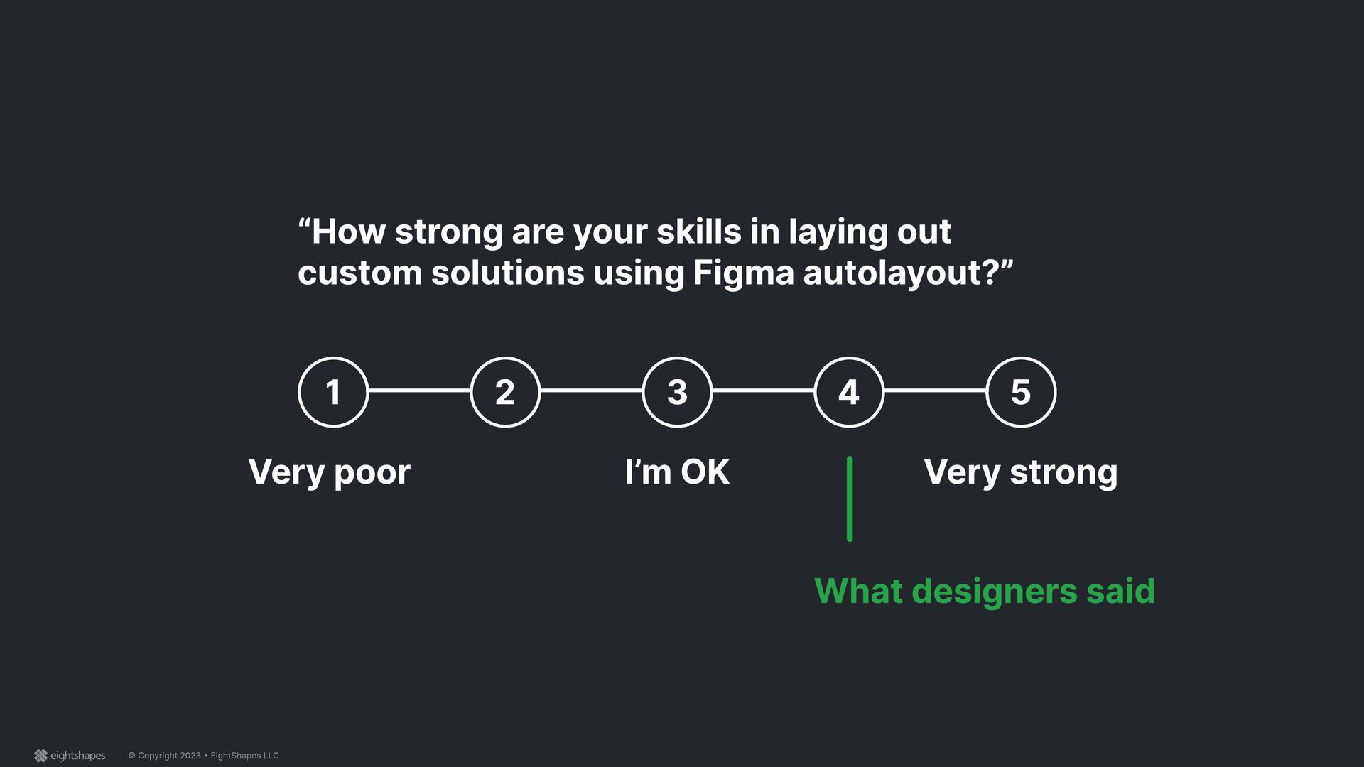
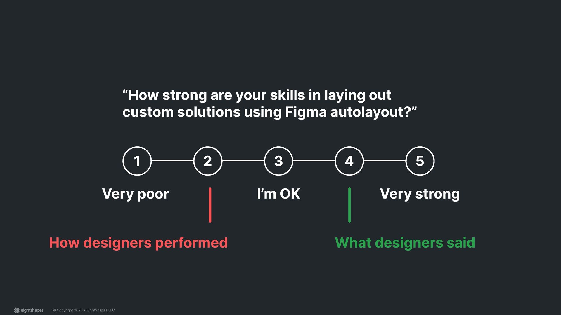
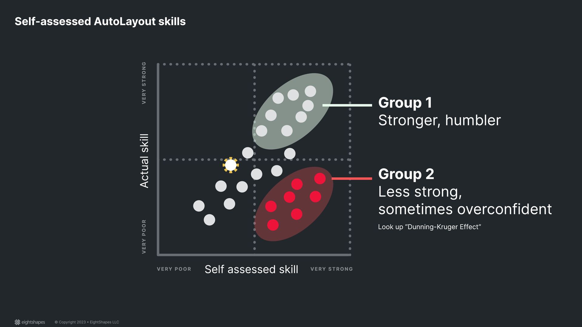
up “Dunning-Kruger Effect” Actual skill VERY STRONG VERY POOR VERY POOR VERY STRONG Group 1 Stronger, humbler Group 2 Less strong, sometimes overconfident Self-assessed AutoLayout skills
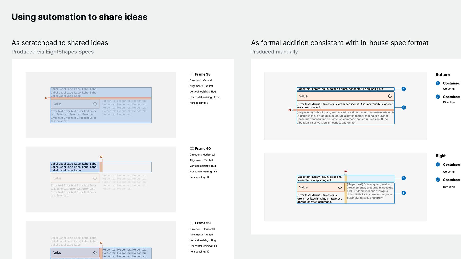
ideas As scratchpad to shared ideas Produced via EightShapes Specs Produced manually As formal addition consistent with in-house spec format Label Label Label Label Label Label Label Label Label Label Label Label Label Label Label Label Value Error text Error text Error text Error text Error text Error text Error text Error text Error text Error text Error text Error text Helper text Helper text Helper text Helper text Helper text Helper text Helper text Helper text Helper text Helper text Helper text Helper text Helper text Helper text Label Label Label Label Label Label Label Label Label Label Label Label Label Label Label Label Value Error text Error text Error text Error text Error text Error text Error text Error text Error text Error text Error text Error text Helper text Helper text Helper text Helper text Helper text Helper text Helper text Helper text Helper text Helper text Helper text Helper text Helper text Helper text 8 Frame 38 Direction : Vertical Alignment : Top left Vertical resizing : Hug Horizontal resizing : Fixed Item spacing: 8 Label Label Label Label Label Label Label Label Label Label Label Label Label Label Label Label Value Error text Error text Error text Error text Error text Error text Error text Error text Error text Error text Error text Error text Helper text Helper text Helper text Helper text Helper text Helper text Helper text Helper text Helper text Helper text Helper text Helper text Helper text Helper text Label Label Label Label Label Label Label Label Label Label Label Label Label Label Label Label 12 Frame 40 Direction : Horizontal Alignment : Top left Vertical resizing : Hug Horizontal resizing : Fill Item spacing: 12 Label Label Label Label Label Label Label Label Label Label Label Label Label Label Label Label Value Helper text Helper text Helper text Helper text Helper text Helper text Helper text Helper text Helper text Value Helper text Helper text Helper text Helper text Helper text Helper text Helper text Helper text Helper text 12 Frame 39 Direction : Horizontal Alignment : Top left Vertical resizing : Hug Horizontal resizing : Fill Item spacing: 12 {Label text} Lorem ipsum dolor sit amet, consectetur adipiscing elit Value {Error text} Mauris ultrices quis lorem nec iaculis. Aliquam faucibus laoreet leo vitae commodo. {Helper text} Duis aliquam, erat ac varius efficitur, erat urna malesuada nibh, ut dapibus lacus eros quis dolor. Nulla luctus tempor magna at pulvinar. Phasellus hendrerit laoreet ante, ac commodo sapien ultrices ac. Nunc bibendum risus vestibulum consequat tempor. 2 1 2X Bottom 1 Container: L Columns 2 Container: [ Direction {Label text} Lorem ipsum dolor sita, consectetur adipiscing elit Value {Error text} Mauris ultrices quis lorem nec iaculis. Aliquam faucibus laoreet leo vitae commodo. {Helper text} Duis aliquam, erat ac varius efficitur, erat urna malesuada nibh, ut dapibus lacus eros quis dolor. Nulla luctus tempor magna at pulvinar. Phasellus hendrerit 2 1 3X Right 1 Container: L Columns 2 Container: [ Direction
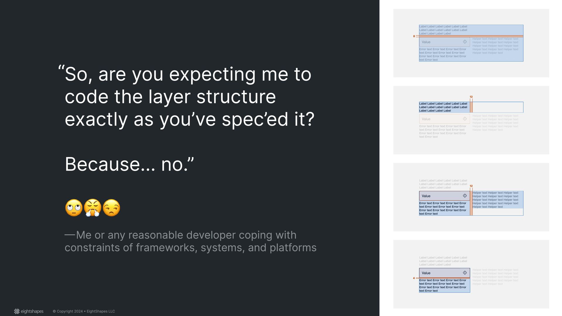
me to code the layer structure exactly as you’ve spec’ed it? Because... no.” — Me or any reasonable developer coping with constraints of frameworks, systems, and platforms Label Label Label Label Label Label Label Label Label Label Label Label Label Label Label Label Value Error text Error text Error text Error text Error text Error text Error text Error text Error text Error text Error text Error text Helper text Helper text Helper text Helper text Helper text Helper text Helper text Helper text Helper text Helper text Helper text Helper text Helper text Helper text Label Label Label Label Label Label Label Label Label Label Label Label Label Label Label Label Value Error text Error text Error text Error text Error text Error text Error text Error text Error text Error text Error text Error text Helper text Helper text Helper text Helper text Helper text Helper text Helper text Helper text Helper text Helper text Helper text Helper text Helper text Helper text 8 Label Label Label Label Label Label Label Label Label Label Label Label Label Label Label Label Value Error text Error text Error text Error text Error text Error text Error text Error text Error text Error text Error text Error text Helper text Helper text Helper text Helper text Helper text Helper text Helper text Helper text Helper text Helper text Helper text Helper text Helper text Helper text Label Label Label Label Label Label Label Label Label Label Label Label Label Label Label Label 12 Label Label Label Label Label Label Label Label Label Label Label Label Label Label Label Label Value Error text Error text Error text Error text Error text Error text Error text Error text Error text Error text Error text Error text Helper text Helper text Helper text Helper text Helper text Helper text Helper text Helper text Helper text Helper text Helper text Helper text Helper text Helper text Value Error text Error text Error text Error text Error text Error text Error text Error text Error text Error text Error text Error text Helper text Helper text Helper text Helper text Helper text Helper text Helper text Helper text Helper text Helper text Helper text Helper text Helper text Helper text 12 Label Label Label Label Label Label Label Label Label Label Label Label Label Label Label Label Value Error text Error text Error text Error text Error text Error text Error text Error text Error text Error text Error text Error text Helper text Helper text Helper text Helper text Helper text Helper text Helper text Helper text Helper text Helper text Helper text Helper text Helper text Helper text Value Error text Error text Error text Error text Error text Error text Error text Error text Error text Error text Error text Error text 4
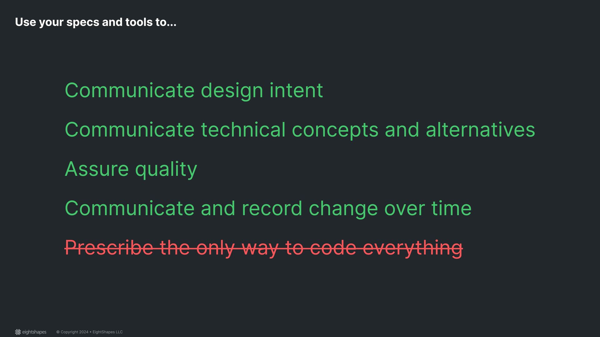
tools to... Communicate design intent Communicate technical concepts and alternatives Assure quality Communicate and record change over time Prescribe the only way to code everything
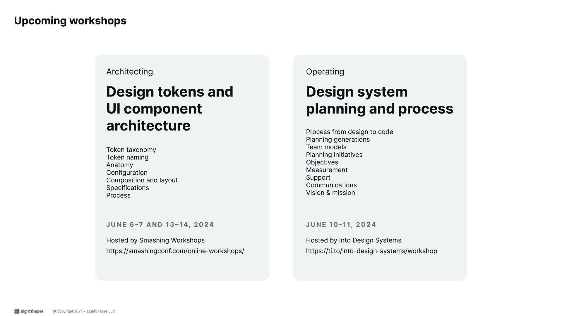
and UI component architecture Hosted by Smashing Workshops Token taxonomy Token naming Anatomy Configuration Composition and layout Specifications Process Process from design to code Planning generations Team models Planning initiatives Objectives Measurement Support Communications Vision & mission https://smashingconf.com/online-workshops/ Hosted by Into Design Systems https://ti.to/into-design-systems/workshop Design system planning and process Architecting Operating June 6–7 and 13–14, 2024 June 10-11, 2024
 nathanacurtis
 solmetts
 satosio
 mixi_design
 cyberagent_creators
 tsubura
 saka2jp
 visional_engineering_and_design
 kenichiota0711
 hideakitakechi
 securecat
 ds35mm
 vivion
 tamaranovitovic
 palkan
 pedronauck
 lauravandoore
 62gerente
 ivargrimstad
 twada
twada
 csswizardry
 gurzu
gurzu
 tmiket
 inesmontani
 cassininazir