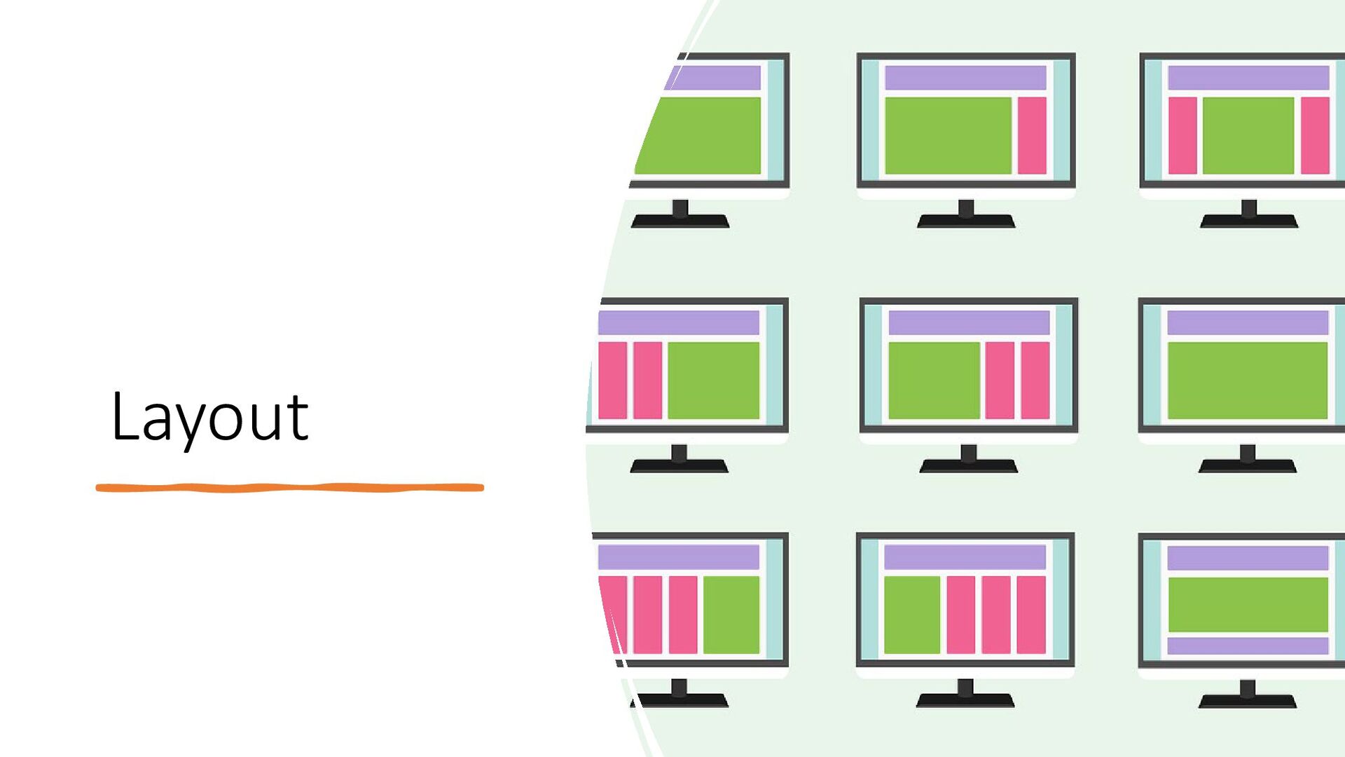
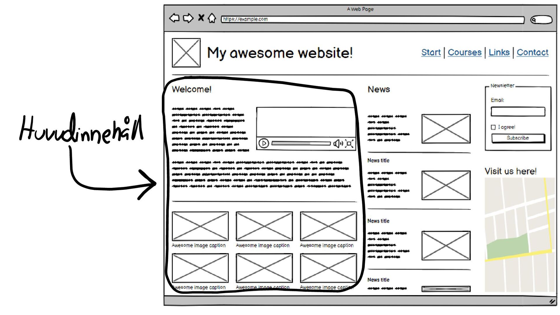
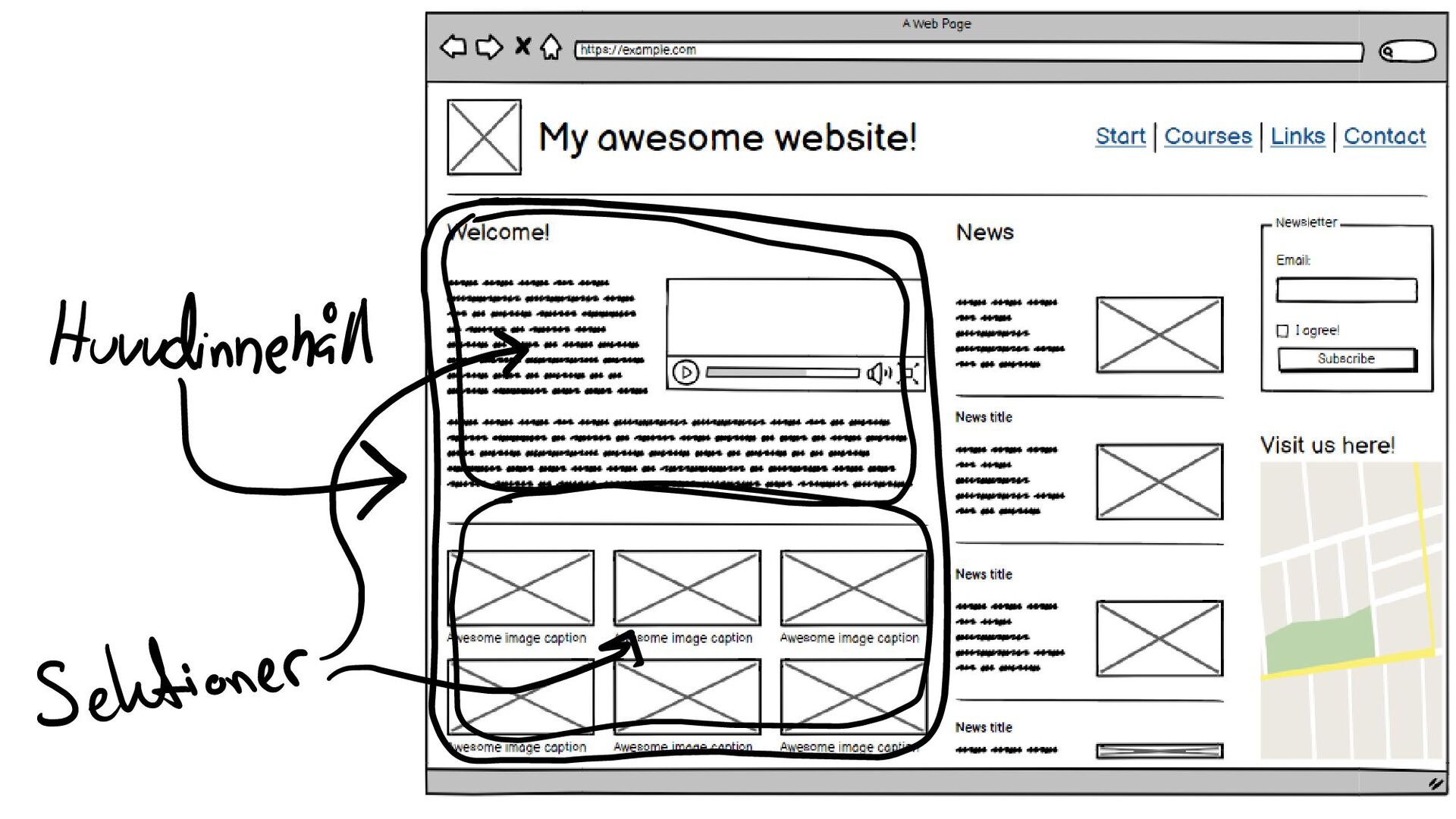
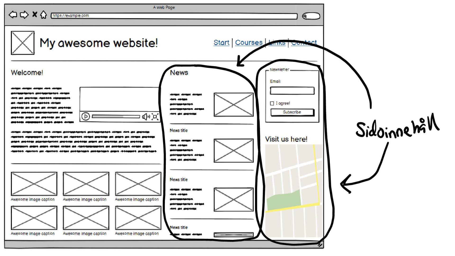
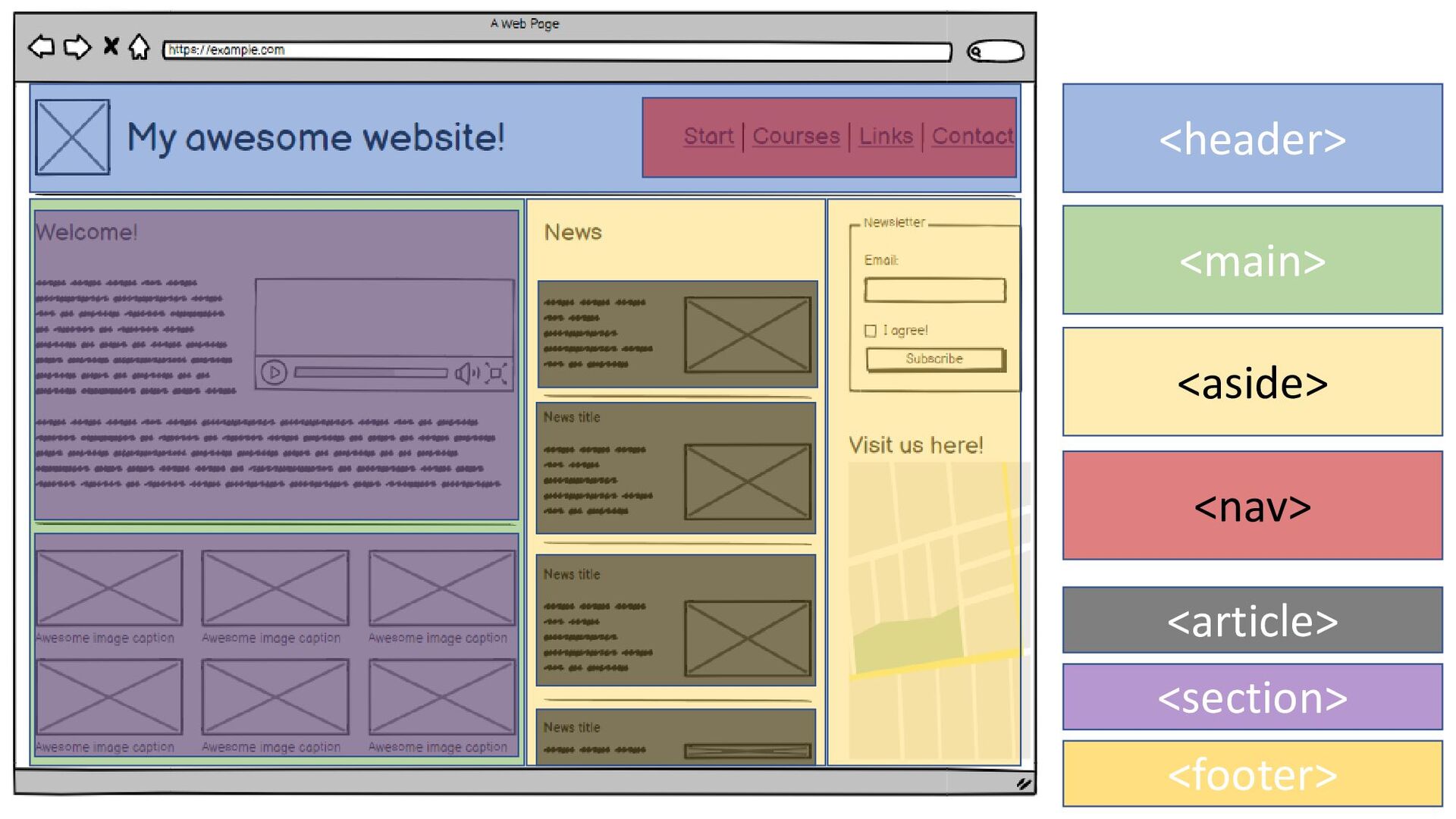
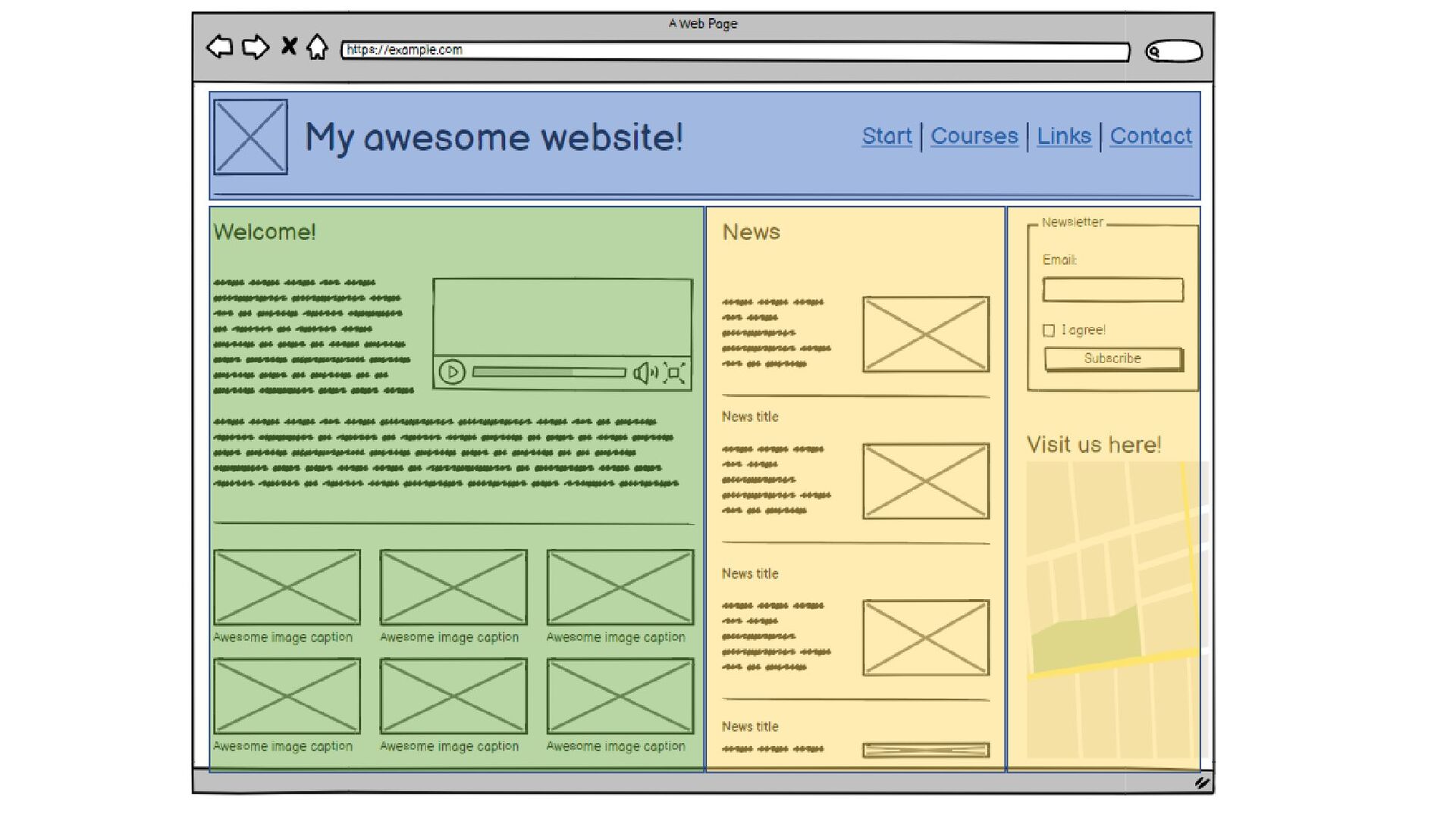
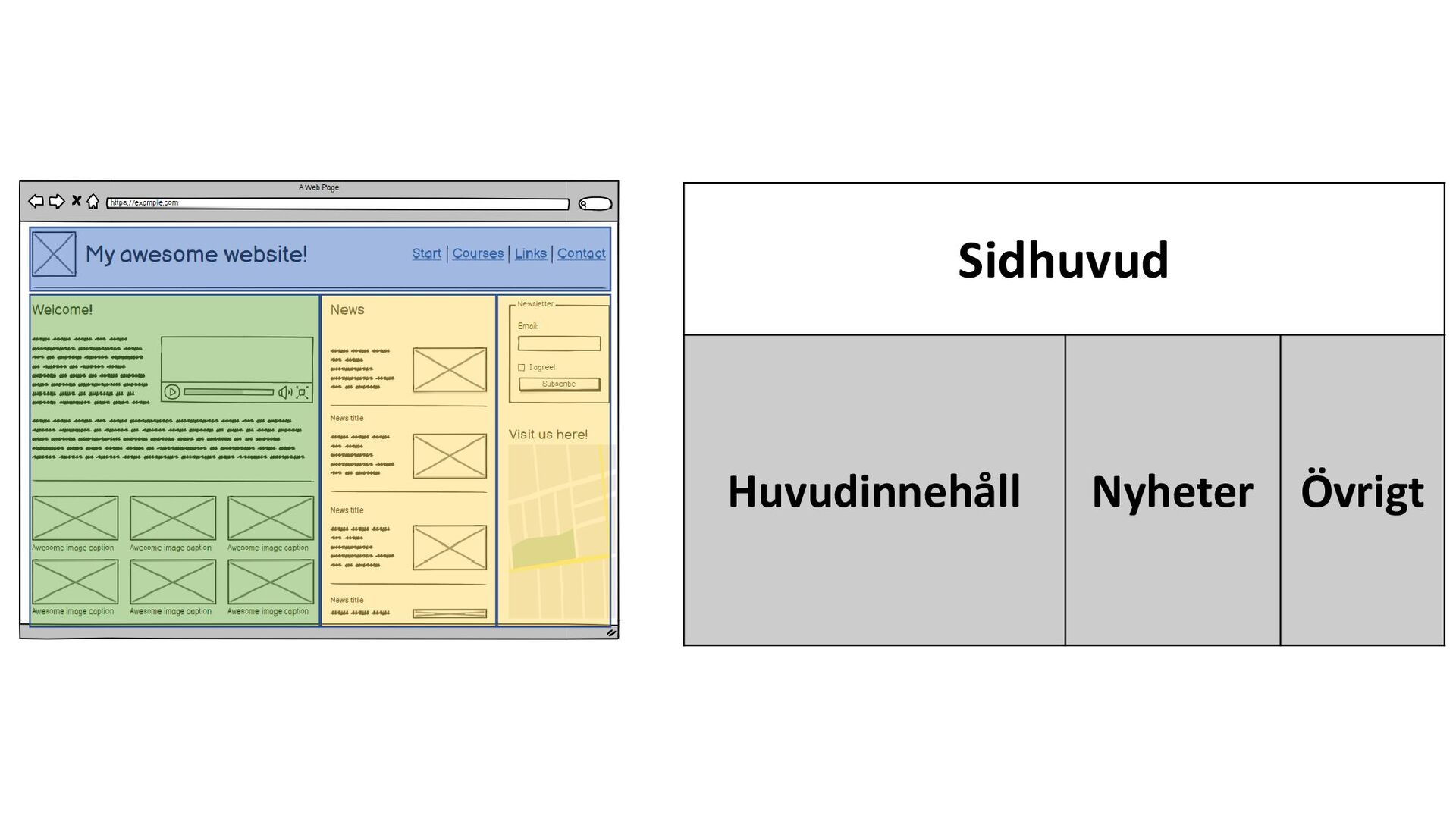
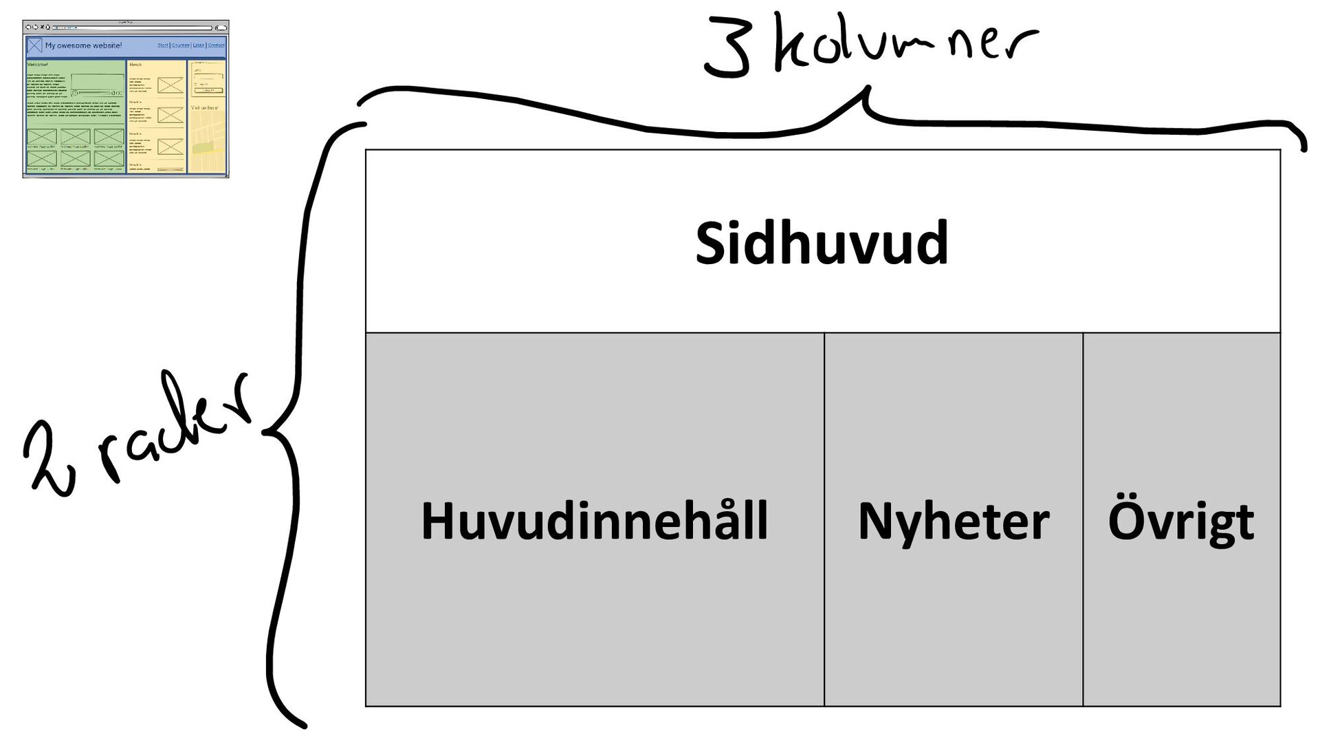
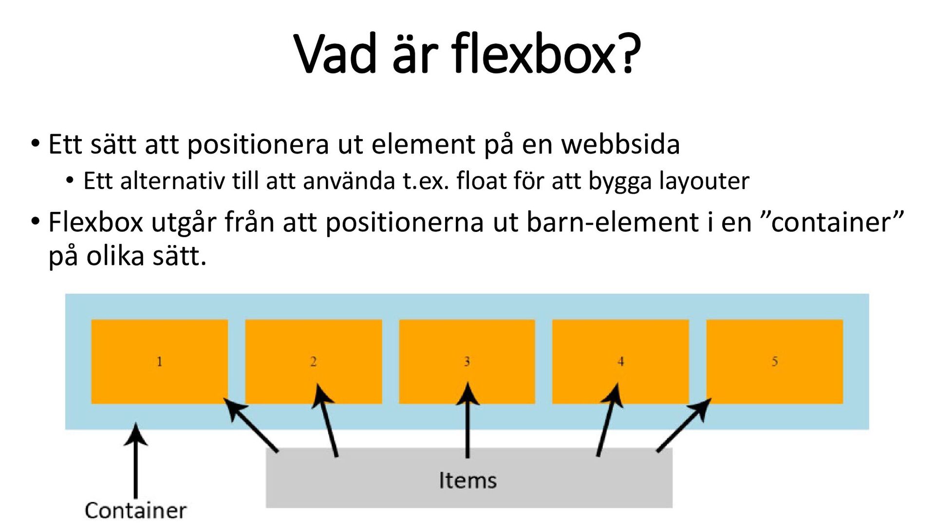
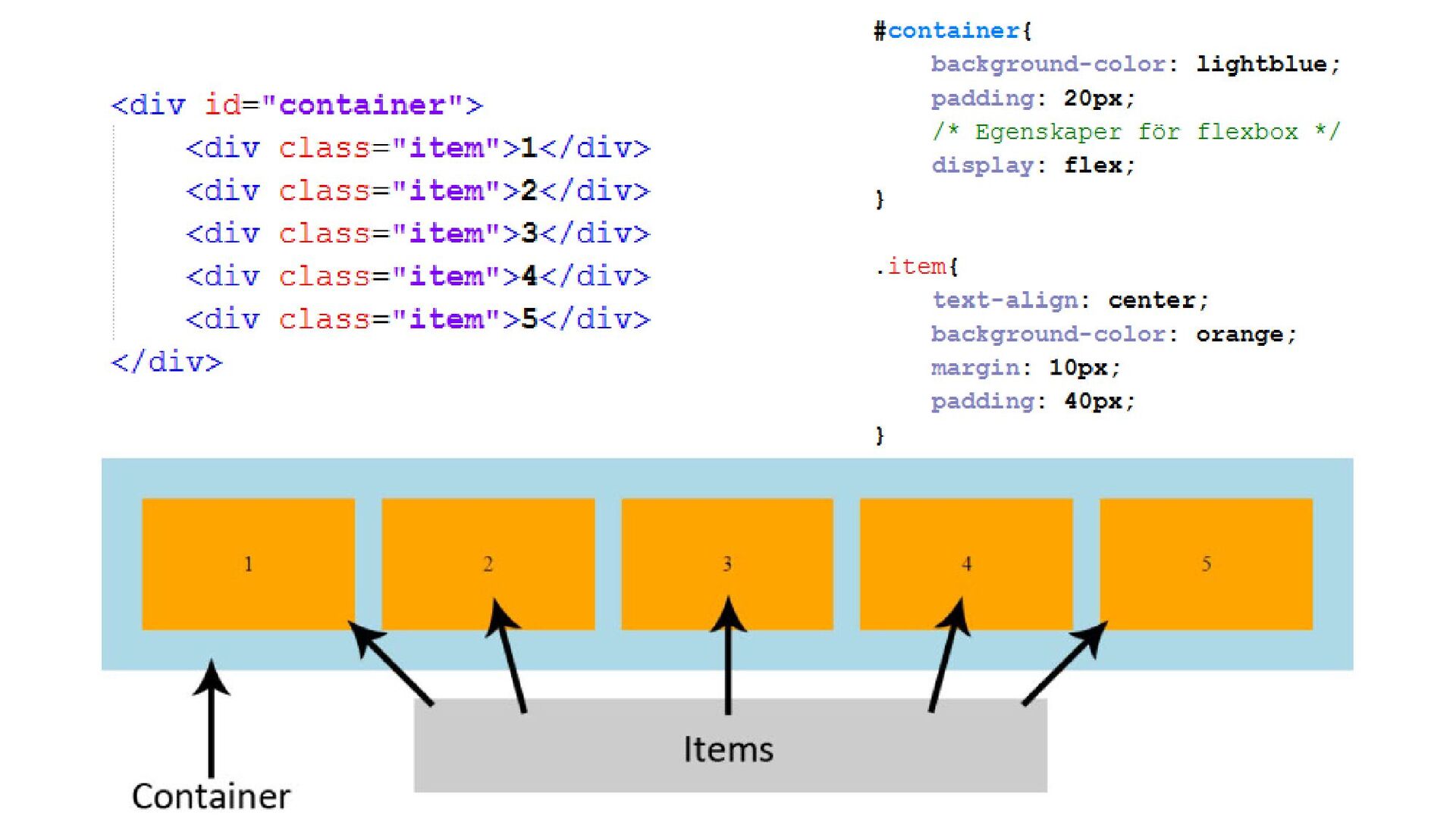
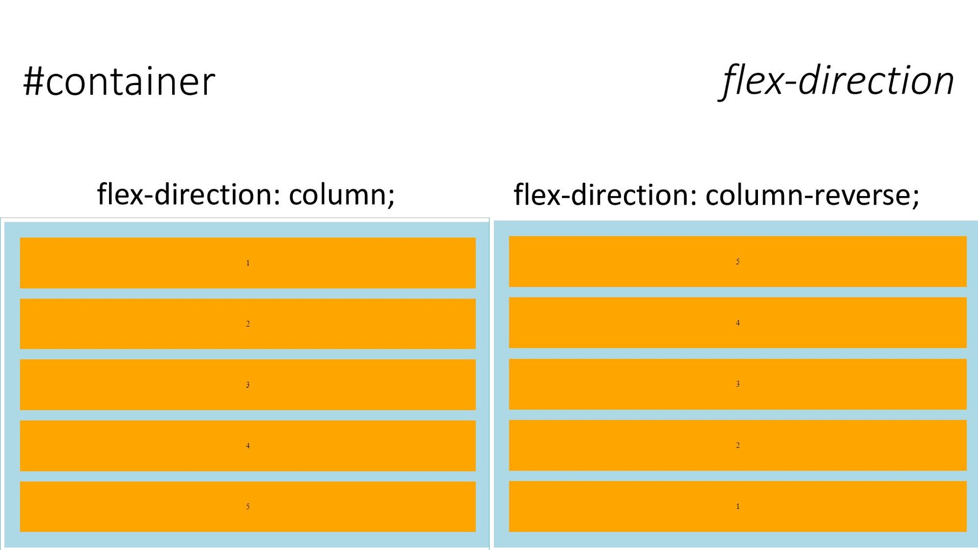
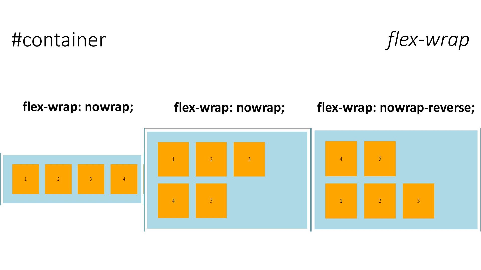
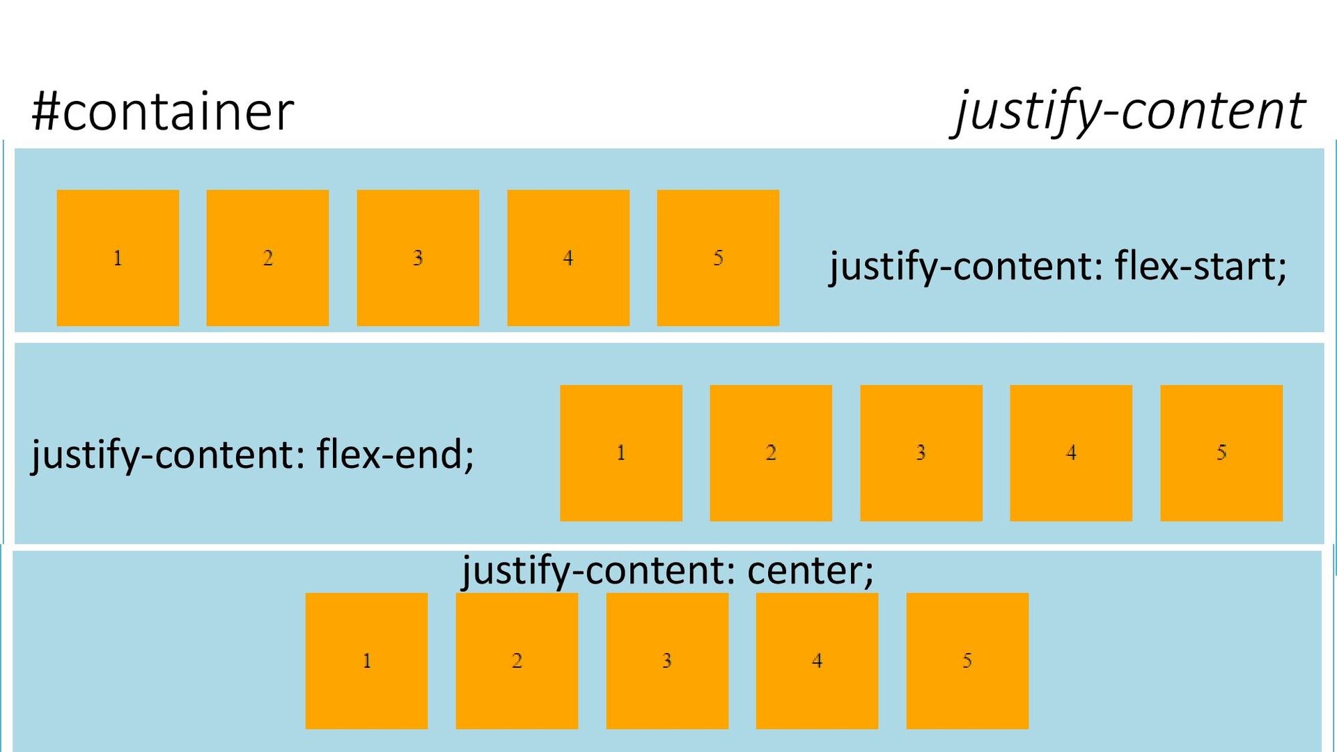
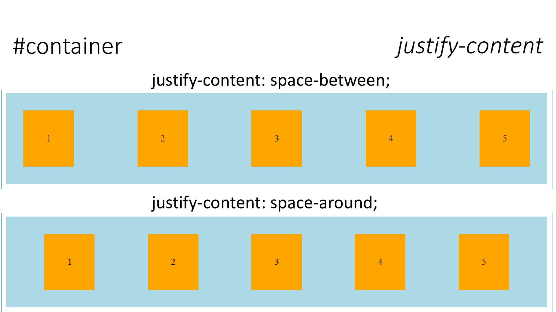
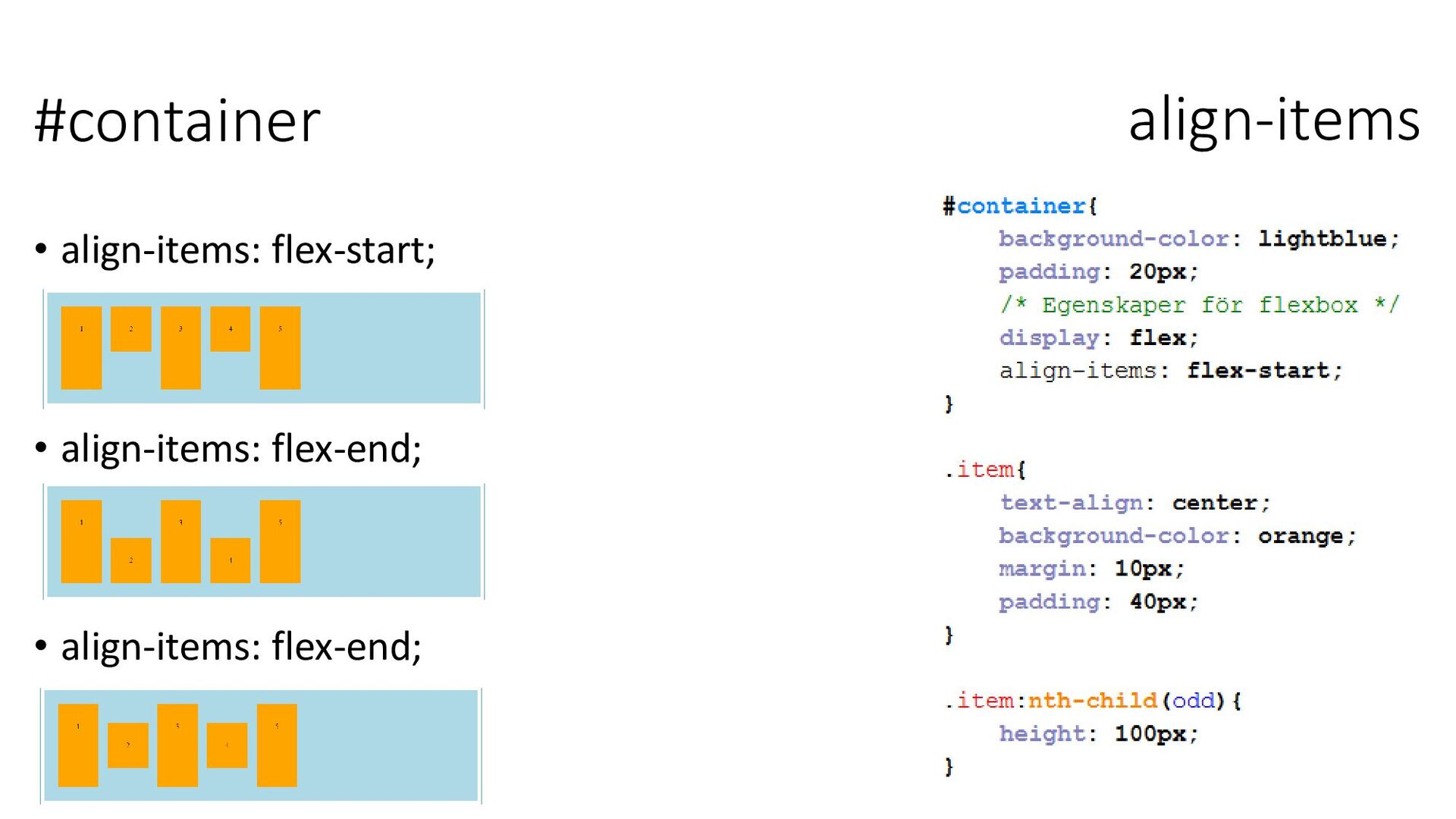
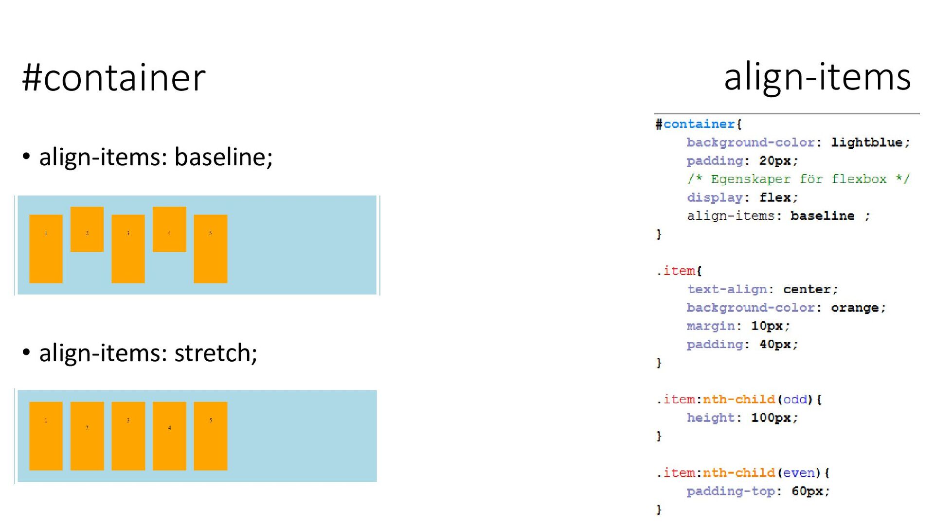
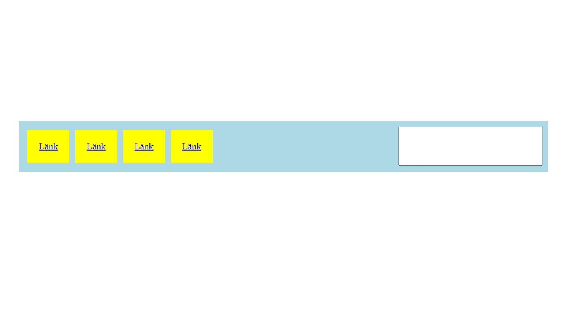
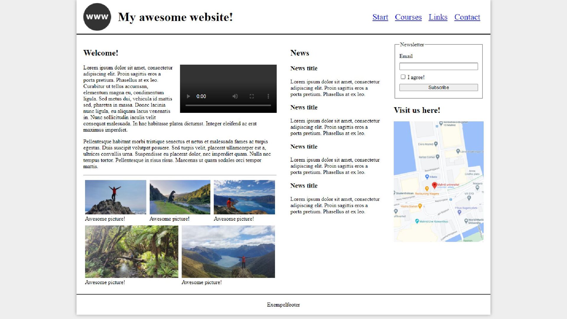
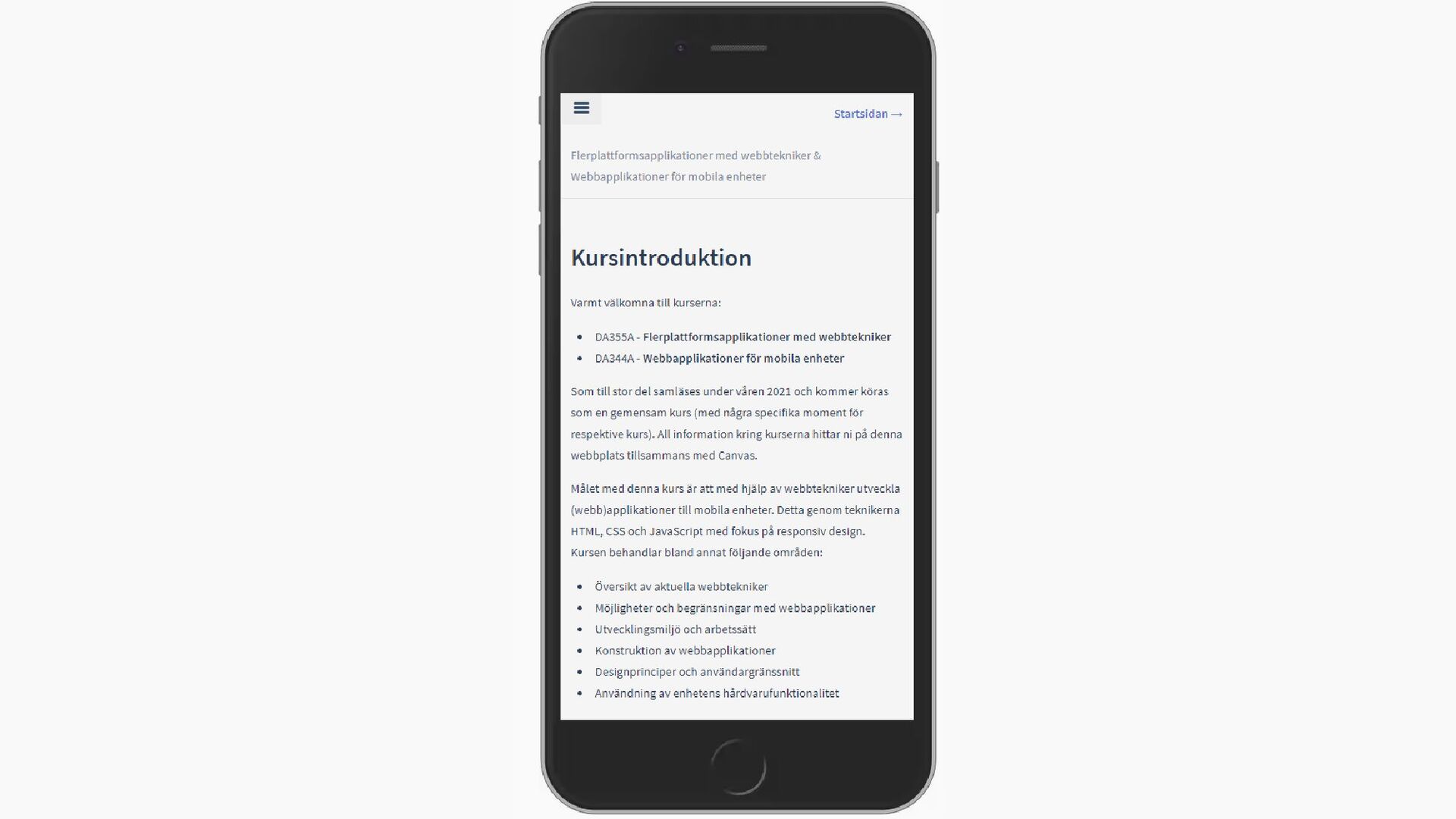
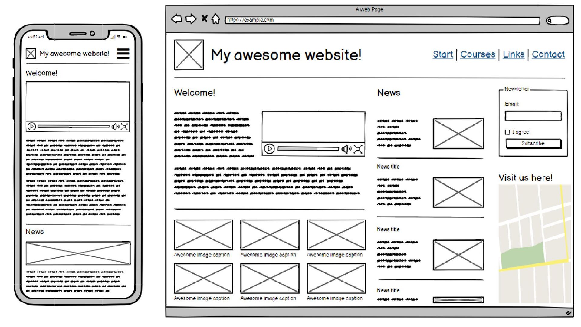
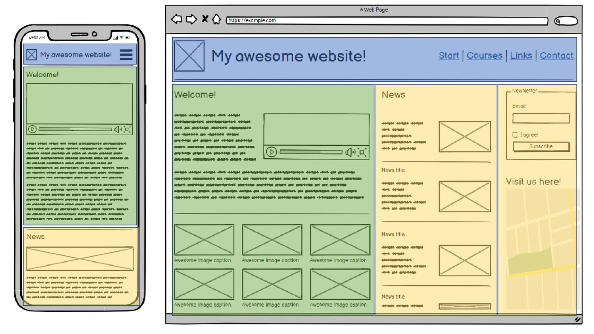
på en webbsida • Ett alternativ till att använda t.ex. float för att bygga layouter • Flexbox utgår från att positionerna ut barn-element i en ”container” på olika sätt.
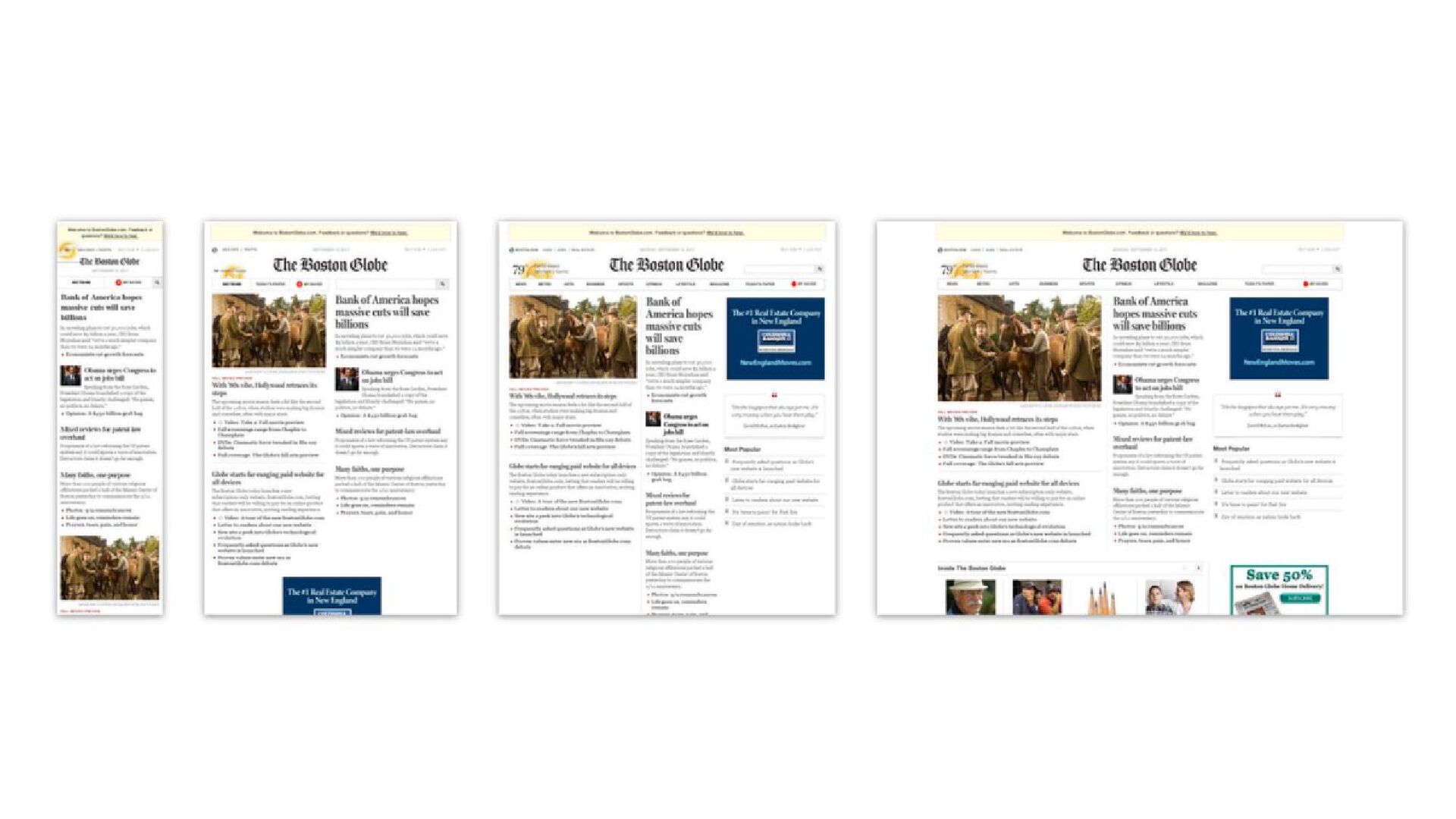
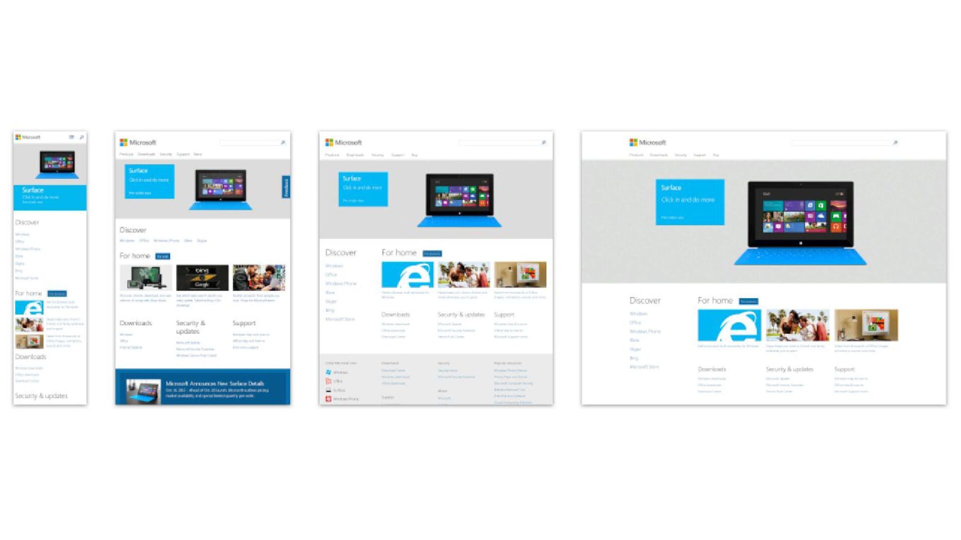
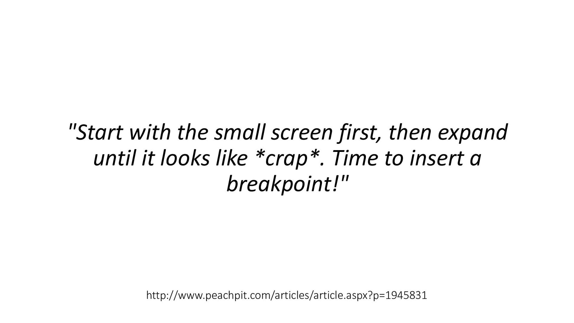
as a limitation, as a defect. It is the nature of the web to be flexible, and it should be our role as designers and developers to embrace this flexibility, and produce pages which, by being flexible, are accessible to all. —John Allsopp, 2000
 tibbelit
 datascientistsociety
 ymzaki_m4
 roadofhope
 hidetoshikawaguchi
 sapi_kawahara
 datarian
 yatabe
 magnolia
 sara2023
 akasan
 akiraasano
 signer
 eileencodes
 lemiorhan
 badams
 codingconduct
 helmedeiros
 inesmontani
 hannesfritz
 mkilby
 stephenakadiri