Upgrade to Pro
— share decks privately, control downloads, hide ads and more …
Speaker Deck
Features
Speaker Deck
PRO
Sign in
Sign up for free
Search
Search
Let's Learn CSS Grid - FEDC
Search
Sponsored
·
Ship Features Fearlessly
Turn features on and off without deploys. Used by thousands of Ruby developers.
→
Tim Smith
April 27, 2018
Design
180
0
Share
Embed
Copy iframe code
Copy JS code
Copy link
Start on current slide
Let's Learn CSS Grid - FEDC
Tim Smith
April 27, 2018
More Decks by Tim Smith
See All by Tim Smith
Let’s Learn CSS Grid - EE Conf
ttimsmith
1
240
Let's Learn CSS Grid - BeerCityCode
ttimsmith
2
220
Let's Learn CSS Grid
ttimsmith
1
340
Become a Better Designer with Side Projects - Blend Conf
ttimsmith
6
680
Become a Better Designer with Side Projects
ttimsmith
5
880
Work to Live, Don't Live to Work
ttimsmith
0
380
Other Decks in Design
See All in Design
工房としてのAI ── デザイナー、作家、ビルダー
hiranotomoki
0
350
再設計される業務 - AIにより再設計される "デザインワークフロー" / AI Ops Lab #2 Redesigned orkflows
kgsi
0
780
Build for the Web, Build on the Web, Build With the Web
csswizardry
0
480
なぜ、インサイトを貯めるのか?
tajima_kaho
3
2.4k
decksh object reference
ajstarks
2
1.7k
凡庸を落とすハーネス
hiromimaeo
1
610
Understanding Branding
ranyfardiany
0
240
「親切なオンボーディング」 が招く罠 ー AI時代のUXデザイン
godlingkogami
1
140
Claudeもくもく会、はじめませんか?
yusukeiyoda
0
120
test deck title
shotamatsuo
0
1.5k
CULTURE DECK/Frontend Engineer
mhand01
0
1.4k
改正JISを見据えた、企業のアクセシビリティ対応ロードマップ
securecat
1
410
Featured
See All Featured
Music & Morning Musume
bryan
47
7.3k
The agentic SEO stack - context over prompts
schlessera
0
850
Designing Experiences People Love
moore
143
24k
HTML-Aware ERB: The Path to Reactive Rendering @ RubyCon 2026, Rimini, Italy
marcoroth
2
340
Site-Speed That Sticks
csswizardry
13
1.3k
Why Our Code Smells
bkeepers
PRO
340
58k
Put a Button on it: Removing Barriers to Going Fast.
kastner
60
4.4k
Optimizing for Happiness
mojombo
378
71k
[SF Ruby Conf 2025] Rails X
palkan
2
1.2k
The Limits of Empathy - UXLibs8
cassininazir
1
500
A Guide to Academic Writing Using Generative AI - A Workshop
ks91
PRO
1
350
Paper Plane
katiecoart
PRO
2
52k
Transcript
LET’S LEARN CSSGRID
Hi there! I’m Tim Smith
None
YouTube Channel youtube.com/smithtimmytim
Thank You
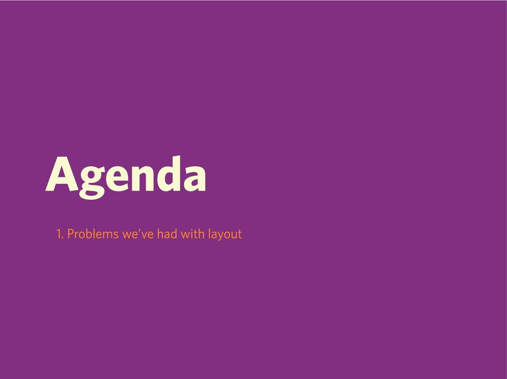
Agenda
Agenda 1. Problems we’ve had with layout
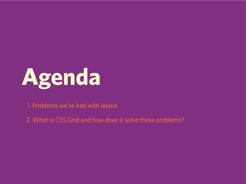
Agenda 1. Problems we’ve had with layout 2. What is
CSS Grid and how does it solve these problems?
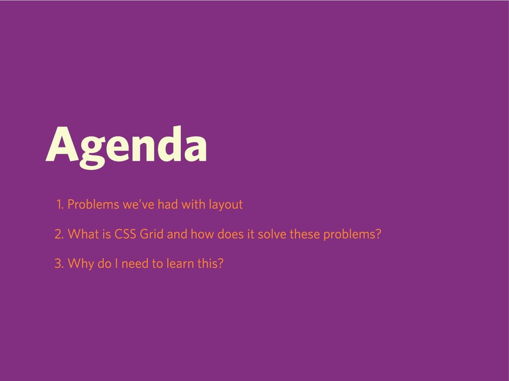
Agenda 1. Problems we’ve had with layout 2. What is
CSS Grid and how does it solve these problems? 3. Why do I need to learn this?
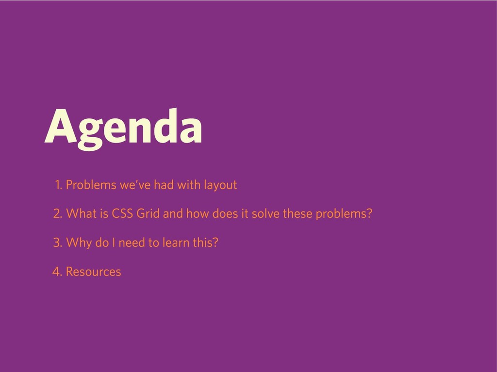
Agenda 1. Problems we’ve had with layout 2. What is
CSS Grid and how does it solve these problems? 3. Why do I need to learn this? 4. Resources
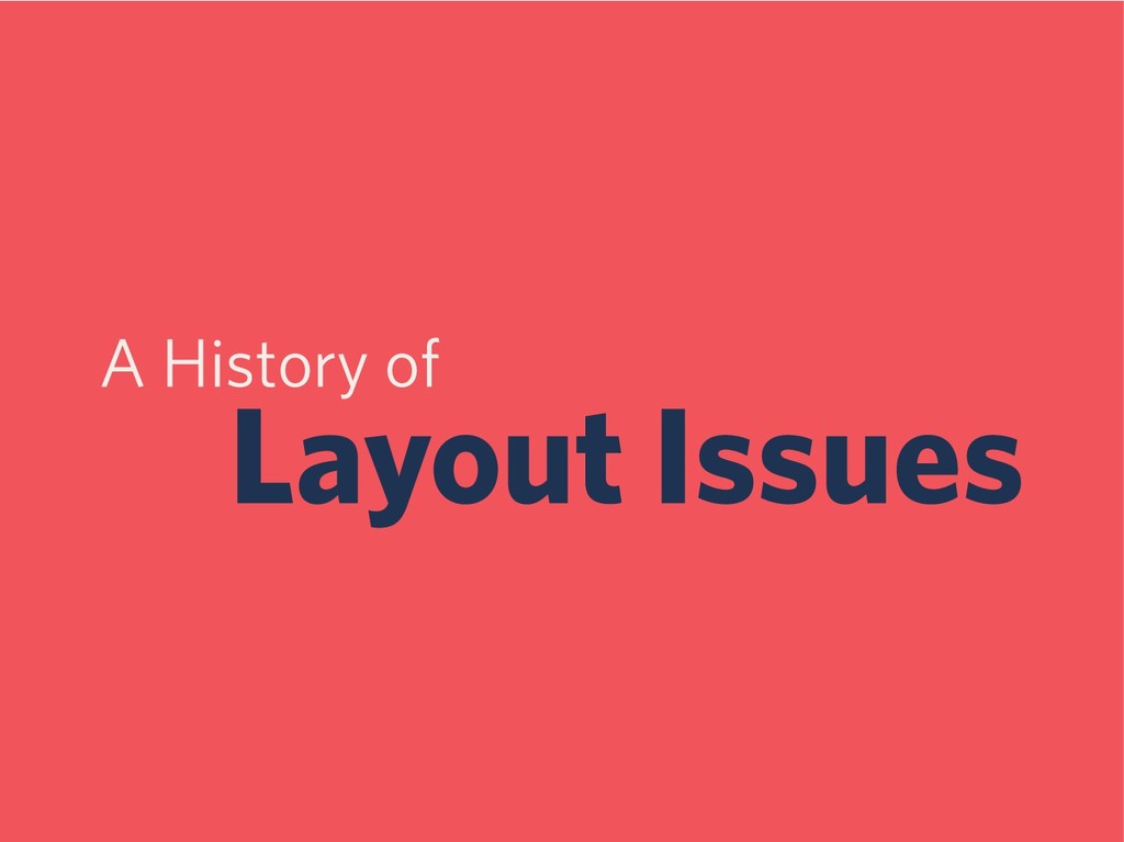
A History of Layout Issues
Floats
Floats Suck
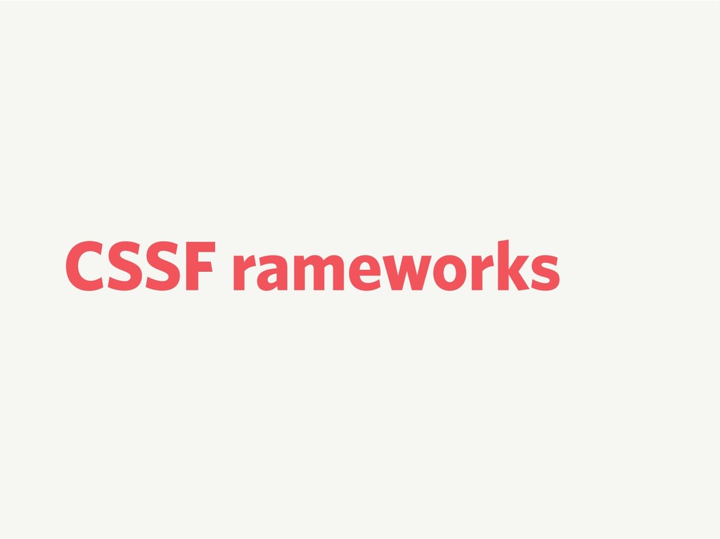
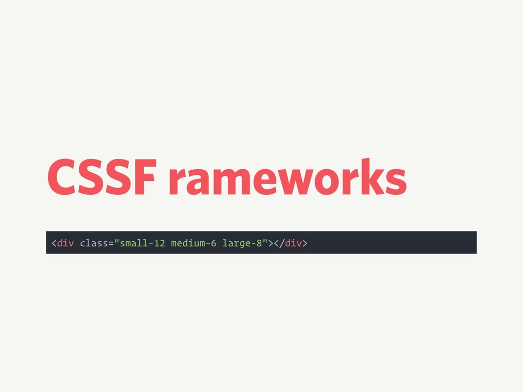
CSS Frameworks
CSS Frameworks <div class="small-12 medium-6 large-8"></div>
Separation of Concerns
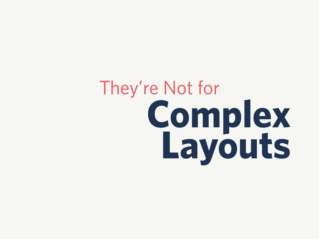
Floats Aren’t Bad
They’re Not for Complex Layouts
Why?
None
Flexbox
Flexbox is Flexible
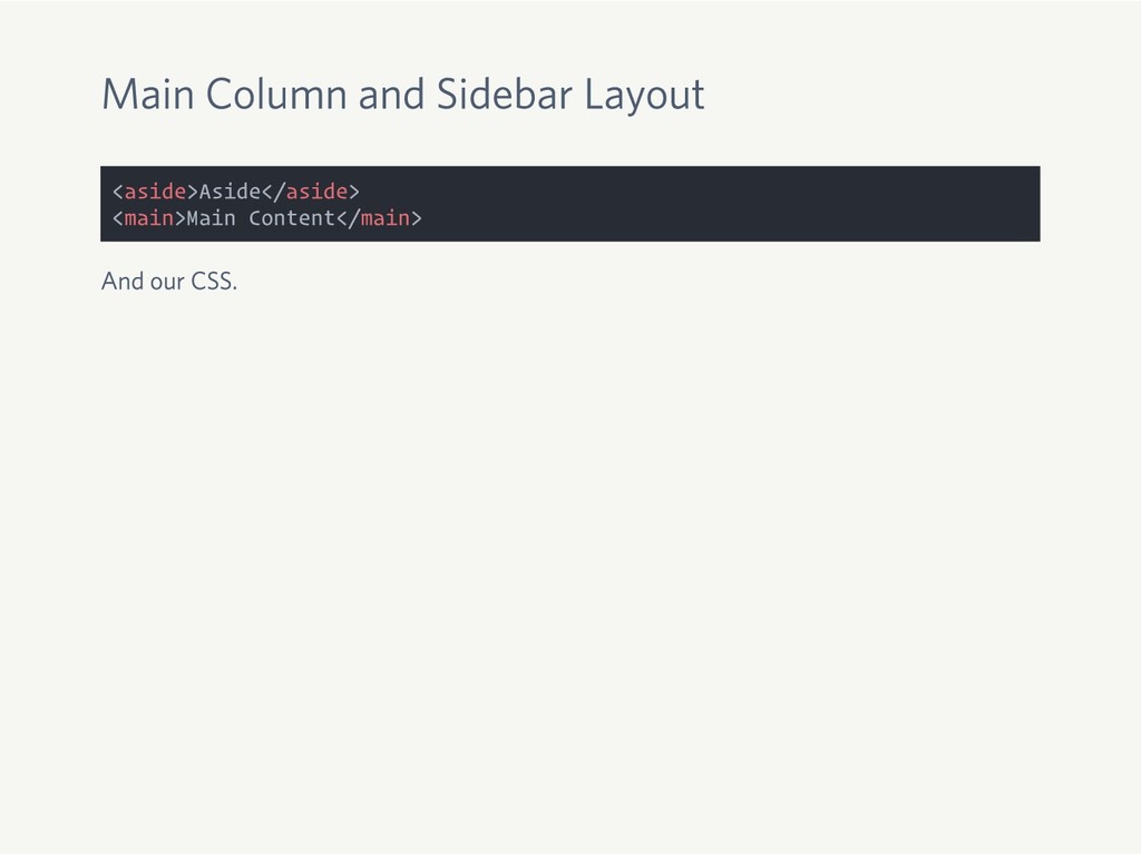
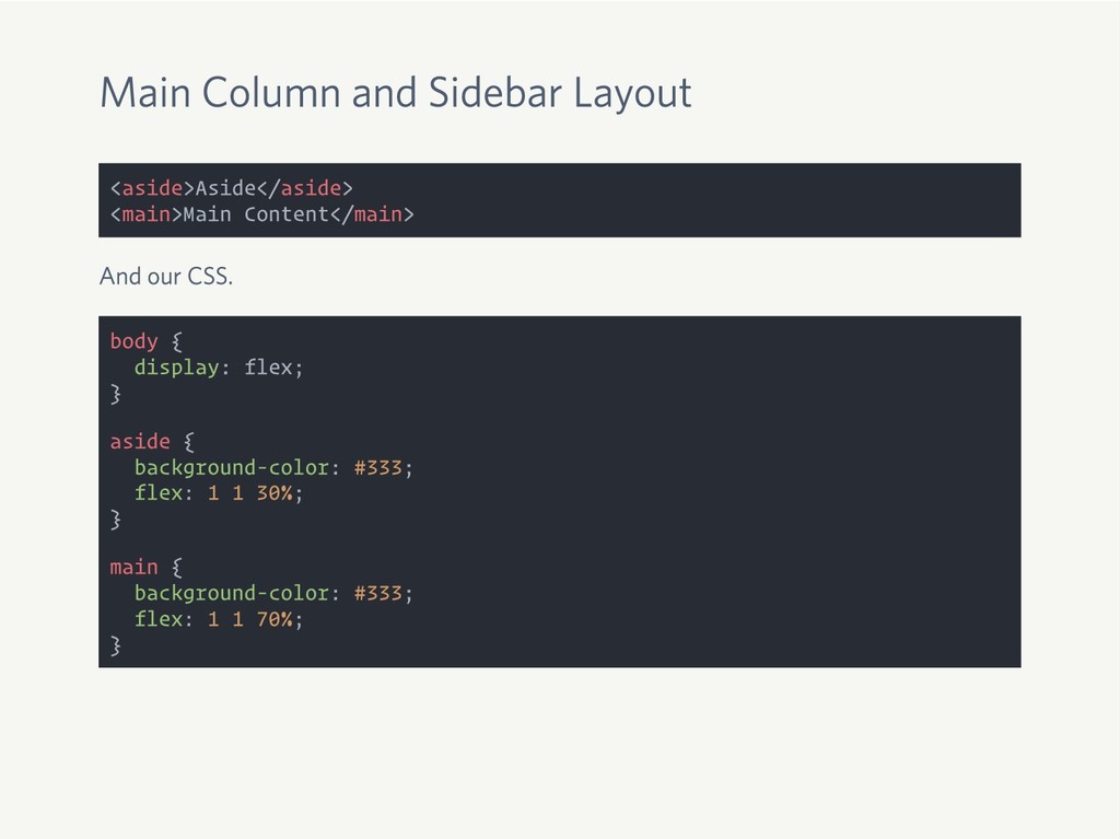
Main Column and Sidebar Layout <aside>Aside</aside> <main>Main Content</main>
Main Column and Sidebar Layout <aside>Aside</aside> <main>Main Content</main> And our
CSS.
Main Column and Sidebar Layout <aside>Aside</aside> <main>Main Content</main> And our
CSS. body { display: flex; } aside { background-color: #333; flex: 1 1 30%; } main { background-color: #333; flex: 1 1 70%; }
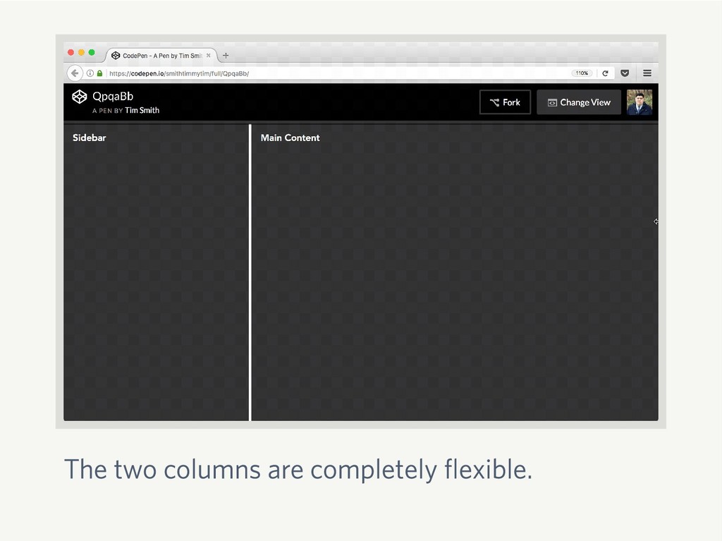
The two columns are completely flexible.
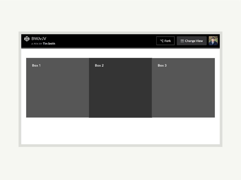
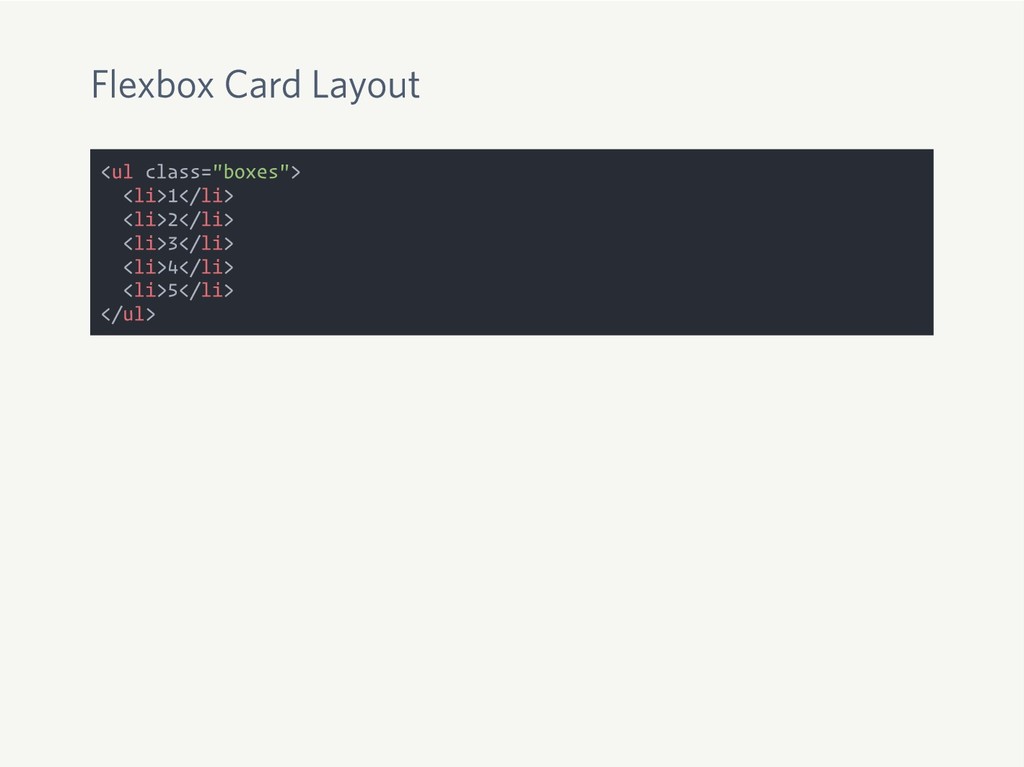
Flexbox Card Layout <ul class="boxes"> <li>1</li> <li>2</li> <li>3</li> <li>4</li> <li>5</li>
</ul>
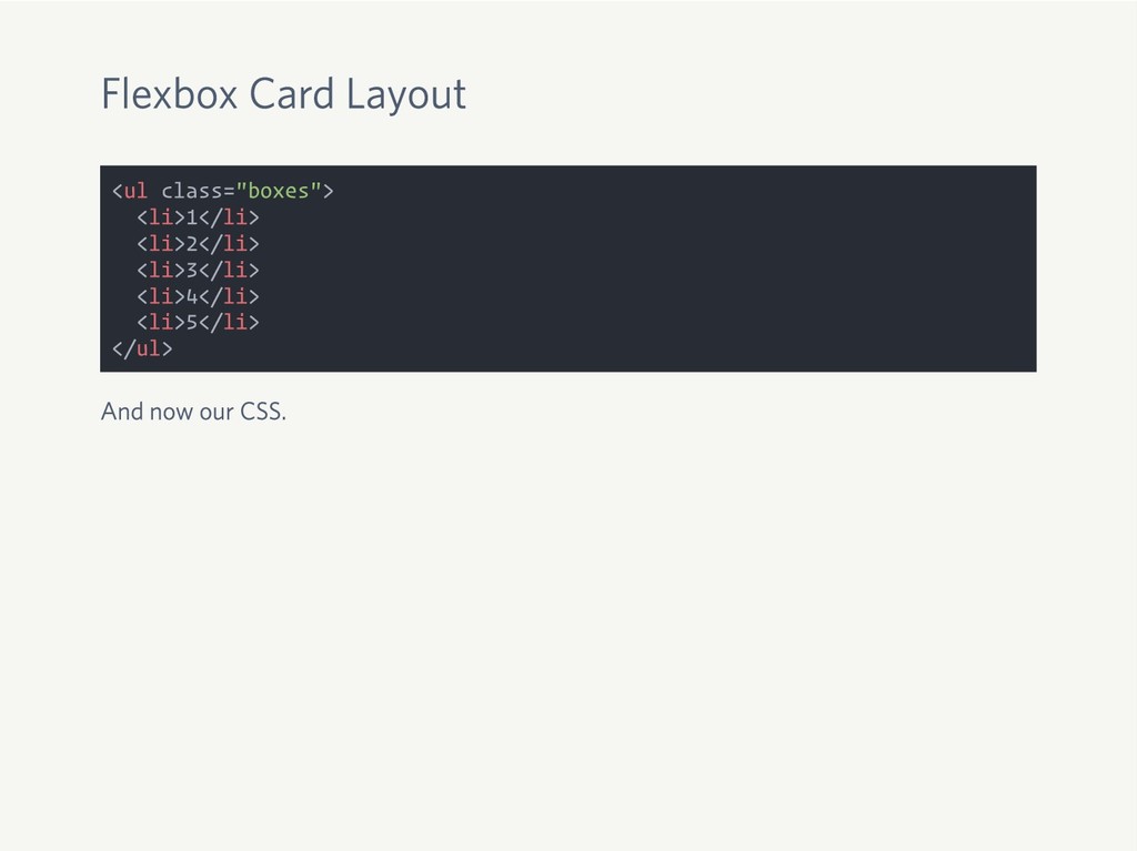
Flexbox Card Layout <ul class="boxes"> <li>1</li> <li>2</li> <li>3</li> <li>4</li> <li>5</li>
</ul> And now our CSS.
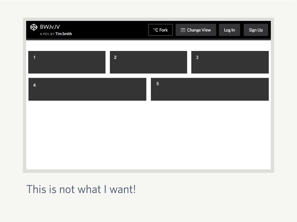
Flexbox Card Layout <ul class="boxes"> <li>1</li> <li>2</li> <li>3</li> <li>4</li> <li>5</li>
</ul> And now our CSS. .boxes { display: flex; flex-wrap: wrap; } .boxes li { flex: 1 1 30%; background: #333; margin: 0 .5rem 1rem; }
This is not what I want!
Math
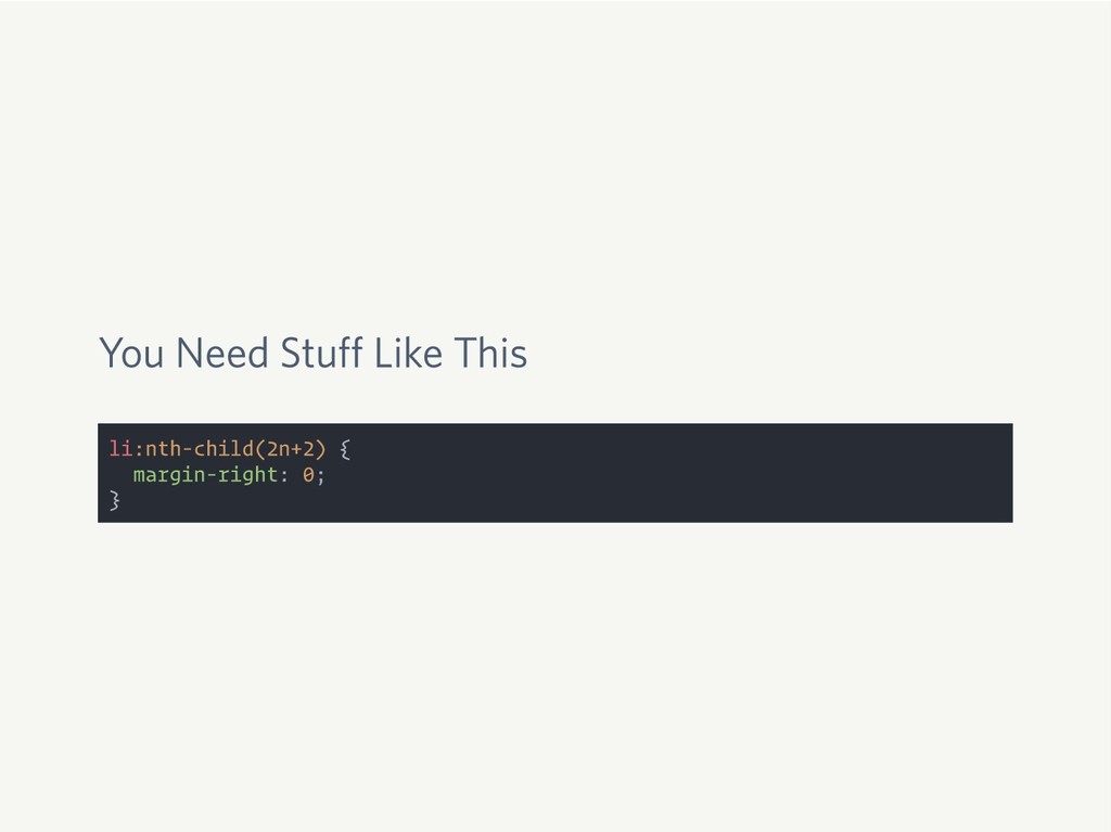
You Need Stuff Like This li:nth-child(2n+2) { margin-right: 0; }
You Need Stuff Like This li:nth-child(2n+2) { margin-right: 0; }
Oh wait! What about bigger screens?
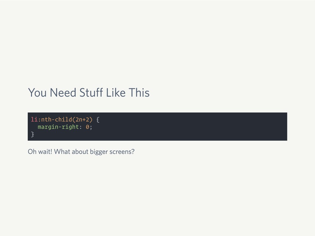
You Need Stuff Like This li:nth-child(2n+2) { margin-right: 0; }
Oh wait! What about bigger screens? @media screen and (min-width: 40em) { li:nth-child(2n+2) { margin-right: 1.5rem; } li:nth-child(3n+3) { margin-right: 0; } }
None
Flexbox Is Awesome
Vertical Align!
We’re Using Flexbox Wrong
CSS Grid to the Rescue
CSS Grid is Not a Float Killer
CSS Grid is Not a Flexbox Killer
You Don’t Need a Framework
CSS Grid Is the Framework
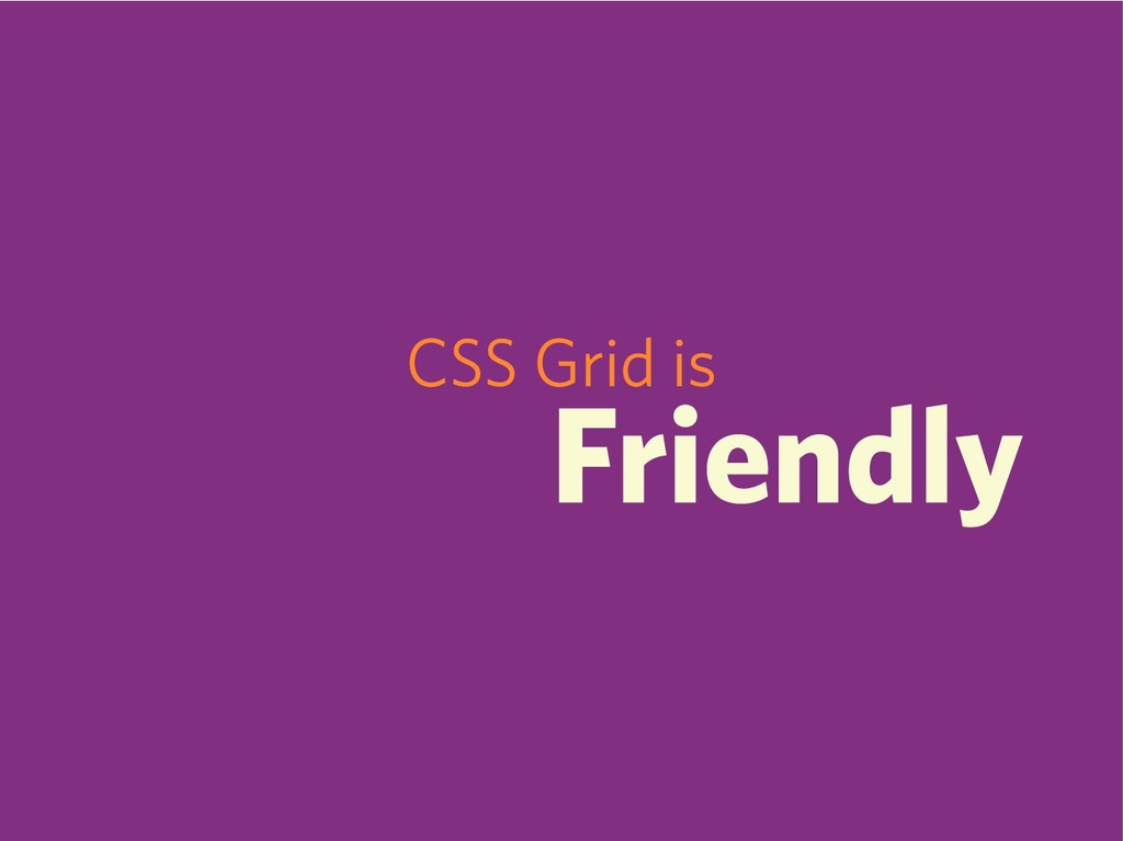
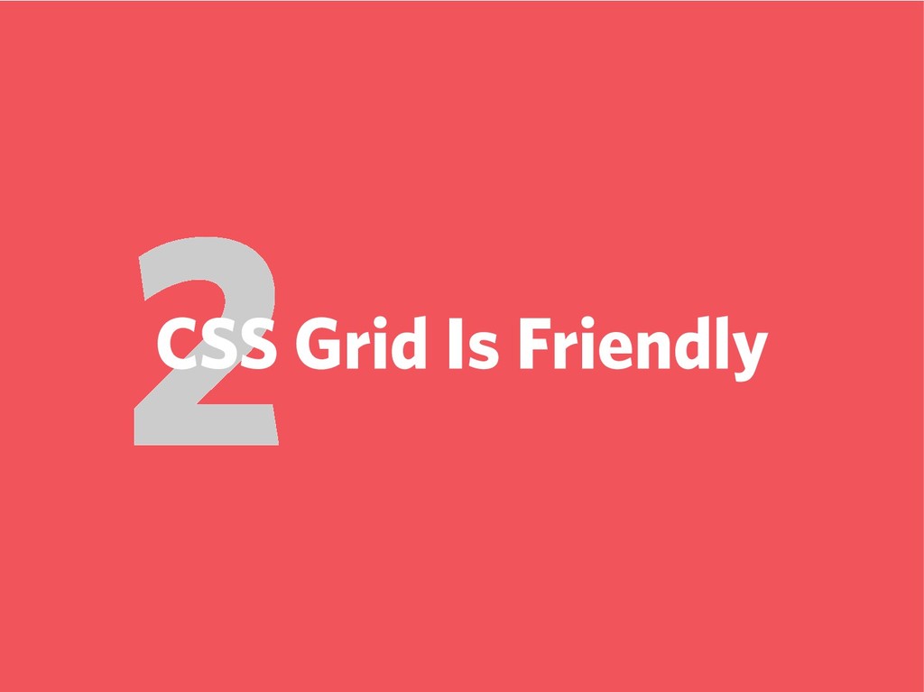
CSS Grid is Friendly
Great Use of Flexbox
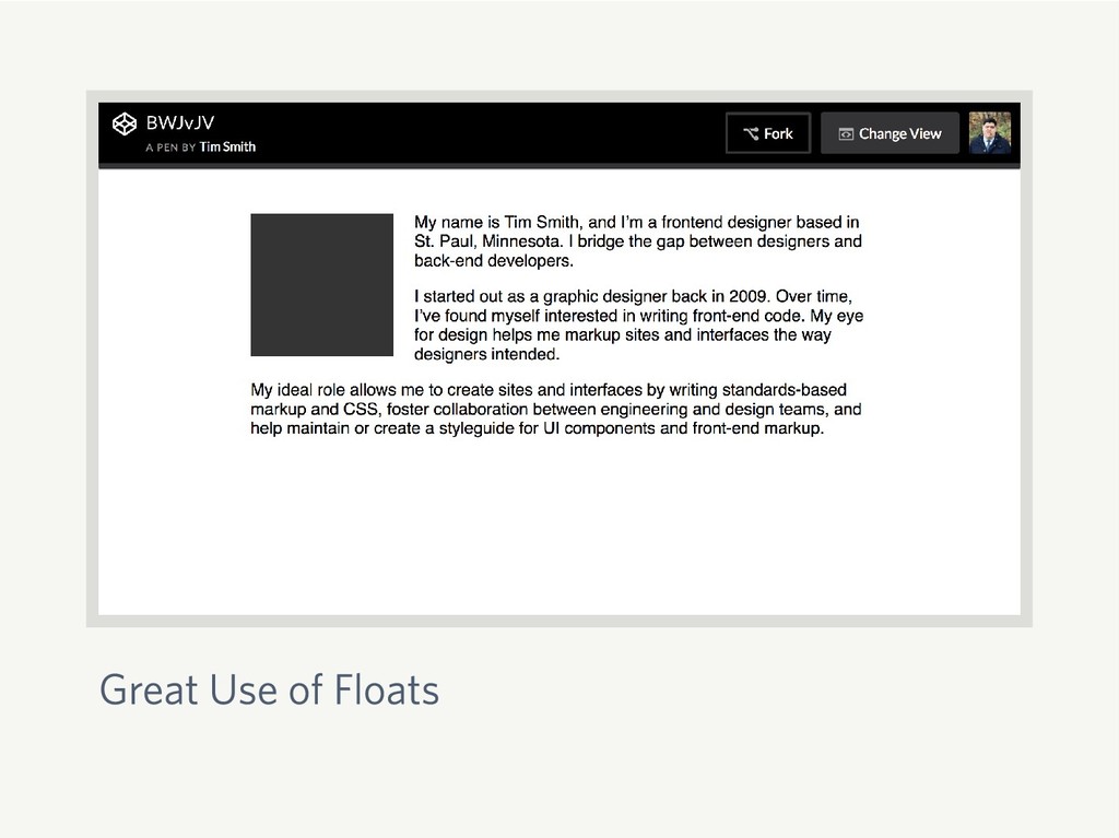
Great Use of Floats
CSS Grid What Is It Good For?
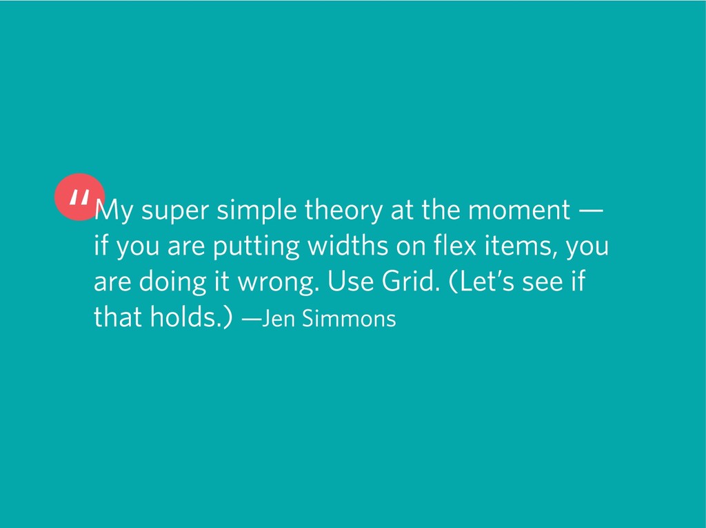
“My super simple theory at the moment — if you
are putting widths on flex items, you are doing it wrong. Use Grid. (Let’s see if that holds.) —Jen Simmons
CSS Grid Basics
display: grid;
grid-template-columns
fr
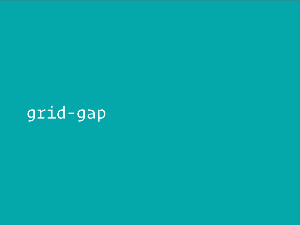
grid-gap
Let’s See It in Action
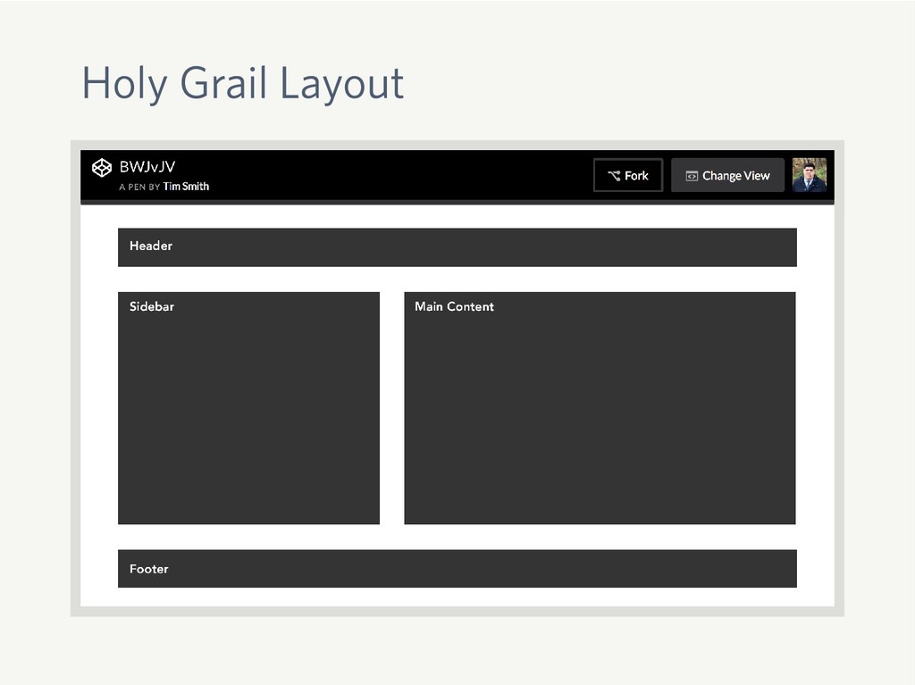
Holy Grail Layout
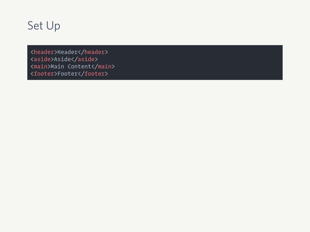
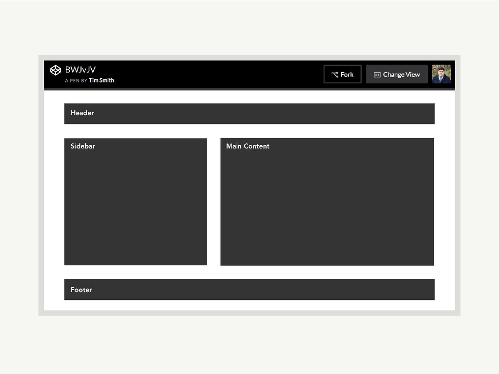
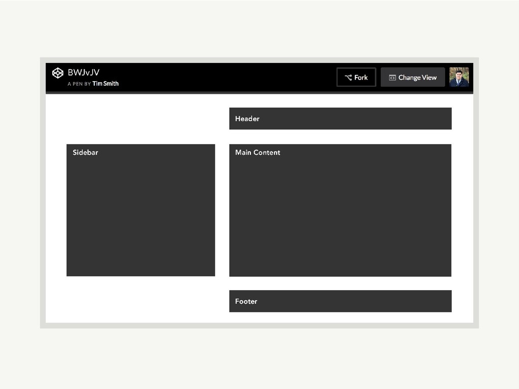
Set Up <header>Header</header> <aside>Aside</aside> <main>Main Content</main> <footer>Footer</footer>
Set Up <header>Header</header> <aside>Aside</aside> <main>Main Content</main> <footer>Footer</footer> body { display:
grid; grid-template-columns: 2fr 3fr; grid-gap: 2rem; }
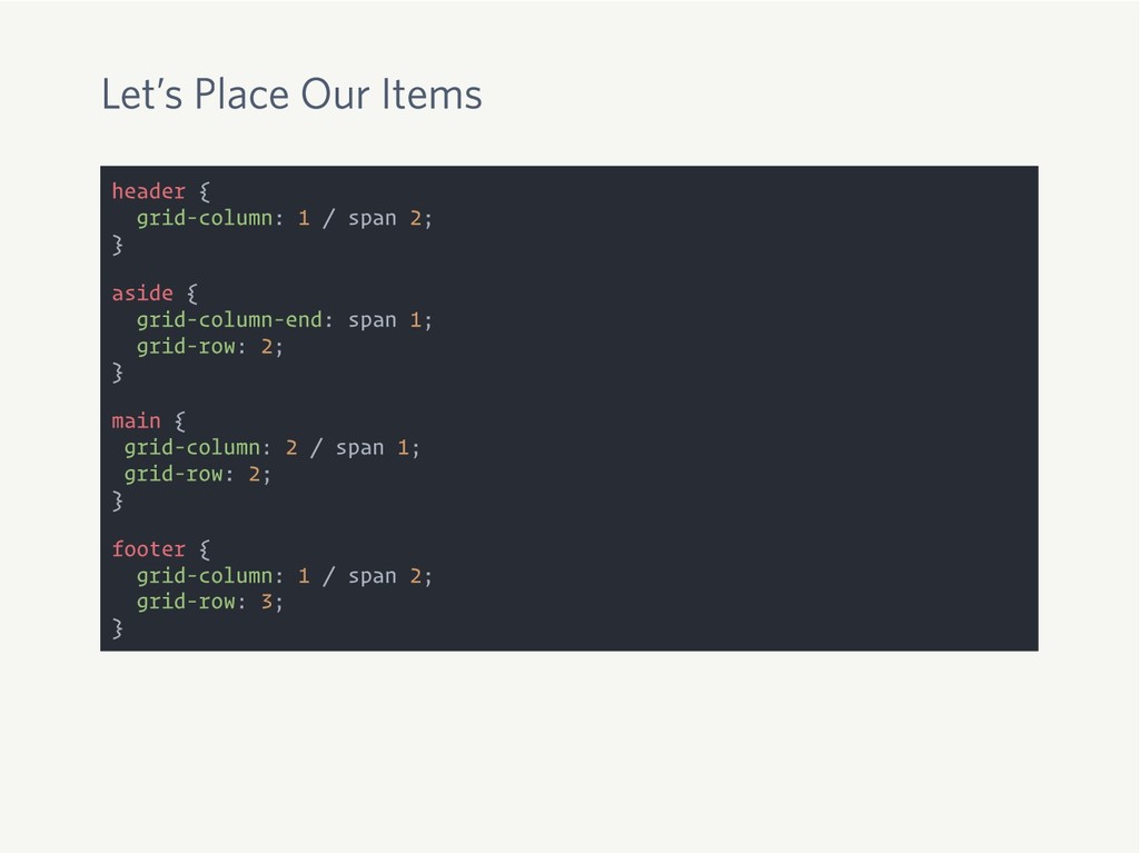
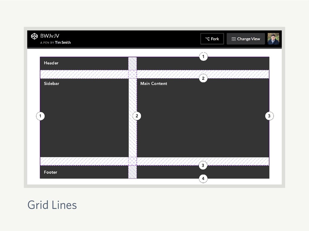
Let’s Place Our Items header { grid-column: 1 / span
2; } aside { grid-column-end: span 1; grid-row: 2; } main { grid-column: 2 / span 1; grid-row: 2; } footer { grid-column: 1 / span 2; grid-row: 3; }
Grid Lines
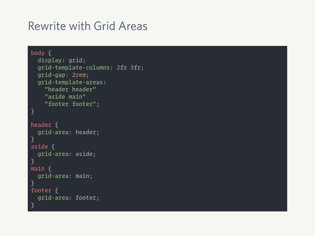
Rewrite with Grid Areas body { display: grid; grid-template-columns: 2fr
3fr; grid-gap: 2rem; grid-template-areas: "header header" "aside main" "footer footer"; } header { grid-area: header; } aside { grid-area: aside; } main { grid-area: main; } footer { grid-area: footer; }
None
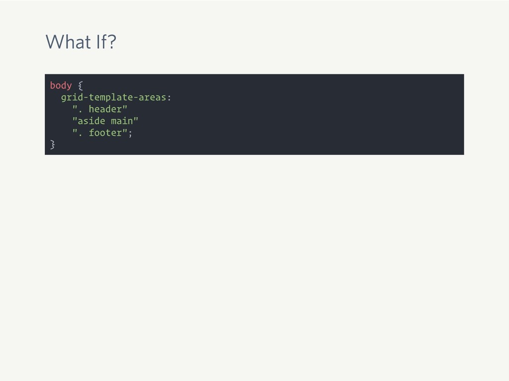
What If? body { grid-template-areas: ". header" "aside main" ".
footer"; }
None
None
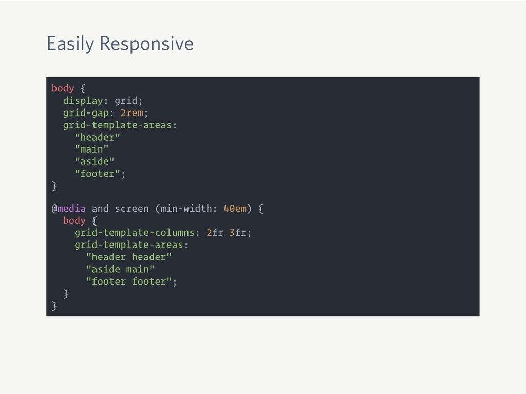
Easily Responsive body { display: grid; grid-gap: 2rem; grid-template-areas: "header"
"main" "aside" "footer"; } @media and screen (min-width: 40em) { body { grid-template-columns: 2fr 3fr; grid-template-areas: "header header" "aside main" "footer footer"; } }
None
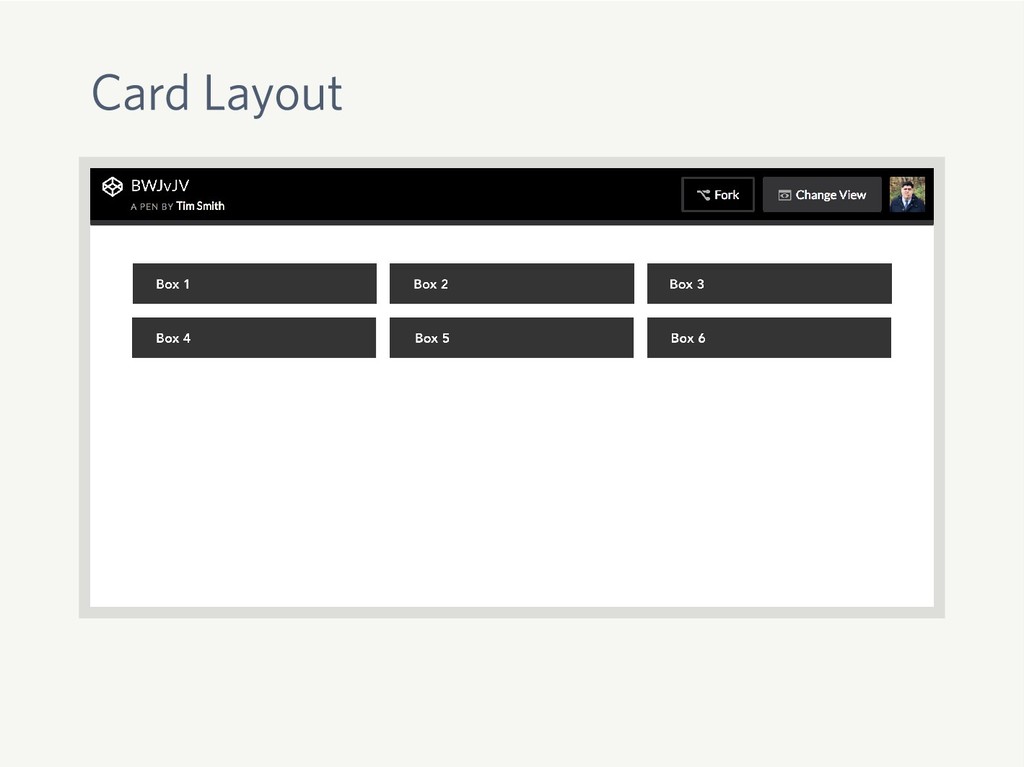
Card Layout
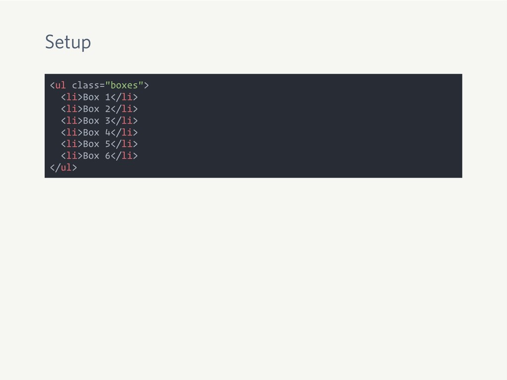
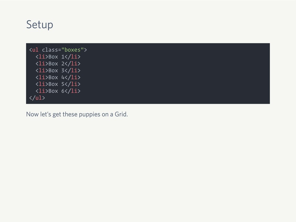
Setup <ul class="boxes"> <li>Box 1</li> <li>Box 2</li> <li>Box 3</li> <li>Box
4</li> <li>Box 5</li> <li>Box 6</li> </ul>
Setup <ul class="boxes"> <li>Box 1</li> <li>Box 2</li> <li>Box 3</li> <li>Box
4</li> <li>Box 5</li> <li>Box 6</li> </ul> Now let’s get these puppies on a Grid.
Setup <ul class="boxes"> <li>Box 1</li> <li>Box 2</li> <li>Box 3</li> <li>Box
4</li> <li>Box 5</li> <li>Box 6</li> </ul> Now let’s get these puppies on a Grid. .boxes { display: grid; grid-template-columns: repeat(auto-fill, minmax(300px, 1fr)); grid-gap: 1rem; }
Whoa! Hold Up.
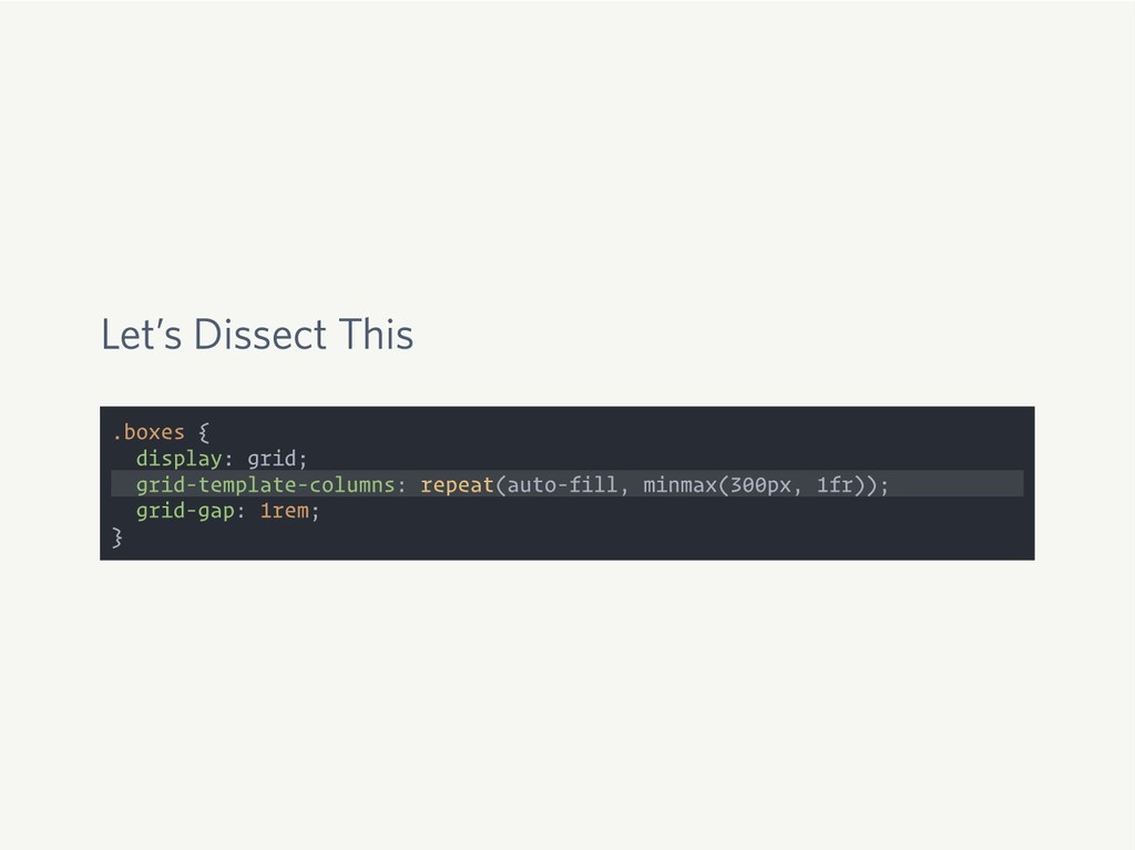
Let’s Dissect This .boxes { display: grid; grid-template-columns: repeat(auto-fill, minmax(300px,
1fr)); grid-gap: 1rem; }
None
Mind. Blown.
Special Portfolio-Inspired Layout
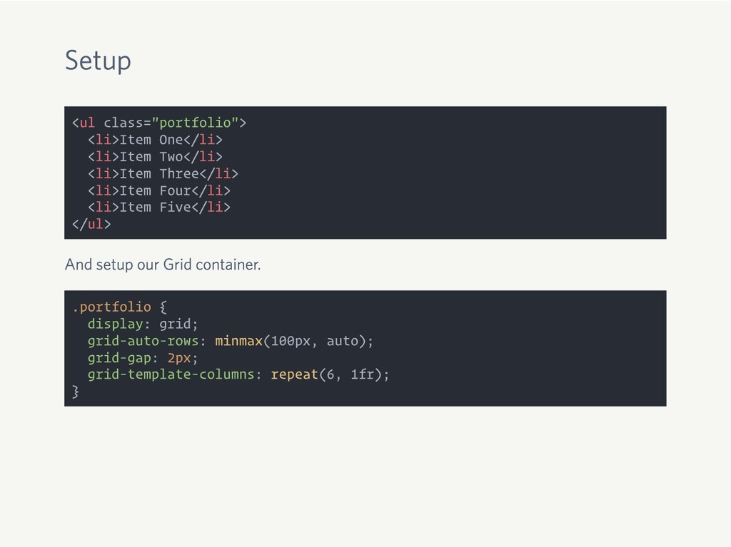
Setup <ul class="portfolio"> <li>Item One</li> <li>Item Two</li> <li>Item Three</li> <li>Item
Four</li> <li>Item Five</li> </ul>
Setup <ul class="portfolio"> <li>Item One</li> <li>Item Two</li> <li>Item Three</li> <li>Item
Four</li> <li>Item Five</li> </ul> And setup our Grid container.
Setup <ul class="portfolio"> <li>Item One</li> <li>Item Two</li> <li>Item Three</li> <li>Item
Four</li> <li>Item Five</li> </ul> And setup our Grid container. .portfolio { display: grid; grid-auto-rows: minmax(100px, auto); grid-gap: 2px; grid-template-columns: repeat(6, 1fr); }
grid-auto-rows
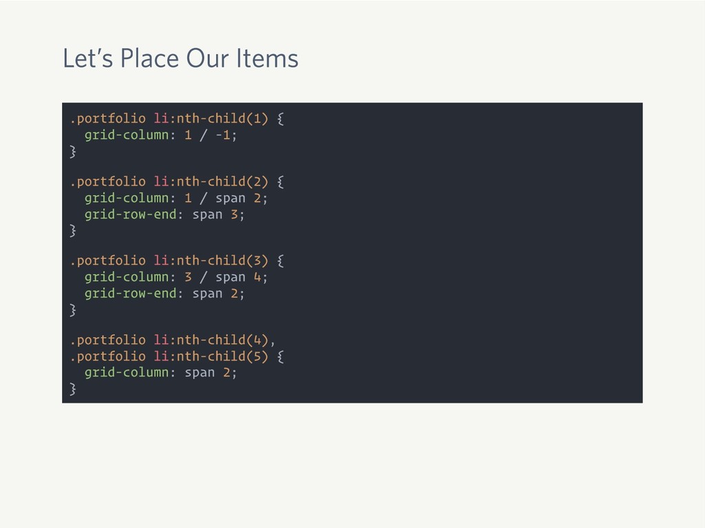
Let’s Place Our Items .portfolio li:nth-child(1) { grid-column: 1 /
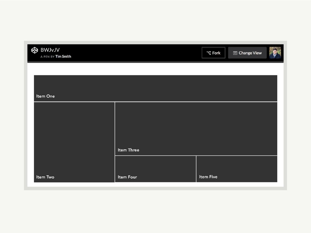
-1; } .portfolio li:nth-child(2) { grid-column: 1 / span 2; grid-row-end: span 3; } .portfolio li:nth-child(3) { grid-column: 3 / span 4; grid-row-end: span 2; } .portfolio li:nth-child(4), .portfolio li:nth-child(5) { grid-column: span 2; }
None
Holy Jack City, Batman
The Power of CSS Grid
None
The Time is Now
Simpler Code
New Amazing Layouts
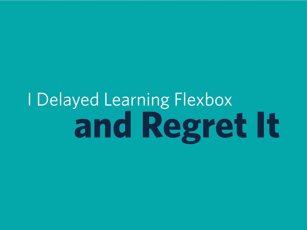
I Delayed Learning Flexbox and Regret It
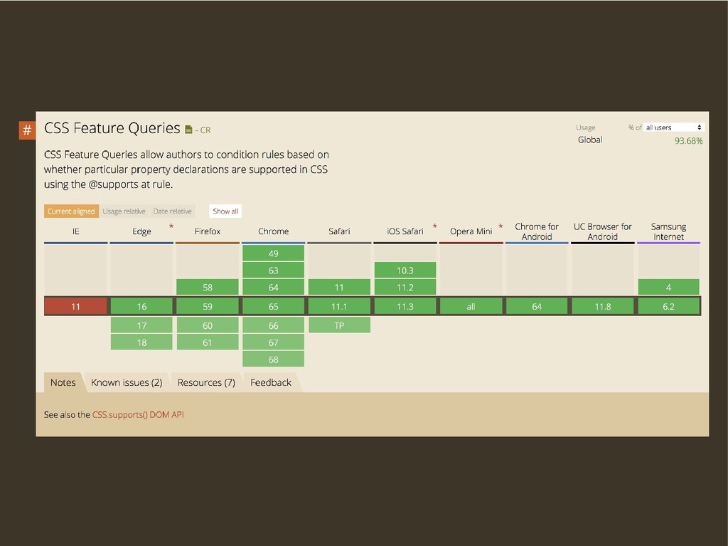
Feature Queries
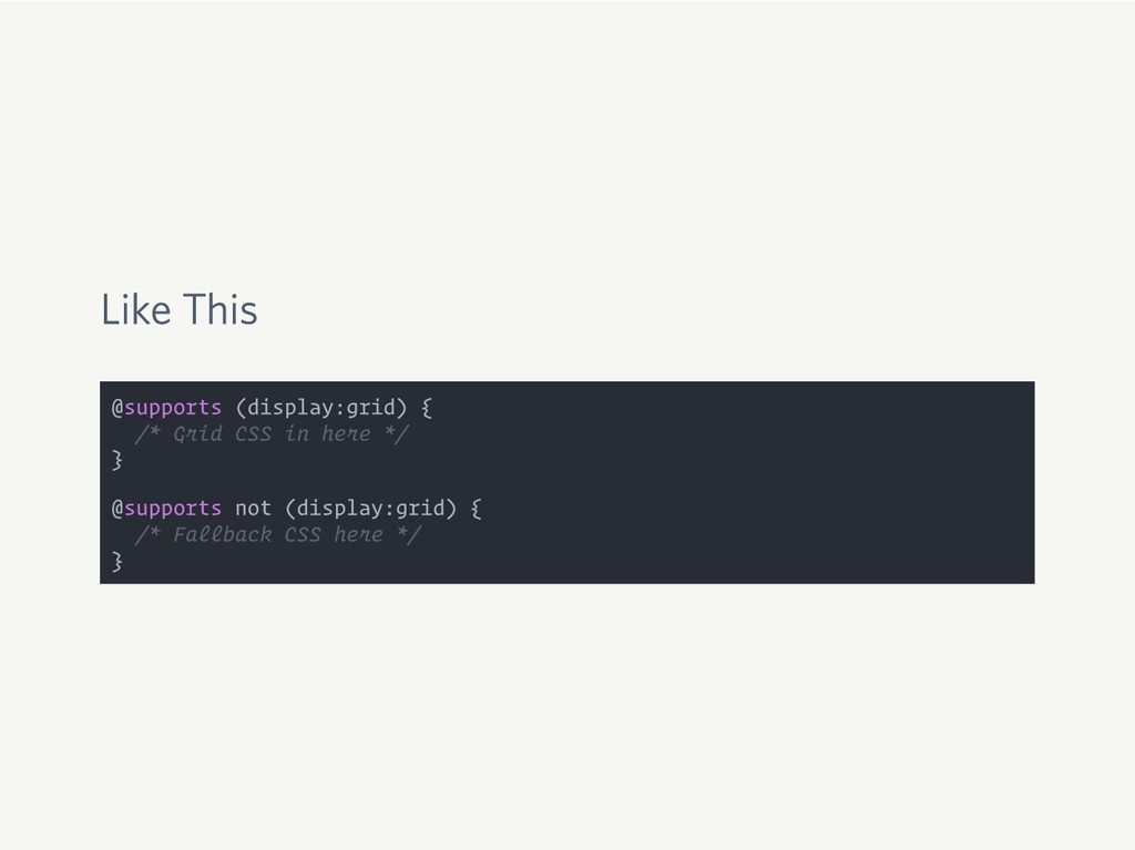
Like This @supports (display:grid) { /* Grid CSS in here
*/ } @supports not (display:grid) { /* Fallback CSS here */ }
None
Browsers Ignore CSS They Don’t Understand
What Did We Learn?
1 CSS Grid Is Awesome
2 CSS Grid Is Friendly
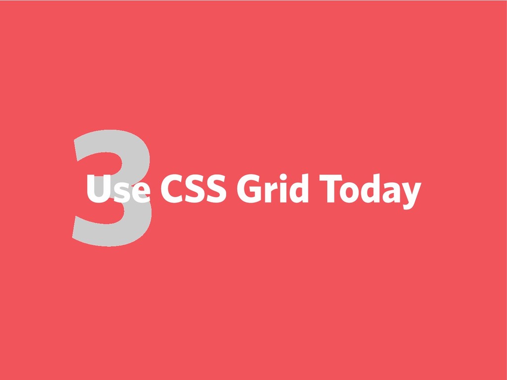
3 Use CSS Grid Today
Only the Beginning
Rachel Andrew gridbyexample.com
Jen Simmons labs.jensimmons.com
Mozilla Developer Network developer.mozilla.org
Read The Spec w3.org/TR/css-grid-1/
Thanks! ttimsmith.com · @smithtimmytim
 ttimsmith
 hiranotomoki
 kgsi
kgsi
 csswizardry
 tajima_kaho
 ajstarks
 hiromimaeo
 ranyfardiany
 godlingkogami
 yusukeiyoda
 shotamatsuo
 mhand01
 securecat
 bryan
bryan
 schlessera
 moore
moore
 marcoroth
 bkeepers
 kastner
 mojombo
 palkan
 cassininazir
 ks91
ks91
 katiecoart