Upgrade to Pro
— share decks privately, control downloads, hide ads and more …
Speaker Deck
Features
Speaker Deck
PRO
Sign in
Sign up for free
Search
Search
Responsive Web Design - Reinventando la web
Search
Swwweet
April 27, 2012
Technology
4.7k
15
Share
Embed
Copy iframe code
Copy JS code
Copy link
Start on current slide
Responsive Web Design - Reinventando la web
Presentación de Javier Usobiaga en el Ideateca HTML5 DevUp 2012.
Swwweet
April 27, 2012
More Decks by Swwweet
See All by Swwweet
Wonders from the Full Stack Fest website
swwweet
1
400
How to be the best web designer in the world.
swwweet
6
1.3k
Design for loading
swwweet
5
590
Mobile First: as difficult as doing things right
swwweet
225
10k
One Size Fits None
swwweet
12
920
One Size Fits None - From the Front 2013
swwweet
2
770
Responsively Responsive
swwweet
23
1.7k
La letra con píxel entra
swwweet
0
1.2k
The future of code
swwweet
4
670
Other Decks in Technology
See All in Technology
ポストモーテム! DDoSからサイトは守れた。 でもビジネスは守れなかった。
bengo4com
1
3k
Keeping applications secure by evolving OAuth 2.0 and OpenID Connect
ahus1
PRO
1
160
世界、断片、モデル。そして理解
ardbeg1958
1
110
Foxgloveについて 実際にExtensionを開発して公開するまでの話 / About Foxglove: The Story of Developing and Releasing an Extension
ry0_ka
0
250
事業価値を⽣み出すSREへ SREが担うべき意思決定の5層
kenta_hi
2
3.6k
完全自律ロボットを作りたくて、先に開発を自律させた話(ROS Japan UG #63 LT)
rryz09
0
580
型は壁、Rustでもバグを直すな、表現できなくせよ
nwiizo
13
2k
しぶいSRE: サーバから見えない障害にどう向き合うか。ラストワンマイルのデバッグ実践 / Shibui SRE
kanny
13
6.2k
なぜ私たちのSREプラクティスはなかなか機能しないのか 〜システムより先に組織を見る〜 / Why our SRE practices aren't really working
vtryo
3
3.7k
ruby.wasmとPicoRuby.wasmに対応した仮想DOMライブラリを作ってる話 #kaigieffect_kaigi
sue445
PRO
0
150
Terraform共通モジュールをチーム横断で“変えられる”運用へ ― リリースと適用の分離
kekke_n
1
3k
「早く出す」より「事業に効く」 ── 顧客の業務サイクルから逆算するAI時代の二重ループ開発と「変化の設計者」 / devsumi2026
rakus_dev
1
250
Featured
See All Featured
Leo the Paperboy
mayatellez
8
1.9k
Mozcon NYC 2025: Stop Losing SEO Traffic
samtorres
1
330
Easily Structure & Communicate Ideas using Wireframe
afnizarnur
194
17k
16th Malabo Montpellier Forum Presentation
akademiya2063
PRO
0
200
Leveraging LLMs for student feedback in introductory data science courses - posit::conf(2025)
minecr
1
310
Docker and Python
trallard
47
3.9k
世界の人気アプリ100個を分析して見えたペイウォール設計の心得
akihiro_kokubo
PRO
72
40k
HU Berlin: Industrial-Strength Natural Language Processing with spaCy and Prodigy
inesmontani
PRO
0
490
Why Our Code Smells
bkeepers
PRO
340
58k
Heart Work Chapter 1 - Part 1
lfama
PRO
8
36k
Beyond borders and beyond the search box: How to win the global "messy middle" with AI-driven SEO
davidcarrasco
3
180
Raft: Consensus for Rubyists
vanstee
141
7.6k
Transcript
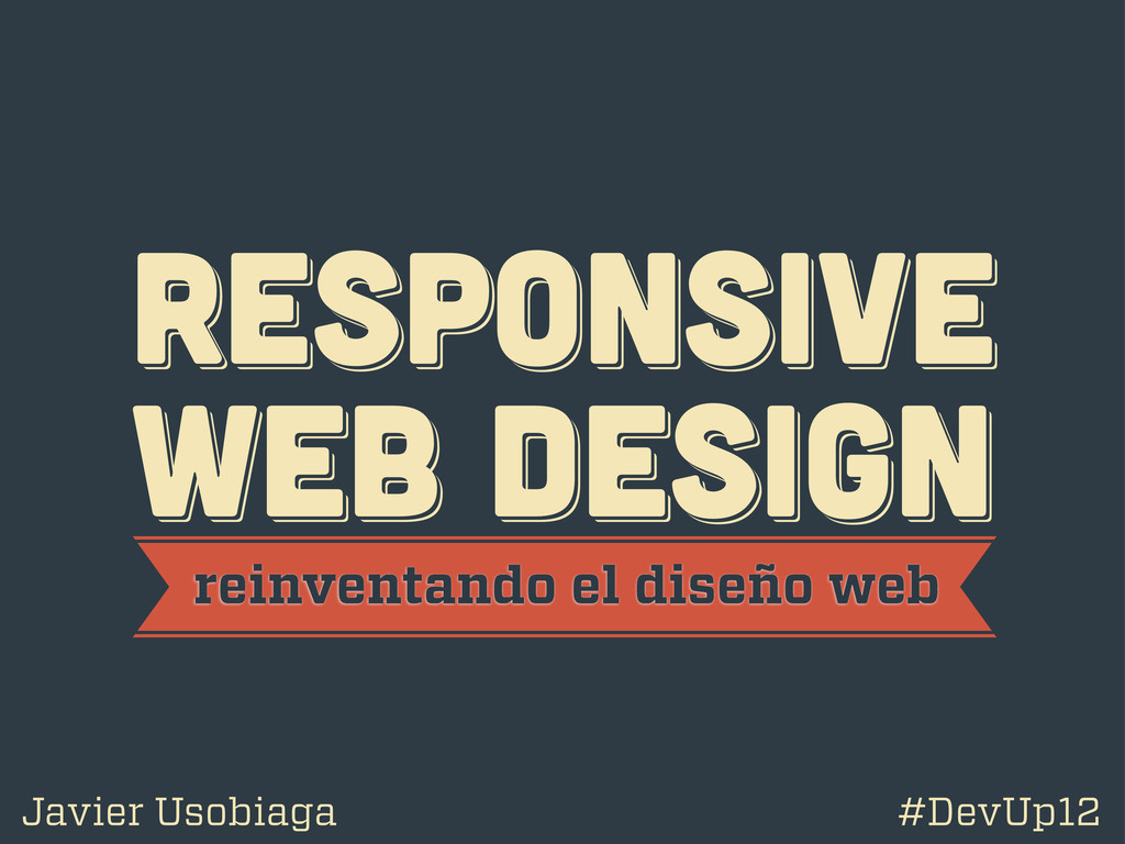
RESPoNSIVE WEB DESIGN RESPoNSIVE WEB DESIGN RESPoNSIVE WEB DESIGN reinventando
el diseño web Javier Usobiaga #DevUp12
@htmlboy @htmlboy @htmlboy trabajo en Swwweet.com
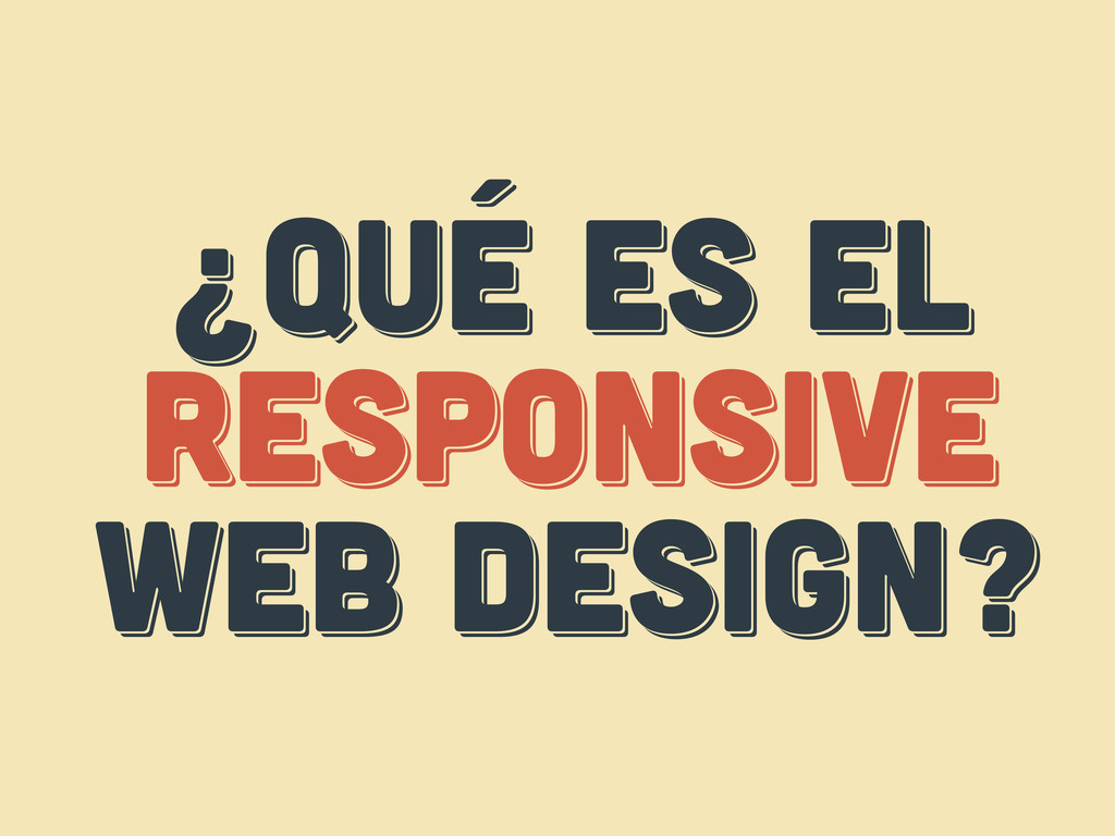
¿Qué es el responsive web design? ¿Qué es el responsive
web design? ¿Qué es el respoNsive web design?
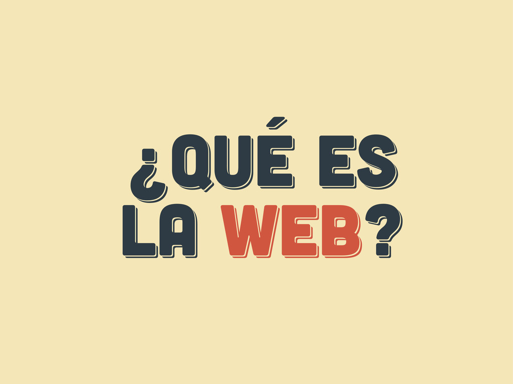
¿Qué es LA web? ¿Qué es LA web? ¿Qué es
LA web?
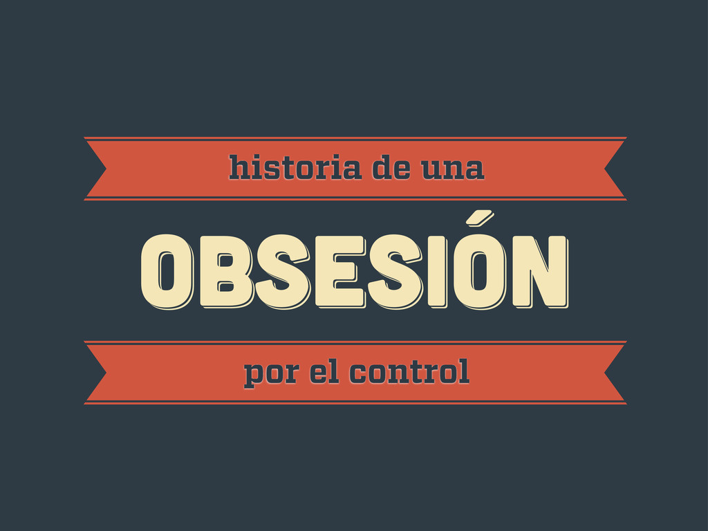
obsesión obsesión historia de una obsesión por el control
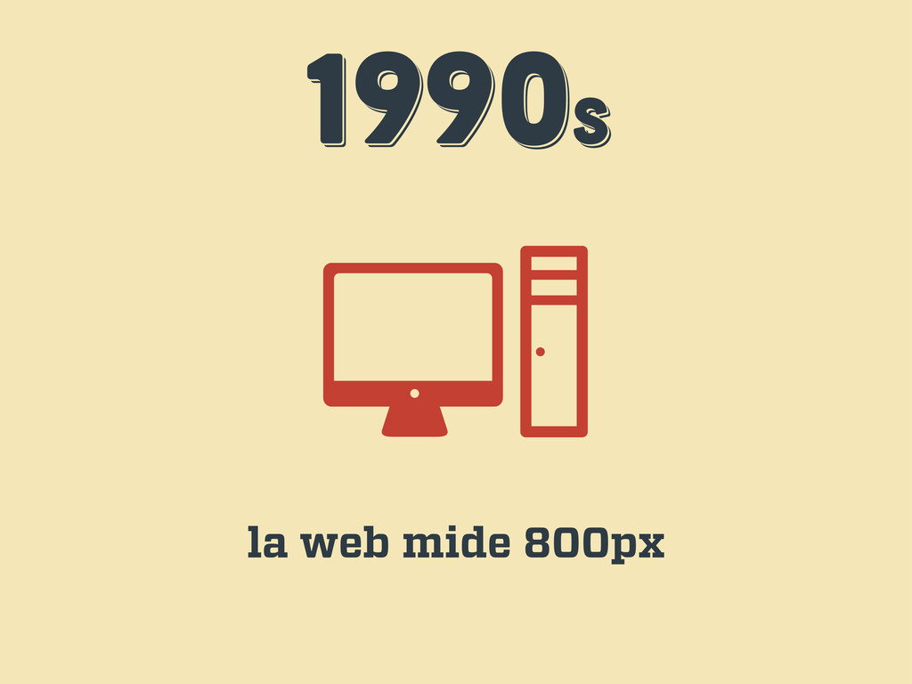
1990s 1990s 1990s la web mide 800px
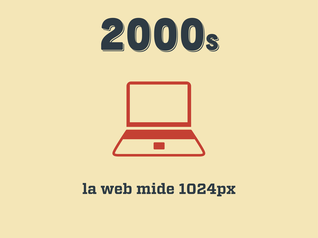
2000s 2000s 2000s la web mide 1024px
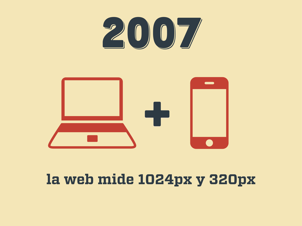
2007 2007 2007 + la web mide 1024px y 320px
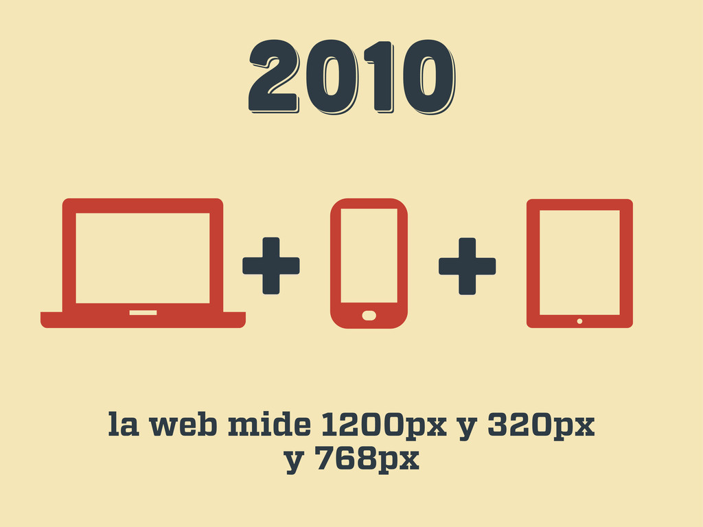
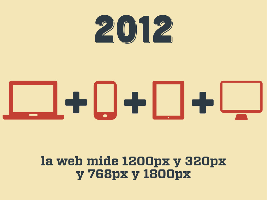
2010 2010 2010 + + la web mide 1200px y
320px y 768px
2012 2012 2012 + + la web mide 1200px y
320px y 768px y 1800px +
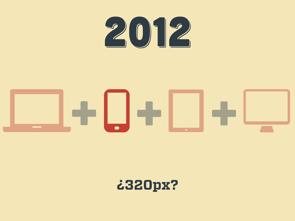
2012 2012 2012 + + ¿320px? +
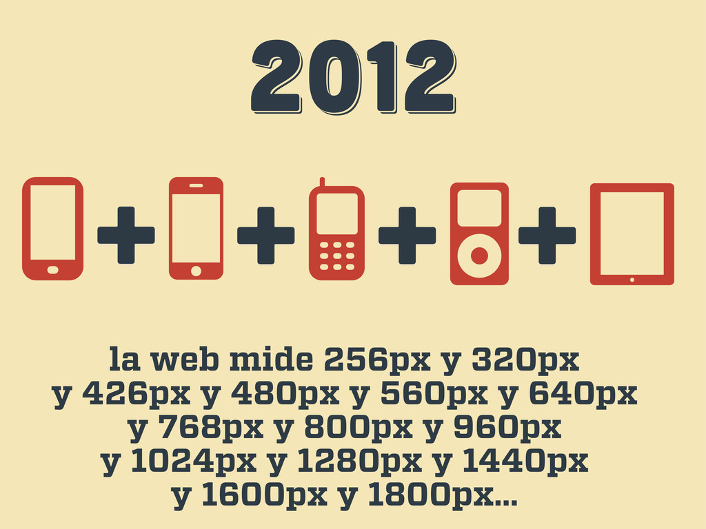
2012 2012 2012 la web mide 256px y 320px y
426px y 480px y 560px y 640px y 768px y 800px y 960px y 1024px y 1280px y 1440px y 1600px y 1800px… + + + +
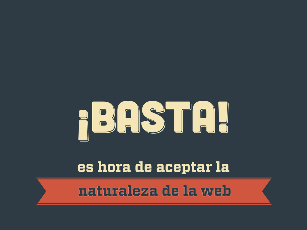
¡BASTA! ¡BASTA! ¡BASTA! es hora de aceptar la naturaleza de
la web
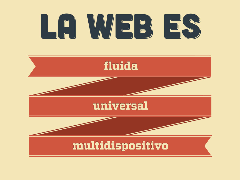
LA WEB ES LA WEB ES LA WEB ES fluida
universal multidispositivo
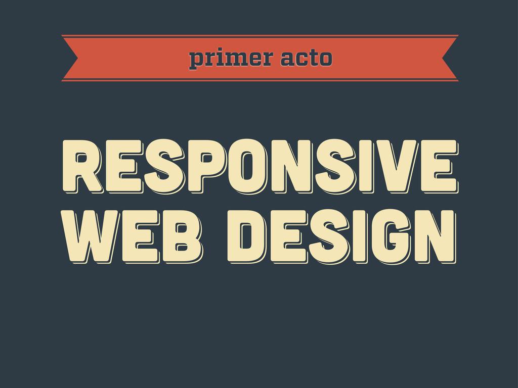
primer acto RESPoNSIVE WEB DESIGN RESPoNSIVE WEB DESIGN RESPoNSIVE WEB
DESIGN
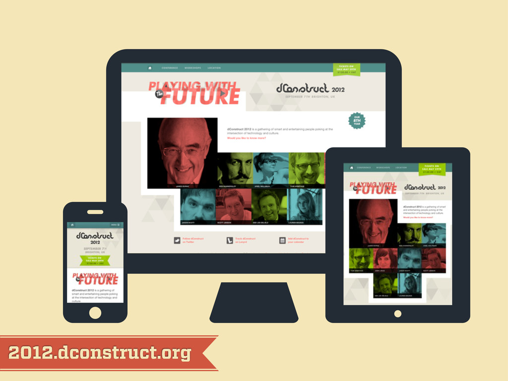
2012.dconstruct.org
mediaqueri.es
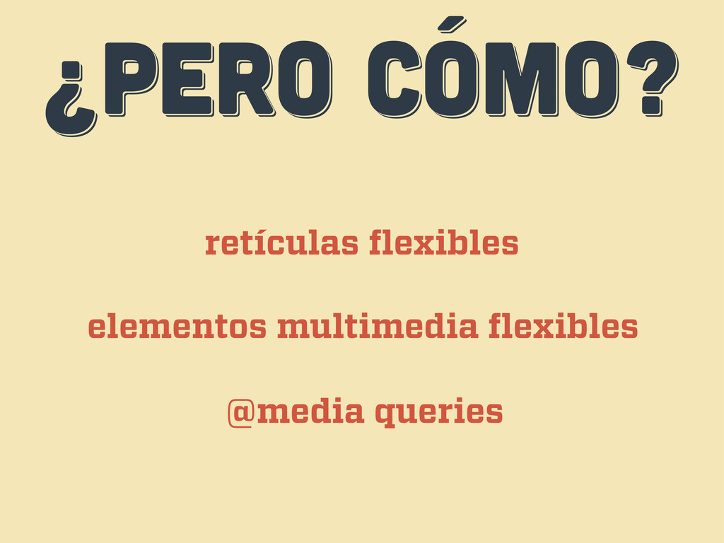
¿PERO CÓMO? ¿PERO CÓMO? ¿PERO CÓMO? retículas flexibles elementos multimedia
flexibles @media queries
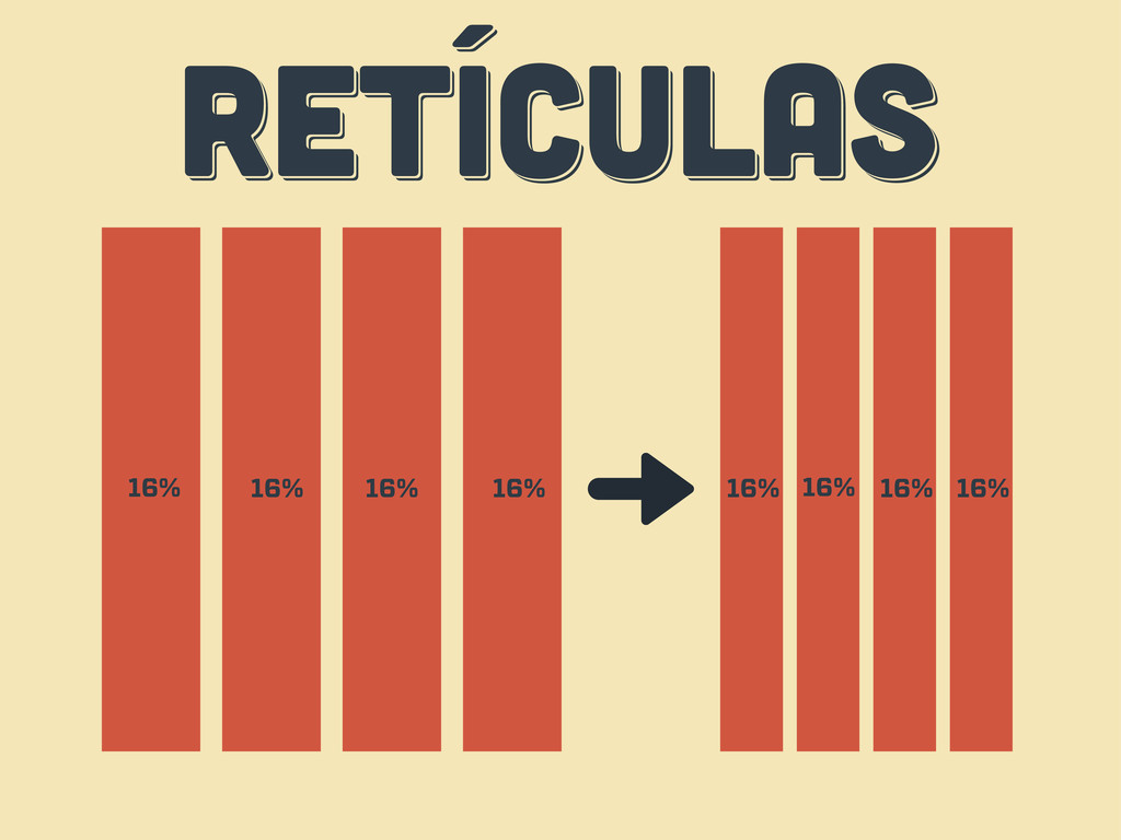
RETÍCULAS RETÍCULAS RETÍCULAS 16% 16% 16% 16% 16% 16% 16%
16%
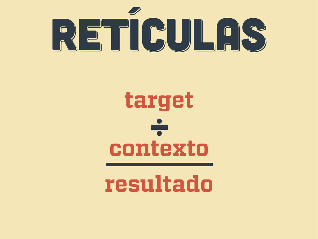
RETÍCULAS RETÍCULAS RETÍCULAS target contexto ÷ resultado
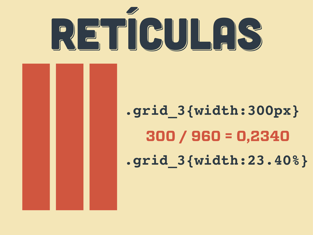
RETÍCULAS RETÍCULAS RETÍCULAS .grid_3{width:300px} 300 / 960 = 0,2340 .grid_3{width:23.40%}
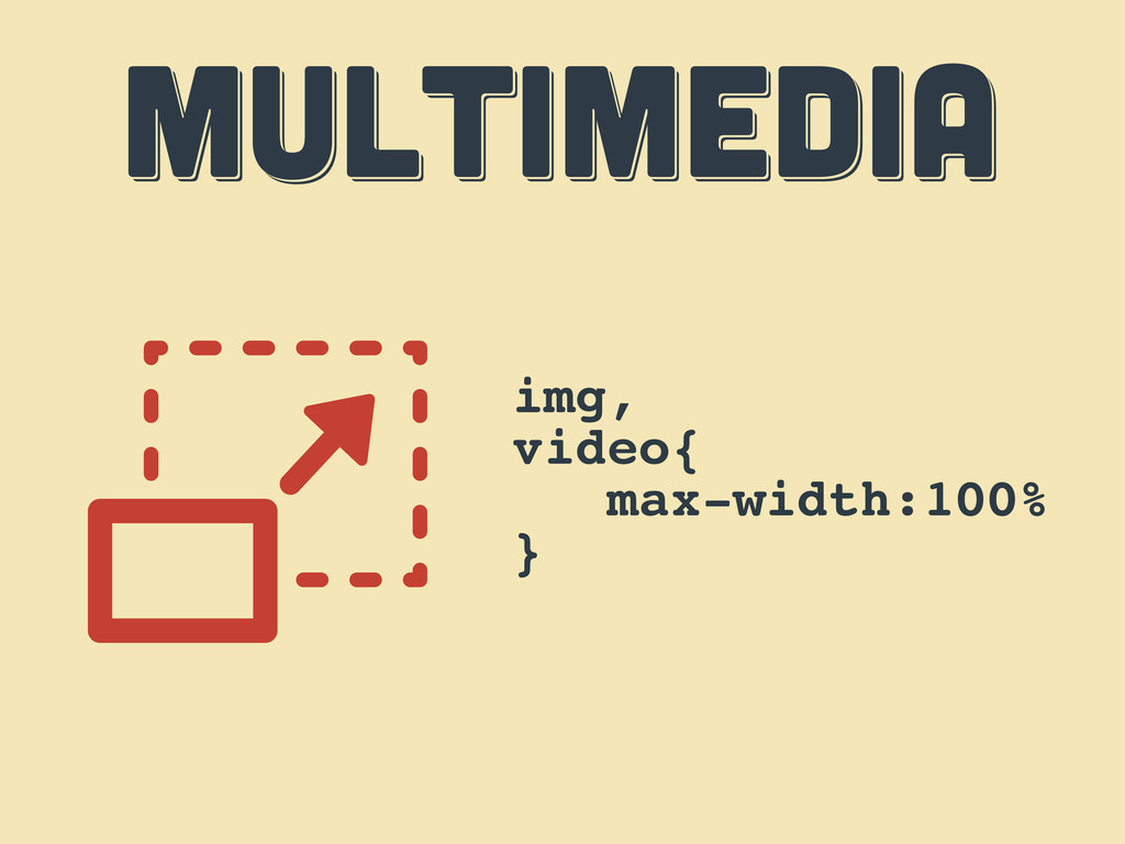
MULTIMEDIA MULTIMEDIA MULTIMEDIA img, video{ max-width:100% }
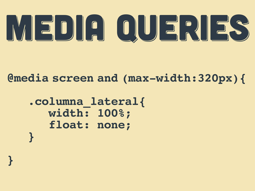
MEDIA QUERIES MEDIA QUERIES MEDIA QUERIES @media screen and (max-width:320px){
.columna_lateral{ width: 100%; float: none; } }
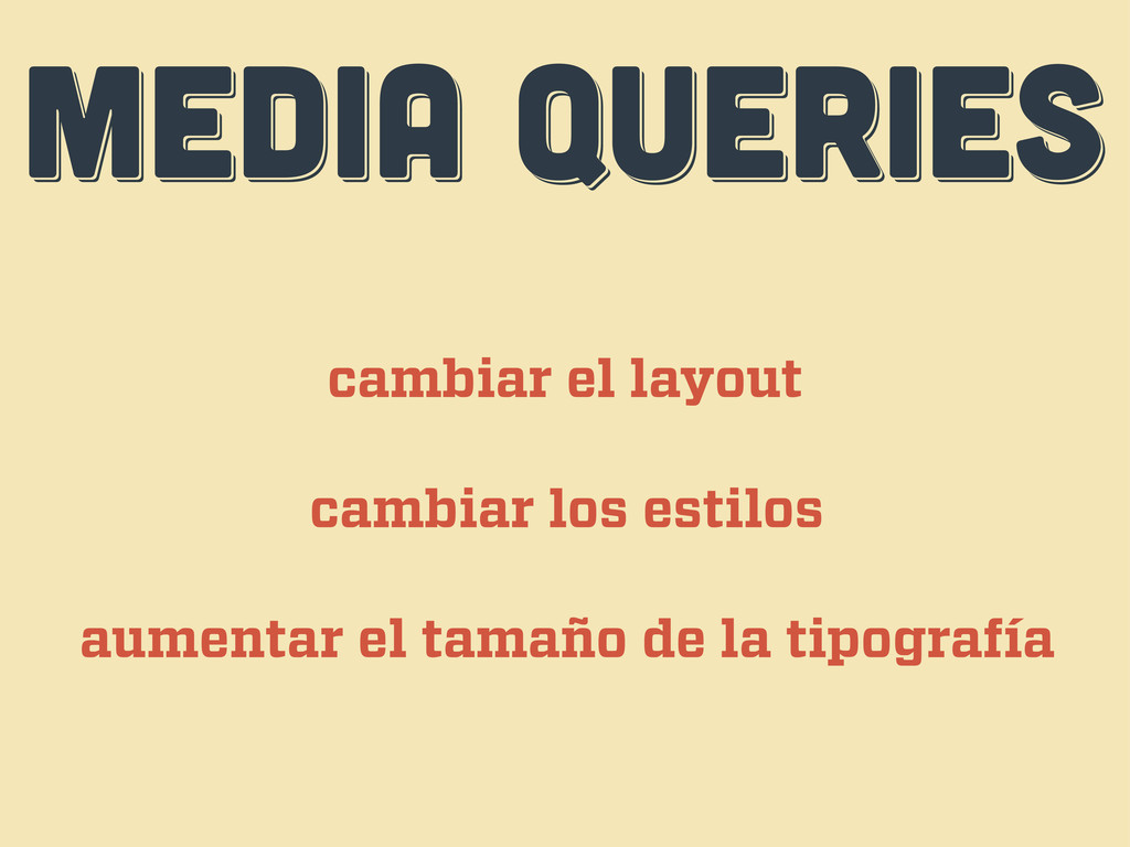
MEDIA QUERIES MEDIA QUERIES MEDIA QUERIES cambiar el layout cambiar
los estilos aumentar el tamaño de la tipografía
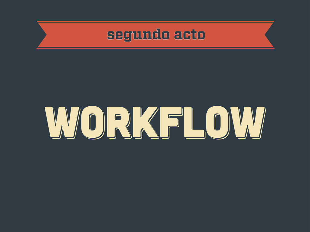
workflow workflow workflow segundo acto
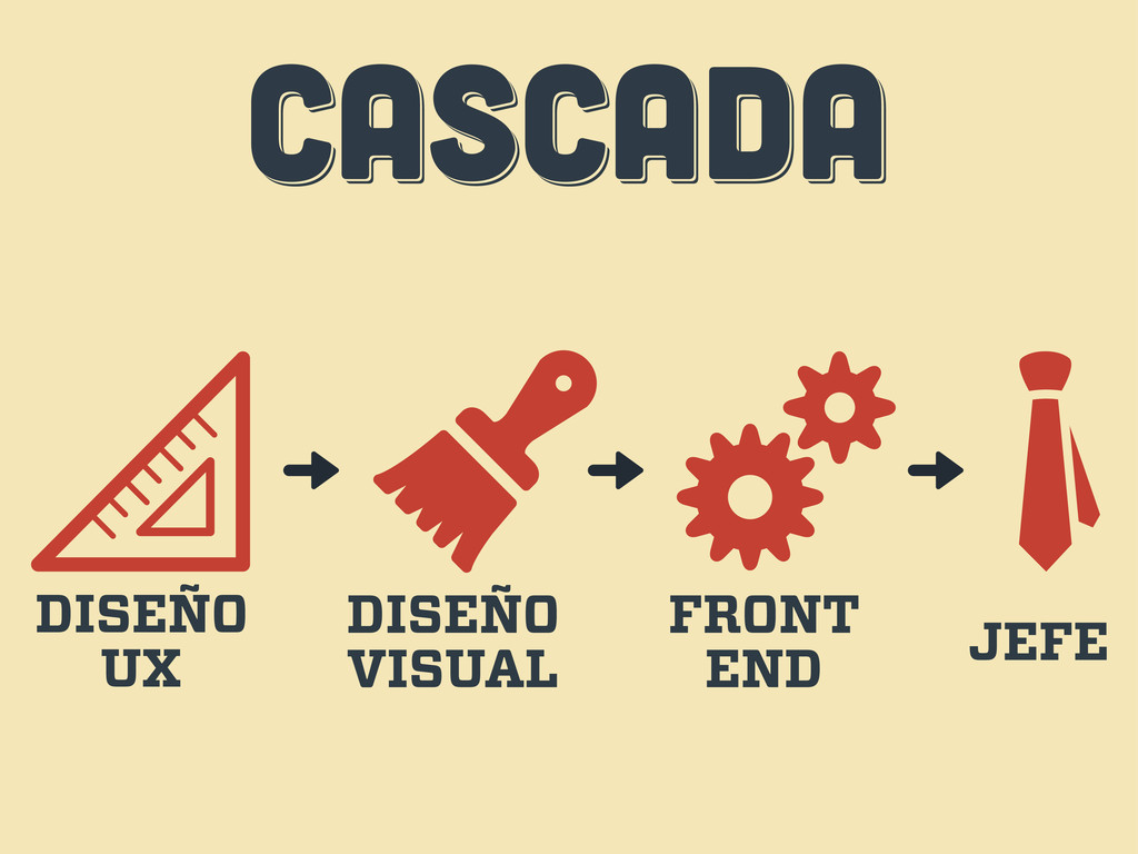
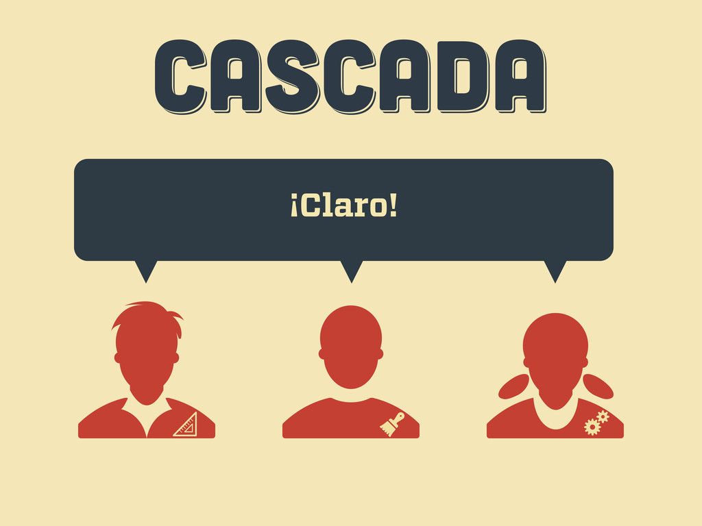
CASCADA CASCADA CASCADA DISEÑO UX DISEÑO VISUAL FRONT END JEFE
CASCADA CASCADA CASCADA Hola, quería una web...
CASCADA CASCADA CASCADA ¡Claro!
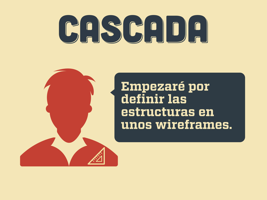
CASCADA CASCADA CASCADA Empezaré por definir las estructuras en unos
wireframes.
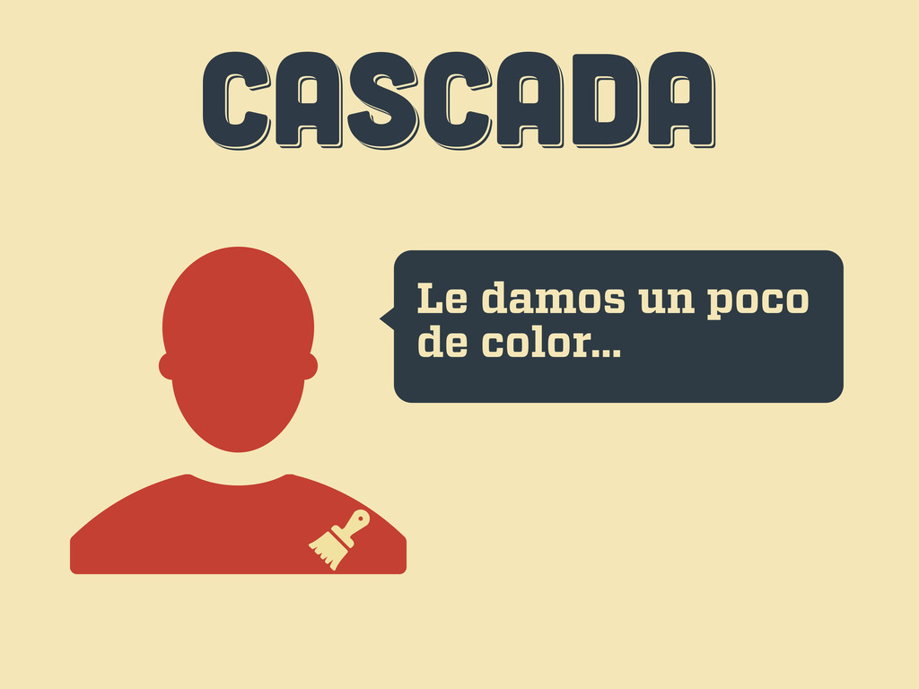
CASCADA CASCADA CASCADA Le damos un poco de color...
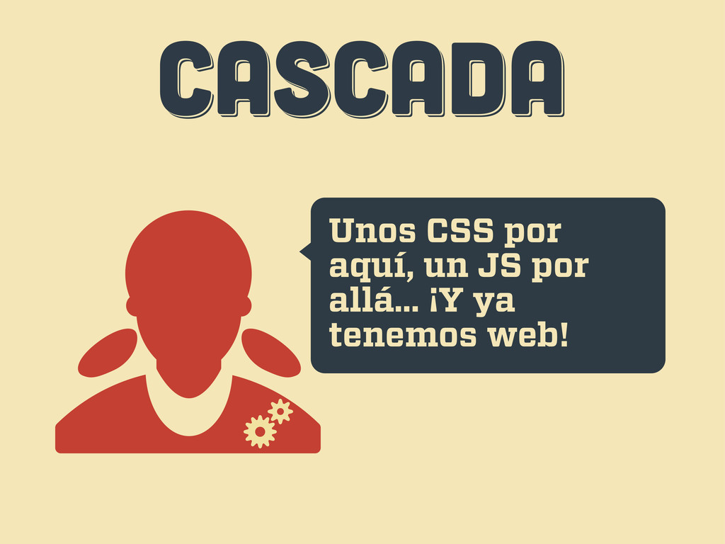
CASCADA CASCADA CASCADA Unos CSS por aquí, un JS por
allá... ¡Y ya tenemos web!
CASCADA CASCADA CASCADA Uh... esto...
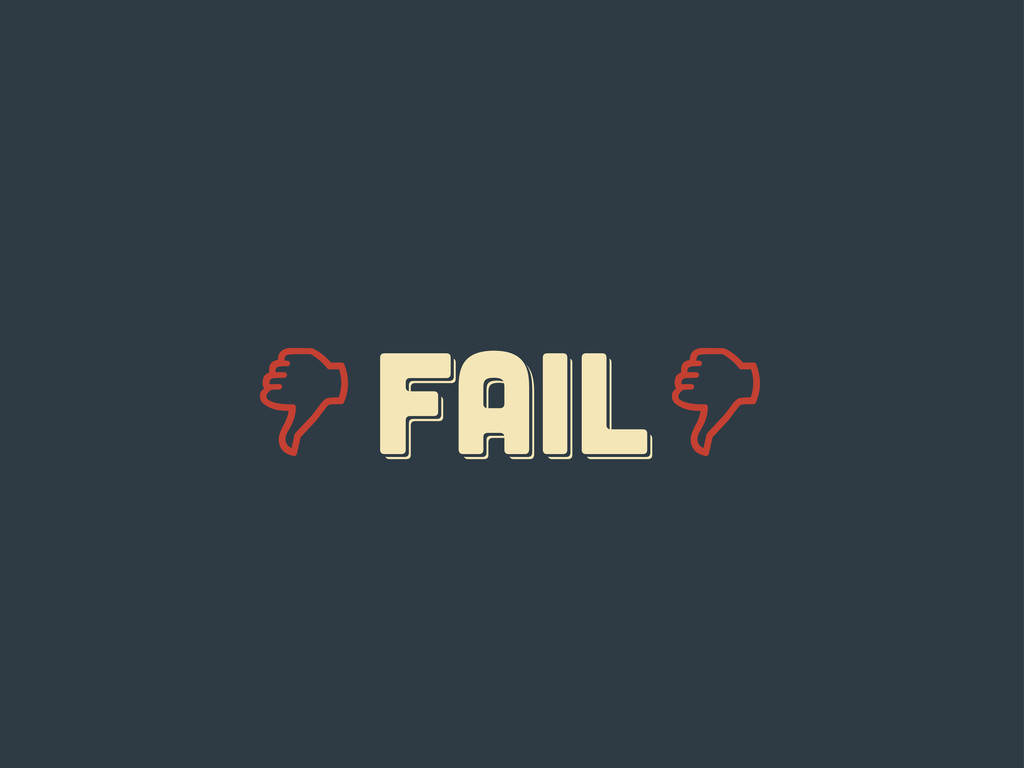
FAIL fail Fail
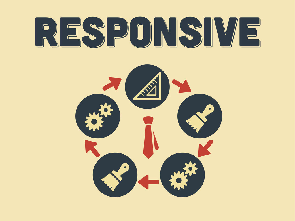
responsive responsive Responsive
diez consejos diez consejos diez consejos tercer acto
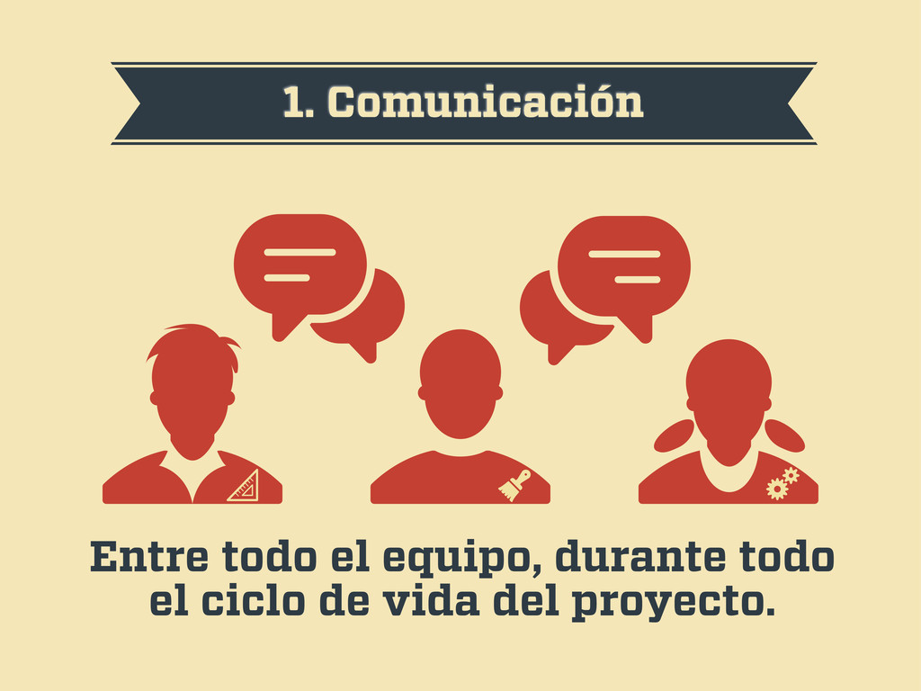
1. Comunicación Entre todo el equipo, durante todo el ciclo
de vida del proyecto.
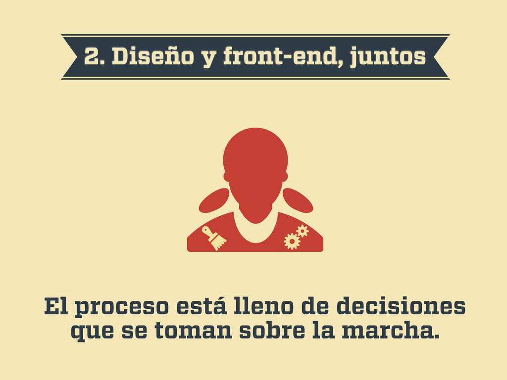
2. Diseño y front-end, juntos El proceso está lleno de
decisiones que se toman sobre la marcha.
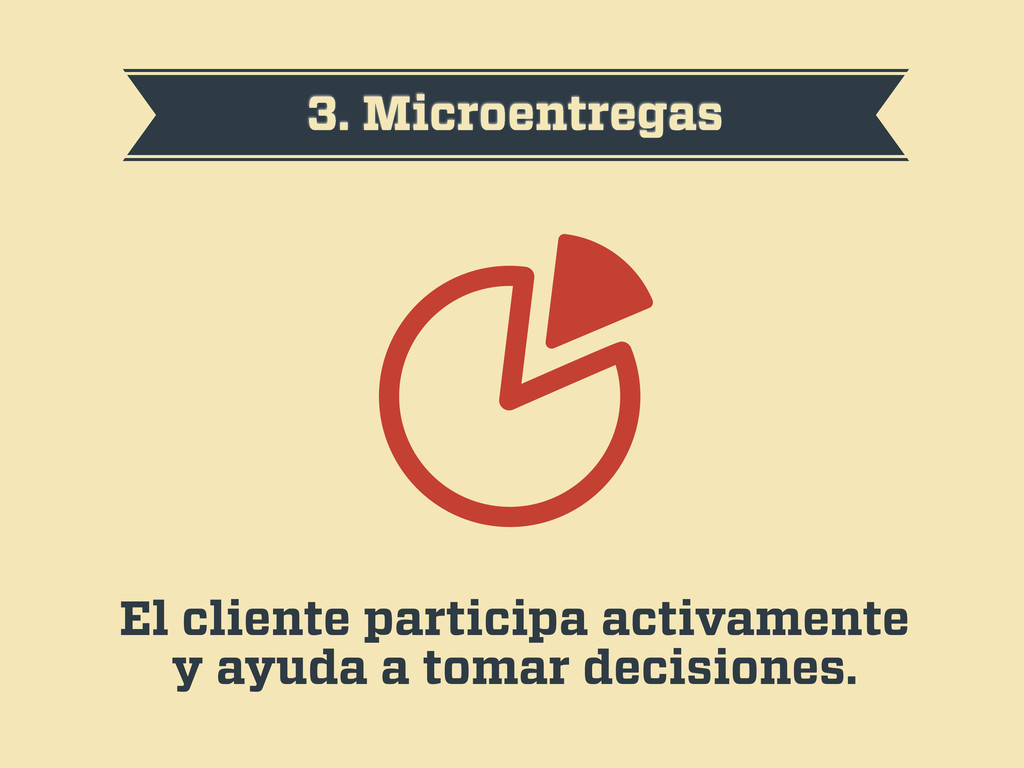
3. Microentregas El cliente participa activamente y ayuda a tomar
decisiones.
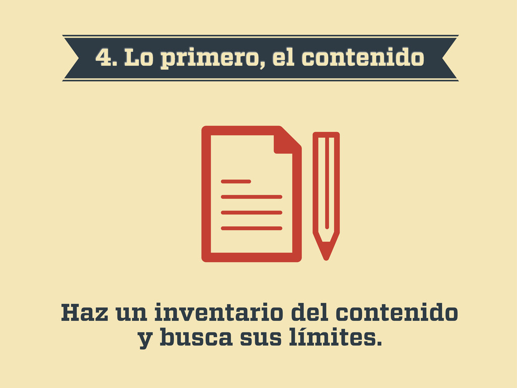
4. Lo primero, el contenido Haz un inventario del contenido
y busca sus límites.
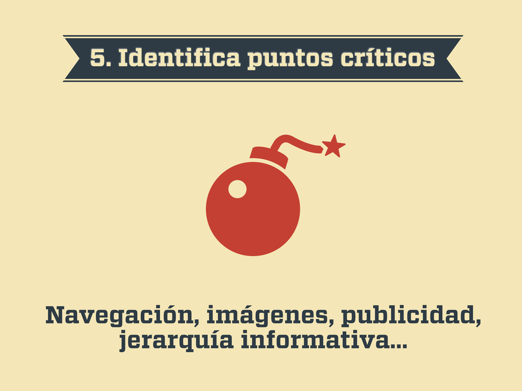
5. Identifica puntos críticos Navegación, imágenes, publicidad, jerarquía informativa…
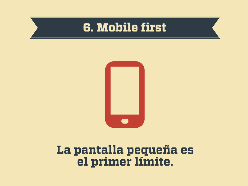
6. Mobile first La pantalla pequeña es el primer límite.
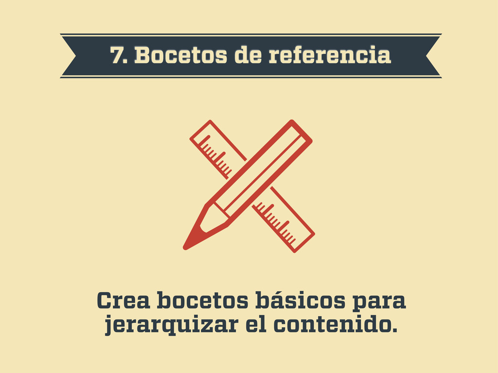
7. Bocetos de referencia Crea bocetos básicos para jerarquizar el
contenido.
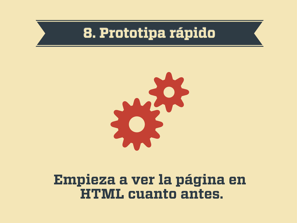
8. Prototipa rápido Empieza a ver la página en HTML
cuanto antes.
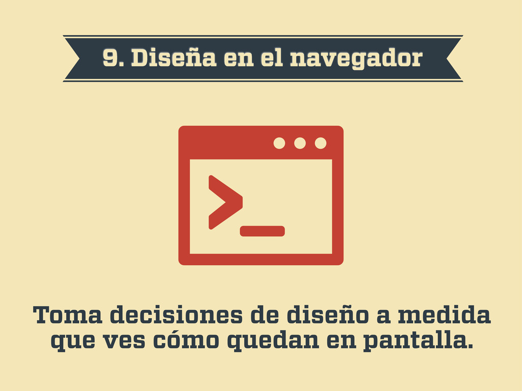
9. Diseña en el navegador Toma decisiones de diseño a
medida que ves cómo quedan en pantalla.
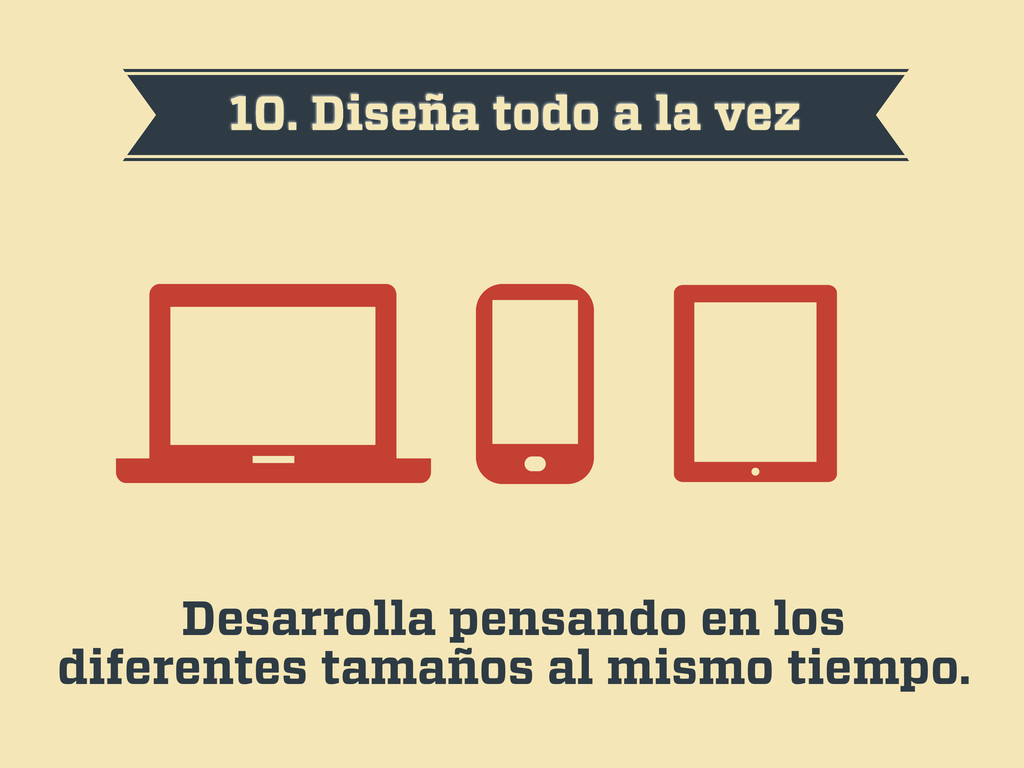
10. Diseña todo a la vez Desarrolla pensando en los
diferentes tamaños al mismo tiempo.
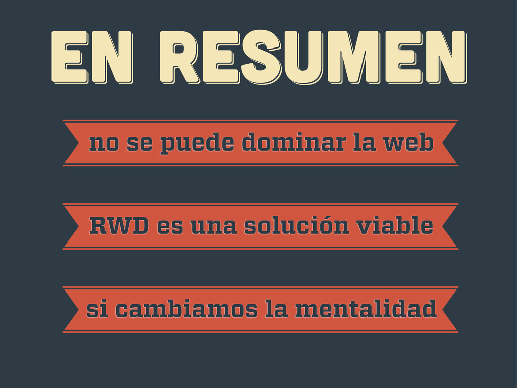
EN RESUMEN EN RESUMEN EN RESUMEN no se puede dominar
la web RWD es una solución viable si cambiamos la mentalidad
¡gracias! ¡gracias! ¡gracias! Javier Usobiaga · http://Swwweet.com · @htmlboy
 swwweet
 bengo4com
 ahus1
ahus1
 ardbeg1958
 ry0_ka
 kenta_hi
 rryz09
 nwiizo
 kanny
kanny
 vtryo
vtryo
 sue445
 kekke_n
 rakus_dev
 mayatellez
 samtorres
 afnizarnur
 akademiya2063
 minecr
 trallard
 akihiro_kokubo
 inesmontani
 bkeepers
 lfama
lfama
 davidcarrasco
 vanstee