Upgrade to Pro
— share decks privately, control downloads, hide ads and more …
Speaker Deck
Features
Speaker Deck
PRO
Sign in
Sign up for free
Search
Search
Intro to Responsive Design
Search
Dan Barber
August 16, 2012
Design
490
4
Share
Embed
Copy iframe code
Copy JS code
Copy link
Start on current slide
Intro to Responsive Design
An introduction to responsive design, what it is, why it exists and how to implement it.
Dan Barber
August 16, 2012
More Decks by Dan Barber
See All by Dan Barber
Design Eye for the Developer Guy
danbarber
21
19k
Other Decks in Design
See All in Design
体験負債を資産に変える組織的アプローチ
hikarutakase
0
1.6k
なぜ、インサイトを貯めるのか?
tajima_kaho
3
2.4k
絵や写真から学ぶ、要素がもたらす副作用
kspace
0
430
From the Visible Crossroads: Turning Outputs into Outcomes
takaikanako
2
1.5k
JBUG大阪#9_登壇資料_引き継ぎで困らないためのBacklogWikiの整え方_ミスと属人化を防ぐために、 “次の人が動ける状態”をどう残すか
webnaut
1
190
Saving_the_King_-_Storyboard.pdf
terencebasart
0
160
セブンデックス プロジェクト事例 / innovation Scenes
sevendex
1
1.3k
デザインの文脈を理解する:エンジニアがデザインカンファレンスに参加して得た学びと気づき
hypebeans
0
240
Frontier
rwang05
0
180
AIネイティブスタートアップにおけるプロダクト開発の新常識 / Product Development Tips in AI-Native Startups
saka2jp
2
1.3k
「余白」と「欲望」を味方につける ——AI時代のデザインエンジニアリングと「越境」の作法 #KNOTS2026
koyaman
1
2k
富山デザイン勉強会_デザイントレンド2026.pdf
keita_yoshikawa
3
270
Featured
See All Featured
Skip the Path - Find Your Career Trail
mkilby
1
170
Organizational Design Perspectives: An Ontology of Organizational Design Elements
kimpetersen
PRO
1
770
From Legacy to Launchpad: Building Startup-Ready Communities
dugsong
0
260
Responsive Adventures: Dirty Tricks From The Dark Corners of Front-End
smashingmag
254
22k
A Guide to Academic Writing Using Generative AI - A Workshop
ks91
PRO
1
350
Navigating the moral maze — ethical principles for Al-driven product design
skipperchong
2
420
Keith and Marios Guide to Fast Websites
keithpitt
413
23k
GraphQLの誤解/rethinking-graphql
sonatard
75
12k
Ethics towards AI in product and experience design
skipperchong
2
330
From π to Pie charts
rasagy
0
240
The Language of Interfaces
destraynor
162
27k
The SEO identity crisis: Don't let AI make you average
varn
0
520
Transcript
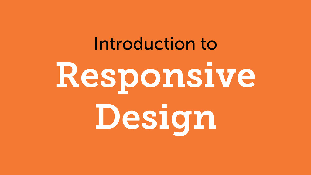
Introduction to Responsive Design
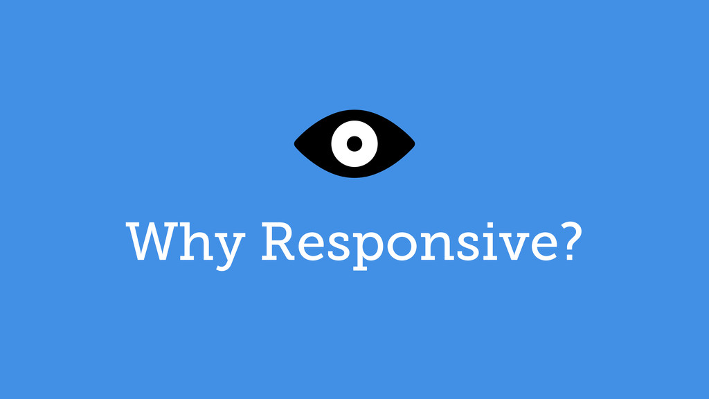
Why Responsive?
None
Best Viewed at 1024x768
None
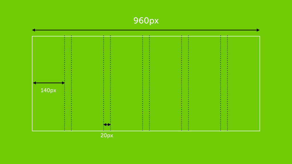
Flexible Grid
960px 140px 20px
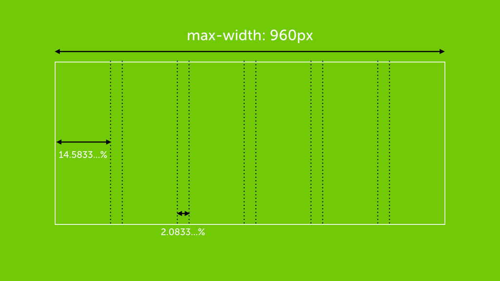
max-width: 960px 14.5833...% 2.0833...%
Flexible Media
img { max-width: 100%; }
img, embed, object, video { max-width: 100%; }
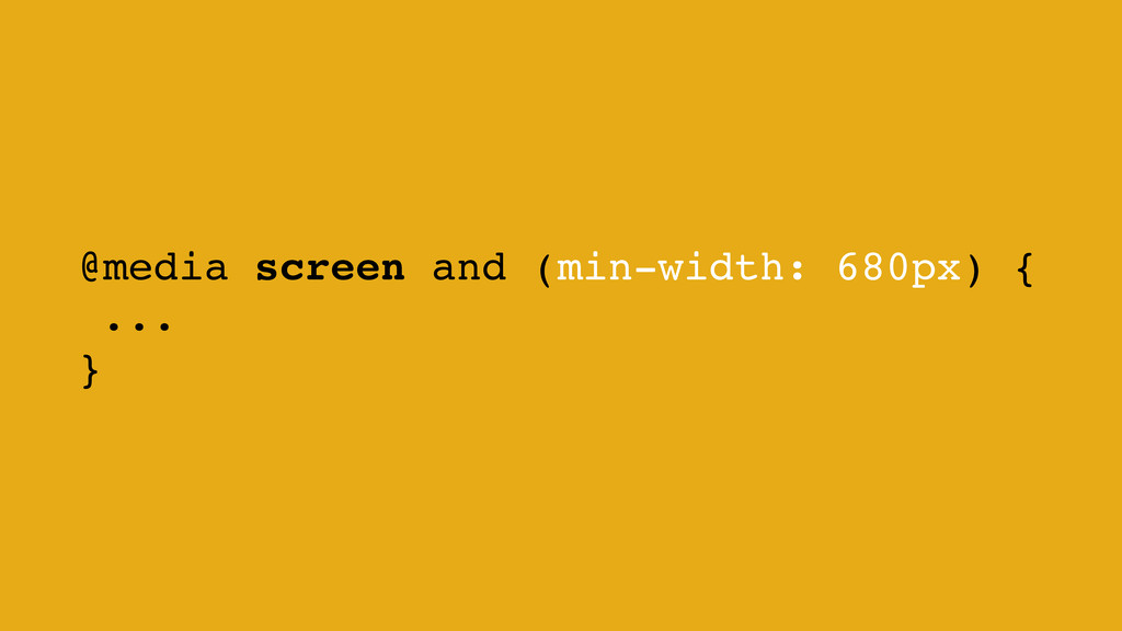
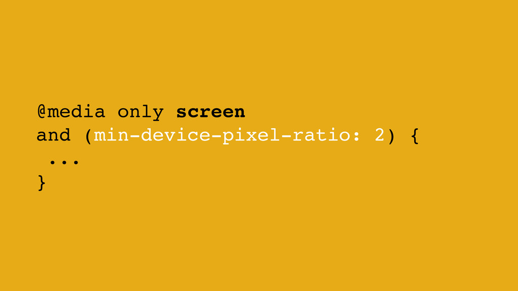
Media Queries
@media screen and (min-width: 680px) { ... }
@media only screen and (min-device-pixel-ratio: 2) { ... }
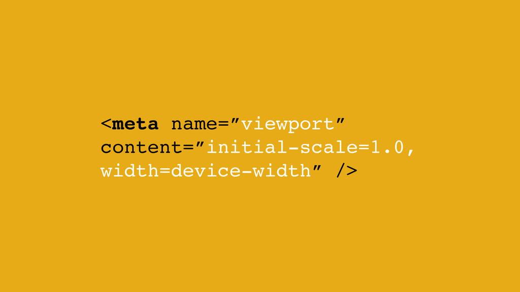
<meta name=”viewport” content=”initial-scale=1.0, width=device-width” />
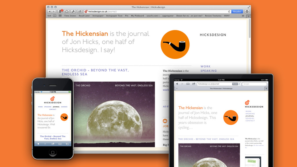
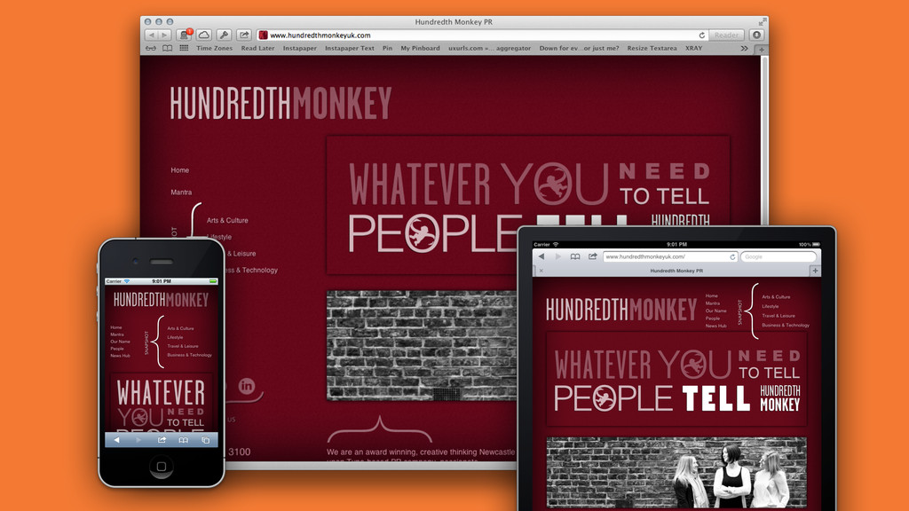
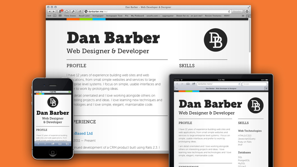
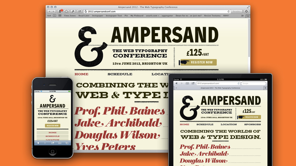
Showcase
None
None
None
None
Fin
 danbarber
 hikarutakase
 tajima_kaho
 kspace
 takaikanako
 webnaut
 terencebasart
 sevendex
 hypebeans
.jpg) rwang05
rwang05
 saka2jp
 koyaman
 keita_yoshikawa
 mkilby
 kimpetersen
 dugsong
 smashingmag
 ks91
ks91
 skipperchong
 keithpitt
 sonatard
 rasagy
 destraynor
 varn
varn